SlideMagic Blog

Frequent updates about all things presentations since 2008. Subscribe to never miss a post.

RSS
all posts

Category Presentation

·Design

What presenters can learn from book cover design

Presentations shared online are different from the “classical” setup of a presenter giving a live talk backed up by some visuals. Online presentations need to stand on their own, without verbal explanation, and need to be able to attract viewers without the help of “please sit down, the presentation will start now”.

Seth Godin posted some good thoughts about what makes an effective book cover. Jeff Bailey asked the question whether this only applies to books. The answer is no. Especially when your presentation has to stand out in SlideShare or on the notice board near the university coffee machine.
·Concepts

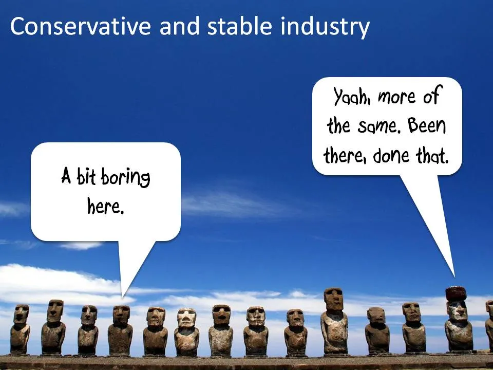
Chart concept - stable industries, not much going on here

Certain industries do not seem to be subject to change (but maybe a new startup is about to change all this!). I like to use images of the moai on Easter Island to visualize this kind of market environment.

Photo credit: Natmandu. For these type of “real” images it is much better to go to sites like Flickr then to stock image sites (check the image license though).

·Art

Using impressionist painters in PowerPoint slides

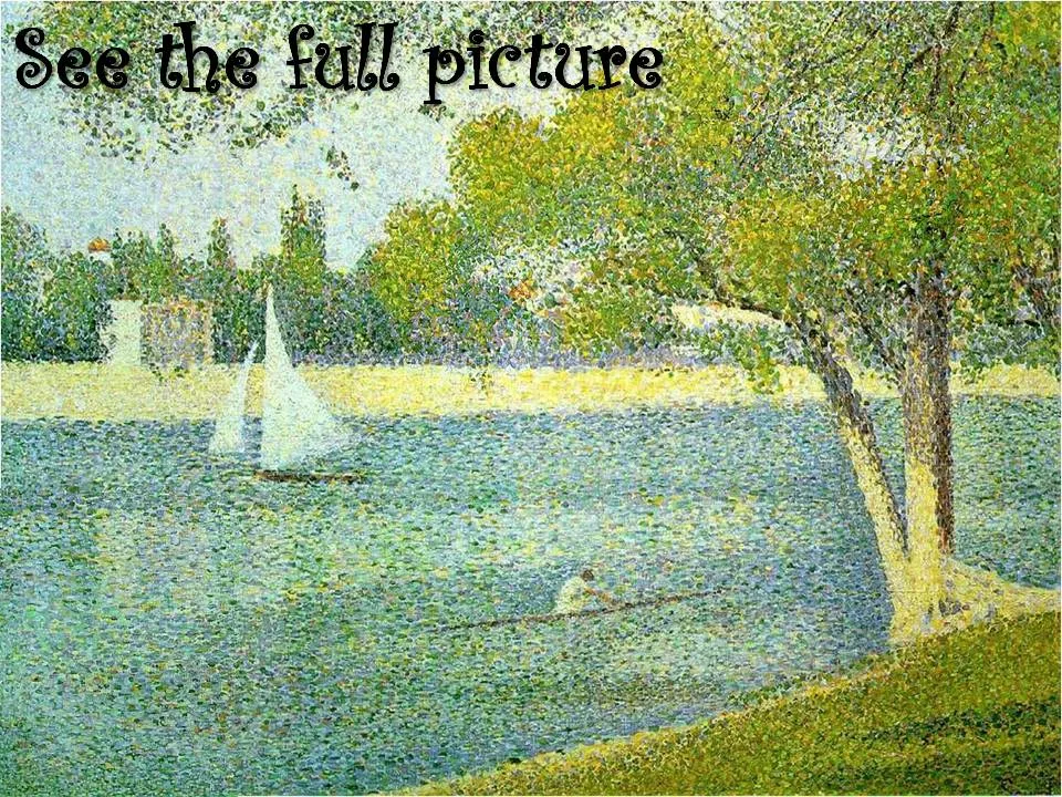
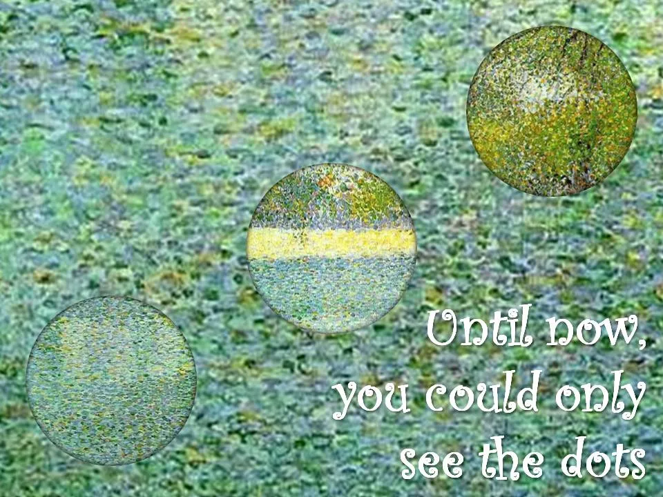
My life and business partner Anat Naschitz has a strong interest in the arts. She recently created a chart for a client that needed to show how its solution makes it possible to see beyond the dots and construct the full picture (in a medical application).

The painting “The Seine at La Grande Jatte” by Seurat is an example of the pointillism style. An approach similar to the CYMK technique used in many printers today. (Seurat starred in a previous post on this blog as well).

The round cutouts were made by setting the background of the PowerPoint shape to “slide background”. The curly font used is Curlz MT.

·Design

Screen shots made easy with Aviary

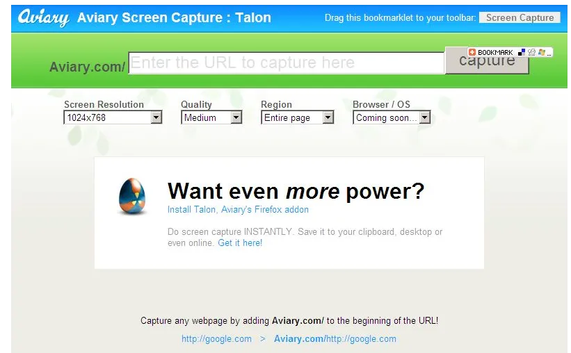
Mashable pointed to this usefull tool yesterday. Aviary is an “in-the-cloud” image manipulation utility (trying to take on Photoshop and others). To lure more users to their site, they have created a neat screen shot capture tool (bookmark this URL).

I use screen shots a lot, and until now relied on CTRL-PRT SCR, followed by a paste into a PowerPoint slide. (For example to extract tag clouds from Wordle) Two drawbacks:

  • A huge, very wide image (I have a large screen resolutions) gets plopped into your slide that you need to crop by switching the PowerPoint zoom to 33%
  • A partial web page image (PRT SCR only captures what’s on the screen)

The Aviary tool is more useful:

  • Simple: type in aviary.com followed by the URL you want to capture, for example aviary.com/http://ww.axiom.co.il if you want to make a screen shot of my corporate site www.axiom.co.il.
  • The image (covering the entire web page including parts that are not on the screen) opens up in a basic image editor for cropping.
  • You can save the image for future use
·Design

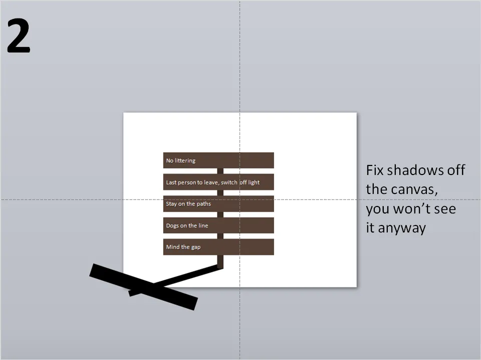
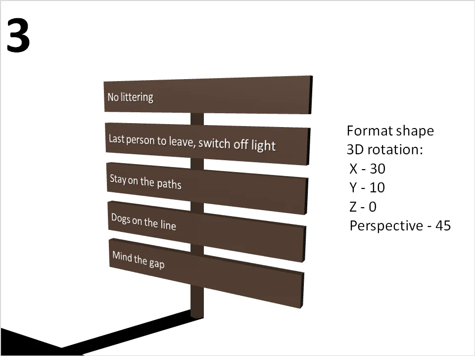
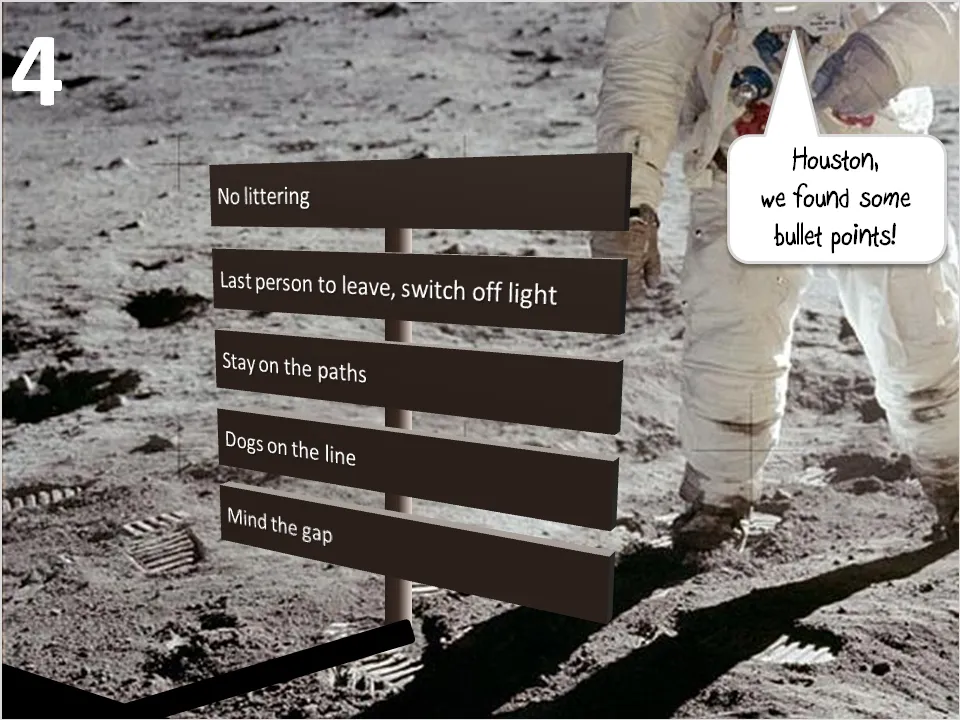
Looooong shadows to add depth

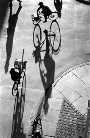
Long shadows can add great perspective to a slide. Lucky Luke needs them to show off his speed. Photographers like Heinrich Heidersberger have used them nicely in photo compositions (see the “Street Scene” image below)

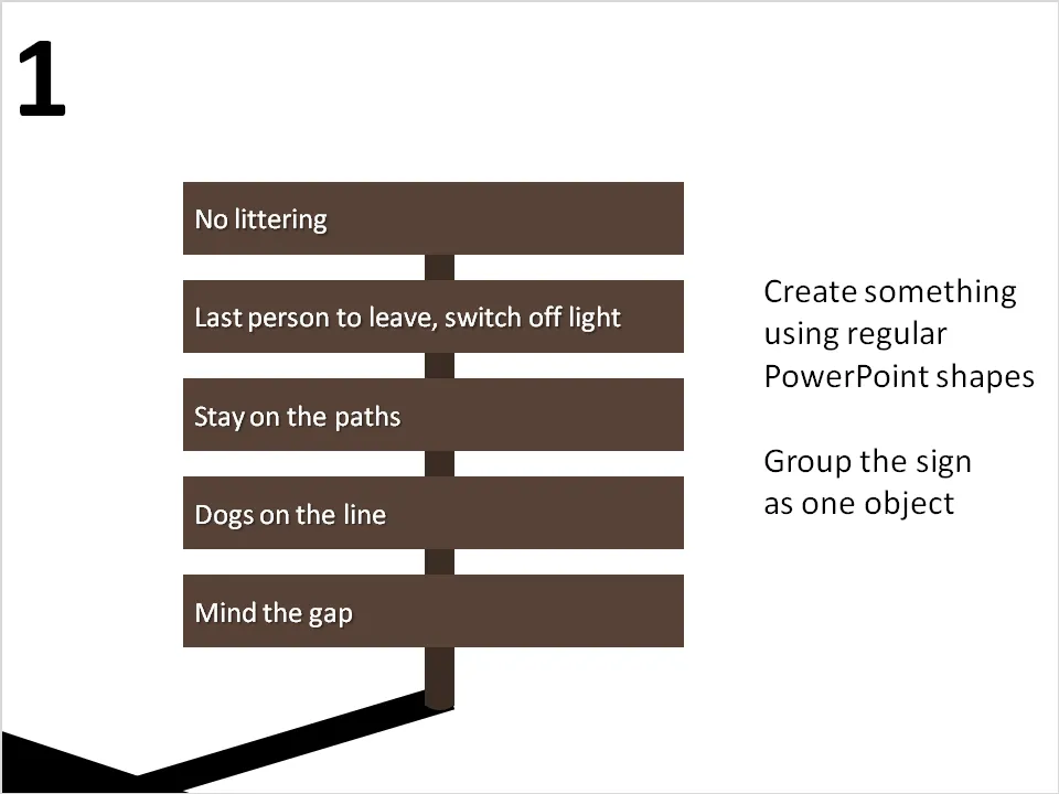
They are very easy to make in PowerPoint. I suggest forgetting about the built-in shadow functions of PowerPoint, they can be tricky control. Instead, draw your shadows using rectangular boxes. Below a chart that can be used as a setting to display the 3 (or so) key messages of a presentation on a final slide (excuse the bullet points):

·Design

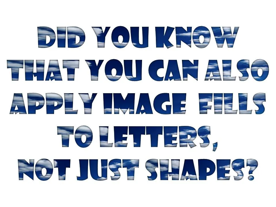
Filling PowerPoint letters with an image background

A neat trick. Select your text, go to “format” and select “text fill”. The font I used in the example below is “Showcard Gothic”.

·Design

Evernote - your note pad always with you

Presentation design needs time. Squeezing out the last slides the night before the deadline will make your presentation look like, well, a document that was squeezed out the night before the deadline (most management consulting presentations). Give yourself lapse time to complete your presentation. A day of work spread out over a week gives much better results than sprinting from 18:00 to 02:00.

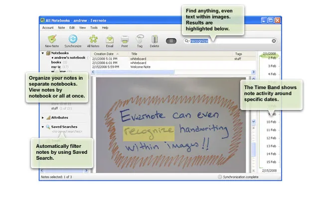
Most ideas come at times and places when you least expect it, and when you don’t always have a note book around. Evernote seems like a useful tool. Capture things on whatever device is convenient, but most importantly, archive it and make it searchable. This archiving is the most important feature I think. Finding notes, mobile phone images, yellow stickies, I lose most of them.

Maybe a special case of Fred Wilson’s “watch later” concept: stumbling on things when you do not have time to deal with it, putting it away somewhere for later access.

Via Lifehacker

·Design

Homeless signs

Weekend reading. A site with signs and portraits of homeless people. It makes you think. You got a piece of card board and a marker (in fact that’s all you got), now write the best “pitch” slide you can…

Via Swiss Miss.

·Art

3D pavement art

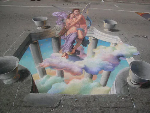
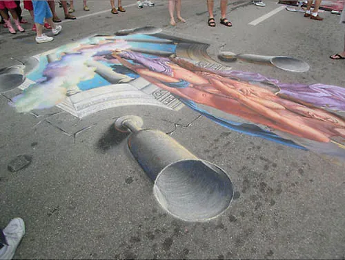
Three dimensional street artists try to create the illusion of a 3D composition jumping out of a flat surface. It results in some stunning pictures. Especially interesting are the images taken not from the viewing position but from the side, giving you an opportunity to see the enormous distortion the artist applies to make his effect work.

Some 3D pavement art links:

A video how Edgar Mueller goes about making one of his creations:

·Design

One click centering across the slide

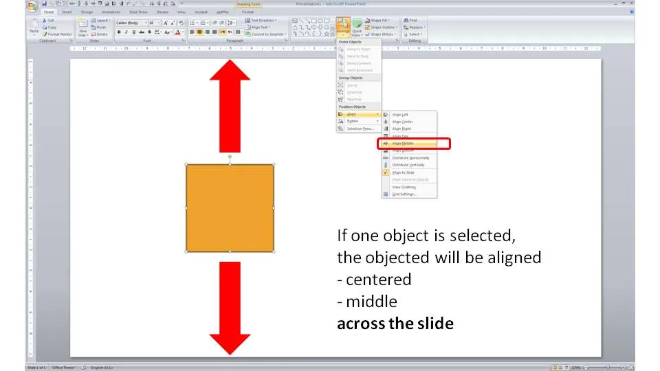
Usually you use the align tool bar buttons (essential tool bar elements) to line up/center multiple objects. If you just select one object and hit a “Align Center” or “Align Middle” button, PowerPoint will center the object across the slide.