SlideMagic Blog

Frequent updates about all things presentations since 2008. Subscribe to never miss a post.

RSS
all posts

Category Presentation design

·Design

The Wolf

My role in some presentation projects reminds me of the character “The Wolf” in Pulp Fiction. The clock is ticking, (many) people are running around, but the presentation is not progressing towards a final end product…

You can call in The Wolf if you really have to, but these situations are best avoided. And, the talents of a professional presentation designer are most useful in stress-free situations. Energy spent on cranking out the deck comes at the expense of creativity.
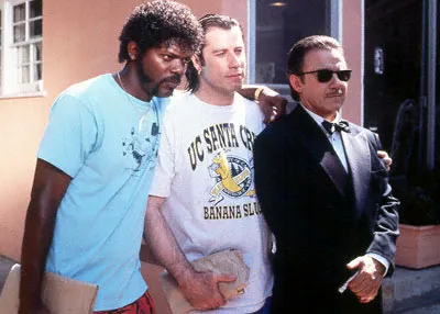
I hope Miramax does not mind me borrowing these videos and images, it might just remind people to buy a copy of this classic movie to watch it again this weekend (Affiliate link to Amazon).

·Concepts

Visualizing the curse of knowledge

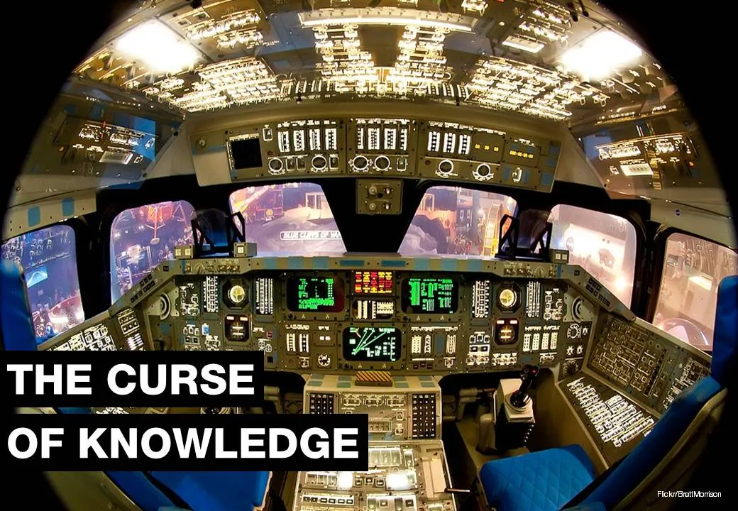
I often have to explain the concept of “the curse of knowledge”: it is actually harder for an expert to explain something than a reasonably intelligent outsider (here is why presentation designers should be reasonably intelligent :-) ).

Dan and Chip Heath use a musical metaphor in their book “Made to Stick”:

  1. The presenter thinks of a musical piece and imagines the full symphony orchestra giving all it can
  2. He taps the tune with his fingers on the desk, it all makes perfect sense
  3. The audience sees/hears someone tapping…

For executives who are keen to load their slides with data for an external audience, I use the cockpit analogy. A pilot can interpret all the signals of all the instruments in a split second and understands the situation the plane is in. The novice needs a bit more time to digest the information…

Thank you Brett Morrison for this beautiful picture of a Space Shuttle cockpit.

·Data visualization

Setting default fonts for PowerPoint data charts

When you insert a data chart in PowerPoint, chances are that the font in which they pop up is the default Calibri. Why? Because you did not bother to change the fonts in “design” “fonts” “custom fonts”. Set the heading and body fonts to whatever you want it to be, and you save yourself a lot of time re-formating data charts.

·Advertising

Oh no, you left some features out of the deck!

This ad by Webroot Internet Security reminded my of many discussions with clients in the technology sector. The VP Product is meticulously scanning the slides to make sure ALL the product features have made it in the deck.The result: a bored audience that will not understand the value your product brings.

Still, there is a way to include them though, but with a different headline: cram them all in page using a neat table in 7pt font with a title: “Powerful specifications”. The audience will believe you without reading all the text.

Via Ads of the World.

·Design

Getting the latest logos

Corporate logos get used a lot in presentations: our customers, our partners, our competitors. You find them via Google image search. When you do, make sure you get one in a good quality (earlier post), but more importantly go to the home page of the company you are looking for to check whether you got the latest logo, and/or the logo in the right colors. Don’t just rely on Google image search.

·Design

Help, my CEO can't present!

I heard this complaint a few times. “My CEO can’t present. She goes off on a tangent. Ignores the slides. Stutters. I create these beautiful slides for her, but somehow it is a waste of time.”

Usually, CEOs are good story tellers (that’s how she got the top job). How can you make sure that she gets the best out of the slides that you prepare for her?

  1. (Really) listen to the story the CEO wants to tell, and adjust the slides to that. What sequence, what anecdotes, what examples
  2. Have the courage to cut slides, CEOs have the confidence to stand up with a black screen and just talk.
  3. Finish the preparation of your slides early and force her to PRACTICE. It is easy to “sell” to a CEO to invest an hour to practice a presentation: “we’ll just try for 10 minutes, and if that goes well, we’ll skip the rest of the rehearsal.” A first practice run never goes well, not even for Steve Jobs who practices a few full days to get his major product launch pitches right.

Most CEOs are good presenters.

·Design

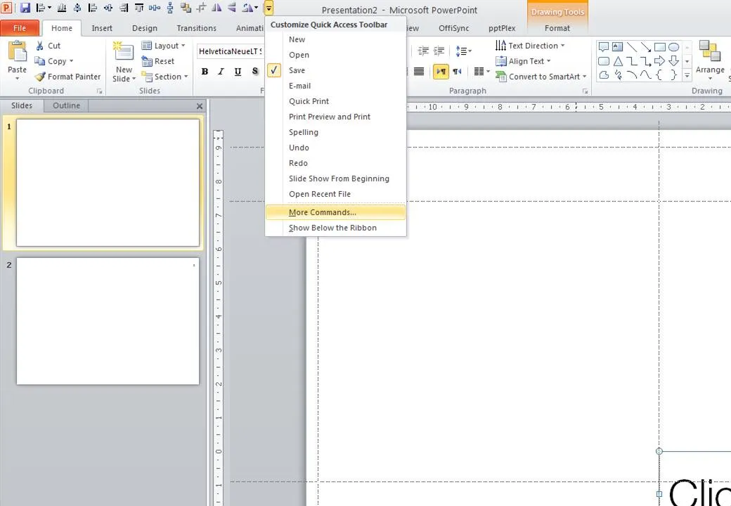
What's in my toolbar

Unlike PowerPoint 2007, it is possible to customize the tool ribbon in PowerPoint 2010 (review). I still use my 2007 workaround in the 2010 version of PowerPoint though. The screen dump below shows those very important buttons that any PowerPoint designer should have always on hand (click for larger image).

  • Save
  • Left, bottom, middle, right, top align
  • Horizontal, vertical distribution
  • Send to back
  • Crop
  • Flip horizontal, vertical
  • Rotate
·Design

"nonlineair" presentation iPad app

Seth Godin made a wishlist of iPad app and readers of his blog created them. One them is nonlineair: “it lets you import a PDF or PPT file and then jump around. It’s not for building slides, it’s for navigating them, and even includes a way to drive an external monitor in a clever way.” It is available or $10 in the app store, $2 of which will go to the Acumen Fund. I still need to find time to review it.

·Design

One more post about the closing slide

OK, the comments on my post from 2 days ago showed that I should think a bit more before writing about the last slide in a presentation. Here we go:

  1. A good story does not need a slide that says “that was it, please applaud”, the story flow in itself should let the audience feel that you have come to the conclusion of your talk. (And what if the audience does not applaud when you ask them to? Awkward.

  2. It is good to recap what you discussed though. But recapping does not mean telling the entire story again. Rather think of it what you want people still to remember 4 hours after the presentation. Leave out the buzzwords and the fluff.:

  • "Every teenager sends 3,339 text messages per month.
  • No teenager would want to miss out on our new service"
  • [re-display of stunning key graphic]
  • “Please invest in our 3rd startup that we will bring from PowerPoint to IPO”.

Much better than:

  • "The market is big,
  • there is no competition,
  • we have a solid business model,
  • there are interesting exit opportunities in this ever-changing mobile communications landscape that will transform the way young people communicate with each other".
  1. It is good to put the “killer graphic” back on the projector, since the brain can anchor an entire discussion/story to an image. People will remember. If you get a lot of questions, this slide will stay on the screen for a long time.
Continue reading →
·Design

Paul Graham on trends in startup fund raising

Many of the readers of this blog are - like me - designing investor pitch presentations. This 30 minute talk by Paul Graham of Y Combinator gives some interesting perspectives on how the competition between “super angels” and regular VCs has an impact on startup valuations and the startup fund raising market in general. If you are here just to learn about slide design, skip the video.

Watch live video from c3oorg on Justin.tv