SlideMagic Blog

Frequent updates about all things presentations since 2008. Subscribe to never miss a post.

RSS
all posts

Category Presentation design

·Books

Book: The a-z of visual ideas

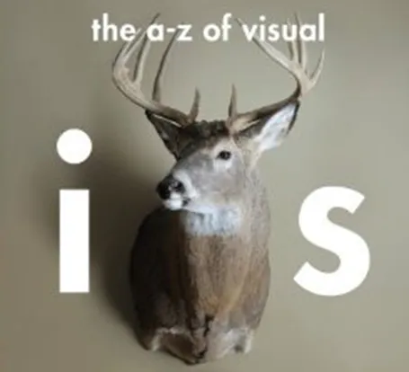
An A-Z of Visual Ideas: How to Solve Any Creative Brief (affiliate link) by John Ingledew, aims to help you solve visual creative deadlock. Organized in 26 sections following the letters of the alphabet, it introduces a number of concepts that you can use as the basis of your design. Examples: counter-intuition, eyes, juxtaposition, and zeitgeist.

It is written more with advertising or poster design in mind, but still it can help you broaden your creative mind with the concepts provided in the book, or by encouraging to think out of the (visual) box yourself.

·Delivery

Timing your elevator pitch

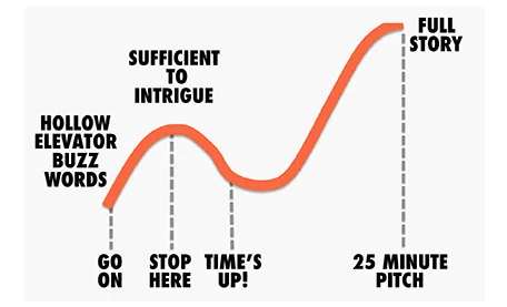
Sometimes there is little time to do your pitch. You meet an investor in the corridor, you got a slot at a pitch competition. Seth Godin said the other day that no one has ever bought anything in an elevator: in other words a very short elevator pitch consisting of 2 sentences with hollow buzz words is not going to excite an investor.

Instead, you need to add more specifics to intrigue the investor to invite you to another occasion where there is more time to discuss your idea.

But sometimes, elevator pitches become less effective when you take too much time. You start adding details, provide facts, that take the energy out of your presentation, that require time to close all all the plot lines. There is a dip between the perfect short pitch, and the full-length 25 minute story. Do not get stopped in the middle, it is better to keep it short.

·Delivery

Room temperature

A room that is too warm will put your audience to sleep, even when you have the most exciting presentation in the world. Climate control is one more thing to add to the pre-presentation technology check list.

·McKinsey

Strategy deck <> pitch deck

The other day a client showed me a pitch deck that a management consulting firm had prepared for them. Having been a consultant myself, I recognized it immediately: structured, organized, logical, dense. Great to solve a problem and/or convince an analytical audience with lots of facts.

Not good enough to make the sale: a good sales presentations needs to touch both the heart and the mind. Consulting presentations touch the latter, not the first.

Instead, put the consulting deck aside and start from scratch. What is the story you would like to tell? Sketch visuals without borrowing / Frankensteining / recycling charts from the consulting presentation.

·Animations

A cinematic presentation opening

Have a look at the way**Francesco Paciocco** credited this short video about Milan. It is a video, but the shots are very close to still images. We do not see the cliché images of the Duomo and other tourist attractions. Instead, a flow of scenes from daily live.

I like cinematic openings in PowerPoint presentations. A series of images to take the audience to a different place. While it might be a bit too complicated for the average designer to create such a video, you can create a very similar effect in PowerPoint by sequencing a series of Flickr images with a Creative Commons license. If you want, you can go one step further and add a slow-zoom effect to your images.

Via Fubiz.

·Delivery

Tricky, those switch-overs

Switch-overs of technology during a presentations are always tricky. That is why I hardly ever recommend clients to use videos played in different software and live demos in short presentations. The worst case scenario happened last night at the school Hanuka event of my daughter.

After the performances of all the groups had been completed, this series of events unfolded:

  1. Mic: “After all the songs we already sang, we will just sing one more, really, only one”
  2. Full lights on in the room, everyone blinking
  3. Mic: “ There are huge amounts of donuts waiting for you outside the room!
  4. People struggling to put up the small PowerPoint projection screen again with lyrics (you can see it behind the band)
  5. People running around the stage looking confused at papers with lyrics, pianist and guitarist flicking through pages
  6. Kids are heading for the donuts…

Happy holidays to everyone!

·PowerPoint

(Brief) venture into print design

I just completed my first print design. Not that I expect this to be my bread and butter, it was a natural extension of a presentation design project I did.

It struck me how simple and fast it is to design a brochure when you start with a good PowerPoint presentation. You have the right flow, you have the right visuals, you have the right visual language. When you start designing print from a blank sheet of paper, people argue and iterate forever to get the wording of the text right, to do the layout, and then, oh, we need a few illustrations as well.

Here are some of the things I had to do.

  1. Teach yourself InDesign. Luckily it was not necessary for this small project extension, I had to go through this process to write my ebook
  2. Print the PowerPoint as a press-quality Adobe PDF to get huge resolution images. If required, remove foot notes, page numbers and other clutter from slides.
  3. Select the right charts from the deck. Out go the ones that describe the story flow, out go the huge-images-one-word slides, what you are left with are the diagrams, the flow charts, the data charts
  4. When you place a chart crop out the titles, foot notes and other distractions
  5. Go through an iterative process of writing text columns, moving images, re-formatting text until you are happy with the result

So my advice to brochure designers: start with a slide deck…

·PowerPoint

Bullet point punctuation

Bullet points can happen to the best of us. If they are short and to the point, there is no need to end them with a period or full stop.

·Art

Screaming colors

I just re-designed my Twitter avatar with a dash of fluorescent paint to stand out in the noise of social media. It is interesting how computer screens work. A really bright color is not yellow or orange, but rather the ones that sit on the edges between 2 colors. Mine is in between yellow and green. It is as if our eyes are being teased by interfering light waves that are just a bit off in terms of wave length.

Other examples of interfering colors are on the border of pink and blue, or green and blue. I blogged earlier about how great classical painters manage to create rich colors through a combination of color mixing, patterns, texture.

·PowerPoint

Teaching slide design to teenagers

In a week from now I will be teaching 15/16 year olds about presentation design in Jerusalem.

MEET is an MIT-sponsored high-tech education initiative that aims to bring Israeli and Palestinian students closer together. Over the past years it has become a very prestigious program and only a small fraction of the applicants get in. Admitted students go through an intensive curriculum of programming and other IT-related subjects in addition to their regular high school commitments. A business idea pitch competition is part of the program, and I will be teaching, coaching, and judging the students.

I know that there are many teachers among the readers of this blog and would welcome suggestions on how I can adjust my content aimed at senior executives and startup CEOs to a younger audience.

You can find out more about MEET here.