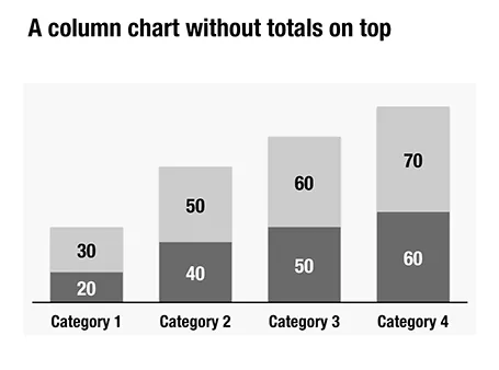
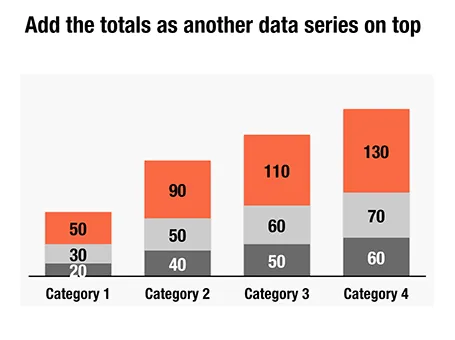
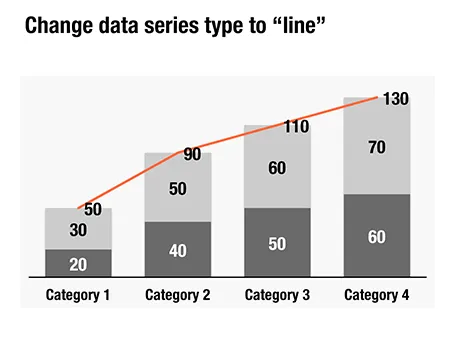
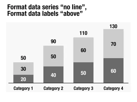
Here is a little trick to create automatic totals on top of column charts. This is an alternative to placing text labels manually, and especially useful when the data in the column charts is changing frequently.


Blog post
Here is a little trick to create automatic totals on top of column charts. This is an alternative to placing text labels manually, and especially useful when the data in the column charts is changing frequently.
About this blog
Notes on all things presentations — design, storytelling, and AI workflows.
Subscribe now to never miss a post.
About SlideMagic
A platform for business presentations.
A free student plan is available.