SlideMagic Blog

Frequent updates about all things presentations since 2008. Subscribe to never miss a post.

RSS
all posts

Category Presentation design

·Colors

Which color schemes work?

You cannot argue about taste, and there are no rules about what color combinations work or not. But somehow there are color schemes that come out great in a presentation, and with certain ones I have a very hard time making a deck look good. Here are my random experiences:

  • Colour schemes with fewer contrasting colours in it tend to work better. You can create beautiful minimalist shades with grey shades and black, with a dash of a bright accent color here and there. In case of three (or more) contrasting colours, I tend to pick one of the three as my main accent color, and reduce the prominence of the other 2
  • Deep colours work better than faded pastel ones. What looks great in print, might not work on a screen. Especially when you make the backgrounds of your slides white. Contradicting my first point, a series of deep colours can look great of they are related, and not contrasting. I have designed great looking decks with 5 to 7 related colours.

So, whenever you are thinking about new colours for your company, create a few presentation slides to evaluate options rather than deciding on the look of a logo. Logo colours can look great, but seeing them used in a business presentation is another challenge.

If you are going to work mainly with dark backgrounds, use that as your color testing ground. And vice-versa, if you find that your colours simply do not look good on white, switch to dark background presentations. I have applied this rescue trick a few times with clients.
·Concepts

Bullet points can be OK

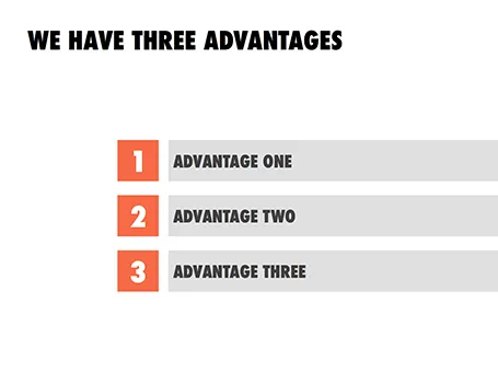
Some readers of my blog have become paranoid to use bullet points in a presentation (a good thing), but there are actually situations where putting 3 short sentences on a page is inevitable, or even a good solution for a slide.

These situations are when you want to express that something has a number of components. Breaking up those 3 advantages and give them one slide each enables you to explain them clearly individually, but the audience loses the overall perspective of how they are related.

In those cases - yes, it happens to the best - I revert to 3 short bullets.  But there are a few things you can do to keep things interesting:

  • A massive visual anchor (like a big 1, 2, and 3) to show that you are talking about an overview slide
  • Really, really short descriptions just to introduce the ideas. The full explanations come in subsequent charts
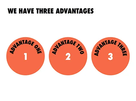
  • Also, you can deviate from the traditional list and come up with other geometrical shapes ore layouts to make your three (short) points.

·Keynote

How to get started?

I recently answered a Quora question on what is the best way to get started with a VC/investor presentation. The answer applies to all presentations, not just investor presentations. Obviously, this is my preferred approach, yours might be different.

I use multiple approaches at the same time, in parallel:

  • Scribble a story line on paper, or an iPad mind mapping app (iThoughtsHD is good)

  • (Just because I like it) design a really beautiful cover page with a nice image and the right look and feel of the deck.

  • Dive straight in and try to craft that ultimate killer slide, the one that makes the most important point in your presentation and finish it all the way. BANG.

Then I continue to iterate: refining the story line, adding a chart here and there. I take lots of breaks in the entire process, designing a good deck can take a lapse time of about 2 weeks. This ensures that your creative energy stays fresh. Presentations made at gun point at 3AM before the 9AM meeting never look really good.

·Concepts

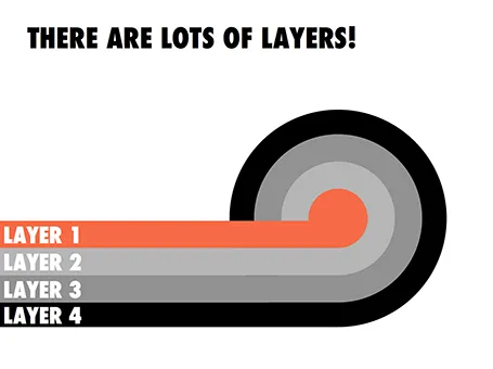
Lots of layers

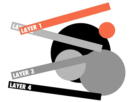
Here is a concept to label lots of layers in a circle without bending text, the second image shows with which components the first chart was created.

·Investor presentation

Your presentation objective?

To many, this might sound as an obvious question. “Hey, this deck is here to get my idea funded!” While this might be the ultimate goal of your presentation, it is usual to break down the process in its individual steps.

The objective of a short elevator-pitch-like-chat or coffee discussion is not to receive the investment, it is to get to the next meeting. And reaching that next stage involves intriguing your audience enough, maybe leaving out some of the tedious detail, while not forgetting to completely  nail that big elephant-in-the-room-issue (even if it means going into excruciating detail).

·Keynote

Page numbers?

Big graphical elements that are repeating on every page obstruct your slide design. Examples are legal disclaimers, company logos, banners, and yes: page numbers. I am not a purist here, and will most of the time put a tiny page number in light grey at the top right of the page. Too small for a keynote audience to see, but big enough to guide a page switch in a phone conversation.

·Investor presentation

Taking off the polish...

Venture capitalist Roelof Botha argues that startups should take off the polish when pitching him:

MB: What puts you off when looking at a startup for possible investment? RB: Unnecessary hyperbole and polish — I much prefer raw authenticity

At first reading, this might suggest to save yourself some time and stop investing in your investor presentation. But I think the opposite is true: good presentation design is actually all about taking off the polish and bringing the raw story out, rather than shining everything up.

Slides with bullet points in fluffy language full of buzz words are polished. Minimalistic, beautifully designed visuals are raw. And this applies to all types of presentations, not just investor pitches.

·Data visualization

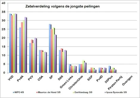
Excel on the front page

It is shocking to see that pre-election poll results on the cover of a large Dutch newspaper are presented in a plain standard Excel template and colours with one adjustment: add some 3D effects, which makes it even worse.

·Images

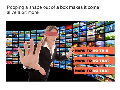
Pop out of the box

If you have a person or an object standing in front of a background, make it pop out a bit: increase the size, and fade the background.

·Investor presentation

The deck is not always the issue

Some stories are really good but complicated to explain. Here, a well-designed slide deck can make a big impact.

Other stories are relatively easy to explain, but have a few big questions inside them. In these cases, effort is better spent on providing answers to the questions, rather than investing it in making the slide deck look and flow better.

If you have limited resources, choose where you are.