SlideMagic Blog

Frequent updates about all things presentations since 2008. Subscribe to never miss a post.

RSS
all posts

Category Presentation design

·Gadgets

Trackpad U-turn: back to the mouse

With the advent of Mac OSX Lion I moved to using a track pad for all those fancy swiping features. However, I am back to a regular mouse. For intensive design work, a track pad strains my wrist too much. You constantly need to lift your hand slightly above the track pad, which starts to hurt. Using a mouse, I can put my hand and wrist in a completely neutral position without straining any muscle.

·Keynote

It does not have to be pretty

You have limited time, you have limited budget, and you are not a natural-born designer. Still you can design an effective presentation. Keep it minimal and tasteful.

  1. No bullet points
  2. One big idea per slide
  3. Use simple shapes without a border
  4. Muted color palette (lots of greys, one bright accent color) without gradients
  5. Non-cheesy stock images: high res and in correct aspect ratio
  6. Arial font
  7. White page, (small logo if you want at the bottom right)

People will recognise it was not designed by a professional, but they will get the message and respect you how you did this with such minimal tools.

·Delivery

Beyond perfection

I recently watched this video: The making of Aja, an album by Steely Dan released in the early 1970s. The movie shows how the bands 2 creative leaders Donald Fagen and Walter Becker going track by track, instrument by instrument, to get the album “beyond perfection”, as one of the studio musicians describes the process about halfway in the video.

Fagen and Becker were ruthless perfectionists, editing down guitar solos of the best players down to a few notes, swapping entire bands overnight, or adding a few high (1970s) synthesizer notes to make a flute sound a bit fuller.

Only when you get to a point that is beyond perfection can you start to improvise to give things that personal edge. And that is exactly the same for presentations: only when you have rehearsed in and out, you can deliver that truly relaxed and spontaneous presentation.

The movie is on Netflix, but to my surprise I also found a lower-quality version free online, the site seems legitimate:

Watch Classic Albums - Steely Dan - Aja in Music  |  View More Free Videos Online at Veoh.com

·Images

But we are a serious company!

I get that question often when presenting my deck loaded with impressionist paintings to a big corporate. Serious companies cannot make presentations like these.

Wrong. Visual presentations without bullet points can be highly professional, and highly serious. Just take a different theme than impressionist paintings.

Right. I do agree that being serious adds a design challenge. Everyone can Google image search a bunch of funny page-filling images together and add some outrageously big wacky fonts to them and call it a visual presentation.  The challenge is to add some aesthetics, but it is an easy step to make once you have made the big leap of leaving bullet points behind.

·Investor presentation

Story prioritization

Some startups have a technology platform that can be used in multiple markets, and often the startup is not completely clear (yet) about how to prioritise them. In a first 20-minute investor pitch this creates a highly confusing story; an investor can only take in so much information in 20 minutes and probably will not buy that a 5 person startup can conquer all these markets (she is probably right). Here is a potential solution:

In the first 20 minute cold pitch:

  • Set up your platform business situation
  • Pitch 1 (maybe 2) markets properly (the most promising ones)
  • Hint at further upside in the other markets (1 quick slide)

If that went well, elaborate more in follow-on meetings about the other opportunities and provide a discussion framework about possible prioritisation, and you can even ask the potential investor for advice.

Do not try to spring all 10 stories in the first 20 minutes, you will fail.

·Images

News photos for bargain prices

Prices for celebrity and news photos are incredibly high (check some of them on Getty Images). Why? Because the licensing options are set for high-volume print runs or web sites. Usually, presentations are different. The audience is relatively small (rarely above 100) and most presentations are a one-off event. So, producers of news and celebrity images are missing out on the presentation design market.

Enter a new web site: slideshots.com. It is a database of AFP images with EUR 2 licensing options for use in presentations. A great alternative for over-sued and cheesy stock images. And the license looks pretty flexible, even for use online on platforms such as SlideShare.

·Keynote

Pink URLs

PowerPoint does weird things with URLs and email addresses. When you type in either, it turns them automatically into a hotlink (sometimes useful), but applies a highly ugly formatting (a bright color with underlined text). A slide is not a web page where links compete for your attention, make sure to tone down the formatting or remove the hyperlink all together.

·Data visualization

How to position a data chart

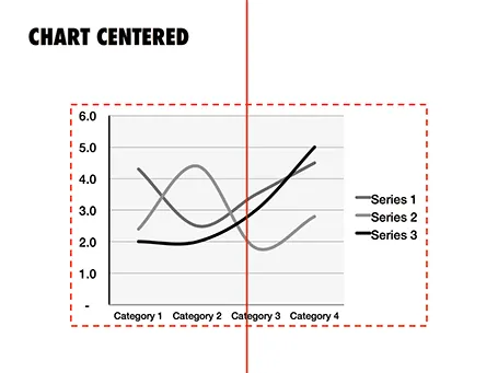
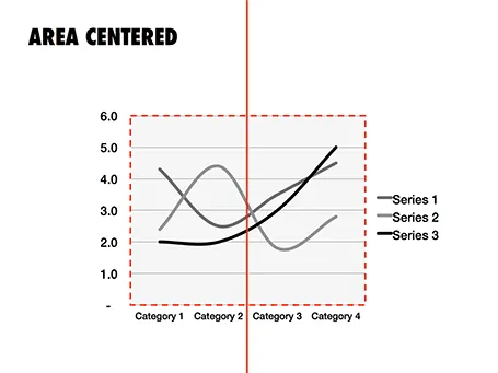
There are two ways to center a data chart on a slide: center the entire chart image including labels and legends, or center just the chart area, ignoring the labels. I prefer the latter.

·Images

Stress-inducing cover image?

A frightening, dramatic, stressful image can greatly enhance your message. But I would not use it on the cover page of your presentation. That page usually sits on the projector for a long time while the audience is walking in and you do not want to destroy their mood before your talk started. Use the stressful slide at a key moment inside your deck instead, it could even be one page 2, just not on page 1.

·Keynote

A double-edged sword

There are 2 benefits to using simple slides with little content and one focussed message:

  1. They are much more effective than busy complex slides (most of us believe this by now)
  2. They are a lot easier to design than busy complex slides (very few realize this)

Once you decide to adopt 1, your slide design skills have quadrupled instantly because of argument 2.