

SlideMagic Blog

Frequent updates about all things presentations since 2008. Subscribe to never miss a post.

RSS
all posts

Category Presentation design

·Delivery

4:3-ing that LCD screen

Most people design their slides for a the 4:3 aspect ratio of older TV screens and computer monitors (I still think it is actually better than 16:9).

Increasingly conference rooms are using large 16:9 LCD screens that are much brighter than the traditional on screen projectors. And most of these 16:9 screens are set to stretch 4:3 input signals. As a result your slides will look bloated.

Grab that monitor remote (you cannot control this from your computer) and set the aspect ratio to 4:3 before you start presenting. The tech person present usually will say “What, you want those black bars?”. You can answer affirmative. Your slides will look much better, and if you use a black slide background, no one will even notice the black vertical bars.
P.S. Ancient post that touches on slide backgrounds.

·Delivery

A deck for a 5 hr meeting?

After my presentation in Barcelona last night, one of the audience members came up to me and asked whether for 5-hour presentations, you should take a different approach from the one that I had been advocating for the 20 minute investor pitch. Two answers:

  1. Break up your 5-hour presentation in blocks of high-energy and well-designed 20 minute pitches and discussion sessions.
  2. But better still: cut that 5 hours. Give people the opportunity to read things beforehand and just do a discussion rather than going through details for 5 hours. Obviously this might require a culture change in your organisation if people usually do not do their pre-meeting homework.
Kicking off my talk in Barcelona last night
·Keynote

No watermarks please

When graphic designers start with the design of a PowerPoint template, they are faced with a white page. A common way to fill it is with a faded, washed out, water mark. It might look OK on an empty page, but it will clash with any other object than a text bullet point. To be avoided.

Unless other prescribed corporate template elements that are hard to change, a water mark can be easily taken out, simply delete the graphic on the page, or cover it with a white box.

·Keynote

The tiny legend

Many consulting charts feature a tiny legend in the top-right corner that explains what the shading in the bar chart means (for example “Have no access to clean drinking water”). Often that is the whole point of the chart and that legend deserve to be made a bit more visible.

·Data visualization

Making up some numbers

In many cases it is hard to give a real example of the cost savings someone can achieve with your product or service. Data is not public, or in case of a startup, you might not have that many customers yet. “Making up some numbers” does not sound like an ethical alternative, but it is a good strategy if you stick to some simple guidelines.

  • Explicitly say that it is a hypothetical example
  • Create a highly realistic artificial customer (1 owner, 3 trucks, 1 warehouse, $x million in annual revenues, etc.)
  • And most importantly: explain how you get to your cost savings. If possible break them down into a few simple categories, and use a highly simple and transparent way to quantify them (10 instead of 35 phone calls of 30 minutes each per week equals $x)
  • Make the spreadsheet as complicated as you want, but start with a blank PowerPoint/Keynote page to explain your calculation.
  • Add everything up and see whether the cost reductions make sense as a % of the total

The main purpose of the case example is to explain how you got to the savings, not the absolute point estimate.

·Investor presentation

Over-complicating a framework

Yesterday I posted about a way to visualize a complex comparison (a hedge fund). Sometimes thought, the best things is just to simplify. “Here is a competitive landscape. These guys are bigger. These guys use a wholesale model (we are retail). These focus mainly on Asia. These market to younger consumers.” Interesting for PhD students that study your market, too much information for a first pitch to a potential investor. Aggregate things up to a simple grouping of competitors and complicate things in later discussions.

·Concepts

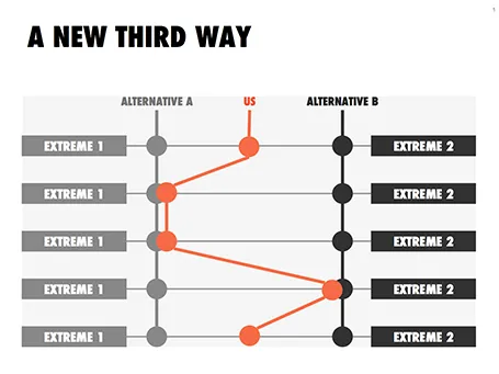
Concept: a third way

This slider chart is a great way to show a comparison between multiple concepts across multiple dimensions. I recently used it for a hedge fund with a new innovative investment process.

UPDATE: this slide concept can now be downloaded from the SlideMagic store

·Keynote

The screen shot workflow

On a Mac, you can create a screenshot of a specific part of your screen. Pressing CMD-SHIFT-4 brings up a cross hair and you can select the area you want to capture.

Screen shots have become an essential part of my workflow. Rather than worrying how import PDF files, web sites, video stills, or other images into my presentation I just snap a picture of them. The same for exporting PowerPoint slides, the images on my blog are usually screen shots.

No more looking for files, no more worrying about file formats. I heart screen shots.

·Delivery

1996 presentation training

In the bottom of my office drawer I just found a small card with personalised suggestions for better presenting that I had to fill out after a communication training at McKinsey all the way back in 1996. All the usual things are there: stance, eye contact, etc.

But one things stands out and is so 1996/McKinsey: “Introduce the slide before putting it up” (remember we were still in the time of the overhead projector). McKinsey slides were incredibly busy and filled with data, so plopping that overhead sheet on the projector without warning would overwhelm the audience.

Instead, we had to introduce the message of the slide, show it, talk people through the various elements of the slide (what is on the axes, what the line means, etc. etc.), and maybe repeat the key point one more time.

Now 16 years later, my approach has completely changed. When you put up a slide, it should be completely self explanatory, cutting out unnecessary clutter and spreading out content of multiple slides if needed.

·Investor presentation

From screenshots to use case

How do you showcase your application in a 20 minute pitch? Doing a full, live demo is hardly ever an option:

  • Murphy’s Law will strike, and your Internet connection will break down, and if not, another technical issue will hit you
  • Some aspects of your app are interesting to show, others are boring and time consuming (loggin in, entering some data, etc.)
  • It is hard to stay focussed and on script in a live application, before you know you have lost yourself in an interesting feature and spent far too much time on your demo.

In a short VC pitch, doing a live demo is likely to take the energy and momentum out of our talk. The other solution is showing a bunch of screen shots. But how can we transform a series of uninspiring screen shots into an exciting use case of your product? Some steps to consider:

  • Base the whole section on a story. The best stories are real: find an actual customer, disguise everything so it is impossible to expose private information and build the entire screen shot demo on her case.
  • Alternate between regular visuals and screen shots. Use a map to show locations, use images taken in the street to give things a sense of place.
  • When using screen shots, crop out all the clutter that is irrelevant: operating system window bars, icons, browser navigations and put huge arrows or circles to focus the viewer attention to what you want to see them. Use big text to emphasise what you are doing and why it is so great (“We open an account in just one click”).
  • Throughout your story, stay consistent: the same user, the same location, the same issue she is trying to solve.
Continue reading →