

SlideMagic Blog

Frequent updates about all things presentations since 2008. Subscribe to never miss a post.

RSS
all posts

Category Presentation design

·Keynote

Visualising verbs

So, you need to depict an important concept in a slide. How do you do something more interesting than just writing a paragraph or 3 bullets on a page?

Here is how I start. That paragraph that you were about to write usually has one over-riding verb or action in it. Zoom in on that verb/action and use it to set up the overall structure of the slide:

  • We are better than an alternative: comparison, box on the left, box on the right
  • We stand out from the crowd: lots of elements in grey, one element in a bright colour, or clever 2x2 plot if you can find the axis definitions
  • We are squeezed, arrows pointing to a box in the centre
  • The inevitable conclusion: horizontal arrows at the left, pointing to a box on the right
  • There is a trade off: simplistic scales: box on left, box on right, tilted bar across the 2 of them, the preferred box is hanging down
  • The best of both worlds: overlapping boxes
  • We are the biggest: bar charts
  • It is complex: 25 factors written in font 10 all over the place
  • Etc.

This overarching visual movement sets the framework of your slide. Even if you cannot create an artistic master piece like a pro, your slide will be 10,000 times better than a list of bullet points. Good luck!
·Keynote

Guitar strumming

My encouragement for my son to take on guitar lessons is that I join him and take lessons as well. The way the teacher introduces a new guitar strumming pattern is a good example of the Curse of Knowledge(it is difficult for an expert to explain things). The teacher has the full song playing in his head so for him, the strum is a piece of cake. Me, lacking the full context it is just very hard to memorise those ups and downs in the right rhythm…

The same is true for your presentation. For you, your story is totally obvious, for the outsider it is not.

·Art

Become a great graphics designer

I am reading the book How to Think Like a Great Graphic Designer (affiliate link) by Debbie Millman (picked up at Rizzoli in New York, a great place to find design books). The book comprises of a series of interviews with famous graphics designers. Here are some common themes in all the discussions.

  • The process to getting to a good design is messy: you try, try, try, and then all of a sudden it happens (or not). Different from churning out analysis and data charts one after the other.
  • The standard career path for a graphics designer (start at the bottom in a big studio) inhibits success later on. Multiple designers spoke about finding a career setup that frees you from a big corporate structure in your formative years (a financial challenge).
  • You need to find time to do work away from the day-to-day pressure of a client. Again, this is a financial issue. Designers quoted lucky family situations and/or a large steady client as the enabler for creative freedom.
  • Pro-bono work often brings out the best in a designer, since “the client who is not paying has no right to interfere with the work”
  • Many designers are introverts, like to work by themselves, and stay in the front line of design work, i.e., they do not move into the management ranks.
  • Almost every designer talks about art versus design. I think deep in their hearts they regret not having made it as an artist.
Continue reading →
·Keynote

Dummy grid

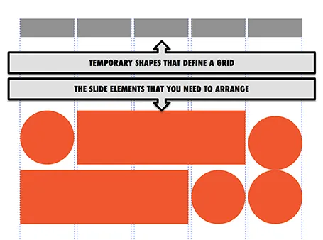
Drawing guides are a pain in PowerPoint (when you need to move an object close to the grid, you always end up moving the drawing guide line by accident). Also, grids can change from slide to slide.

My solution, quickly plop in some dummy shapes that define the grid for the slide you are working on. With snap to shape, you can create the slide layout you need, and get rid of the temporary shapes when you are done.

·Keynote

How did you become a designer?

I get asked this question frequently by people who are considering a career change. Here is my story.

The first 10 formative years of my career were spent with McKinsey, a strategy consulting firm, working in the London and Amsterdam offices with projects pretty much in every country in Europe. My stay there was a bit different than the norm: 1) I stuck around for about 10 years, versus 2-3 on average, and 2) I did not specialise in one industry (banking, consumer goods, etc.), but rather did a functional specialisation: mergers and acquisitions, usually on the sell side. In short, I helped big Fortune 500 companies sell themselves to other big Fortune 500 companies. As a result, every project that I worked on was in a different industry, and I had to adjust rapidly to understand a completely new field of work (beer, pet food, DIY retailing, petrol retailing, grocery, retail banking, asset management, insurance, private equity, e-commerce, mobile payments, postal services and logistics just to name a few). Little did I know then, how useful this skill would come in a decade later in a briefing for a new presentation design project.

After leaving the Firm, I moved with my family to Tel Aviv where I started out as an independent strategy consultant. Soon, I got in touch with the Israeli high tech industry. The small startups could not afford (and probably did not need) me as a strategy consultant for 6 months but saw value in my PowerPoint slides for meetings with potential investors (these charts were still B&W, highly organised, full of consulting speak at that time). It was here that my gradual transformation to a presentation designer started. Gradual is important here, I think no freelancer figures out exactly his professional niche from day one. In my case it probably took around 2-3 years to stop calling myself a strategy consultant.

Continue reading →
·Investor presentation

Big co versus small co

I have seen big improvements in the presentation design of my startup clients over the past year. In some cases when the design is adequate, I have to admit that my involvement might not be the best return on investment for a start up on a tight budget.

Whereas startups are adopting new design and story telling ideas rapidly, the opposite is true in big corporates. Corporate culture (“This is how we do things here”) is reflected in PowerPoint decks that look pretty much the same as they did 5 years ago. Managers go through the ranks by continuing to use PowerPoint like they used to do, and new recruits get told to stick to the format.

When designing for a startup, we can dive straight into the content of the presentation, when designing for a big corporate we first go through a process to convince them that a visual presentation can still be serious.

·Keynote

Native PPT on iPad

Parallels (best know for enabling virtual PCs to run on Macs) now offers a product that allows you to run any PC or Mac app (including PowerPoint and Keynote) on an iPad: Parallels Access.

How does it work? You need to install software on your PC or Mac that beams your application screen to your iPad. But Parallels Access is more than a simple remote access tool: adjustments have been made to add iPad-specific controls to PC or Mac apps (copy/paste, scrolling, etc.).

The service costs $80 per year, per machine you want to broadcast.

My take? I still think that the current iPad user interface is not suitable for intensive office work: you start missing a keyboard and a big screen when working for 8 to 10 hours per day. So I do not expect people to use this app when they are 5 meters away from their desk machine. Instead, it provides convenient access to crucial office applications when away from your desk (last minute changes in the taxi on the way to the sales pitch for example).

The pricing is also clearly aimed at the large corporate market. If you are interested in this type of solution, it might be worth to check out Splashtop.

·Images

Fewer stock images

I noticed that I am using fewer and fewer stock images in my slides. Not so long ago, almost every slide started as a brain storm about what image concept to use. Not anymore for 2 reasons.

  1. Stock images are often cheesy and unnatural and have a very specific style, which makes it hard to mix them with other stock images in the same deck. I also suspect that stock image providers have been adding a lot of content to their databases thereby diluting the quality of the search results.
  2. My slide designs are getting simpler and simpler and often I can design them without the need for an image. A simple message written on a slide can be more effective than a slightly forced visual analogy in an image.
·Keynote

Be annoying?

A question to you, to be answered from the point of view of 2 audiences: 1) you, people who are interested in presentation design and early adopters of new ideas, and 2) everyone else struggling with PowerPoint decks.

 I have the option in my upcoming presentation design app to eliminate features that contribute to bad slide designs. The result will be that you simply cannot do what you used to do for 20 years, and you will also have to say “no, not possible” to your boss who just asked you to do something to a slide.

Will this be a liberating experience, or will tired employees just switch back to PowerPoint at 23:15 in the evening to get the deck out for tomorrow morning 09:00 and still get some sleep?

·Data visualization

2-step scientific charts

Especially for my pharmaceutical clients I often need to produce scientific presentation slides. I tend to take a different approach to the industry standard when I need to present to a non-scientific audience: split the chart in 2.

  1. Chart 1 focusses just on the message and is highly simplified (“Survival rates went up 35%”)
  2. Chart 2 provides all the details about the study (number of patients, patient profile, confidence interval)

Springing the full combined chart with all the detail will just overwhelm the laymen audience. Medical professionals have trained decades to extract chart 1 from the combined chart in a nano second. The average investor lacks this experience.