

SlideMagic Blog

Frequent updates about all things presentations since 2008. Subscribe to never miss a post.

RSS
all posts

Search results for “curse of knowledge”

·Concepts

Visualizing the curse of knowledge

I often have to explain the concept of “the curse of knowledge”: it is actually harder for an expert to explain something than a reasonably intelligent outsider (here is why presentation designers should be reasonably intelligent :-) ).

Dan and Chip Heath use a musical metaphor in their book “Made to Stick”:

  1. The presenter thinks of a musical piece and imagines the full symphony orchestra giving all it can
  2. He taps the tune with his fingers on the desk, it all makes perfect sense
  3. The audience sees/hears someone tapping…

For executives who are keen to load their slides with data for an external audience, I use the cockpit analogy. A pilot can interpret all the signals of all the instruments in a split second and understands the situation the plane is in. The novice needs a bit more time to digest the information…
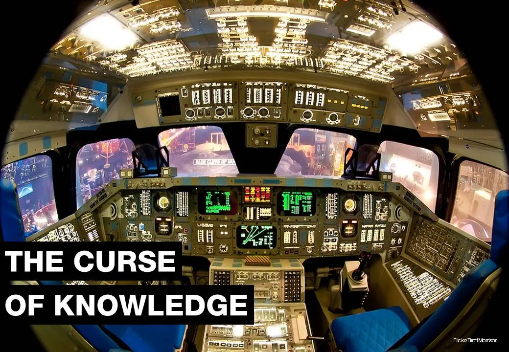
Thank you Brett Morrison for this beautiful picture of a Space Shuttle cockpit.

Fresh ears and eyes

Artists and designers often say that when you use a fresh pair of ears and/or eyes to examine your work again, things can appear to be completely different from how you remember them (both in a positive or negative way). Why?

The brain mixes up reality and imagination. When writing songs for example, I can get totally immersed in what I am creating, and after a while my brain probably hears what it wants to hear, which could deviate somewhat from what my instruments produce. Your brain added context.

Listening to it again the next morning with the imaginative context, can be a rude awakening… This is a similar effect as the “Curse of Knowledge”, which says that experts find it so hard to explain something to an audience that misses their mental frame of reference.

With first versions of presentation, I almost always try to avoid sending things out “hot from the oven”, instead sleep on it one night, and use those fresh eyes as a sanity check.

Cover image by Rachel Pfuetzner on Unsplash

·Creativity

Communicating musical ideas

In my spare time, I like to play electronic musical instruments. Recently, I amassed all my courage together, and started writing my own music, and send it carefully to a few selected friends, forcing myself to feel the responsibility of creating something for an audience.

It is very hard to communicate a musical idea in raw form, and it feels a bit like the curse of knowledge. The expert cannot explain an idea because she has all the context in her head that others lack. When I tap a melody on the table, I hear a symphony, the audience hears tapping.

So, sending over a basic chord progression and a rough melody line with a plastic drum beat, some strings, and a piano is not cutting it. Now, what gave me some encouragement, is to try and play famous songs using exactly these tools, going the other way.

Let’s see what happens.

Cover image by Steve Harvey on Unsplash

·Story

"There are people who get it, and people who don't"

The other day, one of my clients simply wanted to give up on explaining his concept to the typical 50% of people who “simply did not get it”.

In life there are many situations where you “give up” on certain people. Students who fail the entrance exam of a university, job applicants that did not make the cut, athletes who miss the qualifying threshold for the Olympics, contestants who did not make it to the next round of American Idol.

When presenting your company, you need to put the blame not on the audience, but on your presentation. Your targeted audience should understand your message. And that audience can differ: a presentation to a general audience, journalists, scientific experts can build on different levels of pre-existing knowledge and background.

Often, as a presenter you suffer from the curse of knowledge, you are so deep into your own story that you cannot possibly imagine how someone who is new to the subject cannot get it. Another reason for the disconnect is different types of reasoning/thinking of people. When people frown in disbelief, it might not be because that they did not understand what you are trying to say, they might have a valid different approach to evaluating your pitch that you have not yet covered in your presentation.

When you leave the room, your chosen audience of high school students or elite academics should understand your message. Whether they agree with it, that is a second challenge, but they understood where you are coming from.

Continue reading →
·Story

Two reasons the story does not come out well

  1. The curse of knowledge, you are so deep in the material that you:
    • Cannot see anymore what points of your story are obvious to an audience, and which points are not (and vice versa, which points are difficult to understand while you think they are very clear
    • Cannot see anymore which details are important / add flavour to the story, and which details are tangents that lead to nowhere
  2. You probably hang on to a story structure that you designed for your first presentation a long time ago. Your company and your story has moved on, but your slide deck has not.

Art: Franz MarcDie großen blauen Pferde (The Large Blue Horses), (1911)

·Keynote

The ponder slide

Not all PowerPoint presentations are in front of 500-seat TED audiences. Many presentations get emailed around and read on screens.

Strategic decisions are usually a careful trade-off between options. Some choices are clear, fact-based and objective. Others are qualitative, and yet others are complete leaps in the dark.

To make a decision you need to have all of the factors on some page somehow. Yes, this dense slide violates all the rules about good presentation design. But there is one big difference: the audience that will appreciate it are insiders, who suffer from the Benefit of Knowledge (the opposite of the Curse of Knowledge [what?]). They have heard the arguments before and they are ready for decision time.

How to design a good decision slide for these people?

  1. A table: options in the columns, arguments in the rows
  2. Group the options and arguments somehow, sort options by risk, how radical they are, something. Group arguments: similar arguments go together, if they are sort of the same thing, you collapse them into one. Group the factual arguments, to make the more contested ones stand out.
  3. Label your options and arguments for the audience with the Benefit of Knowledge, short labels or placeholders that are enough for them to understand the full picture. After months of discussions “Blink first” might be enough to describe a strategic scenario covering 25 pages.
  4. Frame the options so that the answers are in the same direction: I usually pick positive ones: no cannibalisation, retention of talent, limited competitive threat. Etc.
  5. Now the tricky bit: score options (1, 2, 3, low, medium, high) and use colours to distinctive good or bad. Re-group, re-sort options and arguments until you get the maximum number of continuous good and bad fields.
  6. Look at the result and tweak scores and weights until you reach your conclusion. If you had the push up the weight of the leap-of-faith type of arguments a lot to balance the factual criteria, you know what you will have to explain in your presentation
  7. Once you reach your conclusion you can make a hugely simplified version of this matrix, collapsing all similar arguments together and boiling it down to the 2 or 3 points that will tip the balance
·Keynote

The new Yahoo! logo

Marissa Mayer “Geeked out” on a new Yahoo! logo in a weekend (pretty much the same way in which the gmail logo was created) and designer Oliver Reichenstein rants about how she violated every best practice of corporate branding.

I am somewhat in the middle between the 2 extreme viewpoints. What Marissa did, was not a major rebranding of the company, she fine tuned the existing logo. I think it actually looks better than the old one, but - to Oliver&rsqo;s point - the Yahoo! brand has not changed for me. Marissa is only showing that she is making an effort to change things.

On the other hand I do find that big corporate branding projects often have a “the emperor has no clothes” feel to it. A company’ brand is more defined by what a company actually does: what product it delivers, and how she interacts with customers. Fluffy marketing slogans and long brainstorm sessions about logo personalities do not change much.

You could say that the Curse of Knowledge also applies to multi-million dollar logo redesign projects: for the people who were part of the design process and sat through all the workshops, it is perfectly clear that small green oval (no, not a circle) at the top right symbolises openness. For everyone else, it has no meaning. In that respect, many logo design projects are similar to mission statement crafting projects.

I guess there is a difference for companies with different logo audiences. If you are a big holding company, your corporate logo probably only speaks to 500 investment analysts. If you are a big retailer that needs to stand out in a busy high street full of visual clutter, your logo all of a sudden becomes a lot more important.

Continue reading →
·Keynote

Guitar strumming

My encouragement for my son to take on guitar lessons is that I join him and take lessons as well. The way the teacher introduces a new guitar strumming pattern is a good example of the Curse of Knowledge(it is difficult for an expert to explain things). The teacher has the full song playing in his head so for him, the strum is a piece of cake. Me, lacking the full context it is just very hard to memorise those ups and downs in the right rhythm…

The same is true for your presentation. For you, your story is totally obvious, for the outsider it is not.

·Keynote

Design process killers

Here are creative design killers that are common in many big corporate offices.

  • Constant interruption by phone, walk-ins, or your boss who cannot find that slide deck you created last week. Open plan office layouts are especially difficult to work in. After an interruption it can take some time to get back in the flow. A 10 second call can equal 30 minutes in lost time.
  • Meeting schedules that fragment an entire day so you do not have time to start any major piece of design work (manager versus maker schedule).
  • Feedback and input from colleagues who have not taken sufficient time to digest what you actually created. Things get read over quickly, not internalized, and people provide some high level comments that do not build on the work you already did.
  • People start working on the presentation of the story, when the actual story is still not clear. At the last minute a whole slide deck needs to be re-written to support a different conclusion.
  • Long work hours turn employees into robots with little energy for creativity inside them. Work has become a process to try to empty the in-tray, rather than produce beautiful presentations.
  • Multiple authors try to write the overall storyline, each with their own structure and style.
  • Throughout a project, team members usually develop a common language where one simple concept can depict a very complicated issue. For the insiders, writing the name of the concept on a slide makes it all clear, the outsider, has no idea. The result: pages and pages of hollow inside jargon. (The curse of knowledge)
Continue reading →
·Keynote

Story procrastination

Life is tough in the corporate world today. Endless (often useless) meetings, short-term requests that frustrate your attention to get the big job done, a relentless stream of emails. With all these distractions, it is hard to find the time to simply sit down and design/write/dream the story you want to tell. And on top of that, managers assume (correctly) that they know what they want to say, so there is no point wasting two hours to go over the obvious. Incorrect.

Managers suffer from the Curse of Knowledge. Yes, they do know the substance inside out, but cannot explain it to outsiders. Buzzwords and corporate speak have become a morse code, a short cut, that management understands perfectly, but that does not stick with outsiders.

Moreover, outsiders might have difficult questions that do not follow the business-school-like structure a manager would use to explain her business. Writing a story to lecture someone on a new topic is different from writing a story to address the concerns of a highly cynical audience.

And finally, writing a presentation without a proper story brainstorm takes out those personal anecdotes and jokes that can make your presentation so much more interesting.

In the end, many corporate presentations work out and are great. But very often this is the result of a reset in the middle of the design process. After the presentation is almost ready to go, people take a step back and start discussing the story, which often in  a complete redesign of the deck.

Continue reading →