Good data chart examples in this Kleiner Perkins presentation
This Kleiner Perkins presentation introducing their iFund makes good use of data charts to prove points.


Frequent updates about all things presentations since 2008. Subscribe to never miss a post.
This Kleiner Perkins presentation introducing their iFund makes good use of data charts to prove points.
Sometimes you need a fresh start, begin from a clean sheet of paper, do some serious house cleaning. Covering a busy messy image with a paint roller and some stripes of fresh paint is a great way to visualize this message.
Here is an example of images on iStockPhoto that could be that basis of such a chart (the yellow paint rollers, make sure to strip out the white background color in Photoshop or with this PowerPoint trick). This post was triggered by this ad on Ads of the World:

Yesterday I came across a very insightful blog post about what is probably the main source of unneccesary time wasting in enterprises: the clash between people on a maker’s schedule versus those on a manager’s schedule. (Paul Graham is a partner in Y Combinator, a funder of very early-stage startups.)
What is the big idea? There are 2 fundamentally different time schedules that people can work on. The clash between these two causes a lot of wasted time and frustration:
Although people in power are usually on a manager’s schedule, it is not neccessarily so that a maker is someone in a subordinate role. Anyone doing creative or problem solving work (designers, engineers, architects, yes even management consultants) is likely to be on a maker’s schedule.
Why does it interest me? Since breaking away from big corporate environments half a decade ago I have been given a great deal of freedom to design my own work practices. To my surprise I have noticed how it is possible to improve productivity dramatically without relying on the leverage of a large number of more junior people working for you. I often get feedback from clients that they outsource presentation/strategy work to me because “you can isolate a piece of quiet time to get things done”.
“Can we make that look a bit more impressive?”
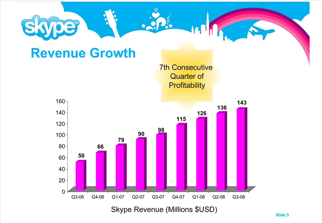
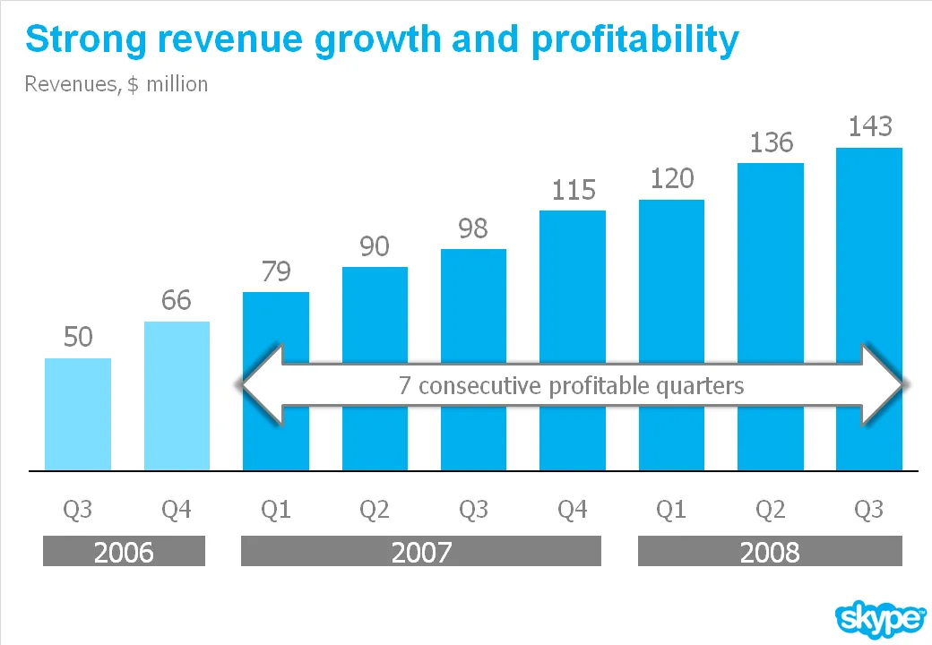
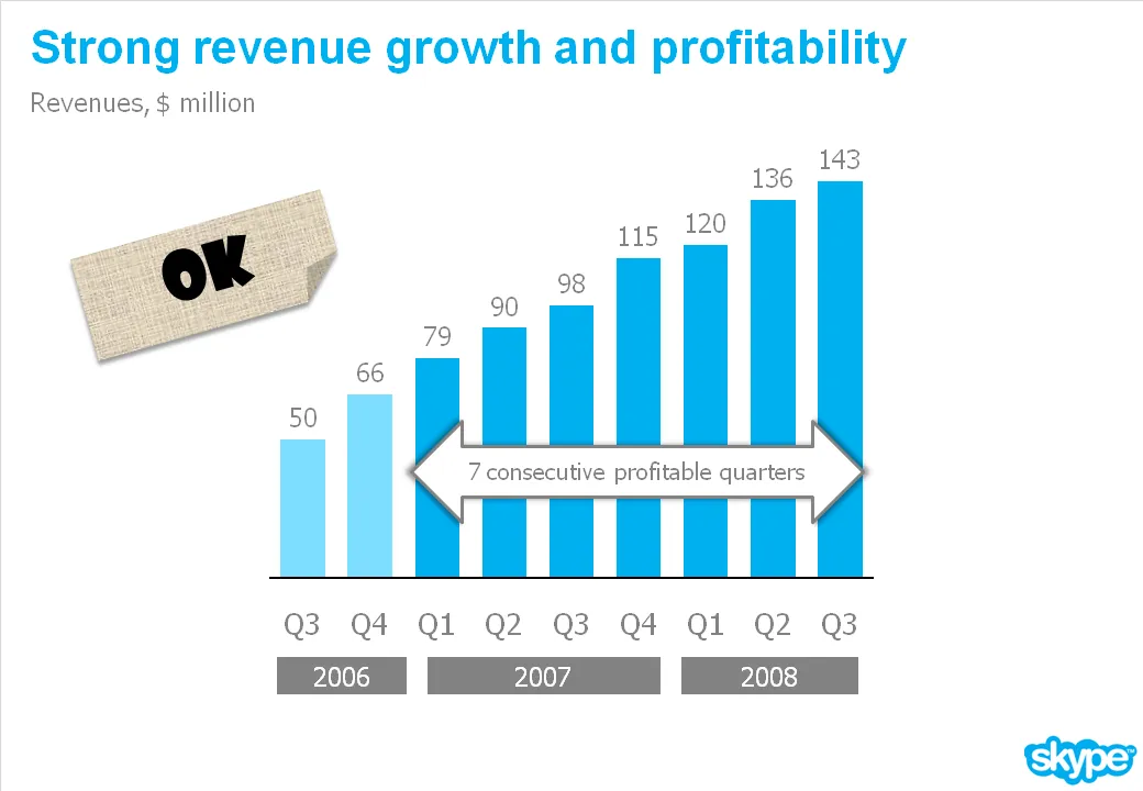
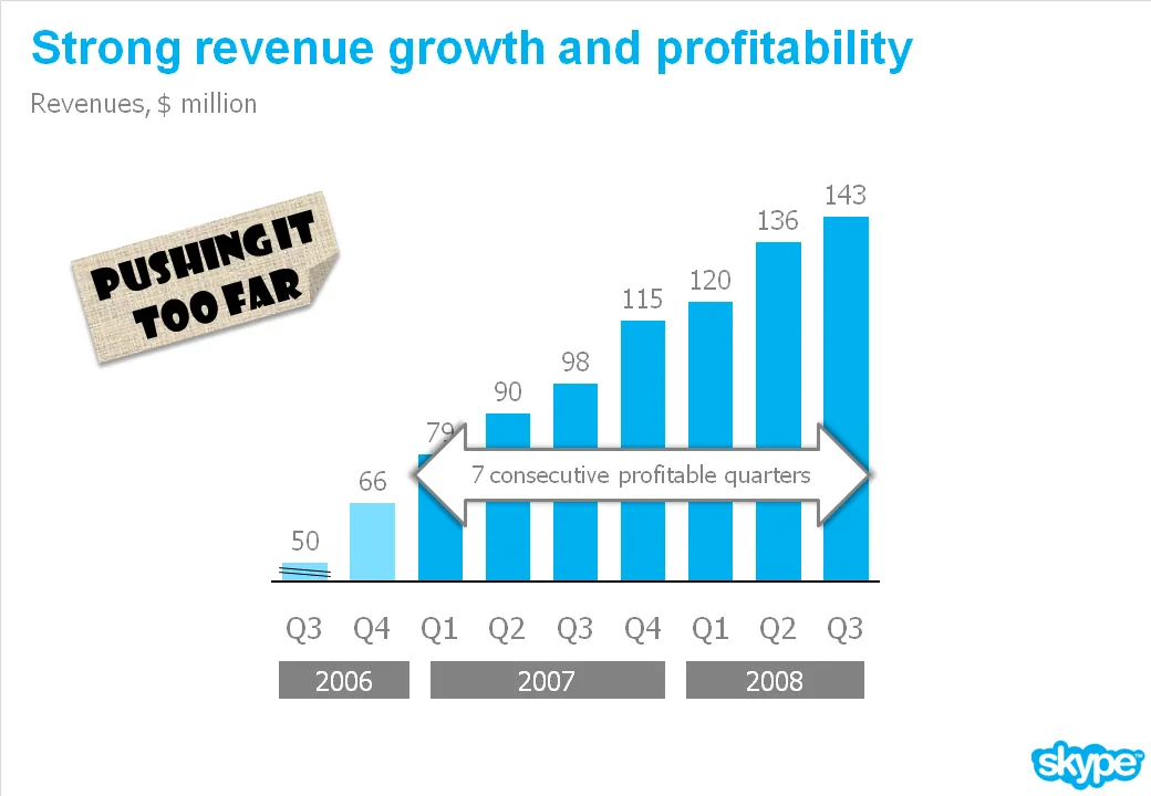
I get that question a lot. An obvious trick with column/line charts is to cut the axis. I think that is cheating the audience, putting at risk the trust in the content of all your other slides in the presentation.
What you can do is play with the aspect ratio of your chart. As an example see the make-over of a Skype chart I used earlier. People in the comments were suggesting that the new version actually looks less impressive than the original. Maybe squeezing the chart horizontally while keeping the vertical size the same fixes that.
Yesterday’s post about Venn diagrams led me to a blog that I seem to be the last person on the planet to discover:Indexed. Jessica Hagy posts a napkin-style framework everyday. Sometimes funny, sometimes with a valuable insight about life or an unusual way of looking at things. Here is an example:
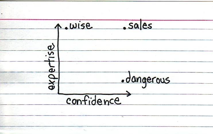
Venn diagrams, but especially 2x2’s, are very popular among McKinsey, BCG, Bain, and other management consultants. “We have put the world into 4 buckets, so now we understand it”.
For solving problems they are great, and I have used hundreds of them in my 17 year (oops) as a management consultant. All issues are on the map, how we can we move from one box to another?
But take a step back and think when you want to use these frameworks in a big keynote presentation. To illustrate my point: look at the drawings on the Indexed blog, and check which ones do you get in a second. Tricky isn’t it?
My advice: use these 2x2 frameworks only
If you just need a structure to list 3 items, try to find a simpler way to visualize things.
Still, add Indexed to your RSS reader, it’s great fun.
I came across this nice diagram with a useful lesson about what we should be doing in life (via Flowing Data).
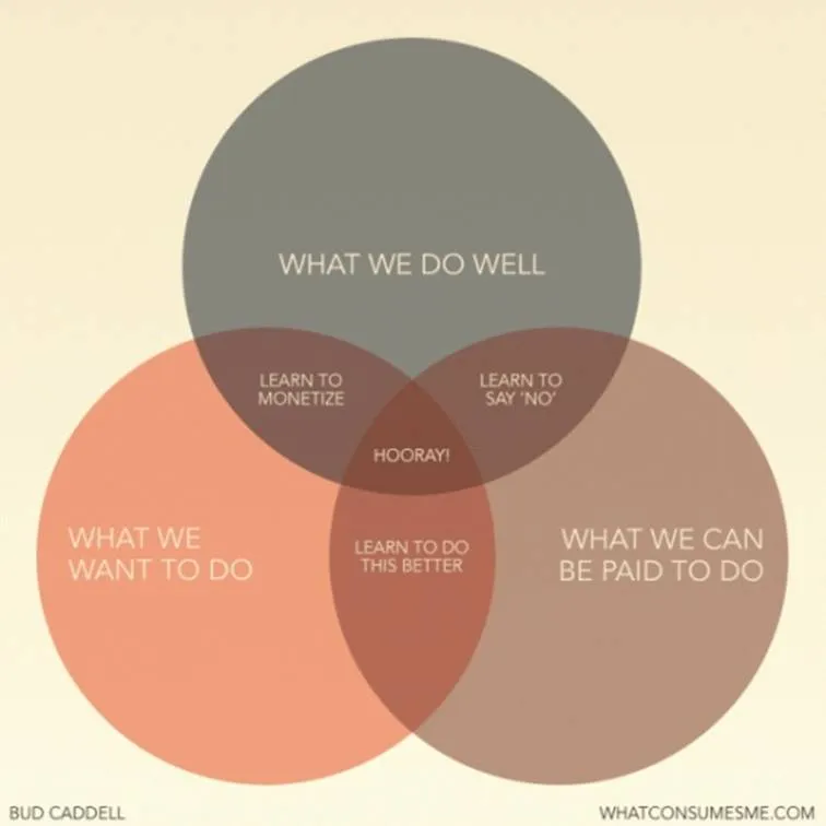
A neat concept, and the Venn diagram is the right framework to visualize it.
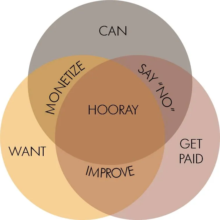
The chart is simple, but it actually takes the reader a few seconds to internalize it. If you want to use something like this in a stand-up presentation, some modifacations to the slides are required:
Unfortunately, my slide does not look prettier than the original one, and standing on its own, it does a worse job in explaining the concept. On stage though, it will work better.
Another excellent post by Mark Suster on the subject of pitching to VCs, specifically whether you should send your deck in advance. Read the post here, or get an overview of his entire series on VC pitching here.
The main conclusion: do send A deck in advance. As I suspected, VCs double-click the PPT attachment of an email, and go PGDN PGDN PGDN (this fast) until the end before reading the body of the email (if they read this at all).
OK, we all know that most presentations do not stand on their own, and that the presenter him/herself adds 80% to a presentation. To get through to a busy VC though, you have to leave all these ideals behind. Sorry.
Think of this PGDN PGDN PGDN presentation as a specific type of presentation that has a completely different objective from the standup ptich presentation. You try to get the VC to think longer than 60 seconds about your company:
Repetition helps the brain to remember things. But when looking at a slide, it is just fine to say things once. OK, OK, I get the point (for now).

Anat created another great chart this week to visualize how a company is going to kick the competition out of the game. See the example below with the client-specific details and colors left out.
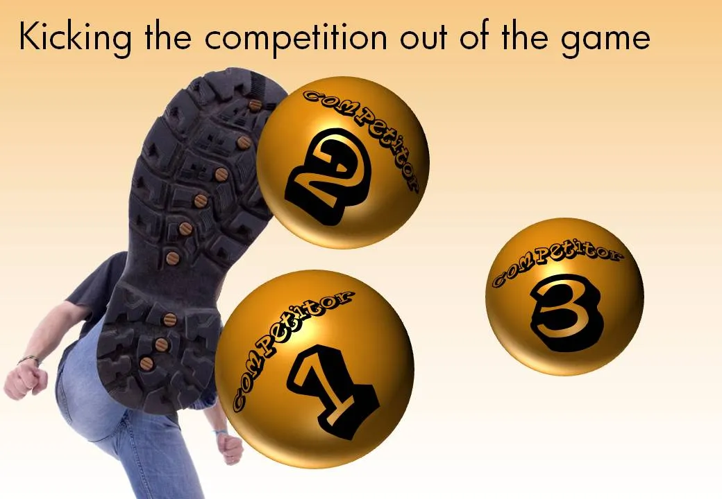
The image is purchased from iStockPhoto, the balls are standard PowerPoint circles with some “extreme bevel” added to it, gradient shading in the back, the font is Planet Benson 2.
After a first review of Prezi and pptPlex I started to get into a more detail with Prezi. One of the applications of these zooming tools is to create an effect of a perpetually zooming canvas. (There is a series of children books that uses this effect brilliantly.)
You can see my Prezi creation here (put together very quickly). Zoom out with your mouse to get the full picture. All images were taken from iStockphoto.