SlideMagic Blog

Frequent updates about all things presentations since 2008. Subscribe to never miss a post.

RSS
all posts

Category Presentation design

·Design

There is no upside in bending the truth in VC pitches

Politicians can make optimistic promises for the future, even if they know deep in their hearts that it will be (almost) impossible to deliver. Four years is a long time, memory is short, and the average member of the audience is unlikely to go through the numbers in detail. A VC (venture capitalist) pitch is totally different. If you make it pas the first VC partner meeting, a gruesome due diligence will start that will bring every fact to the surface. It won’t start in four years, it starts tomorrow.

Management team integrity (“can I trust this guy”) is probably a more important investment criterium than your actual business idea. If you flunk this test, you will have blown your VC pitch for your current venture, but worse, you are black-listed for years, maybe even decades to come as:

  • a person to invest in
  • a person to do business with
  • a person to build a partnership with
  • a person to hire
  • a person to believe

What to do if there are some not-so-great-details about your startup?

  • Avoid the subject as much as possible in a “cold-call” presentation, a deck that you send out to the world and is mostly read without you being in the room (“more data about customer uptake in recent pilots will be provided upon request”)
  • Once in the VC partner meeting, have your perfect explanation ready: why it happened (including the explanation “I -beep- up”, and what you will do to turn things around.

Continue reading →
·Design

Comparing an online presentation and a "Desperate Housewives" episode

For those readers who are not directly involved in the high tech industry (and are not reading Fred Wilson’s blog on a daily basis), have a look at this presentation:

Digital Strangelove (or How I Learned To Stop Worrying And Love The Internet)

Some observations:

  • It is designed using the big images/big fonts style, one that is very suitable for online viewing (we are all impatient clickers).
  • The interesting content makes us click through all the 263 pages, and the key messages will stick in our heads as a result. Something that is hardly the case with most 30-pagers in this style on SlideShare.
  • The presentation is a potpourri of styles but I do not think this is a problem (You can see presentation Zen images, Tom Peters-style giant words, Back of the Napkin sketches). They are all used to build the case: some set the mood, some focus us to pause (and read a detailed quote), some explain a concept.
  • Hey, what about the title for this blog post? If you use 263 images, you have a new technique at your disposal: repeat. Images of Madison Avenue, or Egyptian cave art work bring the reader back to previous points in the presentation. Almost like a TV series such as “Desperate Housewives” in which each episode as a handful of almost independent sub-plots.
·Design

Setting your presentation's personality

Usually, I still fail to do this 100%: setting the personality of a presentation and using it consistently throughout the slides. What contributes to a presentation personality:

  • The basics: colors and fonts
  • Slide design approach: huge images/few words, “Economist-style” data diagrams (headline message supported by a graph), bullets (uh oh), cartoon-style, etc.
  • Type of images: color or B&W, “tacky” stock images or real pictures, people or landscapes/buildings or isolated objects, funny or serious, vintage or recent, images-only or illustration-only, etc.

One example of a consistent personality is a teenage bedroom: decoration, posters, are all in a consistent style. And the style fits the personality of the owner as well.

Let’s think of a few possible presentation personalities:

  • Vintage 1950s images (family scenes, food advertising, first electrical appliances)
  • College humor (brutal, in-your-face, “funny” stock images isolated on white)
  • Zen (few colors, calm images, Helvetica light font)
  • Feminine (paintings, elegant images, some frivolous elements)
  • Economist (clean/neat data charts, one after another)
  • Cartoon (hand drawings, cartoon-type fonts, including very fat ones [“BANG”])
  • Napkin-style (simplistic drawings, hand-written/white-board style comments on printed text)
  • Macho (black background, performance cars)
  • Big words on a white background
  • Big words on a colorful background (Tom Peters)
  • Anti-design presentation (see Dave McClure’s work, I am only discussing his presentation personality, not his real one…)

The list can go on forever. Think about personality when designing your next presentation, taking into account your own personality, the topic at hand, your audience’s personality, your mood. And try to stick to it.

Continue reading →
·Advertising

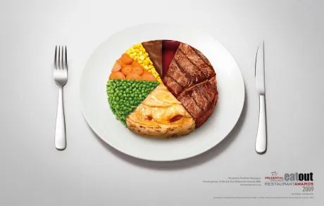
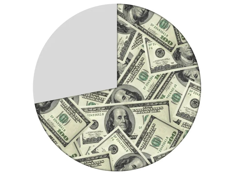
Filling parts of a data chart with an image

This ad on Ads of the World uses an effect that you can easily replicate in PowerPoint. Select a data point (or a data series), right click, fill, and select “image”.

·Concepts

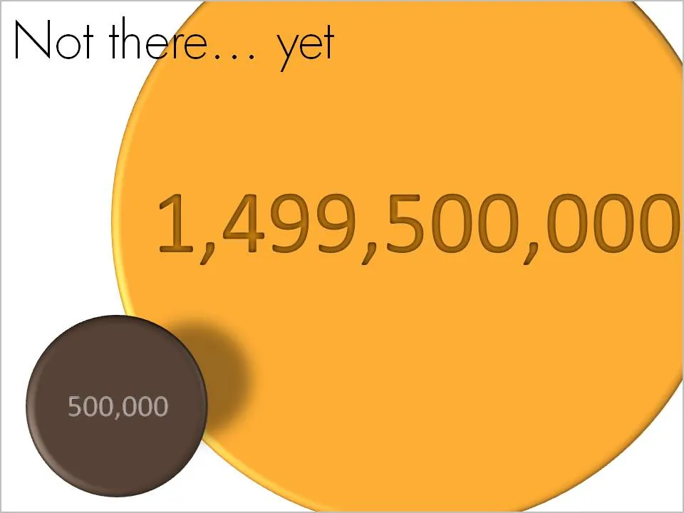
Chart concept - not there yet

OK, we made some significant achievements, but we still have a loooong way to go. How to visualize this? Here is one solution inspired by a solar system constellation. Working with actual numbers can add a nice twist: take a bite of 0.5 million out of 1.5 billion can be visualized differently.

·Design

Reduce font size to increase readability

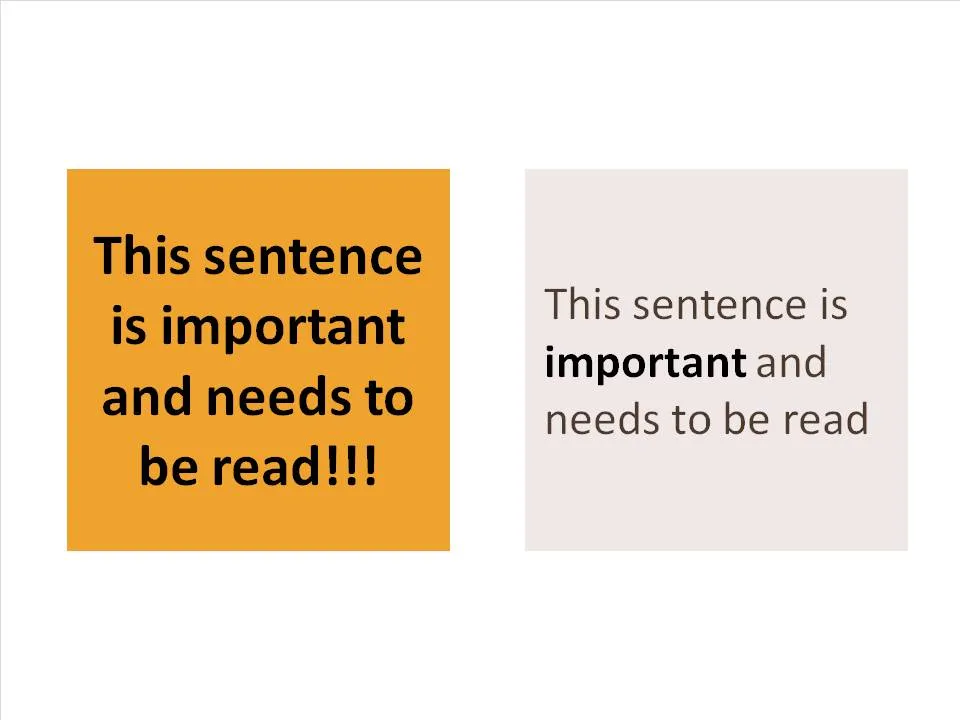
A follow-up on yesterday’s post about avoiding bold fonts whenever you can. Sometimes, reducing font sizes can actually help you increase the readability of a point. See the example below.

Why is it easier to read the box on the right? (At least I find it easier to read)

  • There is (empty) white space around the text, drawing my attention to the sentence that now sticks out. On the left side, the sentence blends into the very loud background noise of the slide. The text now looks like a coherent piece of information that can be interpreted by the brain in one snapshot, as opposed to the left side where we need to read out each word left to right, top to bottom to see what’s written there.
  • The proportion of the text block is more rectangular, close to the 16:9 aspect ratio of a wide screen TV, a shape that is more natural for the brain to absorb information
  • Removing the bold font except for one word makes the whole typography more calm and easier to read
  • Taking out screaming exclamation marks and left-aligning the paragraph improves readability further

Less is more.

·Design

Bold fonts as a last resort

Typography designers design a bold variety of a font as if it were a completely new type face. There is no magic computer algorithm that turns a regular font into a bold one. From scratch, designers need to make the call about balance and readability all over again.

I think bold fonts do not look as good as regular ones. They are often bulky and lacking elegance. Italics/bold fonts are usually even worse.

What to do as a presentation designer? Design your slide without bold fonts initially, and only add bold as a last resort. Your first tool of emphasis should be to increase the size of the font/

  • To highlight a single word, rather than inflating a whole sentence
  • To give more contrast to text written over an image as a background
  • To highlight a label in 10pt font or smaller in a complex diagram such as an IT system architecture

(Not) surprisingly, I find that regular slide titles look better than bold ones. Adjust your template if you can.

Somewhat related, a post on color as a last resort.

·Design

The new London 2012 Olympic pictograms

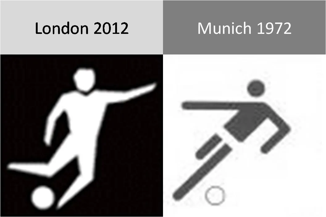
The pictograms for the 2012 Olympic games were launched yesterday, designed by Yasmine. Glancing back over the pictograms of the past decades (a new set is designed for every tournament), I actually still like those of the 1972 Munich games best (designed by Otl Aicher). Simple, recognizable, and full of movement and energy.

Somewhat related, designs for Olympic posters that were not adopted in an earlier post. Again simple and full of motion.

·Design

Calming down your presentation images (sequence)

The audience might feel a little bit like they just stepped out of a roller coaster after you showed them your 30 images in 10 minutes presentation. Some suggestions to calm things down:

  • Not every concept needs a supporting image. “We’re running out of time” [click - image of a time bomb ticking away]. “We’re under pressure” [click - Atlas lifting the globe on his shoulders]. “It’s either” [click - A pot of gold] or “the end” [click - image of the Grand Canyon]. A data chart showing a rapid decline in sales over the past month will do if you want to create a sense of urgency…
  • Consider taking the color out of your images. Black and white images, or images with a monochrome overlay look more in harmony with a presentation’s color scheme.
·Design

The cinematic presentation opening

Film directors can use powerful tools to throw us in the middle of a story right in the first seconds of a movie. Steven Spielberg’s opening of Saving Private Ryan is a gruesome but good example. Everyone in the audience thinks “Wow, I should be grateful to these guys that drew the short straw and had to come out of the boat first…”

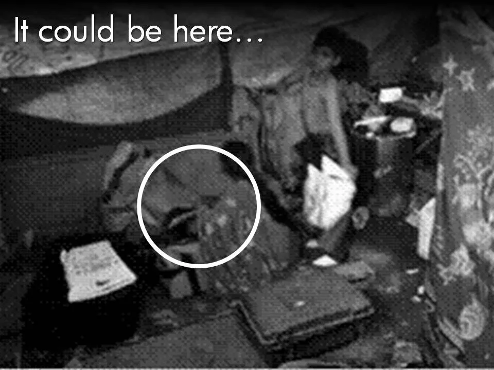
Presenters can use similar techniques. Try to find big images with a perspective as if they were taken from someone in the middle of the issue you are talking about. These images trigger an emotional response from the audience, especially (and maybe only) if they are “real”. Think of photographs that make it on the front page of a newspaper.

The following 2 images could lead into a presentation about the issue of maternal deaths due to poor living and health conditions in the slums of India:

Less powerful examples of images with a patient or victim perspective here and here. Many of my investor pitch presentations use different styles of charts throughout the presentation:

  1. Emotional opening (images) to connect the audience to the problem
  2. Conceptual diagrams (arrows, boxes) to explain why my solution solves it
  3. Data charts to show why this is a big deal
  4. “Standard”, almost slideument, charts to give more background on the company

P.S. Read more about the great work that the Acumen Fund is doing to combat the issue of maternal deaths here.