SlideMagic Blog

Frequent updates about all things presentations since 2008. Subscribe to never miss a post.

RSS
all posts

Category Presentation design

·Advertising

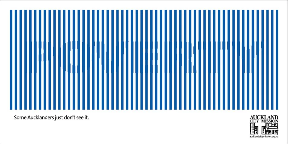
Chart concept - can't see the forest through the trees

Sometimes you can’t see the forest through the trees. How to visualize this? The ad below uses a technique that can be copied easily in PowerPoint: a huge word/sentence in a bold font covered by a set of fat, spaced out stripes in the same color as the text. Via Ads of the World.

·Colors

The color goes in last

Garr Reynolds wrote a beautiful post on what Zen arts can teach us about minimal use of color. Let’s take things down to the very practical level: how to use these concepts when sitting behind your slideware edit screen.

  • Make sure your template has a decent color scheme that works well with your corporate colors. See one of my earlier post how to set one up.
  • Design your charts in black and white. Really, switch off the colors, and give it your best shot using only shades of grey. This is especially useful when working on busy data charts or complex IT architecture diagrams.
  • Now start adding additional background colors from the template to group items together that belong to each other. A cluster of servers, all pieces of a pie chart that relate to manufacturing businesses, etc. Within each background color, again use shadings as if you were working in black and white. A very light orange database server, with a slightly darker orange data pipe coming in, and label it “data base server” with an almost brown orange font.
  • Finally add very bright accent colors to highlight aspects of the chart. The server with breached security that is letting all kind of viruses into the network definitely deserves a dash of red.

The key lesson: the color goes in last (if at all).

·Concepts

Chart concept - easier to get in than out

Some places are easy to get in, and hard to get out. (That one-off discount which becomes permanent for example). How to visualize this?

Things that come to mind (the one-way revolving door, permanent temporary structures such as the Eiffel Tower or the London Eye) are not obvious when you use them in a slide. “You see, your discount scheme is a bit like the Eiffel tower”. Blank stare.

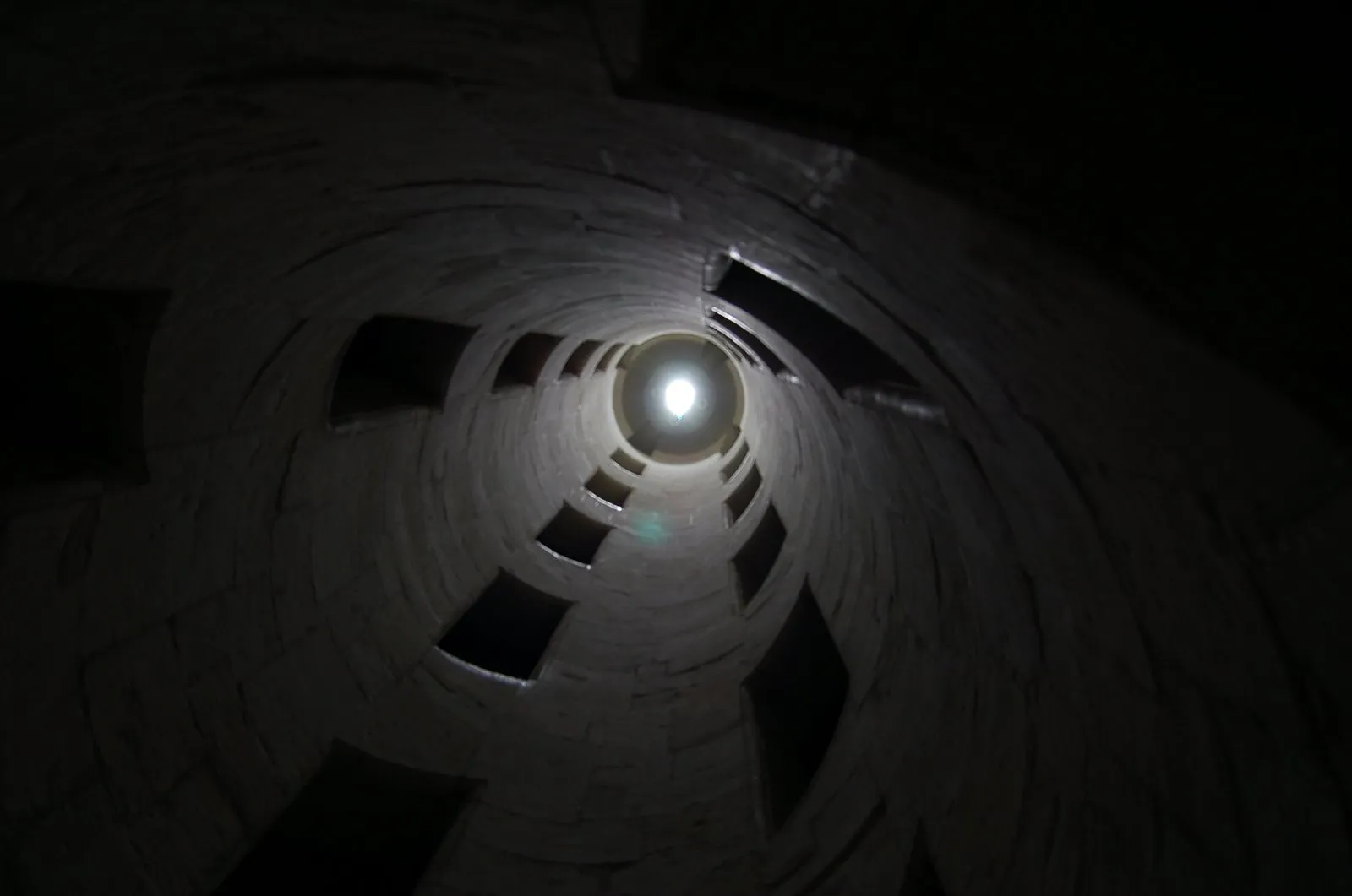
Images of someone stuck in a well and looking up into the light do work. The idea was triggered when I found myself inside the double helix staircase in the Château de Chambord in France, and looking up. Stock image sites also have lots of “inside a well” images.

There is a bigger point in this: presentation designers should look at cinema direction to move audiences inside a scene or a situation and make them “feel” what your message means. A future blog post on this is in the pipeline

·Design

How to scale an image to full-size in PowerPoint

Most people have now caught on to the idea of using large images in presentations. But with a few graphics design tricks you can make things look even better:

  • Make sure that they are not stretched or squeezed: the proportions between height and width are the same as in the original
  • If the image is big, go all the way and have it cover your entire slide.

Here is how to do it:

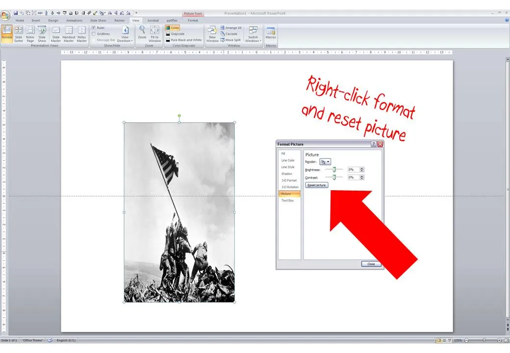
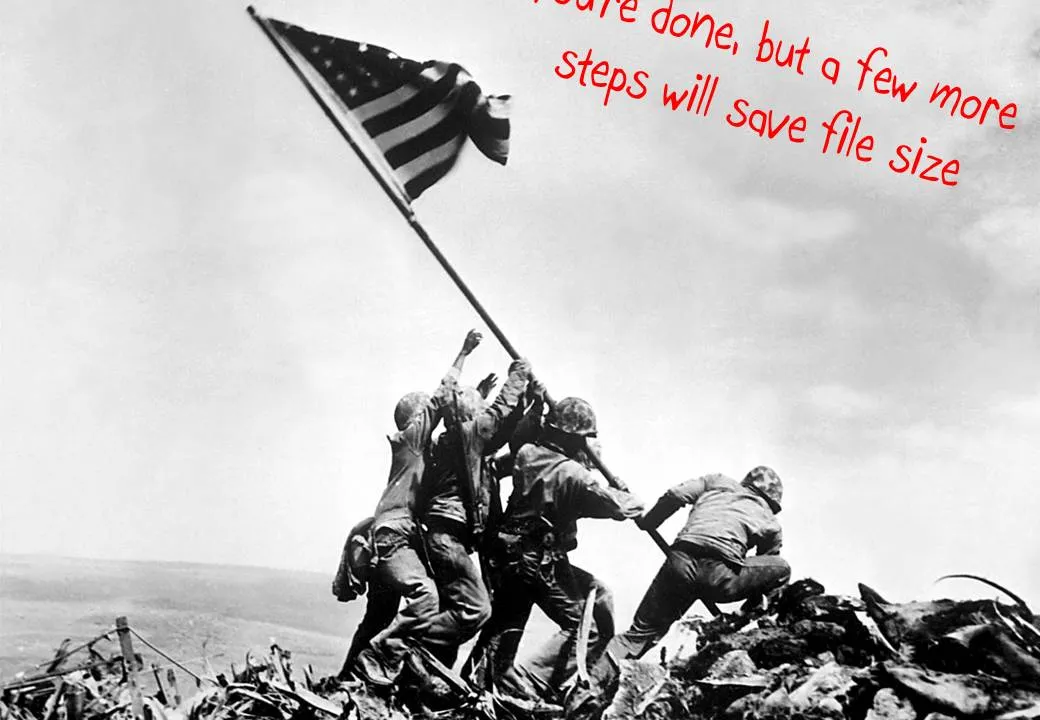
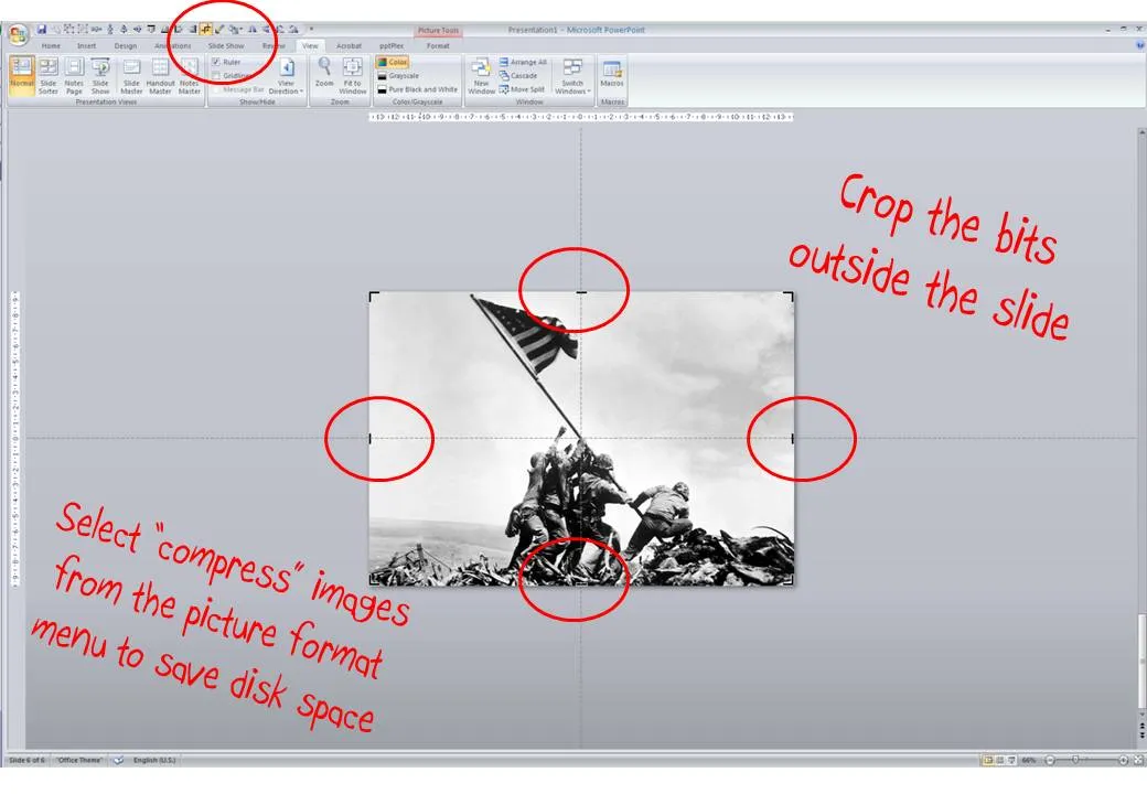
  1. Right-click the image, select format picture and click “reset picture” to restore the original aspect ratio (between height and width)
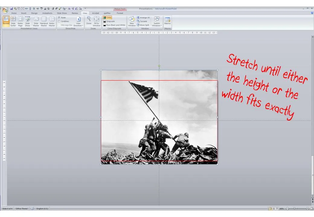
  2. Re-size by dragging a corner until both the height or the width are at least equal to the full screen
  3. Reposition the image and crop the bits of the image that are sticking outside the canvas
  4. Select the image, press format and compress pictures to reduce the file size of your presentation

·Concepts

Cool - make your own picture mosaic

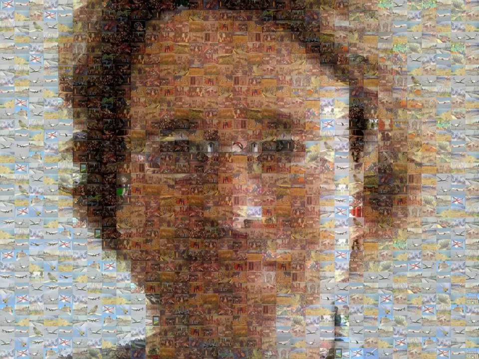
Many new technologies in enterpriseA software help you see the bigger picture that is hiding in various bits of information and data scattered across the organization. One option to visualize this in a presentation is through impressionism (painters such as Monet).

Another one is through a photo mosaic. This ancient post on Engadget still holds. You can download the software AndreaMosaic here. It’s freeware, as you as you give it credit when you use it. Hereby. Installation and use instructions can be found on the site.

·Design

Kindergarten teacher crowd control techniques

I watched in amazement the other day when I saw my child’s kindergarten teacher calming down a rioting group of 5 year olds in a matter of seconds. Maybe there are some presentation lessons here:

  • Start telling a story, build anticipation
  • Lower (and not raise!) your voice
  • Ask people to imagine/see/hear something
  • Maintain direct personal eye contact with everyone in the room
  • Ask people questions, encourage them to contribute, have audience members listen to each other, even put them on the spot (in the center of the circle of kids)

These 5 year olds are most certainly a more difficult crowd than a grown-up presentation audience…

·Design

Calling all professional presentation designers: do a pro-bono project

I have been working on a probono project recently: designing a presentation for free for an organization pursuing a great cause. I can recommend this to any professional presentation designer.

  • A much larger leverage than simply donating money. Fund raising presentation case example: you use a unique skill you have, giving your pro-bono client the ability to raise a large amount of money, which in turn can be deployed for the good cause.
  • These companies are a dream to work for as a presentation designer. The stories that they need to tell are so strong that your presentation is almost guaranteed to be a great success. Moreover, you will find that these pro-bono clients are more willing to push the boundaries of presentation design and try new techniques than your regular corporate clients.

Some guidelines for selecting your project:

  • Pick a cause that you are really passionate about and believe in
  • The best pro-bono clients will actually interview and test your skills as if this was a paid-for project. Don’t be offended, it brings me to my next point:
  • Treat the relationship with a pro-bono client as you would do with any other client: agree deliverables and deadlines, and meet them. Once you promise a presentation, these people need to rely on you. There is no room for “sorry, a paying client called me, you’ll have to wait 2 weeks”
  • Don’t even think about pay back, putting a logo, a reference, etc. The cause should be your motivation. Chances are that if you did a great job, the word will spread and benefit you somehow in the medium term. But if it doesn’t, that is fine too. If you feel the need to make a return-on-investment calculation, the pro-bono project is not the right thing for you
·Design

Pitch MY problem - not YOUR solution

I am catching up on Dave McClure’s blog. Here is another good post (strong language alert): when pitching to venture capitalists (VCs)::

  1. When people emotionally connect to the problem
  2. You earn the permission to introduce your solution

Many startup pitch presentations are designed the other way around:

  1. Take some technical architecture slides from the product roadmap deck
  2. Add some stuff upfront to show that the world needs this (“that $1bn IDC number sounds good”, “hey, let’s plop in this Gartner quote and leave the date February 2007 out”)

OK, there is more to an investor pitch than just talking about the problem. The relative importance of the problem pitch on the development stage of the market you are operating in.

  • If you would be pitching Twitter 5 years ago, you will have had to spend 99% of your presentation on why there is something missing in the way people communicate on the Internet. “Yeah right, people are interested to follow SMS-es from 1,500 strangers all day?”. Pitch the problem.
  • If you claim to be able to beat the Google search engine, you better spend 99% of your presentation showing that your technology works. “OK, let’s see what comes up when I type [VC PARTNER NAME]”. Pitch the solution.
·Design

A great presentation ignoring EVERYTHING suggested on this blog

Presenters should pick their own slide design style. The safe option is to read this blog, read Presentation Zen, read Slide:ology, and other resources and apply the principles as best as you can to your deck. But hey, the world would be pretty boring if all of us did this.

Why not do the exact opposite what the presentation design establishment is trying to teach you - on purpose?

Dave McClure is an investor in startups that does exactly that. Random colors, bullet points galore, “love that clip art”, arbitrarily placed images, and some pretty rough language. Kicking the presentation etiquette. Building businesses is all about getting your hands dirty, passion & energy, and ignoring slick packaging. It’s the substance that matters.

Here is a recent presentation (some strong language):

Startup Metrics for Pirates (FOWA London, Oct 2009)

The resulting presentation is actually pretty good. I am sure the “show” on the London stage was great. And through reading the slides I get the main point about feature focus. If you have Dave’s substance and confidence, there is nothing holding you back to deliver a presentation like this. Another example of a presentation by Dave: how to pitch to a VC (strong language)

·Concepts

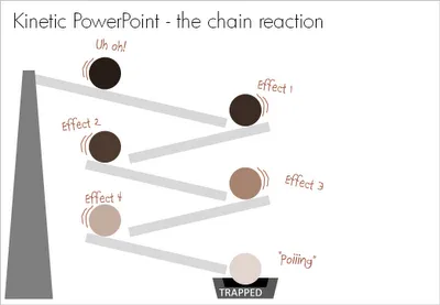
Chart concept - the chain reaction

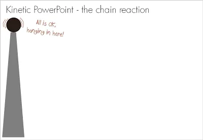
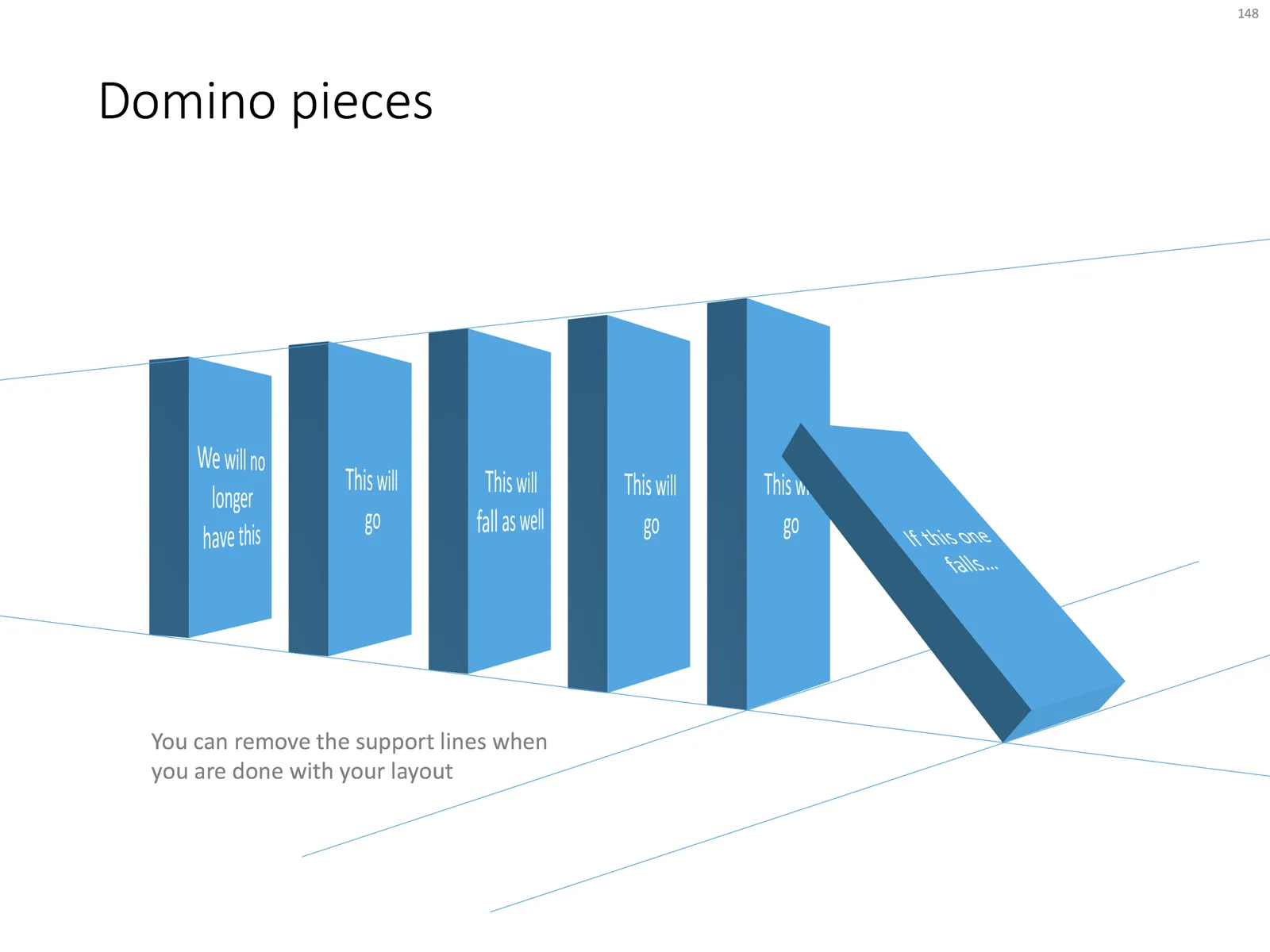
Sometimes a stable situation can easily be knocked out of balance, triggering an irreversible chain reaction of events. How to visualize this? A nuclear mushroom might be slightly too explosive. An image of a series of falling domino stones might be too cliche. Here is another idea based on a toy:

UPDATE: if you would like those domino stones, there is not a template with dominoes ready for download.