SlideMagic Blog

Frequent updates about all things presentations since 2008. Subscribe to never miss a post.

RSS
all posts

Category Presentation design

·Design

Zooming in down to cell-level

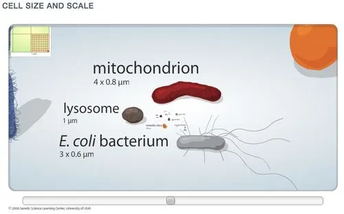
I really like zooming presentation formats such as Prezi, but I am still struggling to find useful application areas. Steve Johnson pointed me to one: to put proportions in perspective. Have a look at this amazing visualization of the relative size of biological cells.

·Design

Dusting off the McKinsey business system

McKinsey has been posting a number of classic consulting frameworks under the title “enduring ideas” on the McKinsey Quarterly site. I discussed before: consulting frameworks are great for solving problems, but often less good at communicating solutions.

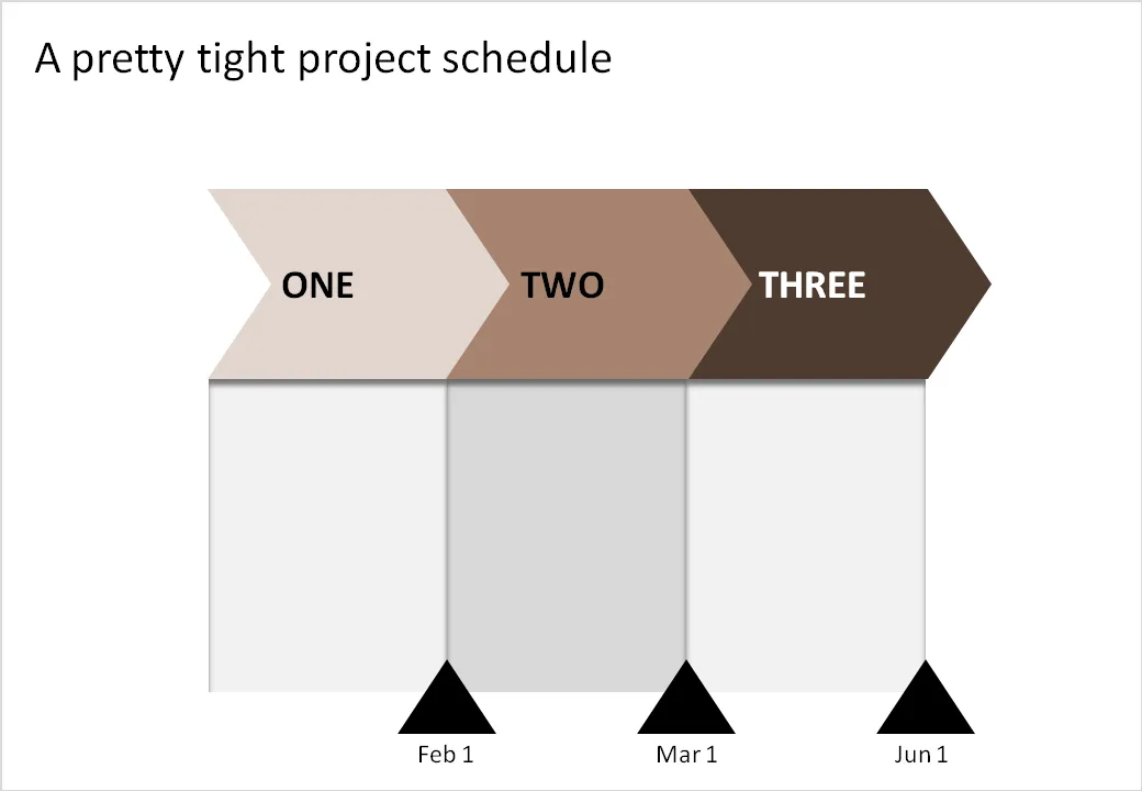
Recently, the business system was discussed. At McKinsey we used it to analyse the value chain of an industry (manufacturing, sales, distribution, etc.). The basic graphic concept of it (simple arrows) can also be used in another context: communicating a project schedule. See the example below.

Related reading:

·Design

The "what have I done in the past year" slide

This slide always comes in somewhere in the annual management review. Here are all the activities of me (or my department) over the past year. The bullets are coming out:

  • Organized the annual consumer event
  • Biz dev trip to Poland
  • Created a new planning tool
  • Put a trade symposium together

These slides do not justice to your efforts. Break each bullet point up into a separate slide and go through them really quickly, but add something interesting to each slide:

  • Slide: an overview picture of the 80,000 visitors of your consumer event (a rock concert)
  • Slide: an image of you having a flat tire in the middle of Poland on the site of a major new potential customer
  • Slide: head shots + name of the very well-known people from the trade that were present on your symposium
  • Slide: sceen shots of the new sales budget planning tool

Stories make the achievement look much more impressive and people will remember them better (“hey, was that you who did this?”).

A second implication: always have camera (or a photographer) at hand during important events, maybe even a better one than the one built in to your phone. Think ahead about next year’s annual review presentation.

This same technique is also really useful when making presentations that need to present your company and its activities to a major (international) customer or business partner. The only pictures of the company that usually makes it in these type of presentations are the one of the lonely receptionist waiting for a call to come in.


·Concepts

Chart concept - lost in translation

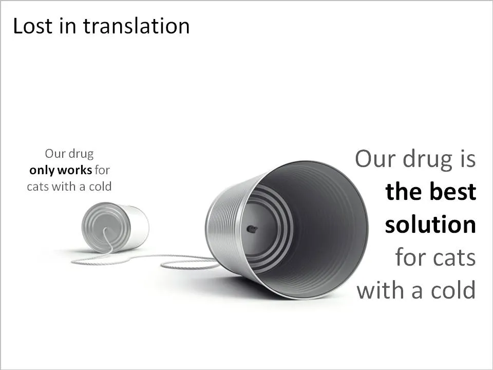
A client in the pharmaceutical industry had this problem: a competitor managed to turn a relatively weak clinical fact and turn it upside down into a forceful message that took over the market. The good old tins cans are great to visualize this. See the example below (sanitized to maintain client confidentiality)

Related reading: an earlier post about classic miscommunication in a project.

·Design

Israel, startup-nation, and how it turned me into a presentation designer

A slightly off-topic post today.

Malcolm Gladwell talks about how people are the product of the hours they put into something, plus the privileges of experiences they have been given. I am Dutch, not Jewish, do not really speak Hebrew, but ended up living in Israel somehow.

The Israeli startup environment was the main driver behind me becoming a presentation designer. Countless entrepreneurs pitching me their dreams and asking me to “put it in PowerPoint” gave me a rare opportunity to expand my presentation design skills from structured McKinsey-style Board documents to presentations that need to touch someone’s heart (often the heart/wallet of an investor).

A short video about a new book “Start-up Nation: The Story of Israel’s Economic Miracle” in case you are not familiar with Israel as a hightech center.

Disclosure: I earn a small commission if you purchase items through Amazon links on this site.

·Design

Social Bees - client work that is not confidential

Most of the presentations I help design for clients are confidential, with some exceptions. Hazel Grace runs a company called Social Bees that helps small businesses establish their presence on Facebook using fan pages. We developed a presentation together to present her company in a session at the BizTechDay conference. It was designed over the course of 2 days (pretty last minute), at different ends of the globe, and I wanted to make sure to adjust it as much as possible to the presentation style of Hazel. SlideShare created some glitches in fonts and graphics, but the presentation below is still pretty close to the final result that was shown in San Francisco.

·Design

FedEx shows: no need for an elaborate PowerPoint template

An ad from FedEx found on Ad Goodness:

Proof for one of my 101s of PowerPoint design: ditch the elaborate PowerPoint template (with colorful horizontal bars, big logos, and other graphics repeated on each page). From a mile’s distance, anyone can see that this is an ad by FedEx. Achieved by consistent use of colors on a completely white background. They can almost do without the small logo in the bottom right.

Related reading: the 2nd post on this blog from July 2008

·Design

Photo subtitles (redux)

I talked about slide subtitles before as an idea to add detailed content to a “Zen-style” presentation with big images and few words, content that can be read when the document is viewed without a presenter being present.

I start using photo subtitles more and more as I increasingly move away from staged/fake stock images and use real images in my presentations. When using a creative common image from Flickr, it is important to give credit to the photographer, that is one thing to in the footer.

But the photo footer can also include a little bit more background information on what we see in the image, information that does not always have to contribute to the slide. The full details of the painter, the painting title and the place where the painting is currently displayed. The fact that the Paris cafe you see on the image is actually Cafe de Flore, in an image from 2006.

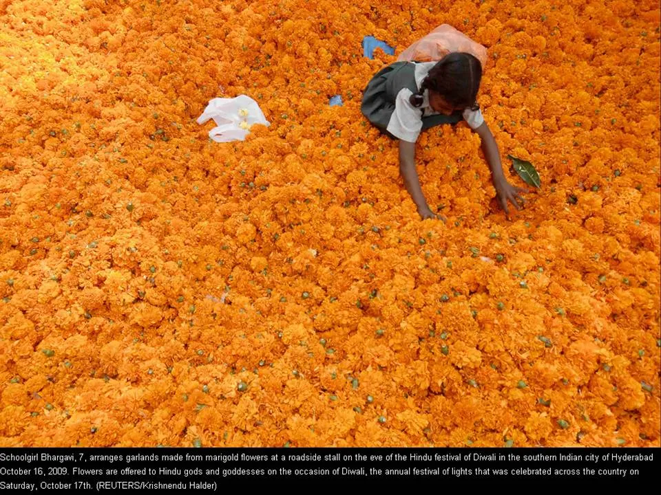
The Big Picture section of boston.com should feature in the RSS reader of every presentation designer. It is an almost daily stream of beautiful images (often more than 1MB a piece). The image below (related to the Diwali celebrations) was taken from it. You see a good way to format an image subtitle (with - in this case a lot of - information) as white text in black at the bottom of the photo.

·Data visualization

Adoption curves - how long does it take?

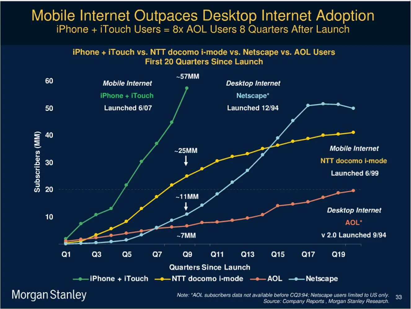
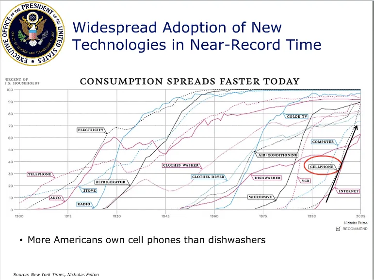
Adoption curves are a great way to compare the speed at which ideas spread, technologies were adopted or great companies were born. They are basic line graphs with the starting year set to zero. An alternative visualization would be a simple bar charts with “number of years before x reached y”. While simpler, this approach loses a lot of information: the absolute size, the rate of adoption, and changes in the rate of adoption over time. The classic use is to show that new technologies are getting adopted faster and faster. A good example can be found in Mary Meeker’s 2009 Internet presentation:

Mike Pulsifer found a chart that does not make all starting years zero, here is what happened:

Finally, interactive data visualization tools can add another dimension to adoption curves. See this example of a chart that shows how many years it takes to transform a startup into a large company (thank you Michael Eisenberg). The opening chart is far too busy to show in a PowerPoint presentation, but that’s not the objective here. These charts are designed for pondering over: select and de-select lines, mouse-over data, etc. If you had to translate this chart into PowerPoint, you would have to use a number of slides to highlight the messages you want to stand out.

·Books

Book review - "Blink"

I finally managed to get to reading Blink: The Power of Thinking Without Thinking. Malcom Gladwell makes an engaging case for why snap judgement often turn out to be right, providing a constant flow of interesting case examples:

  • Firefighters deciding to leave a building seconds before it collapses
  • Art critiques “knowing” that a sculpture is a fake
  • Police agents making the wrong judgement call in a shooting
  • Autistic people unable to follow a pointing finger

The brain is very powerful, it can “thin slice” all memories of let’s say all the people we met in our entire life and stack these up against a new individual in front of us. These powers work best when we are well-rested and not under stress. The human brain is built that in case of stress (i.e., we are trying to shake off a tiger that is chasing us), all non-essential brain functions are shutting down to focus on the immediate task at hand.

This book is not directly related to the subject of presentations, but it is relevant for some issues:

  • The first-second audience judgement that every speaker has to deal with
  • “Thin slicing” of bullet point decks. “Uh oh, the guys starts reading his bullets”/[scan the slide]/[open email on the mobile phone]
  • Count to 10, when a heckler manages to get you upset, wait a bit before answering. In “upset mode” your brain is less effective.

Disclosure: the links to Amazon in this post are affiliate links, I earn a small commission when you purchase items through them.