

Some places are easy to get in, and hard to get out. (That one-off discount which becomes permanent for example). How to visualize this?
Things that come to mind (the one-way revolving door, permanent temporary structures such as the Eiffel Tower or the London Eye) are not obvious when you use them in a slide. “You see, your discount scheme is a bit like the Eiffel tower”. Blank stare.
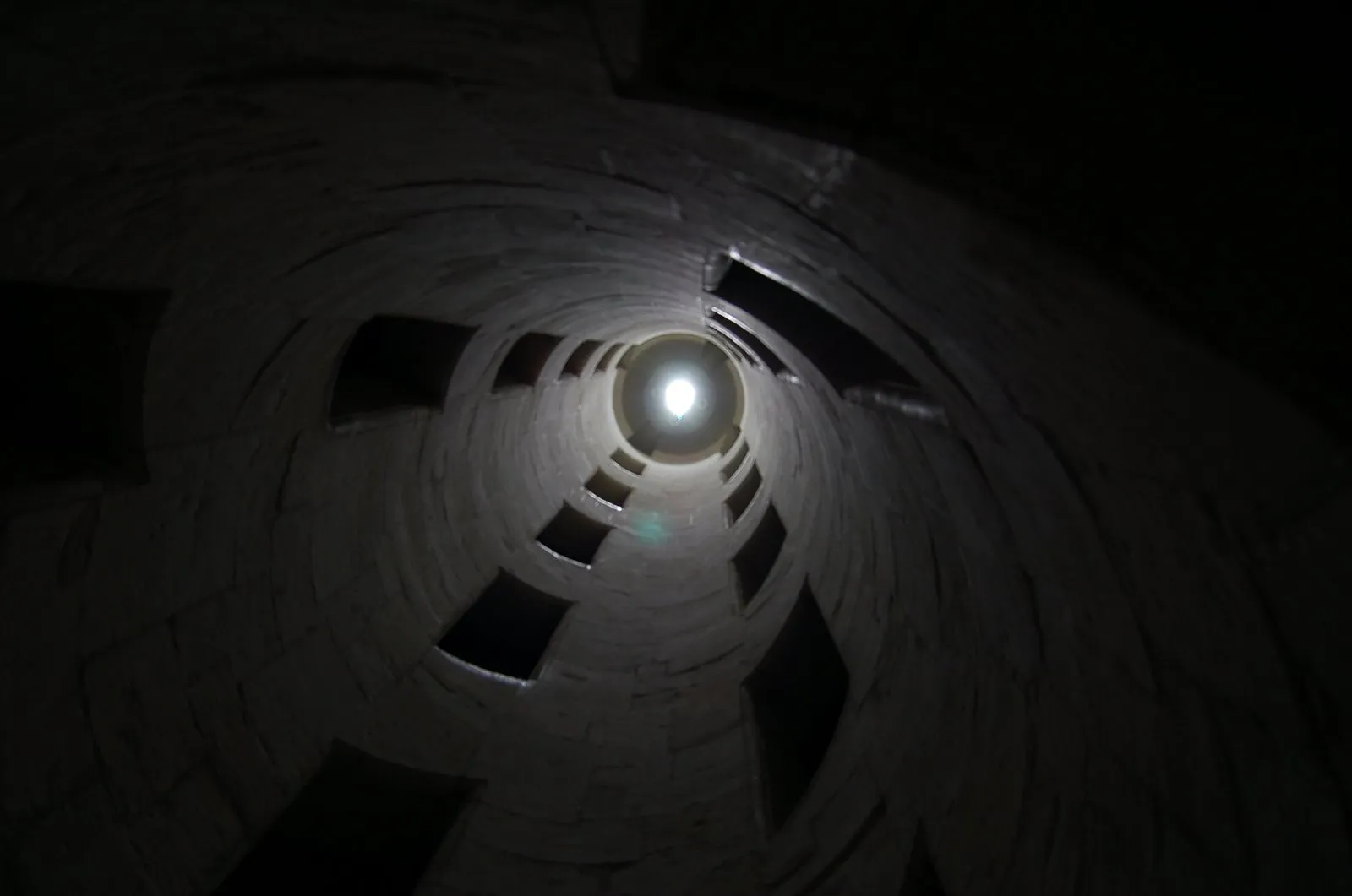
Images of someone stuck in a well and looking up into the light do work. The idea was triggered when I found myself inside the double helix staircase in the Château de Chambord in France, and looking up. Stock image sites also have lots of “inside a well” images.
There is a bigger point in this: presentation designers should look at cinema direction to move audiences inside a scene or a situation and make them “feel” what your message means. A future blog post on this is in the pipeline