SlideMagic Blog

Frequent updates about all things presentations since 2008. Subscribe to never miss a post.

RSS
all posts

Category Presentation design

·Delivery

Practice, practice, practice - please read the body of this post as well

Practice, practice, practice.

Every public speaking book talks about it (this one and this one for example). Every presentation design and public speaker blogger repeats it all the time. So much so, that it is tempting just to speed read over the paragraph to get to the cool stuff about adding that 3D shadow to your slide. “Hey, I am a confident speaker, ticked that box”

Some sentences to get you to change your mind:

  • Steve Jobs practices for roughly 2 days full time before his keynotes
  • When your are confident you know your stuff, test yourself: close the office door and do the first 3 slides as if it were the real thing. Did that came out brilliantly? If it did, congratulations, because this first test run is exactly how your opening would have come out in front of a large audience. If it did not go that well, congratulations, you just got yourself a good incentive to start practicing.
  • Spontaneity does not equal winging your story, a good movie actress can only come across spontaneous if she now her stuff inside out
  • If you know your material inside out, all the presentation professional’s talk about cutting bullet points and clutter will come naturally to you: you do not need on-screen speaker notes anymore.
·Design

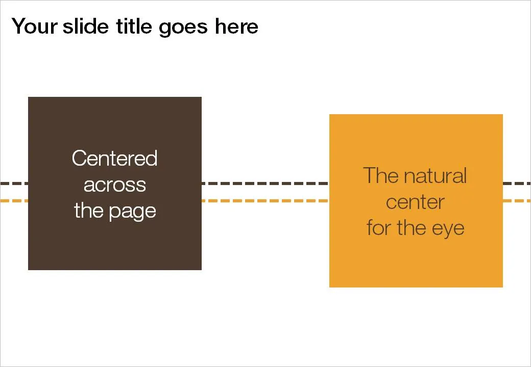
The vertical center that feels right to the eye

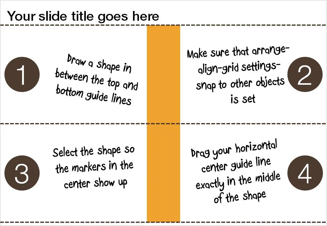
If you use big title headings on your PowerPoint slide, the exact vertical center of the slide might not feel natural to the eye. I suggest centering items slightly lower. Here is how you can find the exact location where to set your drawing guides.

  1. Draw a random shape in between the top and bottom drawing guide
  2. Switch on “snap to other objects” (arrange-align-grid settings-snap to other objects)
  3. Select the shape to make its center marker visible
  4. Drag the middle horizontal drawing guide to the center of the shape, it should “snap”

·Design

Be aware of the most recent iStockPhoto price hike

I just noticed that iStockPhoto has increased prices over the weekend. A medium-sized image now costs 10 credits instead of 6. That means that such an image costs around $15 depending on the pricing plan you use.

What image sources are you using for your presentations?

·Design

Grunge fonts

I must admit, I am ignoring my own earlier assertions about not using non-standard fonts in presentations. PCs do not come with Helvetica installed, and I love it. In most cases, embedding the font inside the PowerPoint presentation makes sure that people can use it on other computers as well.

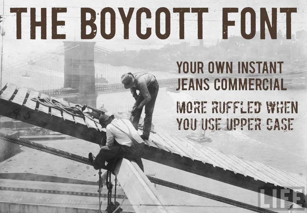
Helvetica is a relatively tame font. Selectively you can go a bit wilder. The image below (taken from the excellent Google LIFE image archive) mixed together with the Boycott font gives that instant jeans commercial effect. Here is an example of a presentation that uses something similar. Obviously, these type of fonts are only to be used for big image/huge font presentations, and probably not in every presentation you make.

·Design

Making a photo cutout in PowerPoint (redux)

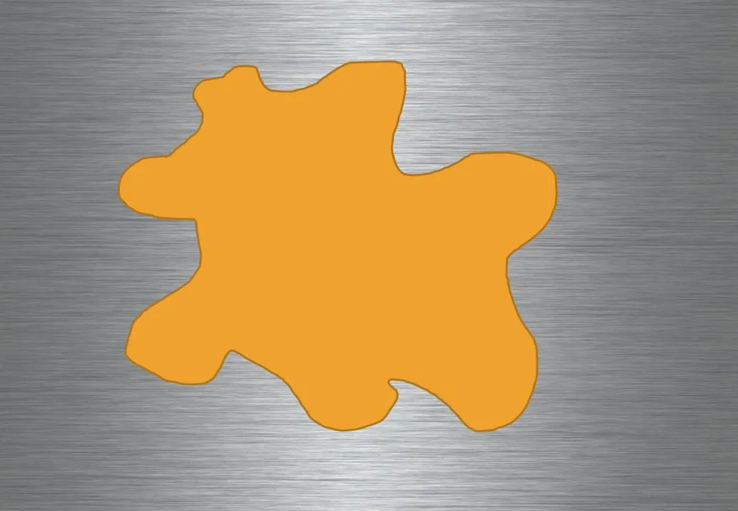
Readers from the early days will remember similar posts, but I want to bring up the subject of cutouts again. Recently, I started using them more, especially in combination with randomly drawn shapes.

  1. Fill the background of a slide with an image. Right-click the slide, select [format background], select [Picture or texture fill] and select a file. Note that this is different from simply copying a page-covering image on your slide.

  1. Copy another image over it.

  1. Draw a shape, I like using random shapes.

  1. Right-click the shape and select [Format shape], [Fill], [Slide background fill], and add an inner shadow for additional effect.

Images found on iStockPhoto.com.

·Art

Develping confident PowerPoint "brush strokes"

OK, this concept is somewhat hard to explain. I will give it a try, but I am not sure I can get it across in a blog post. Here we go:

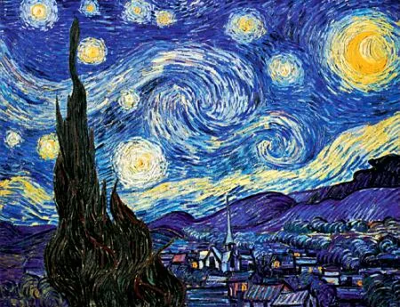
Paint is irreversible: therefore a painter must get it right a first time, or otherwise face extensive fix up work. The more experience the painter gets, the more confident a painter becomes. It is better to make a (small) mistake than restrict yourself to making timid and boring paintings.

The starry night, Vincent van Gogh, 1889, oil on canvas, 74x92cm, MoMa, New York

I notice something similar in presentation design. Be confident as your design your slide in “analogue mode”, scribbling on a piece of paper. Be confident to open the PowerPoint screen, delete all Microsoft bullets and start adding elements from your design: box, box box, align, arrow, etc. Make them big, bold, confident, but minimalist.

In this way you work faster, and slides come out more natural. It is all about confidence.

Maybe this post does a better job in explaining.

·Books

A presentation about Steve Jobs' presentations

Following my recent review of the book The Presentation Secrets of Steve Jobs, here is a nice presentation summarizing the content of the book.

The Presentation Secrets Of Steve Jobs

Thank you Nancy Duarte for pointing me to this. Disclosure: links on this blogs to Amazon are affiliate links, I earn a small commission when you purchase products through them.

·Data visualization

Formating an Excel table in PowerPoint (under time pressure)

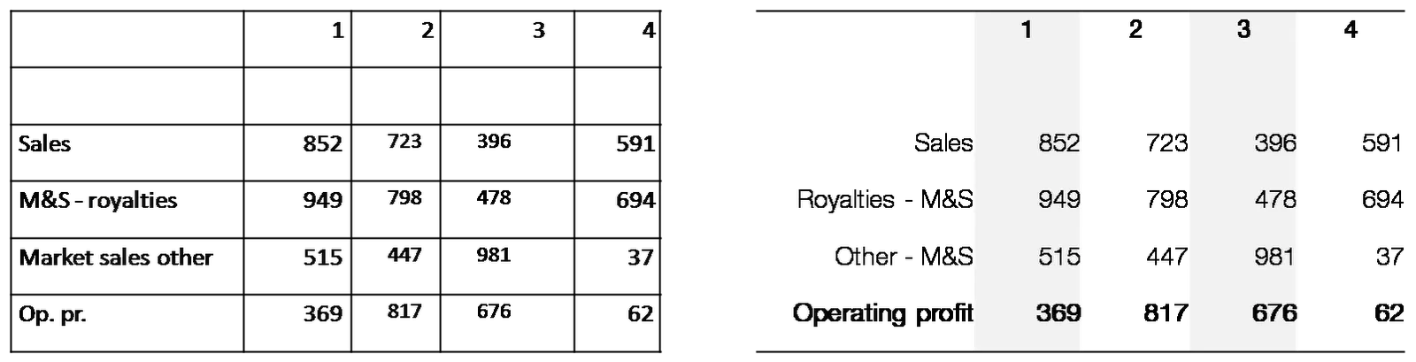
At 11PM on the evening before the Board meeting, the finance department emails you a horribly looking PowerPoint deck full of copied tables from Excel with the latest quarterly results. There is no time to start designing beautiful data charts. What emergency fixes can you do?

Here are a few suggestions:

  • Select the the table and set the fonts and font sizes to the ones you are using throughout the presentation. (Get rid of that Excel Arial)
  • Remove as many abbreviations as you can
  • Right-align the row labels
  • Right-align the numbers
  • Take out decimal points, or add decimal points so that the numbers align
  • Round up to whole millions, billions if you can
  • Select the columns with data and distribute them, set them to be exactly the same width
  • Put repeated words (“M&S” in my example) to the right
  • Center the column headings
  • Bold up the totals
  • Get rid of as many borders as you can
  • Add some subtle grey tones to differentiate columns

Click on the image for a bigger picture.

·Advertising

Everything in excess

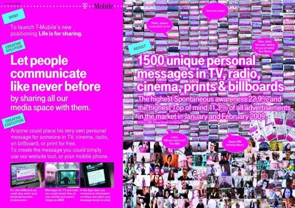
This ad reminds me of many poor PowerPoint slides I see. It sure grabs the attention, but that’s probably also the only thing it does.

Let people communicate like never before, let’s try to achieve that in 2010 but in a more positive way. A happy new year to you all.

A bigger picture on Ads of the World.

·Design

Five presentation images your audience will not understand

It is important that your audience “gets” the image on a slide immediately, otherwise they will be staring at it, thinking about it, trying to solve the puzzle, in short everything but return their attention to you as the speaker.

Some reasons why an image that makes perfect sense to you in your office might not work for a big audience:

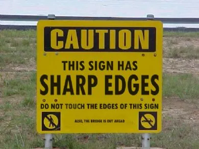
  1. The clue is in the small print (as in the image used in this post). Put a big marker to draw the attention to the sentence that matters
  2. Incredibly busy compositions, Times Square in New York, a screen shot of a video game
  3. Cartoons with a lot of text. Things get worse when a small cartoon image is scaled up, leaving a poor picture quality. Give your audience time to read it, and may black out the screen to focus attention back on you
  4. (Too) interesting people: an image of the red carpet during Oscar night might make people wander off and examine those beautiful dresses rather than listen to your story about Business Process Redesign
  5. Clever graphics such as an Escher drawing. “Hey, how did he do that?”