SlideMagic Blog

Frequent updates about all things presentations since 2008. Subscribe to never miss a post.

RSS
all posts

Category Presentation design

·3D

Maintain one vanishing point when rotating 3D PowerPoint objects

3D effects can add impact to a PowerPoint slide if used at the appropriate occasion.

  • 3D for the sake of 3D adds complexity: the slide becomes harder to understand, the only thing you showed is that you know where to find advanced formating buttons of PowerPoint. 3D data charts are a good example of this
  • 3D adds value if you need to convey distance: I use 3D for what it actually is, a way to add a third dimension to your slide, to show depth… (Notice in the previous post I linked to that you often do not need to use sophisticated 3D effects to create depth, colors or differences in size can do the trick equally well).

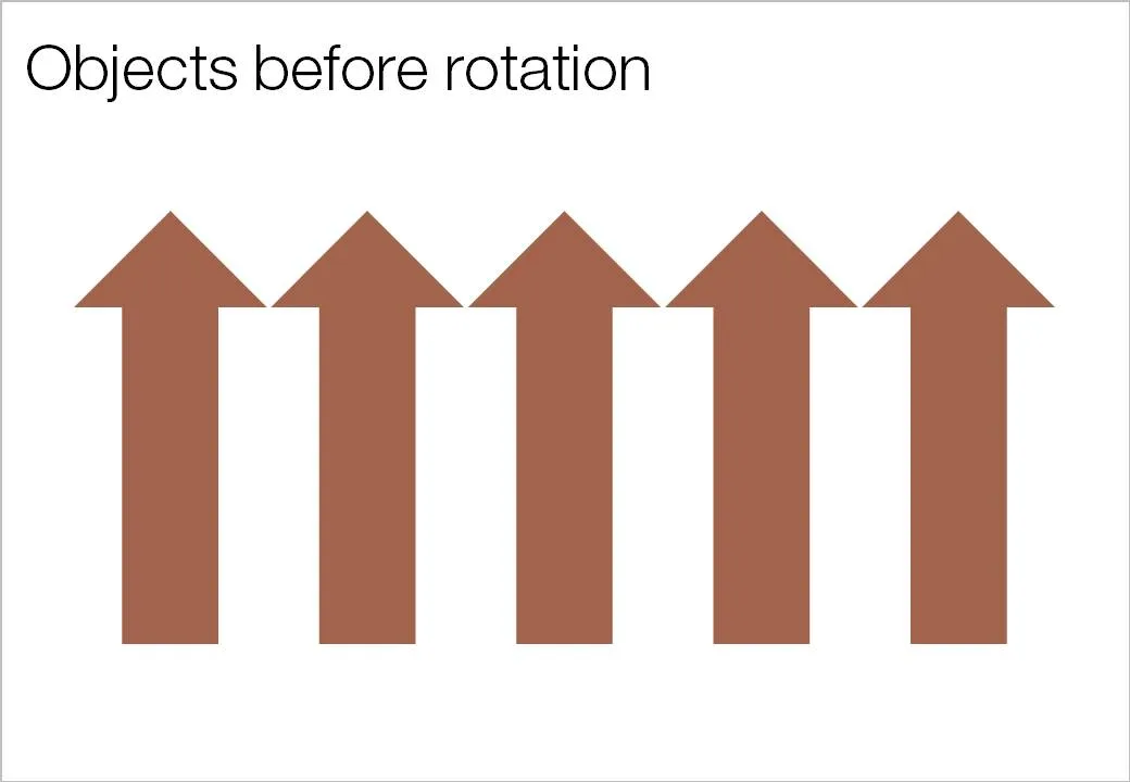
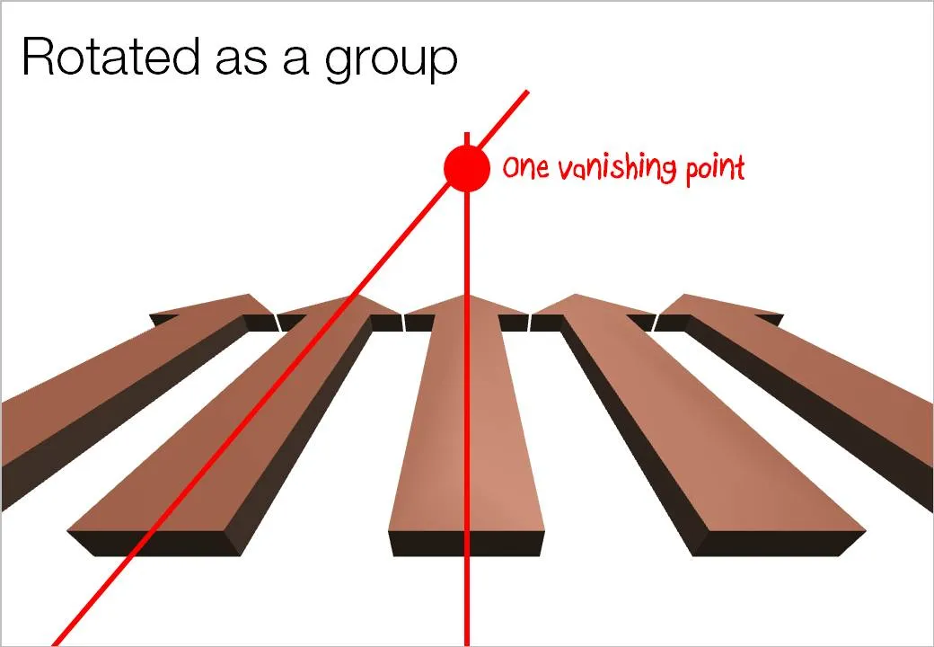
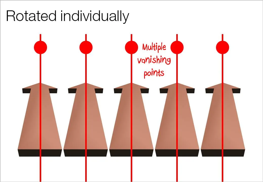
Here is an important thing to remember when using 3D rotations in PowerPoint: rotate a composition of objects as a group, rather than a collection of individual objects. Grouping them preserves one vanishing point in your slide composition. An example:

·Concepts

Chart makeover - a new huge supermarket is coming to the neighborhood!

Sometimes a reader emails me with a question about a chart makeover. It is hard for me to free up the time for personal 1-on-1 answers, but if I can discuss them here for the benefit of everyone, it is a good deal. So here we go, I am obviously removing any reference to the specifics of the situation.

This case example is about supermarkets. There is a plan to open a new one, one that will be far bigger in floor space than all the surrounding super markets. This floor space will be the main competitive differentiator.

Before

Because of confidentiality I cannot post the actual image, so I will describe it (apologies for the bullet points):

  • A copy of a Google map with all the grocery stores in a 2km area marked with red circles
  • Each red circle (store) is connected to a descriptive label at the edge of the map.
  • In the middle of the map, a bit green circle where the new store will be opened.
  • At the bottom is a sentence explaining that “Our surrounding competition are mostly supermarkets which are severely space constrained, we can use this fact to our advantage”

My suggestions

Ideally you want to break up this chart into at least 2 charts with different messages:

  1. A Google map with competing stores and the new stores marked. If possible, get rid of all other clutter on the map: parking lots, bus stations, etc. etc. Make it as clean as possible. The key message: “yes, we are going to open another store in a catchment that is already full of competitors”.
  2. To make the “our store is bigger” point, you have multiple options, depending on data and images that you have available:
Continue reading →
·Design

SpiderPic - price comparison shopping is coming to stock images

By now everyone knows that using professional images in your presentation is far better than ripping images from Google image search or clipart: higher quality photographs, isolated subjects on a white background, detailed search capabilities including required colors or available white space for type, and last but not least: no copy right infringement issues.

With the increase in popularity of stock images also came a backlash: many photographs were so cliche and/or over-used that designers increasingly start to look at other image sources with creative common licenses (I like Flickr a lot).

Price is another issue. Online stock image sites used to charge around $1 for each image. At that price you could afford to buy volumes and volumes of images, try them and discard them if they were not appropriate. Prices have gone up significantly recently, requiring a change in the creative process: design your presentation with low-resolution comps and only buy your images at the very last stage of the project.

Technology is about to put new power in the hands of stock image buyers. Many stock image sites contain the exact same image, but offer them at different prices. Differences in price are the result of general pricing policies (driven by the strength of the brand of the stock image site) or sophisticated dynamic pricing algorithms, setting image prices based on the number of downloads/views (more popular images become more expensive).

SpiderPic is a price comparison search engine for stock images and let’s you decide from which source you want to buy the image. You key in the search term, the site presents the available options, and once you select a candidate it lists other sites that offer the image (and at what price for what resolution). Once you made your selection you are linked through to the relevant stock image site to complete the purchase transaction.


Continue reading →
·Design

How I wrote a recent presentation

I kept track of the phases of a recent presentation design project:

  1. Quickly racing down an existing PPT, checking out the client’s web site (“what is it that they do exactly”?)
  2. Break
  3. Listening to the full pitch via screen sharing software: PPT on screen, client on the phone. Asking naive questions all the time, jumping back and forth between slides and web sites, interrupting the presentation all the time (some people might get offended)
  4. Jotting down all impressions immediately after that, to make sure that I do not lose the richness of the discussion (especially comments and ideas that do not appear on a slide)
  5. BIG BREAK including a night of sleep
  6. Putting together the template, setting fonts, colors, spending time on finding a perfect and beautiful image/graphic for the front page (yes, open up the slideware!). Thinking about a style of images, the style of presentation. Most people might embark on some analogue story boarding exercise here, but I find it useful do dive into the detail of color codes to get my mind focussed.
  7. Break
  8. Start designing a few absolute killer charts that are instrumental in getting the story across without worrying where they exactly fit in the story. In VC pitch presentations, these are usually charts describing the pain that the world-without-this-great-invention is suffering. These will be the most important charts in the presentation.
  9. BIG BREAK
  10. Going analogue to design the overall story of the presentation on a piece of paper
  11. Filling in the blanks with slides, starting on page 1 and working my way through to the end. Finishing each slide to final quality (i.e., I do not create quick PowerPoint dummies)
  12. BIG BREAK
  13. Look at the draft again, make some small changes and send it off to the client
  14. Here is where the regular iteration process with the client starts. Feedback, correction, feedback, correction.
Continue reading →
·Design

Motion graphics going analogue

A cute video clip designed by David Pino full of analogue motion graphics: characters held up by wires and movement because of a camera actually changes location.

Found via Fubiz

·Advertising

"Be stupid" - DIESEL ad with motion graphics

A bit noisy, but nicely done.

Via Ads of the World

·Design

An unusual take on typographic color...

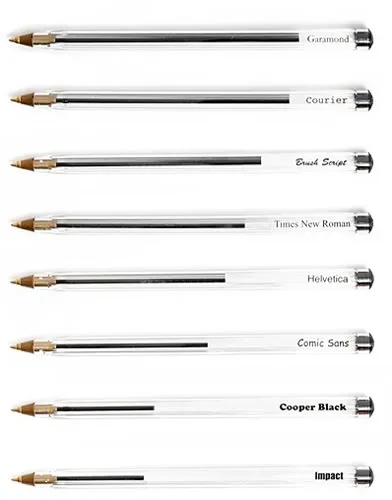
Typographic color is the apparent level of black (or color) that appears to you when looking at a block of text.

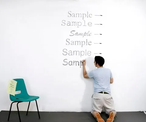
Matt Robinson engineered an interesting experiment to test it. Take low-cost, transparent ball points, use them to write the same text in different fonts on a a wall, and see how much ink is left in them afterwards. A quantification of typographic color use (and/or) waste of ink.

Courier comes out really environmentally friendly in this test. It might be true in terms of ink, but this is definitely not the case of you measure the amount of paper used.

I am a bit late to discover this via Ministry of Type.

·Design

Help, not enough white space in my image!

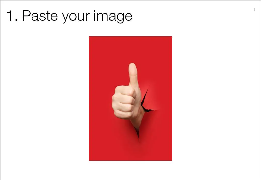
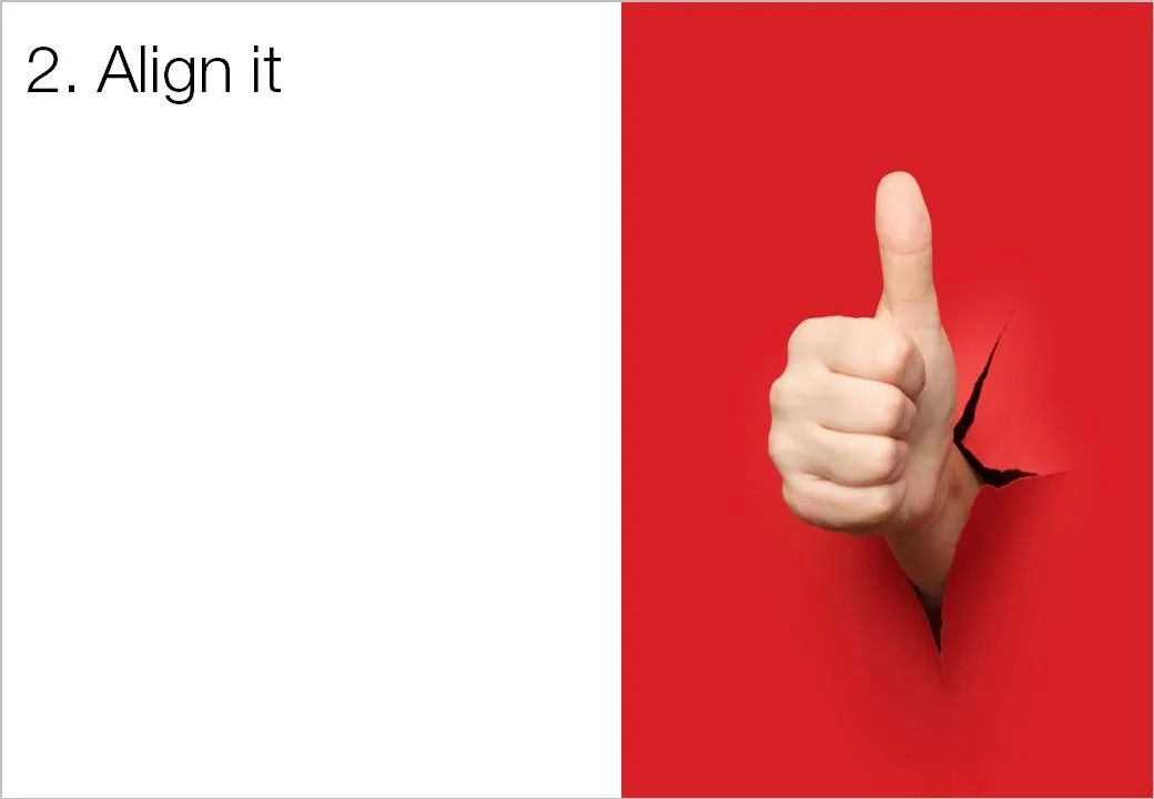
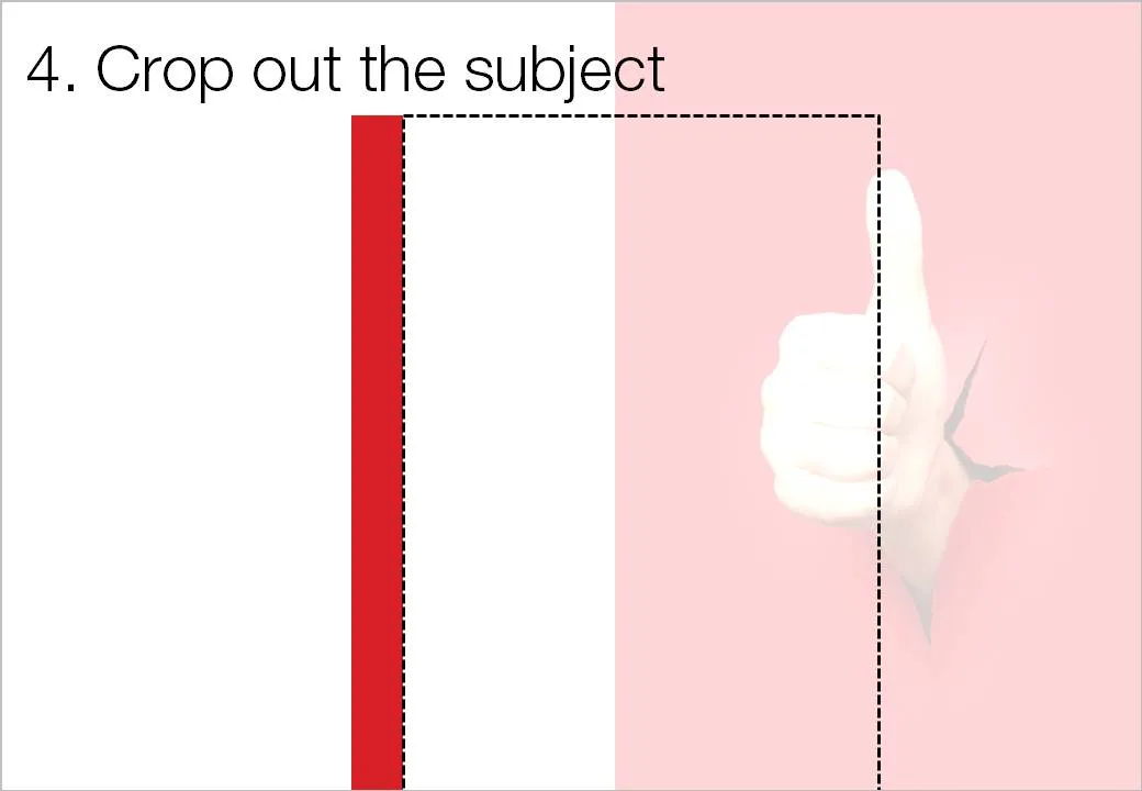
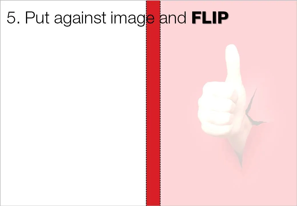
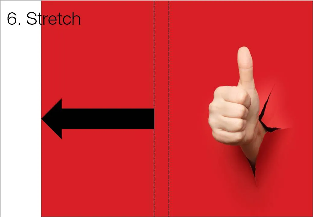
White space is a powerful element in slide design. An image with the subject in the center often does not leave enough space to let the slide breathe a bit. The following image sequence explain a work around. Basically, you stretch the background of the image without stretching and distorting the image subject itself. Flipping the cropped background makes sure that there is a smooth transition between original and stretched background.

Image via iStockPhoto.

·Design

Google Street View - a great source of presentation images

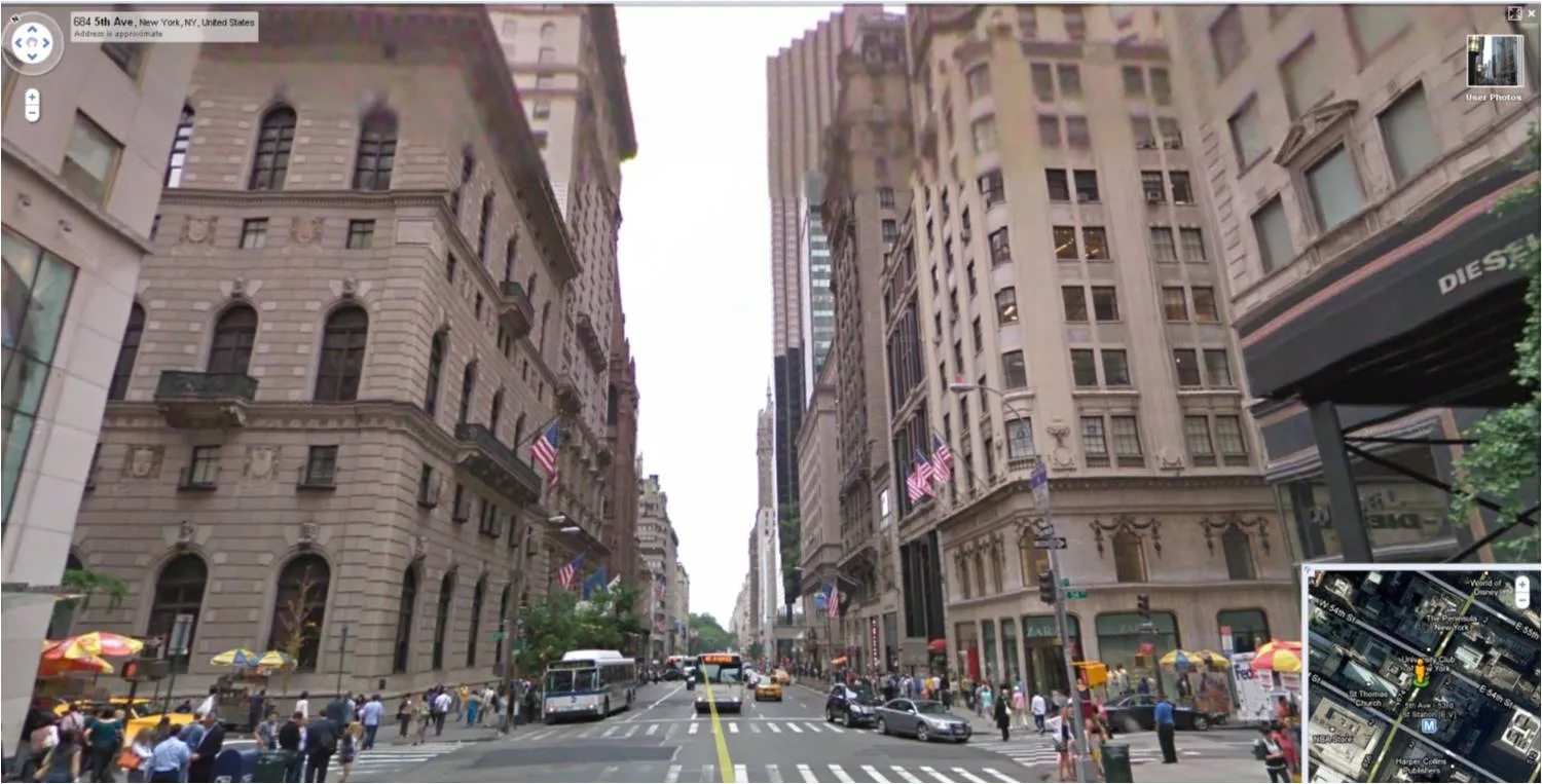
For those who do not know: Google Street View lets you look at images taken in the streets of more and more cities. You walk around, look up, down, sideways. Like Google Earth (see an earlier post about how to tilt Google Earth maps), this is a fantastic source of images for presentations.

  • Images of landmarks that are much more natural and real than the ones you can find in stock image sites.
  • The ability to take unusual photo angles, most stock images are taken looking straight ahead.
  • Ultra-local: if your presentation somehow is set in a certain location, go there!
  • If your presentation is in the area of retail, urban planning, Street View is a great way to give examples of let’s say Starbucks stores in a few different cities, in a few different formats
  • People shots: doing a presentation about mobile phone use, youth fashion trends? Google Street View enables you to walk out in the streets of Paris and see what’s going on.

·Design

The trouble with 99% perfect photo compositions

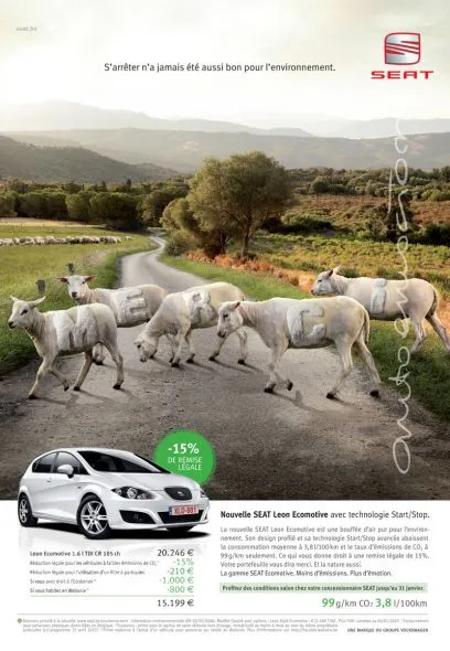
See the ad below. Something is not right. It is hard to see what it exactly is, but the image is not natural. The light? The shadows? The 3D proportions?

Photo manipulations are increasingly easy to make, but the technology of image editing is not the problem. We already learn as a child that getting 3D to look right on a 2D canvas is hard. Architects and designers use a full 3D design environment to create realistic-looking simulations.

But, a 3D composition can look great even if the designer does not even bother to get the proportions right. Art would be have been incredibly boring if painters had stuck to the conventions all the time. Luckily they did not.

The problem are those compositions that are almost right, but not 100%. Look at the ad: very good technical execution, no ruffled borders around the sheep, drop shadows re-created, letters embedded in the fur: far better than most PowerPoint designers (including me) could do. Still the viewer is distracted: what is going on here? A distracted audience does not absorb messages.

In short: distort reality completely or forget about photo compositions all together.

Related, one of my earlier posts contains some useful links about photo manipulations.

Ad via Ads of the World.