SlideMagic Blog

Frequent updates about all things presentations since 2008. Subscribe to never miss a post.

RSS
all posts

Category PowerPoint

·Investor presentation

Send me an executive summary

When an investor is running out of time, conversations often end with “why don’t you email me an executive summary”.

Upon hearing that, startups wil scramble to produce the well-known executive summary format, compressing the entire pitch deck in just a few paragraphs:

  • Has to fit 2 pages, so no space for visuals, use a small font or narrow margins if required
  • Stuff the text with buzzwords and big numbers
  • Include all the features of your product
  • Spend a lot of paragraphs on CV details of the founding team

Think of this from the investor perspective: this document is boring and so dense that it would take the same amount of time to read it start to finish than to page-down through a slide deck. Here is an alternative: “I am sending you a 5 minute pitch”

  • A short and visual document, but it could be longer than 2 pages
  • Explaining the investment opportunity in human language
  • Focus more on the problem, less on financial,  product details, and team details (that can come later)
  • The objective is not to get the investment (yet), but to get invited to the next stage in the investment process, possibly a full pitch meeting
·PowerPoint

My new Macbook Pro setup

So I replaced my computing infrastructure over the past week. Things are moving fast in the world of IT.

  • Laptop. A few years ago having decent graphical power still restricted you to using desktops. No longer. I have gone mobile. (Maybe motion graphics will make me regret it later). No I can use those little downtimes in between meetings to do actual useful work, rather than catching up on email or Twitter.
  • 17", I compared screen sizes and concluded that as a visual designer there is no avoiding the extra weight and size to get a decent size screen
  • Apple. Strangely enough it is actually the physical interfaces that convinced me. A nice machine to touch, nice keyboard, nice track pad. Something you spend the majority of your day on. Interestingly, a hardware decision, not a software one.
  • Cloud. It was surprisingly simple to move to a new environment when all your critical data resides in the cloud: email on gmail, files in dropbox (affiliate link), clients and invoices in Freshbooks (affiliate link), contacts in Batchbook. Everything is in sync on my new machine, and the legacy infrastructure that I continue to use as backup. 1Password synced via Dropbox to keep track of all the accounts
  • Virtual Windows/OSX blur. None of my clients use Keynote, and PowerPoint on Mac is simply not good enough (see a comparison between PowerPoint 2010 for Windows and PowerPoint 2011 for Mac). So in comes Windows, but I totally do not notice it. I use Parallels to create a virtual machine, and my Windows applications run in a Window as if I am working on a Mac. All data is shared and file management happens via OSX. It requires beefing up the hardware though. I put in 8GB of memory, of which I allocate 5GB to the Windows machine. The big customer segment for Parallels is actually hardcore gamers who want to port their favorite graphics-intensive games to the Mac. As a result, performance of a Windows virtual machine is actually very good. There is only a slight delay when you switch over.
  • Adobe alternatives. Adobe software is incredibly complicated and bloated. I need basic photo editing capabilities to resize images for the web and take out backgrounds out of images. Pixelmator is a beautiful Mac app that can do all these things (and much more) in a beautiful user interface. The same with Illustrator, I need it to edit stock vector diagrams nothing more. I could not find an alternative for Mac yet and as a result kept my old Windows CS3 installed (I see no need to upgrade). It is interesting to see that I started to look at user interfaces to decide my software, not so much the features anymore (same story as in hardware).
  • Legacy software. Some of my clients (mostly the large ones) are still running PowerPoint 2003. Hence I actually installed it in parallel to my production software PowerPoint 2010. (It took some time to dig up those old CDs).
·PowerPoint

Financial forecasting in VC presentations

The financial forecast in a VC pitch presentation combines two different pieces of financial information in one chart. Still, you can treat them differently.

  1. The short term burn rate. This is information should highly precise and accurate. An investor is 100% sure she will “lose” this money. If you cannot be accurate, you probably do not have a clue what investment is required to build the company
  2. The long-term dream. There is no point specifying that you will have $50,342,784.12m sales in year 5. You just don’t know and claiming that you do will lose you realism points. Explain to an investor why you think it will be ~$50m
·Data visualization

Reuters issues a 1-page online annual report

Slowly, large publicly traded companies are starting to experiment with Internet and social media as alternatives to the dry and boring annual report. Reuters just issued a 1-page version (see it here), with a promise that over the next few days, this will be followed up with more detailed blog posts about the company and its financial results.

Early online annual reports were a pain. They basically were print documents put online and you had to keep on clicking on “next” links to get to the following page. Rendering of tables and data in basic HTML also did not provide good results. Combine that with slow page loads and you get a pretty useless experience.

New display protocols (and certainly HTML5) will give PowerPoint-like fast navigation controls to online documents. I think a hybrid of a traditional slide presentation, advanced (and fast) web navigation, video and other multi-media, plus social aspects will give a powerful distribution platform for financial data. You get the best of both worlds: PowerPoint-style visualization of data and key strategic messes, and nicely-formated text for those who want more details. Certainly for public investor presentations such as this one, but also for confidential documents. You can distribute login details to (potential) investors you want to share your data with and exclude them from the online data room as soon as the deal process has stopped.

There are also great opportunities in sales. I rarely use a PowerPoint presentation anymore to introduce my own services for example. Rather, I just take people through a few sections of my web site, either in person or via a remote presentation tool. SalesCrunch, the company that is organizing my upcoming New York presentations, is trying to create a platform for these remote sales presentations.

Continue reading →
·PowerPoint

The sales presentation is only a small part of the sales meeting

A potential customer has many ways to get information about your product:

  • There is information on your web site
  • Your competitors bring the client up the learning curve about the industry
  • In your preparation phone calls with the prospect, already a lot of information gets exchanged
  • Maybe you sent the customer a copy of the slides of the sales presentation in advance
  • There could be a product demo that the client already has been playing with

So, when you finally enter that meeting room, it is good to think about the value of the precious 1.5 hour of face time. Maybe it is not about information transfer. Maybe it is about giving your client an opportunity to get exposed to what they have not seen before: you in action, in person.

  • What type of supplier are you?
  • What about integrity?
  • Can you be trusted?
  • Do you understand their questions?
  • Are you flexible?
  • Etc.

The sales presentation is an excuse to figure you out.

·PowerPoint

A review of PowerPoint 2010 (Windows) versus PowerPoint 2011 (Mac)

I have now spent a few days doing real presentation design client work on PowerPoint 2011 for Mac. This post brings together impressions published in earlier blog posts.

The bottom line is that the average user will not notice any differences between the 2 versions of PowerPoint. Some positives:

  1. The application has slightly more Mac fee to it
  2. I like the organized way fonts weights are grouped together.
  3. The integration with Aperture, a photo organizer is very good. If you buy images from iStockPhoto, somehow a lot of keywords are saved with the file. PowerPoint 2011 integrates seamlessly with Aperture, making the full library of images on your hard drive searchable by keyword.

The professional presentation designer however, will notice a few differences. PowerPoint 2010 can do a bit more than PowerPoint 2011:

  1. The selection pane, a great tool construct complex layered diagrams is missing. (An earlier post about the selection pane here)
  2. Toolbar customization could make PowerPoint 2011 crash. Especially, do not try to drag the straight arrow connector into your top toolbar. If your software has been corrupted, see this Microsoft post about how to fix things. [UPDATE, THE RELEASE OF SP 1 MIGHT HAVE SOLVED THIS ISSUE]
  3. Whenever you try to move or resize an object very close to the static guides, PowerPoint will decide to move the static guide, not the object, and staying on the subject of static guides: you cannot space the interval at which you want to set static guides.
  4. Color rendering can be a bit off. When give the text and its background shape the same color, you can still read the text on the Mac, but not on the PC. PowerPoint for the Mac handles colors for shapes and text differently.
  5. PowerPoint for Mac cannot embed custom fonts (PowerPoint Ninja explains what this is)
  6. You cannot insert vector shapes in the Mac version of PowerPoint (see here why this is can be useful), so if you want to adjust the color of a vector diagram, you have to do it in Illustrator and import the illustration as a picture into PowerPoint.
Continue reading →
·Images

Images from Chernobyl

The current crisis at Japan’s nuclear plants triggered this morning’s NYT article about Chernobyl, which will need to wait for another 300 years before it can be inhabited by humans again.

The confusion and uncertainty experienced by the people in Japan must be similar to the surreal experience I went through here in Israel while unpacking government-issued gas masks and constructing a biological/chemical shelter in one of our bed rooms just before the 2nd Iraq war in 2003. I remember taping the windows during live TV coverage of Tony Blair’s speech in the House of Commons advocating military action.

This photo set on Flickr by Tim Suess is both scary and beautiful at the same time.

·PowerPoint

I think I found the cause of the Office 2011 toolbar bug

I was in the process of designing a beautiful chart on my new Mac when I got too confident and decided to modify the toolbars of PowerPoint 2011 and… lost all my work again (see my previous rant about this bug)

In sbort: if you customize your toolbar in PowerPoint 2011 for Mac, the program will crash as soon as you enter slideshow mode. Googling around reveals that many users have similar problems: corrupt toolbar files that cause crashing. I decided to dig a bit deeper and through a process of trial and error found that the offending customization button are the straight arrow ones that you find in the autoshape menu. The icon of these bars still have the old PowerPoint 2008 look, I think Microsoft forgot to update them.

They are probably not that many geeky PowerPoint users that would customize their toolbar with straight arrow connector buttons so it would have been hard to uncover the bug. :-)

I am forwarding this post to someone in Microsoft I know, but if there are any Microsoft MVPs reading this post, please pass it on and ask Microsoft to fix the bug.

The post that I originally planned to post will to have to wait a bit…

·PowerPoint

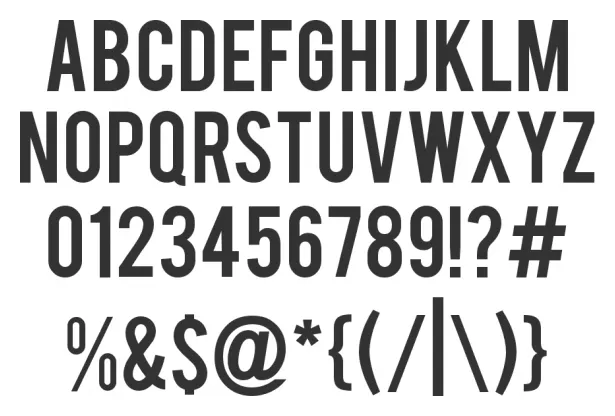
Narrow fonts: Beebas

Some fonts are suitable for small text, some for large text, and some for headlines. Narrow fonts are especially useful for the latter. You can still fit in a lot of information, even for large type sizes. See the differences below. Beebas Neue is a free font that is very space efficient, you can download it here.

·PowerPoint

Mindmapping on the iPad: iThoughtsHD versus DropMind

Triggered by the iPad touch interface, I started to use mindmapping for the first time in presentation design. Mindmapping is a process in which you jot down ideas and the connections between them quickly, and edit, clean up, and move things around later to get a more organized picture. I must say, it works a lot better than my previous approach: the pencil and a piece of paper. Especially since it is a lot harder to lose that piece of paper with your notes on it.

I purchased 2 iPad apps: iThoughtsHD and DropMind. iThoughtsHD was designed specifically for the iPad, and is the cheaper of the 2 ($10 versus $50 for DropMind). The DropMind app is an extension from an existing suite of desktop and web applications. The latter probably explains why it took a relatively long time for DropMind to come out with the app, a working iOS 4.2 version only appeared last week in the app store.

When reading my impressions remember that I am a light-weight mind mapper, just using it to structure ideas for a presentation. Reading around on the Internet it looks like mindmapping is a whole design approach taking things much further than I do.

For the purpose I use it for, iThoughtsHD works perfectly fine. The interface is straightforward and clean, and it is every easy to export mindmaps to PDF or sync them using a Dropbox account.

DropMind’s user interface looks a little bit more sophisticated with more graphical options. When you buy the iPad app, they also offer a perpetual license for the desktop client, and the web app. You can exchange mindmaps between the applications. There is a wide arsenal of tools available that I did not yet have time for to explore. The one drawback I found is that when you export a map to PDF or JPG, the resolution seems to be very low (not an issue with iThoughtsHD). I think this is a bug, or maybe I did not configure the settings correctly).

Continue reading →