SlideMagic Blog

Frequent updates about all things presentations since 2008. Subscribe to never miss a post.

RSS
all posts

Category PowerPoint

·Investor presentation

I don't know

When pitching VCs it is better to say “I don’t know” if you do not know the answer to a question than making something up that turns out to be wrong later. Management integrity is a more important investment criterion than having all facts readily accessible in your head.

·Delivery

Click-click

When I have not prepared a presentation well enough, and/or made last minute changes to the  deck, I find myself skipping a slide during a live presentation. Click-click, when you see a difficult slide coming up in presenter view (more about PowerPoint presenter view here).

Where do you need to practice most?

The opening of the presentation, and not only because here you are likely to be a bit nervous at this stage of your talk. It is here, where you usually talk about yourself as an introduction. You know the content of this section very well (hey, it is about you) and you do not bother rehearsing. So you are on stage, you go blah, blah, blah, and a feeling starts creeping in. This section takes a long time. Is all this detail about me really interesting to the audience. How should I have told the story about myself in such a way that it sets up the rest of the presentation correctly? It is hard to talk about yourself, better practice it…

Visual mental placeholders. These are slides that are great to talk around in a one-on-one meeting. You probably have used them a lot. You know them inside out, and hence do not bother to practice them. But when you are on stage, you realize that you do not have a good sequential story in your mind to talk a larger audience through this slide.

Bad slides. You will discover them when you practice. DELETE.

·PowerPoint

We need to cut slides!

Think about how a movie director cuts down a movie.

  • She does not just chop a few scenes randomly
  • She does not double the speed at which the movie runs.
  • She does not use picture-in-picture to cram two scenes in one screen shot in parallel.

Instead:

  • She thinks in terms of time, not number of scenes. What can I do in 90 minutes?
  • She thinks about plot lines, not scenes. Can we lose that flashback without impacting the story?
  • She thinks about the overall story. Now that we cut a few plot lines, do we need to overhaul the whole story line?

You are your own presentation director.

·PowerPoint

Emailing presentations without verbal explanation

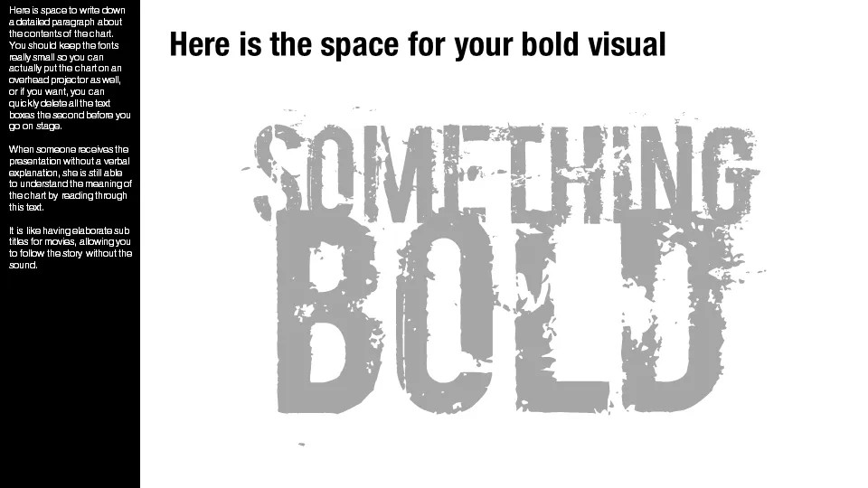
A presentation designed for a large audience with big images and few words cannot stand on its own without verbal explanation. Ideally, you would design two separate decks; one for the big audience, and one for emailing. But, constantly updating two presentations in parallel is time consuming and prone to errors. Here is a work-around.

Design your presentation for a 16:9 screen and add a text column on the left side. Put the full narrative of the slide in a tiny font. The email reader gets the full explanation of the chart. The big audience will see a blurry bar on the left of the slide, clearly distinct from the larger visual. You could go further and quickly delete the text bars a few seconds before you go on stage.

Not perfect, but good enough.

·PowerPoint

The real market is for sales presentations

I have been designing an enormous amount of startup venture capital pitches over the years. The stakes are high, the story is often not clear, the founders are open to new forms of communication and so they are willing to invest in a good pitch deck. I enjoy these projects immensely, there is nothing more fun than taking an idea from 0 to a beautiful visualization.

It is a relatively small presentation design market though. The big change will be in the 1,000s of boring sales presentations that are used every day. Corporates burn millions of dollars on advertising, billboards, fluffy white papers, and conference booths, while sending the salesforce on the road with a low budget PowerPoint deck that is embarrassing to use. It is time to re-allocate some of that marketing budget and stop killing these great stories with bullet points.

·PowerPoint

Get your hands dirty

The other day I was doing the first sales presentation design interview with a startup that soon will start selling storage systems for large data centers that will eclipse the performance of the big names in the industry. Two presentation options

  1. Flaky chart: 2 columns, our performance, their performance.
  2. Substance chart: a series of charts that explains how a totally new type of storage architecture can deliver these performance figures

The first approach does not stick, the second one does, even in the absence of a large number of customer examples.

·PowerPoint

The check list goes in last

How do you make up your mind? Think of this, consider that, go back, look at this. A slightly random process in which you jump from one aspect to the other. Once we are done with this process, we go through a more orderly check list to see we’ve covered everything.

Here are the implications for many of my presentations:

  • Upfront, tease the audience something great is coming, but do not try to summarize or explain the whole pitch in a structured (=boring) way
  • Tell the story using the structure a movie director would take, not the author of a business school text book
  • Come back with an organized summary, the check list, to show the audience that we have covered all.
·PowerPoint

Microsoft Office 2011 Service Pack 1 (version 14.1)

Microsoft posted its first Office 2011 for Mac update yesterday, and as I can see now, it took care of the instability issues in PowerPoint 2011 that I have been complaining about (fingers crossed). Still, there is a long feature wish list for SP2 to bring it at par with the Windows version, of which custom font embedding sits at #1. See my earlier review of PowerPoint 2011 for Mac.

·PowerPoint

My NYU presentations on SlideShare

Last week, I spoke at a SalesSchool event at NYU in New York. Here are the slides I used during the 2 evenings. Both presentations start off the same, but then diverge as they focus on VC pitches and sales meetings. SalesCrunch will post video fragments of the evenings later on their site.

At the end of the presentation, I touch briefly on the challenges of presenting without eye contact. For more suggestions about presenting remotely and in webinars, see this post by Olivia Mitchell.

·PowerPoint

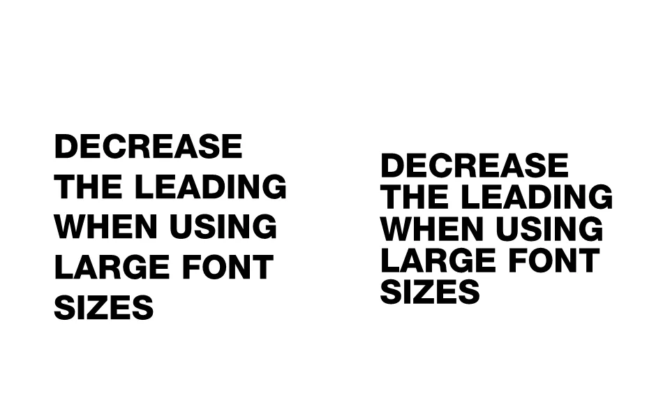
Reduce the leading of large font sizes

Leading is the horizontal spacing between lines of text. For regular font sizes, PowerPoint adjusts the leading fine. When you start getting to huge font sizes though, things tend to go wrong, the distance between lines of text is too large.

To reduce the leading in PowerPoint, select the text, right-click, select paragraph, set spacing inside the spacing group to exactly, and lower the number that pops up.