

A presentation designed for a large audience with big images and few words cannot stand on its own without verbal explanation. Ideally, you would design two separate decks; one for the big audience, and one for emailing. But, constantly updating two presentations in parallel is time consuming and prone to errors. Here is a work-around.
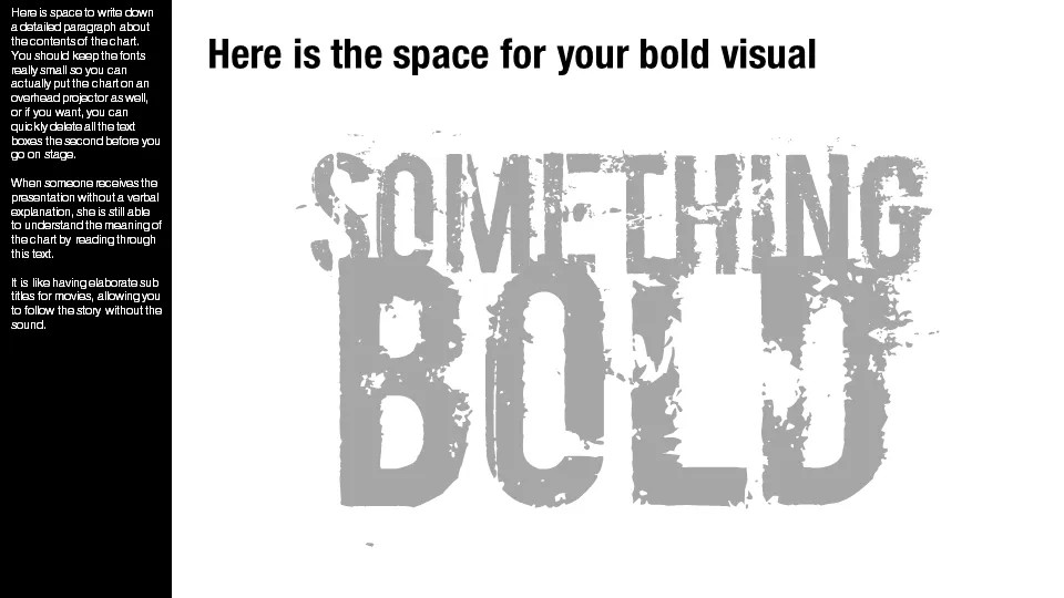
Design your presentation for a 16:9 screen and add a text column on the left side. Put the full narrative of the slide in a tiny font. The email reader gets the full explanation of the chart. The big audience will see a blurry bar on the left of the slide, clearly distinct from the larger visual. You could go further and quickly delete the text bars a few seconds before you go on stage.
Not perfect, but good enough.
9 comments
Usually, they all-too-often just put all the text on the slides.
Thanks, Jan!
David
So what I do is, beforehand, record the presentation with naration, publish it as a video with Camtasia, and either send them that, or put on YouTube and provide them a link.
Audio/visual withou the audio is only half there.
I also use Steve's approach when the attendants need a handout based on my presentation. I put all the information and details into the notes and print the PPT with the notes, which have each slide at the top. The result is nice enough. You can even format the note's text.
Gonzalo
I hope those who post to SlideShare heed this advice, especially since SlideShare's current interface (appending slide notes/script far below the image of the slide) renders such valuable context almost useless.
Instead, as Steve said, you can PDF your deck, and you can do that to your notes pages: see these steps and at step 6, click the Options button.
Really enjoying your blog - thanks for all the great information.
There is a simpler way to do what you just described. Pop the explanatory text in the notes area for each slide and then email the Handout style of printout via PDF.
Cheers,
Steve
Simplify your business. Simplify your life.
Thanks for the great idea, Jan.