Subterranean Homesick Blues
What a brilliant presentation concept by Bob Dylan in this video of his song Subterranean Homesick Blues.



Frequent updates about all things presentations since 2008. Subscribe to never miss a post.
What a brilliant presentation concept by Bob Dylan in this video of his song Subterranean Homesick Blues.
The slides hurt the eyes, but the content is good. VC Dave McClure just posted an update of his deck with advice on how to pitch a VC.
PowToon aims to enable you to create cartoon-style, animated presentation and video clips without professional illustration and motion graphics software. I test drove the beta version.
When you look at many cartoon-style videos you see that they are actually not that complicated from a graphics point of view. Usually they involve a number of scenes (slides), they use static characters, basic entrance, exit, and emphasize animations and sometimes a cute hand that puts items on the slide, all accompanied by some simple music.
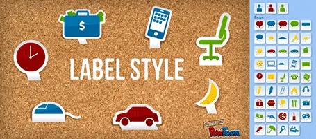
And this is what PowToon does. The edit interface looks Windows blue, it allows you to place items in a slide and specify the animations. In theory, PowerPoint or Keynote can do the same things, but it requires a deep understanding of the software, plus a library of characters.
There is definitely a market for a tool like PowToon. I do not envision these type of animations to be used in a stand-up presentation, but rather they could be useful to create demo videos on web pages, or presentations for emailing to prospects.
The basics of PowToon work great. I spent 10 minutes to stitch together this video based on a pre-defined template. PowToon is still in beta, and there are a number of features that I would recommend the team to incorporate:
Infographics can be beautiful, but many times this comes at the expensive of clarity. This chart explaining the seasonality of fruit on Life Hacker is an example. The designer went for a circle concept because nature does not break up years between December and January. Still, this one would have been clearer with (fatter) horizontal bars.
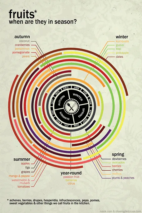
Original design by Chasing Delicious.
The other day I could a project inquiry. The current deck looked like an infographic, it was very nicely done: soft pastel colors, retro fonts, nice icons. Still, the company had difficulty finding traction with investors: where is the meat, where are the numbers, this looks like an ad.
Many VCs come out of the world of engineering or banking which has a certain quantitative, macho communication style to it. Even if your product positioning is “cute”, your investor presentation should probably a bit more testosteron-loaded.
In my previous life as a management consultant, I have spent many years inside consumer goods companies. Believe me, their management presentations do not look like the ads they put on TV for their products.
I am not saying that you should kill the cute slide deck (the world would be a lot more boring if that happened on a large scale), I just wanted to emphasize that if you decide to go with this style to be aware of your audience and compensate in some other way.
Everyone would agree that Steve Jobs was a pretty good presenter. But he is said to have practiced two to three full time days before a major product launch speech. Two to three full time days! I bet if you put in that effort before your next presentation, you would be pretty close.
Practice means real practice: standing up, going through the slides first to last without interruption or a quick skip back when you make a mistake, you cannot do this on stage either. Make a video of yourself if you can. Put your screen where your monitor laptop will be (so you do not have to look back at your screen to see what slide is on).
It may sound counter–intuitive, but you actually need to know your story inside out to be really spontaneous. There is no such thing as “winging it”. Your audience will notice, you will use “uh” and “oh” all the time, the key lines will not come out the way they should, you will repeat yourself all the time.
And memorizing the talk line by line is not enough. If an actor has to go back to her memory for every line in the play, she will not have the mental energy to focus on the mood of her character. You need live and breathe your story. Then it will come out naturally, and you can improvise around your story line depending on the reaction of your audience.
The exception here might be webinars. Here, the audience cannot see you and you can probably get away with reading through a presentation line by line.

One of the most annoying shortcomings of PowerPoint 2011 for Mac is the inability to lock drawing guides. An external app can solve the issue.
A guide is a thin blue line on your design canvas along which you can align slide objects. If you drag an object close to the line, the object snaps into place. In this way objects on multiple pages are positioned in exactly the right place. I use them to mark slide borders, and more importantly the vertical center of my drawing canvas when it does not coincide with the center of the screen.
It is very important that these drawing guides stay exactly in the right location, and this is the issue. As soon as your cursor comes anywhere near a drawing guide, PowerPoint will make moving the actual drawing the priority. So if you try to straighten out an object that is a little bit off and want to fixate it against the guide, PowerPoint moves the guide rather than moving or resizing the object.
xScope (affiliate link) is an app for Mac that allows you to draw screen guides independent of the underlying application. The good news: PowerPoint does not move your guides anymore. The bad news, objects do not snap, you have to make sure manually that they are perfectly aligned. One other comment, the app lets you decide where to draw lines and where not when you use 2 screens. xScope does not allow you to manage this on 3 screens.
It can be a real pain to space out logos in a logo page nicely. My trick is to use a table with a really fine grey line between cells. It is easy to adjust the grid when you need to insert and/or delete columns and/or rows.
See here an earlier post on how to make great looking logo pages.
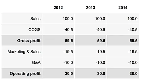
Sometimes, you do not need a data chart at all, and nicely formatted table with rounded numbers might just be the best option to visualize your data. This is especially true for financial statements with lots of information, or in situations where one chart contains a lot of numbers with completely different orders of magnitude. Some quick improvements you can make to make a table look good:
UPDATE: on request an example of a table layout I often use.
Case studies in investor and sales presentations are most of the time hollow and fluffy quotes that were clearly the result of an email saying “Do you mind if I quote you saying that our solution is highly flexible and scalable?”.
Here are a few ways to make a case example real:
Case studies can be more than a simple quote of text. If you want to show that your system can be installed within 6 weeks, why not show a bar chart of your last 10 customer installations, with the exact time it took to install the system?
Tell a real customer story.