SlideMagic Blog

Frequent updates about all things presentations since 2008. Subscribe to never miss a post.

RSS
all posts

Category PowerPoint

·Investor presentation

The pitch bottleneck

Sometimes a startup idea is already stuck in the mind of a potential investor. I think pretty much any VC is convinced that ultimately mobile payments or social friend-to-friend shopping recommendations could be huge businesses. The bottle neck is: how to make it work. When you pitch your startup idea in one of these fields, you will be welcomed by a healthy dose of cynicism.  Do not waste your time on preaching to the converted, but have your pitch target the bottle neck in the mind of the investor.

·PowerPoint

Re-discovering Smart Art

Smart art inside PowerPoint is a semi-automated template engine for diagrams. It easy to add and remove boxes/bubbles, edit text. The idea is good, but I have not used them a lot:

  • The standard out-of-the-box formatting is ugly
  • Although there are many frameworks to chose from, none of them usually really work for my particular presentation problem
  • I have seen them too many times in presentations where designers simply dump in a smart art graphic to replace a bullet point chart (the result is still a bullet point chart that looks a bit different)

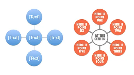
Recently, I have started to use smart art in my presentations, but in a different way. I use them to position objects on a slide by picking only the very basic configurations and reformat the slide items heavily so you can hardly recognize it is a smart art object anymore. An example below:  

Well, I said before: your PowerPoint is really good PowerPoint if your audience cannot tell it is PowerPoint…

More about smart art on the Microsoft site, or over at the PowerPoint Ninja blog.

·Delivery

In between the lines

One of the most important criteria for an investor to invest in your business is you, the entrepreneur, and the in-person presentation is an excellent way to figure you out as a person. Information about all the other elements of your company is covered in the slides, your business plan and/or your website. Investors can read about your CV, but the only way to figure you out is attending that 45 minute presentation. What you present is important, but the other 50%, how you are as a person is also vital. How is to work with you as a Board member with you, the CEO, at the helm of the company?

Can you be trusted? Trust and integrity are one of the most important things a potential investor is looking for. And it does not really work to put a slide on the projector that says “I never lie”. The investor needs other clues that come out in between the lines of your slides. Maybe an investor knows the answer to a question, but asks it any way. If you do not know the answer it is better to say so than make something up. Do you start to gossip, leak information, to people you have just met 20 minutes ago? If you do it to the potential investor, you are likely to do it to others as well.

There is no upside in bending the truth. So maybe you were successful in getting away with some form of reality distortion in the pitch meeting, the investor will eventually find out during the extended due diligence in the weeks (or sometimes) months to come. You enter an exclusivity period, you continue to burn money, and at the end the investors finds out and withdraws from the deal (integrity issues are a huge red flag). Then you are left without an investor, without funds, and a tarnished reputation as you have to explain to other potential investors why this one pulled out. Your entire company is at risk.


Continue reading →
·Images

Smartphone screen shots

The best way to make a slide with a smartphone screenshot:

  • Get a stock image of a smartphone without the device maker brand (using Google Image search might get you into copy right issues)
  • Take the actual screenshot on your smartphone, in my case I use my iPhone browser to go to the web page and press the home and on/off button at the same time. Email yourself the image
  • And here comes the trick: apply a subtle inner shadow to the image. You see the difference in the image below, the left side one looks a little bit bland, the right side looks much more natural

·Keynote

A Microsoft strategy mistake

This Twitter conversation just unearthed another feature that is missing in the Mac OSX version of PowerPoint:

@ideatransplant Unfortunately no trim video options on PowerPoint:mac - Trim Video Clips bit.ly/MeJKHH — Geetesh Bajaj (@Geetesh) July 10, 2012

There are many more, see older posts about PowerPoint 2011 for Mac versus PowerPoint 2010 for Windows here.

I do not think the reason for this is a technical one, it should be possible to write the same software for both platforms. Hence, Microsoft must be thinking that by making PowerPoint 2010 for Windows just that tiny bit more feature rich, it will convince users to stay on the Mac platform.

I think this will be backfiring: Mac users will simply switch to Keynote. Microsoft should create an organizational separation between the Windows and Office business, the latter should consider the Mac a highly profitable platform for selling software.

·Investor presentation

Use that video

When you have invested in a great animated promotion video to put on your website, why not use it in your presentation? A good video can tell a relatively complex story in under 2 minutes. Most of these videos contain high quality art work that is great for use in a presentation.

Embed the video in your presentation (I prefer putting in the actual file rather than linking to an YouTube video) and create visual connections later on in the deck using screen shots of the video (either page-filling or small thumbnails).

Do not feel embarrassed that that video just cut your bullet point product explanation from 15 minutes to just 2, your audience will appreciate it.

·Investor presentation

Elevator pitches are 2-way

If you got the attention of a potential investor in a random setting you can decide how to use your 2 minutes. One option is the 1-way monologue, where every single one of these precious 120 seconds is filled with information and facts.

The other option is pitch your idea briefly, read someone’s face, interpret a quick question and adjust your story to the concern you see.

I think the second approach is better. Maybe you lose 30 seconds of airtime, but the other 90 seconds are definitely more effective.

·Keynote

PowerPoint as a word processor

PowerPoint or Keynote are perfect alternatives to word processing applications to write documents that are primarily intended for reading and not for presenting on-stage. Corporate executives are so overloaded with information that the memo written in long-hand text is making way for a more visual way of presenting that is somewhere in between a dense text and a keynote presentation. If you write a book or a complex legal contract you probably rely on some of the more advanced word processing functionalities (style sheets, numbering, revision marking, etc.) For all other situations, PowerPoint or Keynote work fine.

The first and most important thing to do is to realize that you are writing a document for reading not presenting and adjust your style accordingly:

  • Reduce your font size to make space for more elaborate sentences. You will not be there to present the document, so the text should be self-explanatory. Big bold fonts work great for catchy headlines, for actual reading a smaller font size is more readable (a bit counter intuitive).
  • Don’t make your sentences to long. A book has only 7-10 words on a line, and newspapers use columns to keep lines short. The eye can get lost if it needs to make left-to-right movements over longer distances. Consider using a column layout of the page as well, either across the page, or one column at the side of the page and an illustration covering the rest.
  • Add tracker pages, page numbers, and other reminders of where the reader is in the document. I believe that in short stand up presentation these elements just add clutter, when we sit down to read, we need to bring them back in.
  • Maintain white space on the page, use wide page borders to create a calmer look. It is better to shrink the text and give it space to breath, rather than increase the font size until you covered the entire canvas.
  • Use very subtle techniques to highlight text. Too many bolds, italics, and underlines create clutter. Only use a few different font sizes.
  • Make sure that objects and text columns are properly aligned on each page.
  • Dark background are usually not very readable with smaller text, and are definitely a problem when your document has to be printed. Go for a light background instead.
Continue reading →
·Images

Cropping a composition

The 2 photos from a birthday party below show what an impact cropping a good composition can have on the quality of your images. I used the iPad app Snapseed (affiliate link) to do the following:

  1. Cut out the eating man, cut out the light/bright parts of the image at the top to focus on the boy in the foreground and the girl reaching fro the bubble in the back
  2. Take out the color since the composition of the greens and the clothing of the kids does not really look interesting. The B&W image enhances the texture of the bubbles, leaves, and grass
  3. Selective up the brightness around the faces of the boy, the girl, and the boy back to the left
  4. Up the sharpness and structure of the image

The result is a transformation from a bland image to one that looks like a Matrix-style freezing in time. I am constrained here by the 455 pixel limitations of Blogger, the final image looks better at its proper resolution.

·Investor presentation

How to put video inside PDF

More and more of my presentations start to use video, and my preferred format for emailing/Dropboxing decks is PDF, so how do you insert a video in PDF? It is easy with Adobe Acrobat X:

  1. Save your presentation (PowerPoint or Keynote) as a PDF without the video
  2. Open the deck in Acrobat X and select tools at the top right
  3. Select multimedia, select video, and draw where your video should go with the cross hairs
  4. Select the video file, or insert a YouTube link (I went for the first option, the video size was below 10MB)
  5. Select advanced options, and select use poster image from file to pick the right cover
  6. Click done

The investment bankers of a recent client insisted on the traditional Executive Summary to send to potential investors. I used this video and a 3 column dense text layout to turn a boring bullet point list into a nice looking one page document meant for reading and watching.

Unfortunately, the video does not (yet) play on an iPad…