Torn
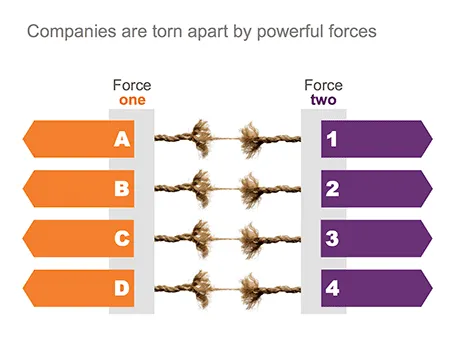
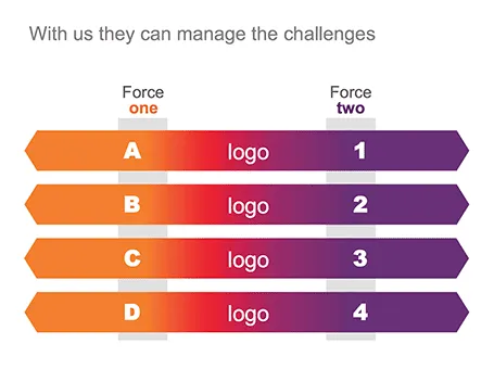
One of my clients is saving companies that are caught between two opposing forces. Here is the visual concept I used that explained the 4 contradictions.


Frequent updates about all things presentations since 2008. Subscribe to never miss a post.
One of my clients is saving companies that are caught between two opposing forces. Here is the visual concept I used that explained the 4 contradictions.
Over the next few weeks posting frequency will drop on the blog as I will be spending more time with my family and less time at the computer. I hope you all have a great summer as well.

Image credit: fridgeirsson
Everyone can install a preview of the new and upcoming Microsoft Office 2013 free of charge. Follow the process outlined here, and take into account some of the health warnings by Geetesh Bajaj (be especially careful with Outlook). I installed my version on a Parallels virtual PC on my Mac and limited my mini review to PowerPoint.
Probably on purpose, Microsoft made very little changes to the menu structure of PowerPoint. Anyone using PowerPoint 2010 will feel at home immediately. Everything stayed in the same place. The look and feel of Office 2013 has improved a lot: clean lines, fewer gradients, fewer shadows, light fonts. The UI radiates calm and good taste. Almost a bit too calm, as it can be hard sometimes to see the contrast of white slide backgrounds against the background of the design canvas. But overall, very good.
Microsoft has made the 16:9 aspect standard in PowerPoint 2013. This will work well with modern computer monitors, but I am actually not a big fan of designing slides in 16:9. It works great for movies, but for visuals I find a wide screen somewhat limiting. Also, old VGA conference room projection screens have a 4:3 ratio, and more importantly, I do not expect tablet devices to go to a 16:9 screen ratio.
If there is one criticism for Microsoft, it would be the bullet point template: it is still there. You insert a new slide, and the bullets are waiting for you to be filled in. The entire slide master is still the messy collection of bullet point-based slide layouts with big page numbers and dates on every page. Maybe with PowerPoint 2016, this will be eliminated…
If you use a custom font just on one page of your presentation, it is better to use the text as an image, so viewers of your presentation do not have to install that font on their computers in order to see it. Microsoft PowerPoint gives the option of paste special, past as image but - at least on a Mac - the resulting graphic looks horrible. I simple make a screen shot of the text and paste that in.
I usually do not get draw into a fight, the exception was recently when a client asked me to design a presentation that was a response to a presentation by a competitor that was a direct attack on the company.
The competitor document consisted of 5 pages of dense text with long sentences written in a style of two children complaining in front of the head teacher: “She says, but that is not true, then I say, you see that I am right?”. Lots of quotes, lots of complicated arguments, no numbers, no visuals.
My design was different. One simple headline per slide, one simple fact or illustration to support it. I did not discuss any features of my client, did not repeat the sales story of my client. Just corrected fact after fact after fact. I think it works pretty well, it is just a bit a waste of all that negative energy that goes into aggressive presentations.
I have never been a fan of stock image photographers making pre-fab slide compositions, but in one area they can add value: digitally replicating items to infinity. See the attached image by higyou on Shutterstock. It is worthwhile visiting multiple stock image sites for these type of renderings, since they often can only be found exclusively on one site. Have a look at Filter Forge if you want to try to create these types of effects.

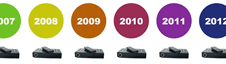
Here is a simple concept to visualize a problem that the cable television industry has: replacement cycles of hardware sitting in the people’s homes is really loooooong, especially compared to how often we upgrade our mobile devices. In this slide I used repetition plus cropped the years on both sides of the page to create that sense of continuity.
Another hard to find feature in PowerPoint. It is possible to change a shape, for example turn a rectangle into an oval. Select the rectangle, go into the SmartArt menu, select the shapes button, and the select the shape you want instead.
I signed up for a trial of Microsoft Office 365, the cloud-based version of Microsoft Office to see whether it could be a work-around to get the Windows version of PowerPoint to run on my Mac. (There are a few bits missing in the Mac-version of PowerPoint).
Not every Office user is the same. For the corporate user that needs access to files on any device, plus the ability to make some small edits to Office documents that are created on desktop applications, the Office 365 offering makes perfect sense.
But Office 365 is not ready yet to become a core design platform. I tested only PowerPoint, and ran the web app in Google Chrome on Mac OSX, please correct me if some of the limitations were due to hardware/software issues:
In a few years from now, Microsoft Office applications will run smoothly across devices and platforms, we need a little bit more patience.
Advertising agency RPA made a bunch of Apple-style ads for common products, probably intending to show that the world would be boring of all ads looked like this. I actually disagree, and would welcome to see the clutter in advertising go.

You see how easy it is to create professional looking slides by just applying a bit of white space and picking the right crop for your images. You do not need to be an advertising professional to do this, you do not need sophisticated software to do this.

Via AdFreak.