SlideMagic Blog

Frequent updates about all things presentations since 2008. Subscribe to never miss a post.

RSS
all posts

Category PowerPoint

·PowerPoint

Clouds in PowerPoint

The standard cloud shape in PowerPoint is not very pretty. Especially if you need a different aspect ratio, there is no option but to stretch the shape, making it look even worse. My solution is to combine multiple cloud shapes into one to get a decent new shape (SHAPE FORMAT, MERGE SHAPES, UNION). See the example below.
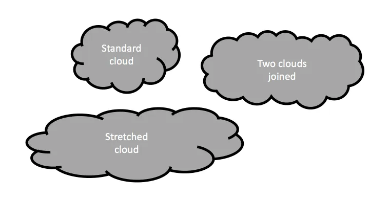
It is interesting to see that merging shapes also kills the “inside” cloud contours.

You can get more sophisticated and design your own cloud shape based on circles. Here is my attempt in 2011 to recreate Apple’s iCloud logo in PowerPoint.

Art: View of Haarlem with bleaching fields, Jacob van Ruisdael, 1670
·SlideMagic

Example PowerPoint conversions

Many of you are requesting PowerPoint conversions of the templates that ship with SlideMagic. You will see that the conversion works nicely, but that it is inconvenient to make structural slide edits in the PowerPoint version of the file, doing them in SlideMagic is much easier.

If you want to check out how converted SlideMagic presentations look, I have put the files all in this shared Google Drive folder.

·Data visualization

Rows or columns?

When designing a table there is always the question: which dimension to put in rows, and which in columns. Personally, I do what looks best, without applying any specific rules.

  • If one dimension has labels that are very long, I prefer to put them in rows
  • If one dimension has lots of data points, I tend to put them in rows (16:9 screens give more flexibility for wide designs though)
  • Years usually go in columns
  • Big options (1, 2, or 3) usually go in columns
  • Ranking different values usually is better vertically, it is easier to compare a column of numbers than have your eyes move across a row of numbers.

Art: Lyubov Popova, Air, Man, Space, 1912

Click here to subscribe to the blog

·Keynote

Text on 16:9

Many people think that the wide screen 16:9 format looks modern for presentations, a slide fills the entire LCD screen, rather than being framed by 2 black bars or worse: stretched/distorted while you cannot find the screen remote in the conference room.

There is a problem though. Widescreen was designed with movies in mind. For text it is a disaster. Even at a decent font size, there are too many words on a single line, it is hard to follow for the eye.

Solutions:

  1. Even bigger fonts
  2. Rather than list things vertically, try putting them in boxes that are horizontally spaced out
  3. Stick to 4:3 and find that sticky, dusty, old, remote control in the conference room (look for the ASP button)
·Keynote

3 things with 3 things each

Management consulting stories are always divided in 3 or 5 components (optimally starting with the same letter), and each of these is then divided into 3 sub components as well.

Connect, communicate, control. And to achieve connect we need to aggregate, accumulate, and accelerate. This works reasonably well in documents for reading (if the verbs are chosen meaningfully and not using a dictionary looking for words starting with C).

Verbal pitches are a bit different though. A human, person-to-person story is flatter, more linear. It is hard to go up one level, down to the second point if we do not have the hierarchical structure in front of us. Also, using too many words that start with a C make you sound like a consulting report, not like a genuine speaker.

Listen to yourself: if it sounds wrong it probably is wrong.

·Keynote

You didn't know you need this

If you pitch your product as a direct alternative to something else, the purchasing manager might say that it is a nice solution, but we already spent our budget on something that is acceptable. Often, it is better to convince the buyer that this is a new market, a new product, that has no substitutes yet. An opportunity for startups that are out there to change the world.

·Images

Thomas Leuthard

Thomas Leuthard (web site, Flickr) is a street photographer who published his work under a Creative Commons license on Flickr (attribution is required). His work is of very high quality. His images make great backgrounds for presentations that need an urban setting.

Image by Thomas Leuthard
·Keynote

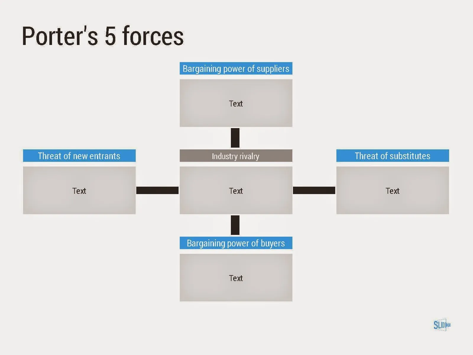
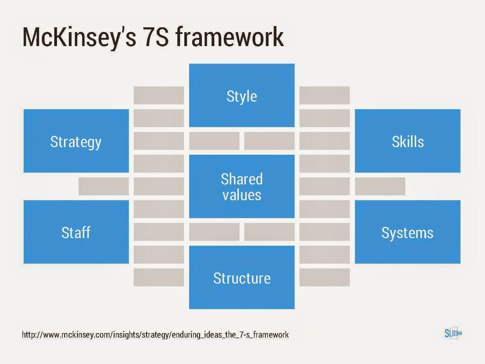
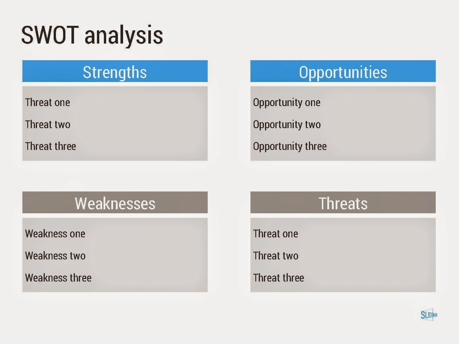
Consulting frameworks

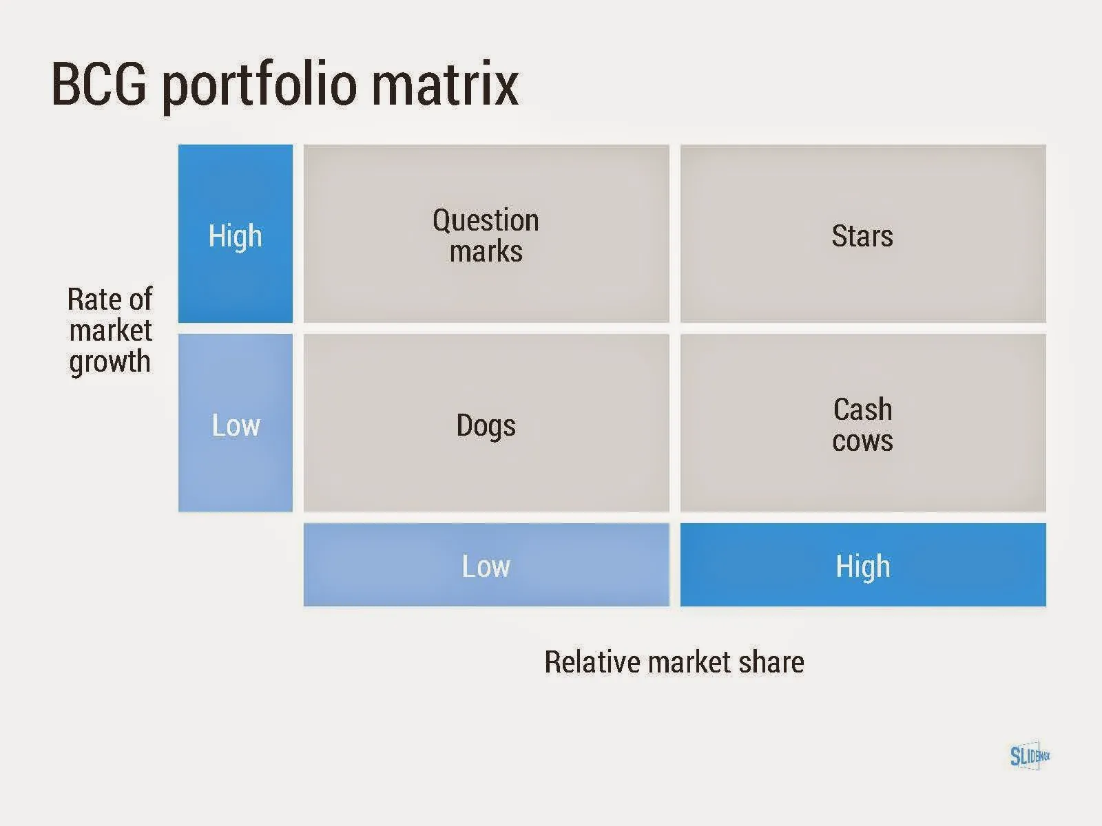
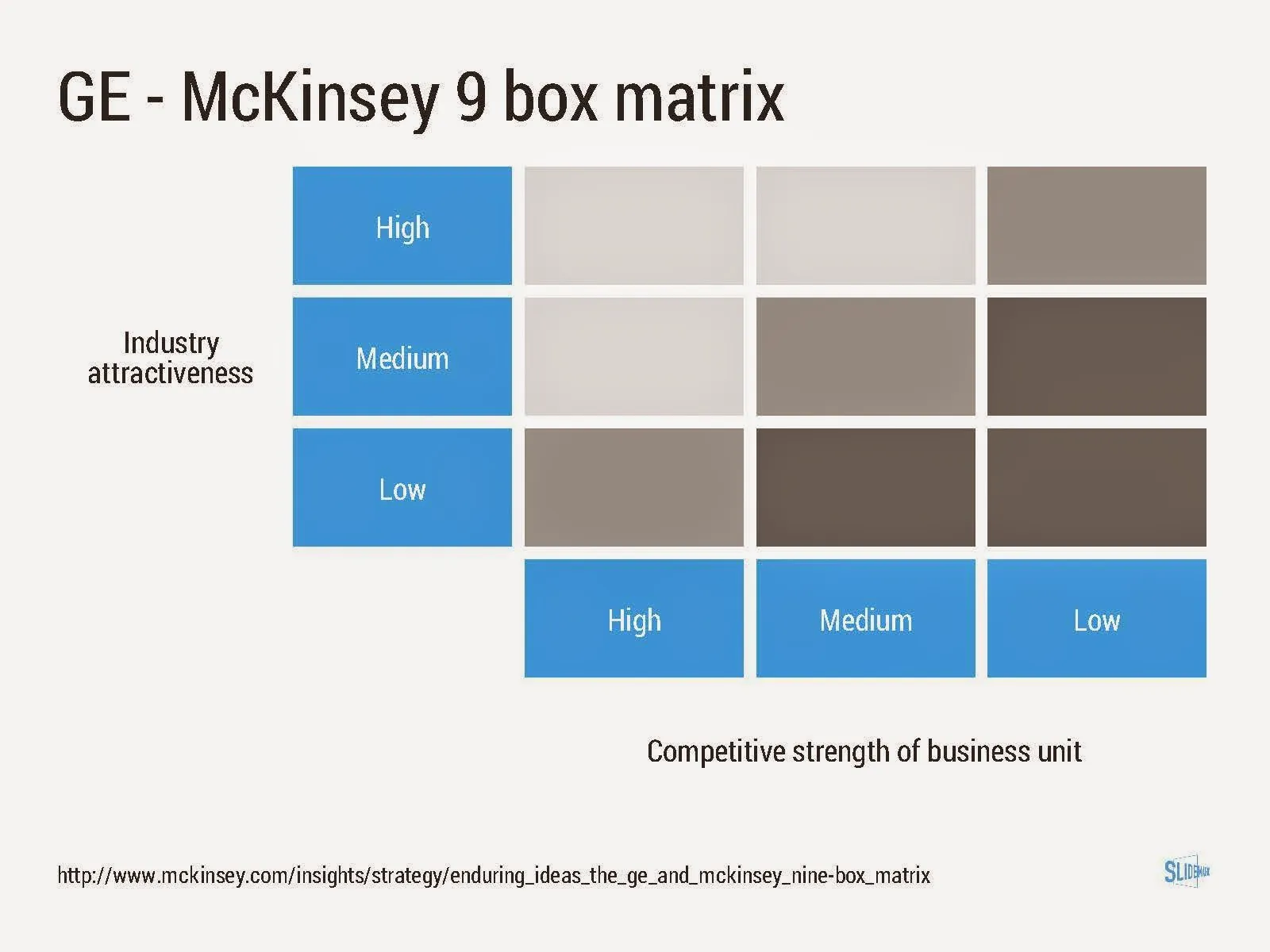
I added a new set of templates to my presentation design app SlideMagic: consulting frameworks. It was an interesting journey back in time (I used to work for 10 years at McKinsey back in the 1990s).

Putting them in SlideMagic was interesting, it shows exactly what SlideMagic is supposed to do for business presentations. Take unnecessary complexity out of visual designs down to a level that the chart still says what it needs to say, but that you do not need to have a degree in graphics design to make them. I had to make slight deviations from the original here and there (Both SlideMagic and layman designers do not like curved shapes for example), but the end result is pretty good.

As to the content of these frameworks. They are more tools to help you think about a problem than slides that will get your audience jumping out of their chairs. Many of them are linked to classic micro-economics theory (demand/supply/competition). I think the strategic issues of many companies today have moved beyond these problems. Still some frameworks can work to kick start a discussion, they good old SWOT works great in group white board discussions.

·Investor presentation

And also, and also, and also

There are so many wonderful things to say about your idea. all the problems it solves, all the things it can do, all the thought you have put in to make it perfect.

In the middle of the “and also, and also, and also, and also” the audience gets bored and wonders what it actually boils down to. In 99% of pitches I have designed, there is one original idea that is more important than all the other features.

Design your presentation around this. When describing the problem (always easier to do than selling the solution), focus on the most important issue. When presenting the solution, hammer in that one crucial innovation. After that is done, you can mention other elements of your story as a “by the way”. But, watch out not to get carried away here.

Prioritising that one big idea out of all your smaller ideas is not a matter of diluting things with generic terms: “we deliver ROI”. It should be highly specific.

·PowerPoint

Self destructing presentations

Many presentations degenerate over time. What started fresh, clean, and straight to the point gets diluted over time.

More people start editing the presentation. They do not understand all the slides 100%, so they add bubbles and bullet points with text just to make sure that the point gets made somewhere in the presentation. Bits of the same messages start appearing on slides throughout the document.

Over time, the company positioning can change a bit. Rather than starting with a clean sheet, the old presentation gets adjusted. The result: a bit of the old, a bit of the new.

Do spring cleaning now and then.