SlideMagic Blog

Frequent updates about all things presentations since 2008. Subscribe to never miss a post.

RSS
all posts

Category PowerPoint

·Colors

What really matters in PowerPoint template design

The design of the template should be simple: minimal graphics and logos, maximum screen space (see a previous post here). My favorite is really simple: a nicely designed title page followed by a completely white page for the rest of the deck.
So what does matter? The technical PowerPoint stuff that helps thousands of employees with only a very basic understanding of PowerPoint do the right thing. Before letting the genie out of the bottle and releasing a new template to the whole organization check the following:

  • Are the RGB codes of the color scheme coded correctly as standard colors? In 99% of all templates I see, PowerPoint offers the default blue, green, red color options when drawing a shape in a template. Easy to fix.
  • Are the drawing guides set up correctly so that people align objects correctly on the page? There should be guides that align with screen graphics, and guides that help users position objects on the screen. (Earlier post here)
  • Does the standard blank page pop up correctly when hitting “insert new slide”? Most templates are a bunch of example charts that people can use for inspiration. Nobody uses them, every one clicks “insert new slide” and - if not corrected - gets served the standard Microsoft chart with a big title and a hierarchy of bullets in Calibri font. To fix this, go into view slide master, delete most of the template charts on the left side of the screen and carefully re-design the key blank slide with the correct graphics, colors, and fonts. If you have courage, delete the standard bullet page.
  • Are the standard shapes set correctly? Draw a text box, set the font, right click it and set as default shape. Repeat for a shape (rectangle, anything) and focus on the color, the font, the outline, the shadow, etc. Right click and set as standard shape.
  • Are custom fonts embedded in the file? (PowerPoint Ninja post)
  • Are the page-filling images in title pages and separator pages compressed? If not, a presentation of 2 pages can already take up 5MB in hard disk space. Go into the slide master, select the image, and compress image sizes.
  • Are the data charts formats set up correctly? This is a bit more advanced but should really pay off. See an earlier post on fixing issues.
Continue reading →
·Design

Comic sans strikes back / has its say

I have joined the legion of designers in criticizing the comic sans font (earlier post here). In this rant (strong language warning), comic sans strikes back at us, elitist Helvetica fans. Written by Mike Lacher, thank you Ellen Daehnick for suggesting it.

·Delivery

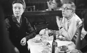
Sartre, Beauvoir, and Miles Davis talking presentations

I just returned from a wonderful holiday in France and hope to pick up my posting habits soon. While in France, I read this interesting book: Parisians: An Adventure History of Paris by Graham Robb (affiliate link). Robb uses a variety of styles and settings to describe famous characters living in Paris through the centuries. One chapter is a film-type script set in Cafe de Flore in Paris around 1948, a small fragment:

Beauvoir: He [Sartre] was invited to give a conference at the UNESCO. It was the first meeting of UNESCO, two or three years ago, in 1946. At the Sorbonne. The evening before, we went to the Scheherazade, with Koestler and Camus. And Sartre - you remember? - danced with Mme Camus, which was like watching a man lugging a sack of coal. He was very drunk, and he had to give his talk in the morning, but he had not written a line. Miles Davis, pointing at Sartre: The teacher hadn’t done his homework! Beauvoir: Yes, and Camus, who was also drunk said, said, “You will have to do it without my help,” and Sartre said, “I wish I could do it without my help.” Sartre, stubby fingers spread on the the table giggles. Beauvoir: An then - he does not remember this - we had breakfast Chez Victor at Les Halles, soupe a l’oignon, huitres, vin blanc - and then it was dawn, and we stood on a bridge over the Seine, Sartre and me, and we were so sad about la tragedie de la conditione humaine - eh oui! - that we should throw ourselves into the river. But instead of that, I went home to my bed, and Sartre, he went to the Sorbonne to talk about la responsibilite de l’ecrivain… Miles Davis: That’s cool Jean-Paul. They knew you were talking straight because you hadn’t prepared… Beauvoir, shaking her head: No Sartre, he had everything already in his head.

·Design

Re-post: cutting up shapes

Cutting and pasting your object as a PNG image allows you to cut up regular PowerPoint shapes in random components. See an example here.

·Design

Re-post: creating a realistic blackboard in PowerPoint

With color and light effects you can create a black board in PowerPoint, an earlier post here.

·Design

Re-post: cutting words and still say the same

An excellent list of words you can lose on a slide here.

·Design

Re-post: keeping titles readable over busy images

A semi-transparent background shading greatly improves the readability of chart titles. See how to do it here.

·Design

Re-post: aligning bullets in PowerPoint

If you are not running PowerPoint 2010 (review), then the 2nd line of a bullet point will always come out wrong. Here is how to fix it.

·Data visualization

Re-post: creating McKinsey-style water fall charts in PowerPoint

Waterfall charts can X-ray a complicated story. Here is an explanation about the technicalities of creating one in PowerPoint, here is an example of an application.

·Design

Re-post: merging presentations without mixing up formats

When Frankensteining a deck (i.e., stitching a new presentation together from old slides), there is nothing more annoying then slide formats that go crazy when pasting in slides. Here is a trick to avoid this.