SlideMagic Blog

Frequent updates about all things presentations since 2008. Subscribe to never miss a post.

RSS
all posts

Category PowerPoint

·Design

The art of writing a good slideument

The term “slideument” was coined by Garr Reynolds (his post from 2006 here): a PowerPoint file that looks more like a densely written text document than a minimalist, visually powerful sequence of slides for a presentation.

Documents and slides serve a different purpose and should be designed differently. But here is what I have been observing: the document is on its way out, and the slideument will have a bright future. Not as a presentation tool, but meant for on-screen reading, mostly for an internal audience that is very close to a subject matter. Background materials for a strategy discussion for an important board meeting would be an example. Nobody has time to plough through a dense text document anymore.

Some suggestions for creating good slideuments:

  • Create good data charts, using the exact same rules as you would for an on-screen presentation. Focus on the trend you want to show, ignore everything else. Round numbers up.
  • Use overview maps, strategic landscapes, with trends/competitors plotted against 2 axes, or lists of options with qualitative evaluation bubbles or traffic lights. One page that has the entire logic in it. Far too dense to present to a big audience, but really useful to discuss options. See the map to get a vague idea about the logic, digest the subsequent information in the deck, come back to the map to understand the full nuances.
  • Bullet points are an essential part of a slideument, but make them useful. Make sure they are short, and say something tangible/specific. Don’t just rattle down a list of 15 points on a page, but group the bullet points into meaningful categories. Put bullet points inside boxes, and use arrows to highlight the relationships between groups of bullet points.
  • Write a clear page upfront with what you want from the group you are submitting the document to.
Continue reading →
·Design

Leave some room for imagination

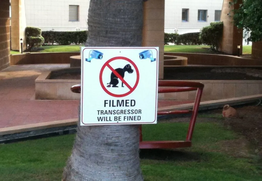
Great novels, movies, and painting leave room for the audience to fill in the blank spots. This photo found outside my own is the exact opposite. Ugly graphics worked out in the greatest detail, even providing the dog with a pair of mean red eyes that would fit the hound of the baskervilles. It is possible to say/show less and still convey the message…

Earlier post with a similar observation.

·Design

A slightly morbid post: gravestone design

The past few weeks have been rough for me as I am dealing with the loss of my brother in law, Ethan Naschitz. After tweets like this one, I got some heart warming comments/questions to see whether I was OK. I can tell you I am (given the circumstances), and the Tweet is actually less morbid than it sounds. Part of daily life in Israel.

Building on this, I had to go through the interesting experience of actually designing a gravestone for Ethan. It is surprising to see that a whole industry is built around the loss of people, including graphics designers that specialize in this type of design. Some guide lines that I hope you will never have to use:

  • Less is more. A stone filled with white space looks much more beautiful. Cut as many details as you can, focusing all the attention to the name and maybe just years of birth and death. It is always tempting to put quotes, descriptions, details, but would your relative have liked them? Would you still like them in 10 years? Would visitors appreciate them in 2,000 years? Cut your font size. If you really would like to put in details, consider adding a “foot note” in small font at the bottom. From a distance the text will blur, when standing close, it can be read.
  • Get rid of symmetry. 99% of stones are centered, why? Why not left centered, bottom aligned?
  • Very important: pick a good font, the standard fonts available are usually poor. “Can you do Helvetica Neue?” gave a blank stare.
  • Extra features available at a premium (filling letters with black, covering things in plastic) do not necessarily  improve the look.
·Data visualization

"Would you buy?"-type data from market research

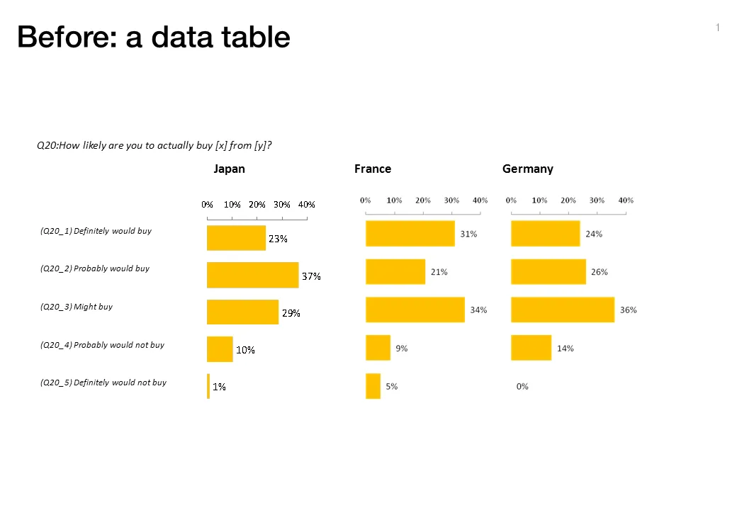
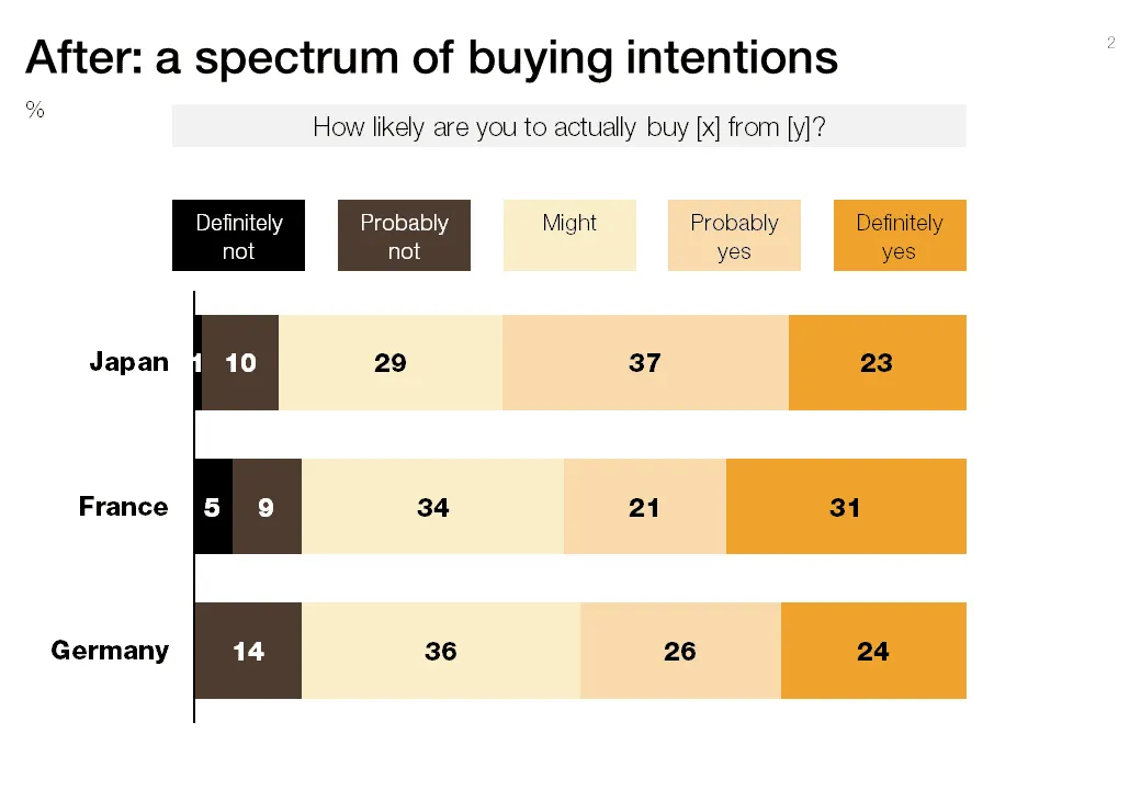
Both of these charts contain the exact same data. The second is a lot easier to read, the spectrum of customer choices is neatly laid out, and the colors are picked in sequential order.

·Advertising

Watch out with charged images

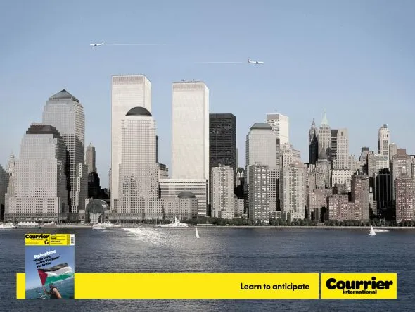
Our collective memory has some very powerful images. Photo editing software enables us to manipulate them and use them to communicate a message. “Learn to anticipate” says the ad below with a set of shortened WTC towers and planes happily flying over it. Maybe the ad was meant to be funny. Maybe its intention was to shock people and trigger a discussion of a controversial subject (What Benetton tried to do in the 1990s). A “fail” on both accounts. Be careful with charged visual concepts.

Via Ads of the World.

·Design

Making the audience feel small

You probably have noticed as well that it is impossible to capture a wide panorama with a camera. “Look at this sunset over the sea! Where is my camera?!”. The resulting image is often boring and lacks depth, the exact reason why so many stock images of panoramas fail to excite.

The human brain is not restricted by a small 2D screen. It senses distance/3D by blending the slightly different images from both eyes in to one. Eyes never sit still, they constantly move. We are standing at the inside of a gigantic sphere. Eyes compare the size of objects, to assess dimensions.

Handing out 3D goggles to your audience is not an option (at least not today), so the presentation designer has to resort to tricks to create 3D effects.

  • Pay attention to camera position (earlier post)
  • Put a known object in the image so people can relate the size of the whole to the familiar dimensions of the object (earlier post).
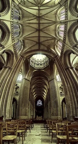
  • Or use effects like the one used in the image below. Stitching together multiple photographs to create on large, distorted image that gives the illusion of standing inside a sphere. Your eyes are really running up and down the image, just as you would do when you would stand inside the cathedral for yourself. Huge image by balondrotor here. (Earlier post on a similar but less spectacular version taken in the Notre Dame)

For those interested, the cathedral in question is the one in Coutances, Normandy, 20 km from this year’s holiday home. This majestic old building stands in the middle of the city center that was largely rebuild after the July 1944 battles. It was almost unscathed.

Continue reading →
·Design

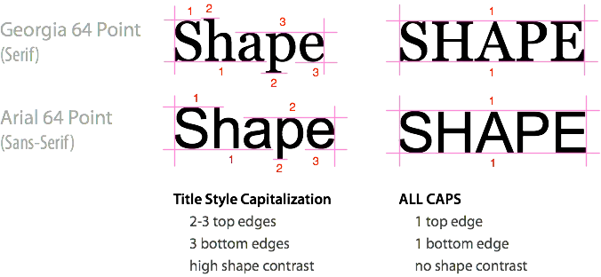
All caps and sentence caps are harder to read

A very interesting analysis of why it is harder to read all caps text on UXMovement. All caps reduces the number of differentiators between words, and hence should only be used in short bites such as titles, logos or lables. I have been ranting about title caps as well before.

OK, sometimes I contradict myself, but all caps worked in this presentation with very few, short sentences.

·Design

Chart concept - umbrella

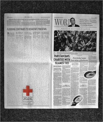
The umbrella protecting you against falling misfortune is powerful visual concept, albeit maybe even a bit cliche (earlier post in defense of cliches). This Red Cross ad uses it very well. Bigger image here. (Via Frederik Samuel’s blog)

·Design

Steal this presentation

The presentation below is packed with useful and specific suggestions to make you a better presentation designer. By Jesse Desjardins.

STEAL THIS PRESENTATION!

·Design

Present to touch someone's heart

Today is a difficult day as we are about to bring my brother in law to his final resting place. Life is a short period of time in which we are granted the opportunity to make this world a better place. Ethan Naschitz has used his 48 years to the maximum. We will miss him.

A major event like this makes you think about what contributions you can make every day you have on this planet. In its purest form, a presentation is a tool to touch someone’s heart, to make them excited about an idea, to bring positive change, to break with the beaten path.Think about that objective when opening PowerPoint and start designing the slides for your next presentation.