

This Apple slide from a recent product launch event looks very non-Apple…
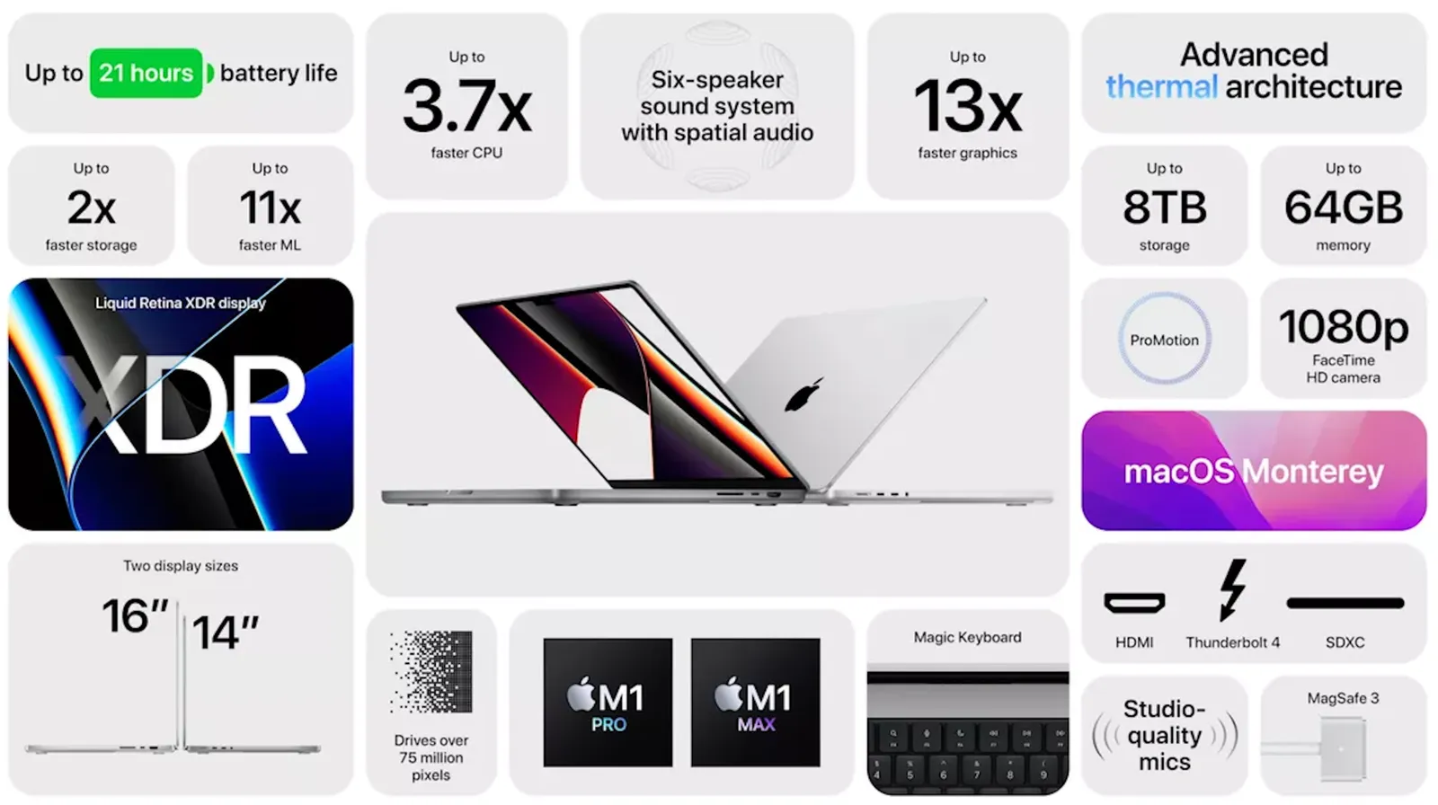
- Busy, lots of information
- Font sizes all over the place
- Big 13x, 11x, 2x, but hard to read what is improved
- Rounded edges are too rounded
- The grid is broken
- Imbalance: some boxes have heavy dark images, bleeding off the edge, others have no images…
- Look at the font styling used for “thermal”
The people and design budget at Apple can do better than this…