SlideMagic Blog

Frequent updates about all things presentations since 2008. Subscribe to never miss a post.

RSS
all posts

Category Layout

·Design

Zap that lone bullet point

  • Bullet points are bad for presentations, so use the opportunity if you can get away with just one brief sentence on a slide: resist the urge to put a bullet point in front of it, even if the Microsoft PowerPoint template really encourages you to do so. Bullets are only for lists of 2 or more sentences, (and lists of 2 or more sentences should be avoided if you can).
·Design

Should you put page numbers on PowerPoint slides?

I think yes, but really tiny ones, in a color with a very low contrast with the background. Standard PowerPoint templates put huge page numbers, dates, and other graphical distractions on every page. It looks ugly, and having a visible counter running on your pages might make your audience wonder how many more numbers there are before the end.

Why still put them on (in a very small font)? It makes it easer to discuss comments/improvement suggestions on your slides, it is easy to run a meeting with printouts and related to that, it makes it easier to put your print deck together if you drop your pages on the floor.

·Design

De-cluttering spaghetti charts

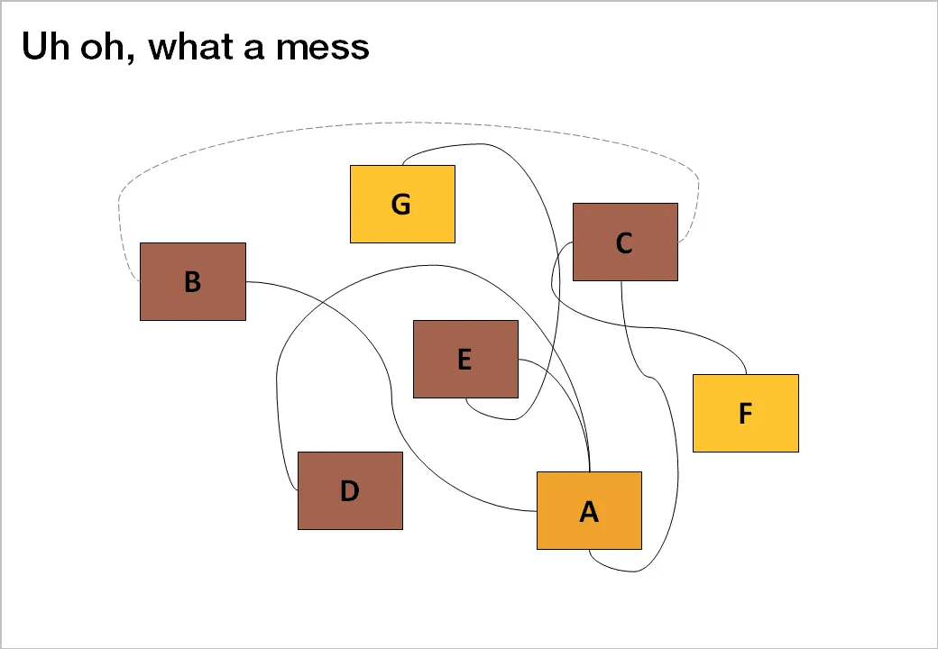
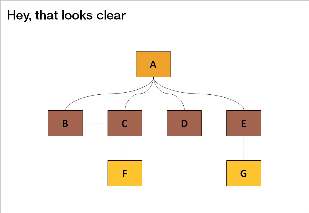
Sometimes, complexity is a visualization issue. When you design your slides, save the audience some work and do the disentangling for them. Example: there are 2 approaches to drawing a technology architecture:

  1. Start with the boxes, then draw the links
  2. Start thinking about the links, then draw the boxes

The second approach always gives a better result.

Thank you Jared Chung for emailing these charts to me in response to the post about the U.S. Army spaghetti chart (in a slightly different context though).

·Design

Location-based memory

The brain works in funny ways. Recently, I snapped a picture with my mobile phone of a busy and messy whiteboard after a long team discussion. It didn’t matter to me that I will not be able to read most of the text (poor handwriting, poor phone camera). Because of the location of the scribbles on the board I was perfectly able to recall the entire discussion without reading a single word.

What happened? The brain had assigned its memory of the entire rich discussion we had to locations on the whiteboard. “Going to a place” is enough to unlock the memory.

Presentation lesson? Credit to management consultants. Sometimes it is good to have that busy chart with all strategic options on one page, it does not have to be pretty, the axes you use to define that 2x2 framework do not really matter. The chart will become the mental map of the discussion. Even when you improve it later on, chances are that your audience will ask you: “hey, that’s the fat-cow option in the top right in our previous diagram isn’t it?”

·Design

Over-used adjectives

Create a slide that makes your audience feel and understand that something is extraordinary, huge, massive, revolutionary, game-changing, and/or enormous instead of writing these over-used adjectives in a bullet point.

·Design

Google's latest investor presentation (part 1)

Quarterly results presentations are in the public domain, designed for an external audience. Below is the presentation that Google used to communicate the results for the first quarter.

These types of presentations are usually prepared under great time pressure, as there is very little time between the moment the accountants are producing the figures and the communication to the analyst community. Unfortunately, this impacts the quality of the presentation (form, not content).

I will use this presentation to provide some suggestions on how to improve corporate presentation design. Not that I am picking on Google (Skype was an earlier victim), this presentation is just a typical example of most analyst presentations I see.

Analyst presentations are slideocuments: they need to be packed with a lot of financial information and the audience (equity analysts), usually know the company and its financials very well and are keen to see this quarter’s update of last quarter’s figures that are already sitting in their spreadsheets. So, adding large images with huge font text is not really appropriate here. Also, I will forgive the use of bullet points in these documents. Still, the quality of the slideocument can be improved.

Let’s look at the opening page. The one thing I like is the minimalist template that Google uses: a tiny logo at the bottom right of the page. Great.
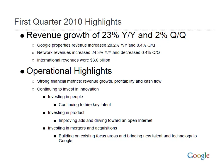
Some improvement suggestions:

  • Break it in two pages, one addressing the financials, one the operating highlights
  • Use horizontal bar charts to highlight the growth rates year-on-year and quarter-on-quarter
  • On the second slide, do not use bullets if you just need to make 1 point
  • Try to make the sentences shorter
Continue reading →
·Design

The vertical center that feels right to the eye

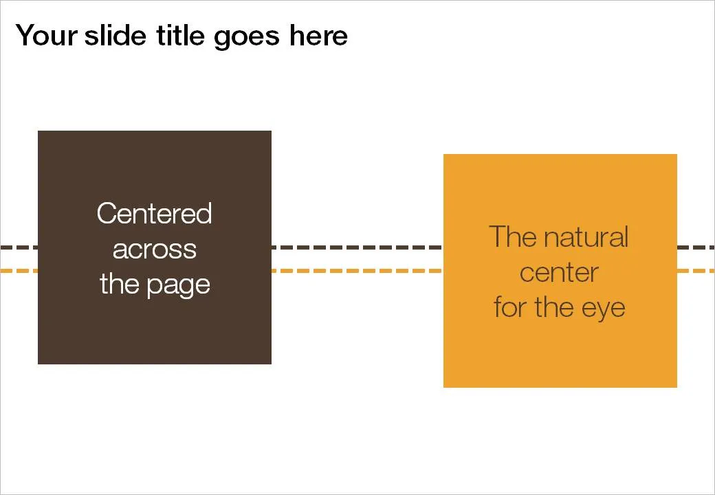
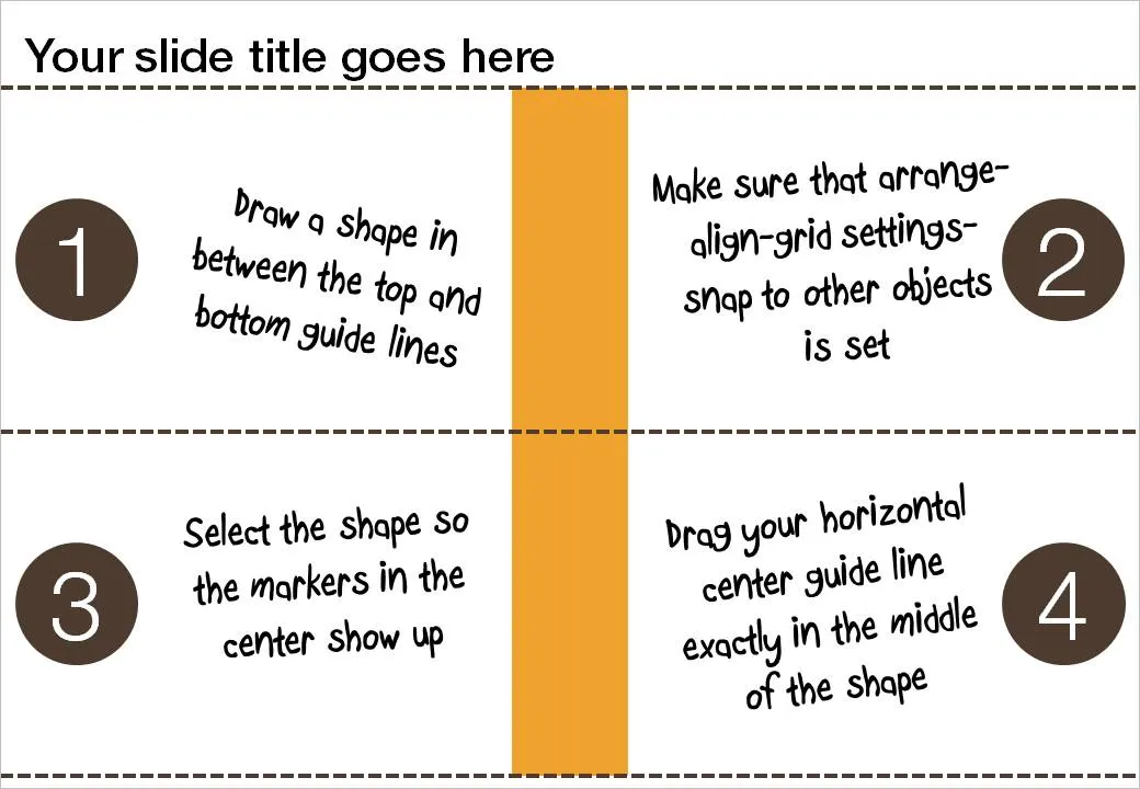
If you use big title headings on your PowerPoint slide, the exact vertical center of the slide might not feel natural to the eye. I suggest centering items slightly lower. Here is how you can find the exact location where to set your drawing guides.

  1. Draw a random shape in between the top and bottom drawing guide
  2. Switch on “snap to other objects” (arrange-align-grid settings-snap to other objects)
  3. Select the shape to make its center marker visible
  4. Drag the middle horizontal drawing guide to the center of the shape, it should “snap”

·Design

Avoid slide elements with negative connotations

I really like red as a bright contrasting color to put comments or circles on busy slides. Until a meeting with people in the Finance Department of one of my big corporate clients. “Can you please take the red off, in our (financial) language red equals bad news”.

Three things to avoid in slide design:

  1. Bright red highlights in fonts, especially when talking about numbers
  2. Arrows pointing down (if you want to visualize something positive), why not redesign the slide and have them point up?
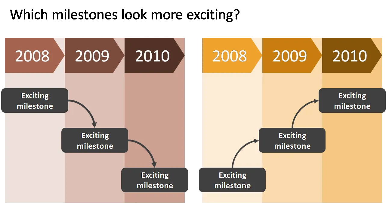
  3. Lines, sequences, or page elements that force the eye to go from top left to bottom right. The milestone graphic in this earlier post is a good example.

As always, these are not rules to be set in stone, it is just another piece of slide design context that you should be aware of.

·Design

Logos on PPT slides / logos on corporate gifts

It’s the time of the year for corporate gifts. Many of these could be really nice, where it not for that huge corporate logo that makes you shelve a beautiful pencil instead of using it. A waste. If your gift is nice, you do not need to remind people that it was you who gave it to you, they will remember.

Most corporate PowerPoint templates waste a lot of screen real estate on elaborate graphics to make sure that the audience does not forget who the employer of the presenter is. This is not only a waste of space, but these graphics also disturb the overall balance of the slide. A far better way to reinforce your corporate identity is to use the corporate colors consistently through your presentation. No need for logos.

So far, a consistent message. But what if the presentation is poor, and people walk in and out of the conference room, check email, make a phone call or get a much-needed coffee? In that case, you might need a reminder of who is speaking when you re-enter the room. Maybe template designers just anticipate this situation…

·Design

Blending PowerPoint shapes into your image

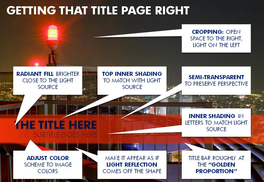
A recent image I used for a cover page of a presentation provided some excellent opportunities to blend PowerPoint text and shapes into the image. Use the strong red light source to create matching shadows and colors. Click on the image with the boxes to get a larger picture.