SlideMagic Blog

Frequent updates about all things presentations since 2008. Subscribe to never miss a post.

RSS
all posts

Category Layout

·Design

Portuguese innovation in newspaper design

An interesting article in the NYT the other day: the Portuguese newspaper “i” that’s breaking the rules of newspaper design. An example of a front page that I found on the “What’s next: innovation in newspapers” blog.
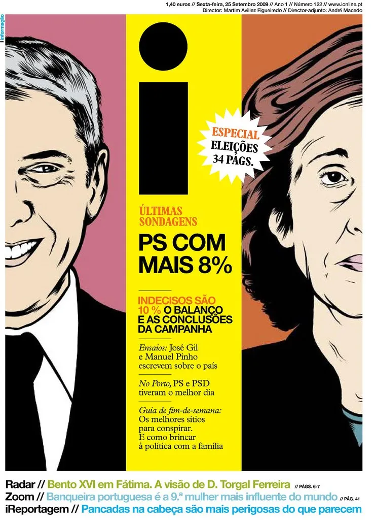
Some interesting lessons that could also apply to presentation design:

  • Big images draw the attention of the reader
  • Interestingly, the newspaper abandoned the typical grouping of newspaper articles around specific categories. Research showed that people just scan for interesting headlines and do not need the structure of a detailed content categorization. Newspaper design does not need to resemble the organization structure of the editorial staff.

With regard to the second point: more and more I start to abandon the use of formal structures in presentation design. Simple use the structure or slide sequence that supports the way you want to tell the story. The brain is capable of dealing with a more creative story structure, as long as it is not bored. Novel writers are the ultimate masters in story line design creativity, but I agree that might be overdoing it a bit when designing your next pitch deck.
·Design

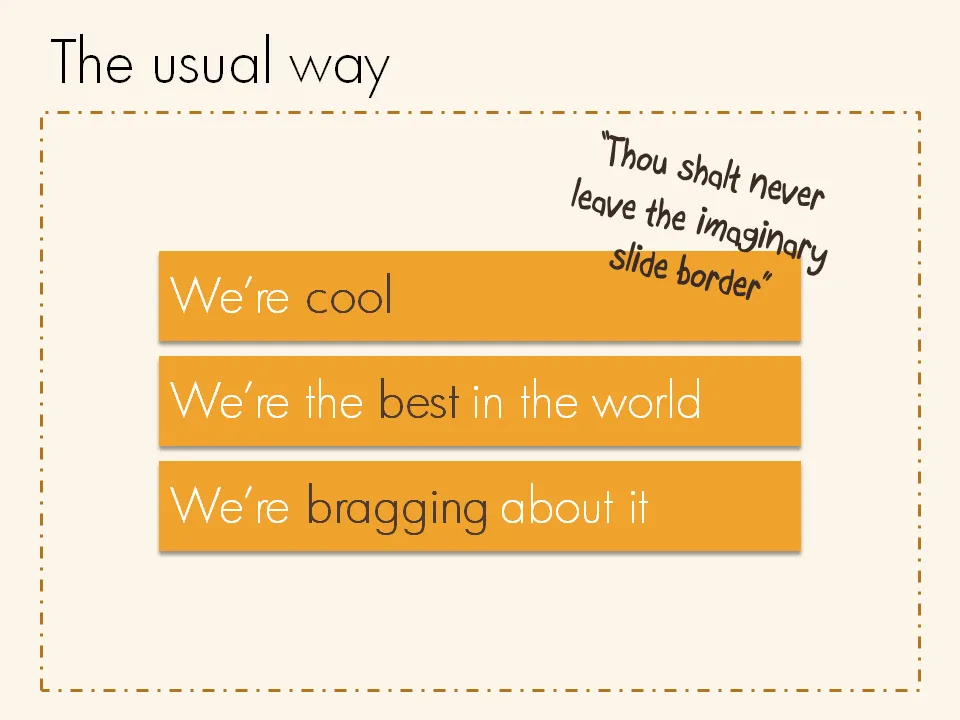
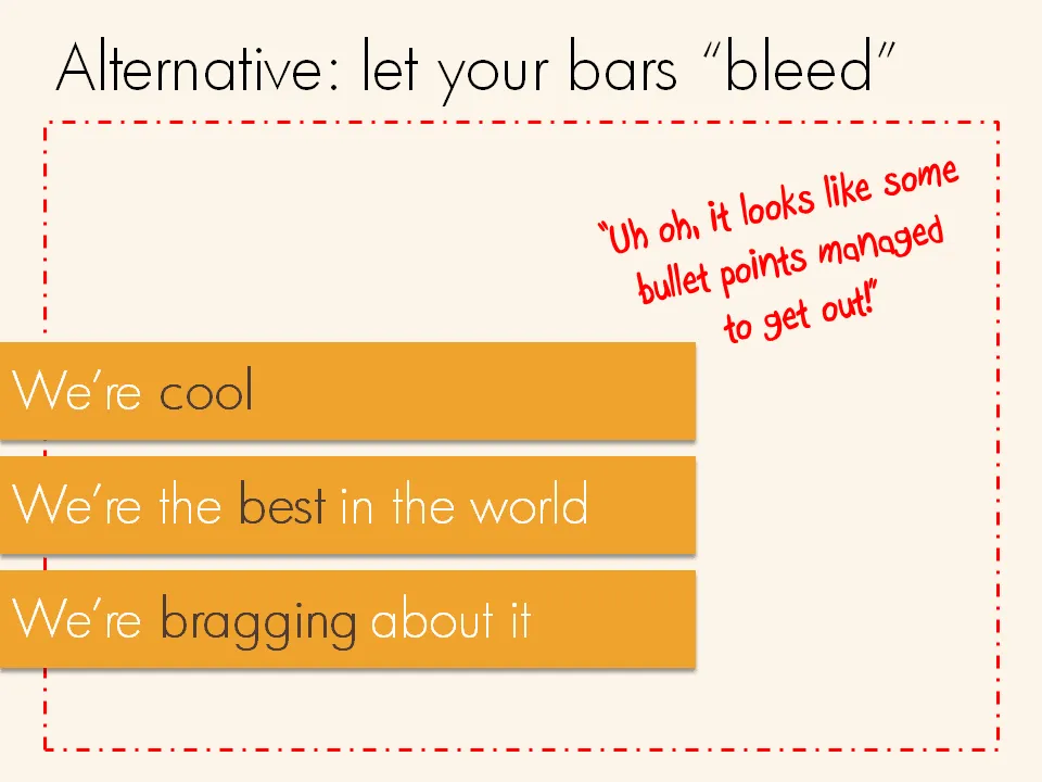
Breaking that imaginary slide border

Pictures are not the only objects that you can have “bleeding” off the slide. Regular text boxes work as well. Especially beautiful over an image.

·Design

Playing around with fonts in section separators

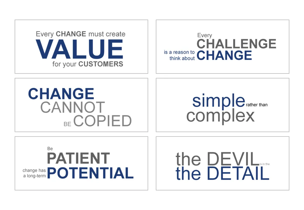
Sometimes a presentation is just a discussion of a series of beliefs or points. Each section of the presentation is devoted to one statement. Big-font section separators are followed with a few more charts adding detail and explanations. Why not play around with fonts a bit on these separators? A summary page could consist of PNG captures of the all the tracker pages in the presentation. In this way, it looks a bit more interesting than six bullet points.

·Design

Intimate 1 on 1's: the PowerPoint/napkin hybrid presentation

Seth Godin nailed the perfect format for a one-on-one presentation in a recent blog post.

  • Full-blown PowerPoint presentations are overkill in an intimate coffee chat
  • Taking an empty note pad and sketching the entire presentation from scratch while you are talking is definitely more intimate, but also high risk. (A bit like the concept used in the book “The back of the napkin
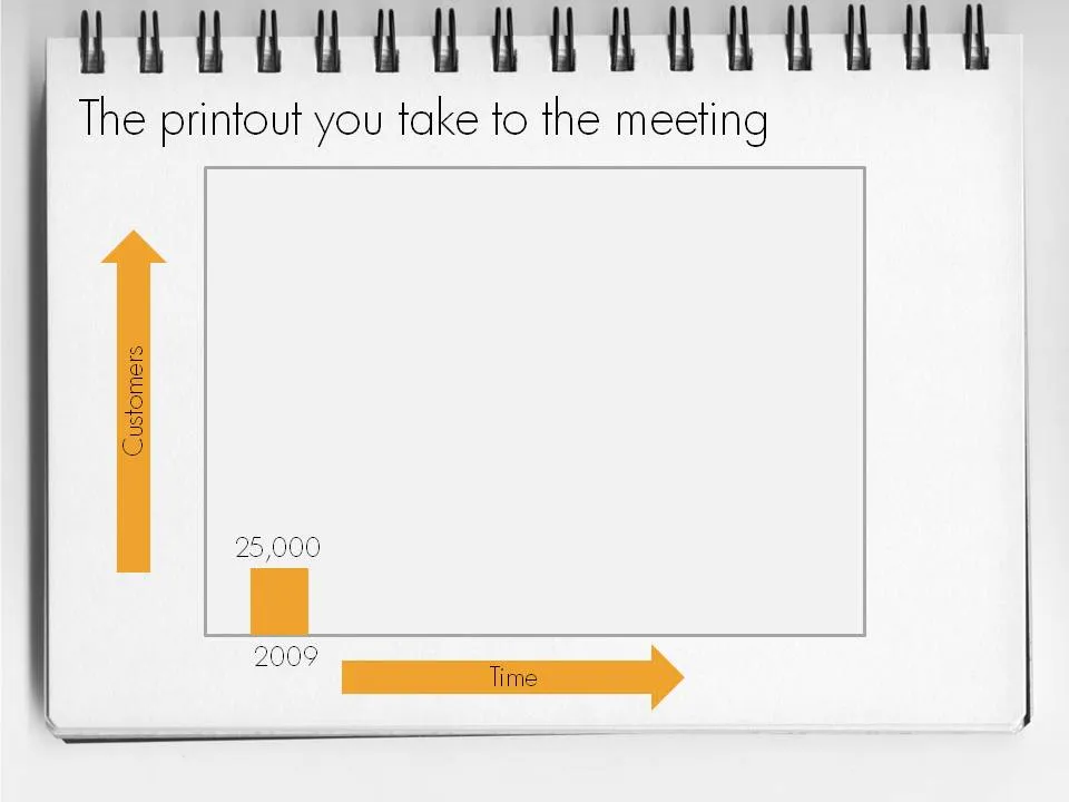
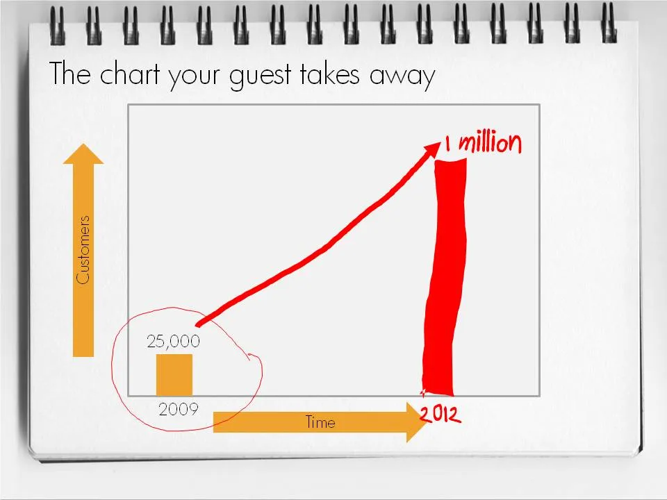
  • Seth’s hybrid of a print out of PowerPoint slides with key numbers, circles, and marks missing is the perfect compromise. Hand-write the key missing pieces during the meeting. Your meeting partner will remember them better, and he can take a nice and personal “coloring book” home.

This type of presentation is ideal for short 15 minute coffee chats with venture capitalists where you try to pitch for a more in-depth meeting.

To make a hybrid napkin presentation, I suggest that you actually design all the slides, including the version with the comments and drawings put on them electronically so that the story flows logically and it is easy to prepare for the meeting. Just before your presentation, you decide which slides to print or not.

·Design

"Nothing on a slide should be placed arbitrarily"

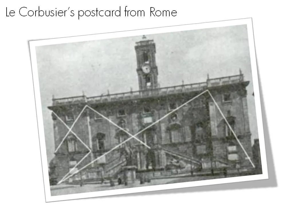
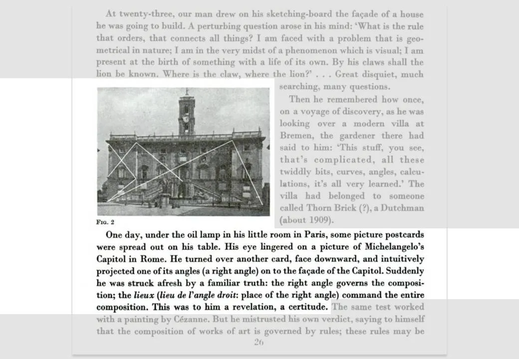
Alignment*. Nothing should be placed on the page arbitrarily. Every element should have some visual connection with another element on the page.*

So very true, this quote from Robin William’s book The Non-Designer’s Design Book. Architects such as Le Corbusier are the masters in planning the proportion and alignment of objects on a facade.

The above image and quotes were taken from page 26 of Le Corbusiers’s The Modulor 1&2. (Click on the page 26 Google books link or the image to read the text)

Not that you have to be like them. But still remember from now, whenever you have the option to position a shape or a text box on a slide, why not think for a second where to put it, align it with something?

·Design

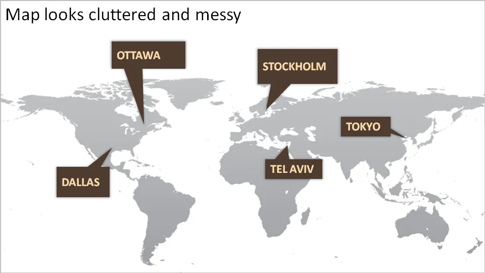
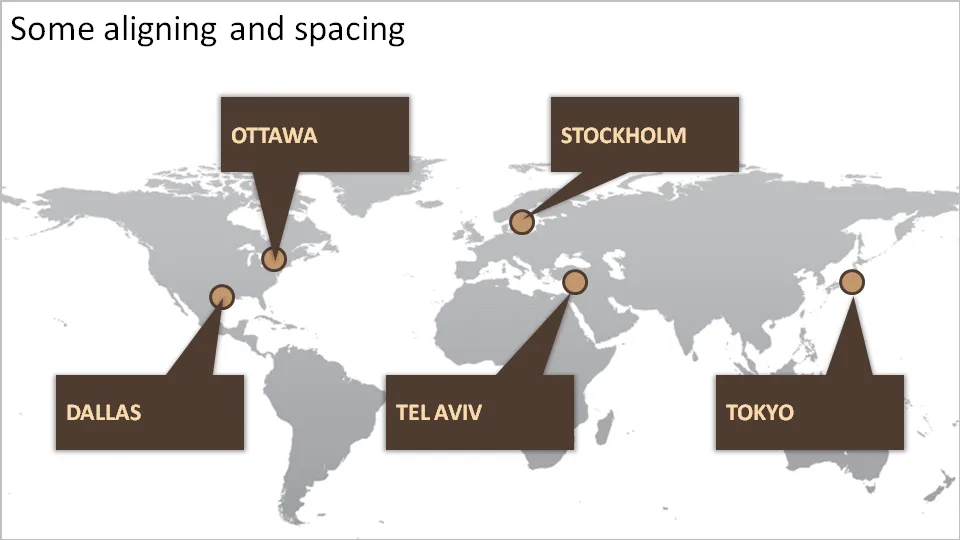
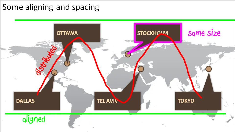
How to bring some order to a cluttered PowerPoint map

One of my clients is keen to show its new network of global support offices. Maps can look messy and random. Here are some simple things you can do to put things in order. We can not change the location of the planet’s cities, we have control over PowerPoint shapes…

·Design

No need to put that huge "message arrow" on you slide

An excellent post on the “Tekst en Communicatie” blog by communication expert Louise Cornelis. It’s in Dutch, so I will translate.

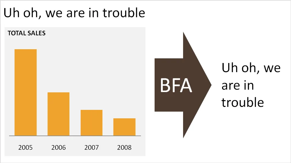
Louise discusses what she refers to as “the big f*cking arrow” or “BFA” (not all Dutch on her blog). A huge arrow in the middle of the slide, pointing at a block of text with the chart’s conclusion. Apparently “BFA” has become a well-known acronym among chart designers in The Netherlands.

Her (and my) recommendation: get rid of it and stick to a clear title headline.

·Advertising

(Snow) white space to the extreme

Don’t fill up your slides to the last square inch. Instead: leave white space (or negative space). Have the courage to write nothing, take a visual break. This ad for a ski resort takes it to the extreme, but makes its point brilliantly (large image here).

Via Ads of the World.

·Advertising

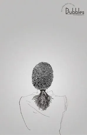
"Signature" advertising for a hairdresser

Unusual. An well-designed ad for a more or less local hairdresser/spa. Like a good slide:

  • You get the point instantly
  • Understated, elegant, and lots of white space

I like the small light-source-behind-the-model effect, I will experiment with it in my next presentation using a radial-gradient with very close color shadings.

Still, there is something “criminal” associated with a finger print (as people suggest in the comments of Ads of the World, where I found this image).

·Design

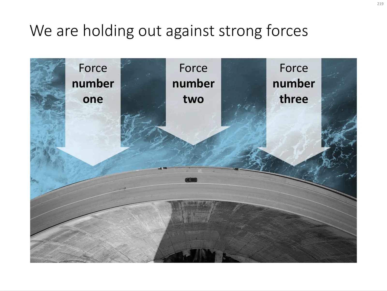
Make big things look huge by adding something small

The 2 tiny people, and their 2 tiny shadows make the whole dam look huge. You probably remember your highschool physics teacher explain: “if the nucleus of an atom is a strawberry, its electrons would be flying around the football field”.

Something to think about when making your next slide composition. Image purchased from iStockPhoto

UPDATE: I have now added a chart concept featuring a dam in the SlideMagic template store, you can download it here.

 A PowerPoint slide template featuring a dam

A PowerPoint slide template featuring a dam