SlideMagic Blog

Frequent updates about all things presentations since 2008. Subscribe to never miss a post.

RSS
all posts

Category Layout

·Layout

One headline will do

Many PowerPoint slides have multiple headlines that say the same thing. One at the top, one in a bubble on the right of the chart, and maybe another arrow to make sure that we do not miss the point. One title should be enough though: a clear message an screen real estate is saved.

Multiple headlines are often the result of poor corporate PowerPoint templates. The top of the page features a heavy colored graphic, and people have gotten used to the visual distraction and are actually filtering it out. They do not read it anymore. I had several instances with clients where I reminded them that the message was already written on the page, they did not notice.

So: one headline and a good PowerPoint template.
·Layout

Presentation = web site

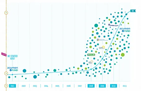
The new web site of the Acumen Fund is a great example of how presentation and web design is blending. Gone are the navigation menus, environmental statements, and other wasted screen real estate. Instead, the site is a vertical series of visuals that equally could have gone into a presentation.

I often recommend this web site design approach to early-stage start ups. Once you have designed your investor presentation deck, you can simplify slides, take out the confidential ones (financials, pipeline, IP) and you have the ingredients for a great, simple web site, that shows potential investors clicking through to your URL a message that is consistent with your pitch.

By the way, Acumen is doing some great work to tackle poverty. If you are interested, join the community here to find out more.

·Layout

One word per line

With an elegant font such as Helvetica Neue Medium, breaking a short sentence in one-word lines can create a beautiful effect. Here an example of a poster by Dutch designer Ben Bos

See how he reduced the space between the lines (looks better with bigger fonts), and did not use capitalization to create a more harmonious composition. I would have left a bit more white space under the text though.

For those who are interested, the poster reminds students to order their school books before the summer holiday. Via

AisleOne

.

·Layout

Disguising bullets in boxes

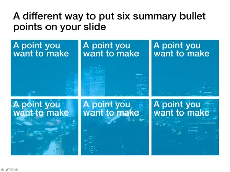
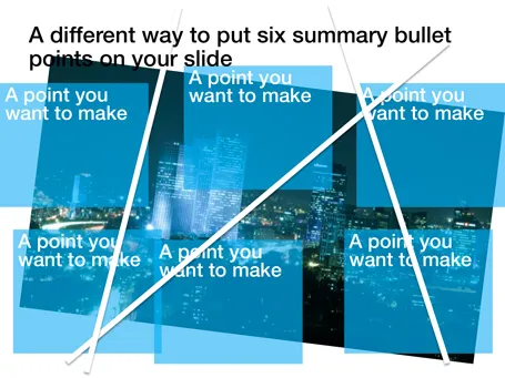
Fancy frameworks (pentagons, triangels) are bullet slides in disguise. Here is a concept that I recently used to put the 6 most important building blocks of a business on a slide. Keep the text really short.

·Layout

Sentences are useful sometimes

Back at McKinsey in the 1990s we would write a long-hand sentence, or a “lead” at the top of every slide (similar in length to today’s 140-character Tweets. This sentence would give you the message of the chart and you could get the whole story by reading all the leads in a document, without looking at the exhibits below.

I am re-discovering the sentence recently.

  1. In some presentation designs, I switch to a slide template with a 2 line title, creating space for longer sentences at the top of a slide.
  2. Certain thoughts or concepts are just too complex to shorten to 2 bullets of 3 words each, so I am just writing them out.
·Layout

Borrowing frameworks

Consulting firms, market research companies, universities produce an endless amount of complex and sophisticated-looking frameworks. Often, I see people borrowing one, re-drawing it, or overwriting the labels with their own text. It is better than you don’t.

  • Frameworks are highly specific to a certain context, so they are unlikely to work when you borrow them for your own presentation
  • Frameworks are great to solve problems, to discuss issues with a small audience who has worked with it before, but are incredibly poor at communicating to a large audience

Instead, sketch your own simple, specific, and relevant diagram on a piece of paper and replicate that in PowerPoint.

·Layout

Drifting slide titles

A highly competent presentation designer asked me why I put my slide titles always at the same position (top left). Good question. My slide titles have started to drift, depending on the composition of the chart.

·Design

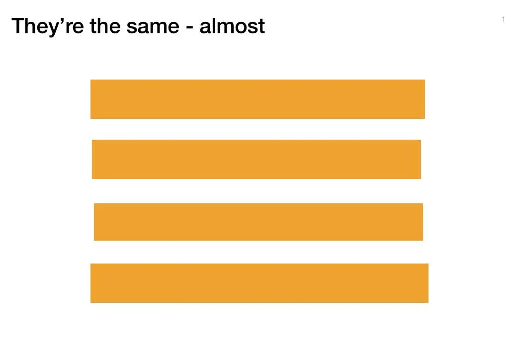
Almost the same size is not good enough

Making similar boxes the exact same size, and exactly aligned matters a  lot in slide design. The brain gets distracted when object alignments is just a bit off.

Usually the slide starts out OK, ctrl-C/ctrl-V a bunch of objects and they are all exactly identical. Over time, things start to degrade. Accidentally resizing things a bit, moving a box a bit, etc.

You need to train your eye to spot the imperfections. The quickest fix is usually to select a group of objects, select “format” and then give them all the same size in centimeters (hight, width, both). In the Arrange / Align menu you will tools to spread objects out evenly.

Little effort, big result.

·Design

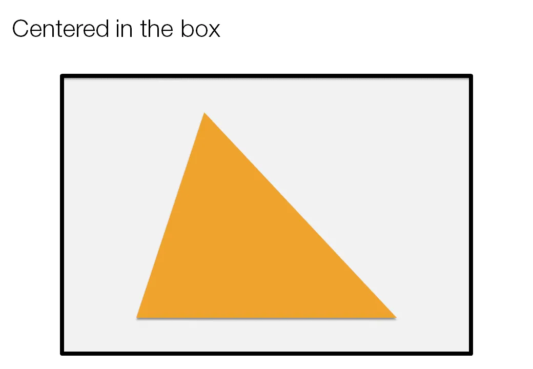
Centroids

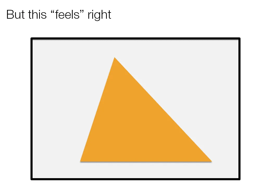
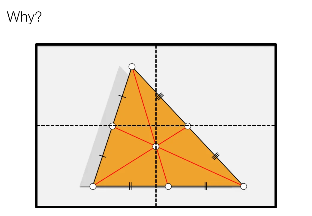
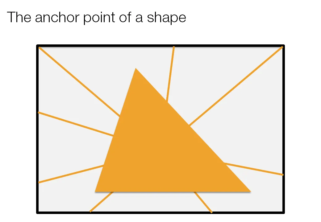
Call me a nit picker, but I always feel this urge to fix the direction of a connecting line or an arrow pointing to an object in a slide, or to position an object exactly where it feels right.

Intuitively, I am looking for the centroid of a shape. Running complex mathematical analysis every time you need to place an object on your slide would be overkill, however, keep the concept in mind.

·Design

Fixating jumping objects

In the 1990s, when we were still relying on print documents at McKinsey, I would hold the deck against a strong light source to look through it to see whether repeating elements such as titles and page numbers were lined up properly. (Something like this cartoon machine)

“Jumping titles” are the result of slightly misplaced items on a slide sequence: when you hit page down and scroll through a series of slides quickly you see the titles moving up, down, right, and left. How to prevent it?

  1. Use drawing guides (excellent post on PowerPoint Ninja)
  2. Control-C object on one page, control-V on the next page. The element will appear in exactly the same location. Good for sequences of diagrams with buildups.
  3. Set the exact location of an object in PowerPoint (format ribbon, size, position)