

Sometimes, complexity is a visualization issue. When you design your slides, save the audience some work and do the disentangling for them. Example: there are 2 approaches to drawing a technology architecture:
- Start with the boxes, then draw the links
- Start thinking about the links, then draw the boxes
The second approach always gives a better result.
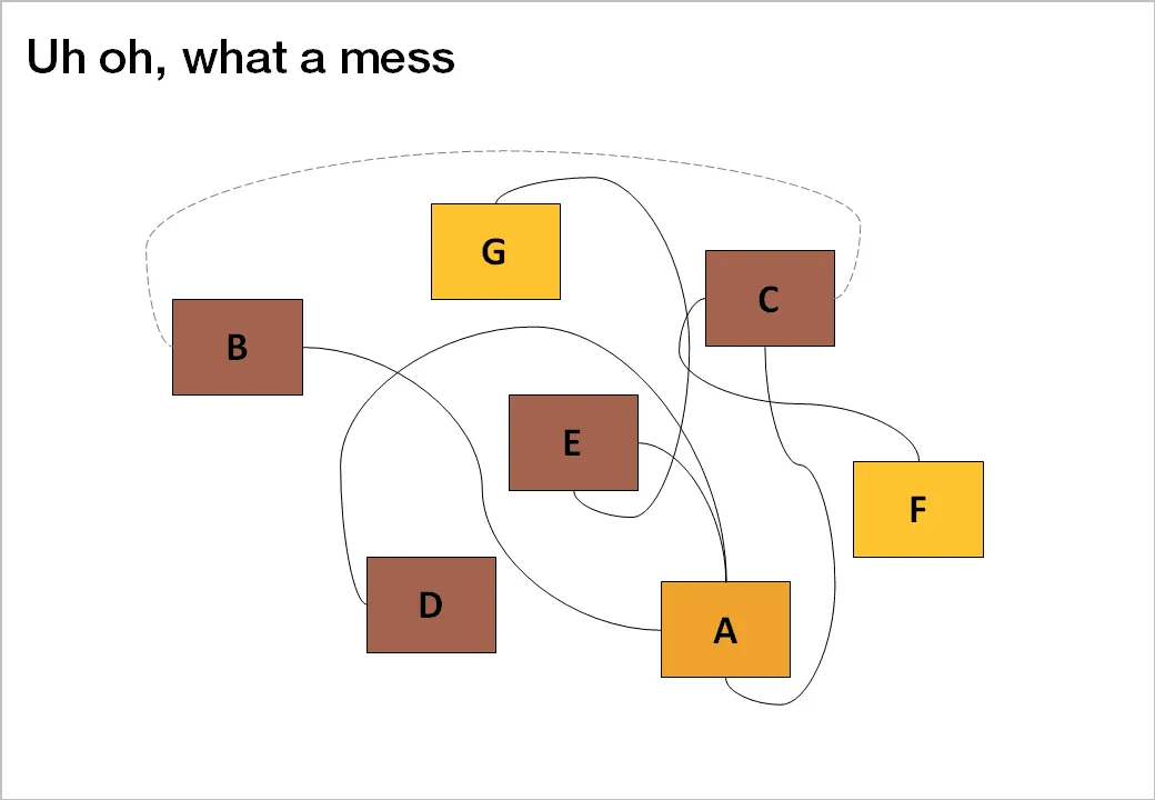
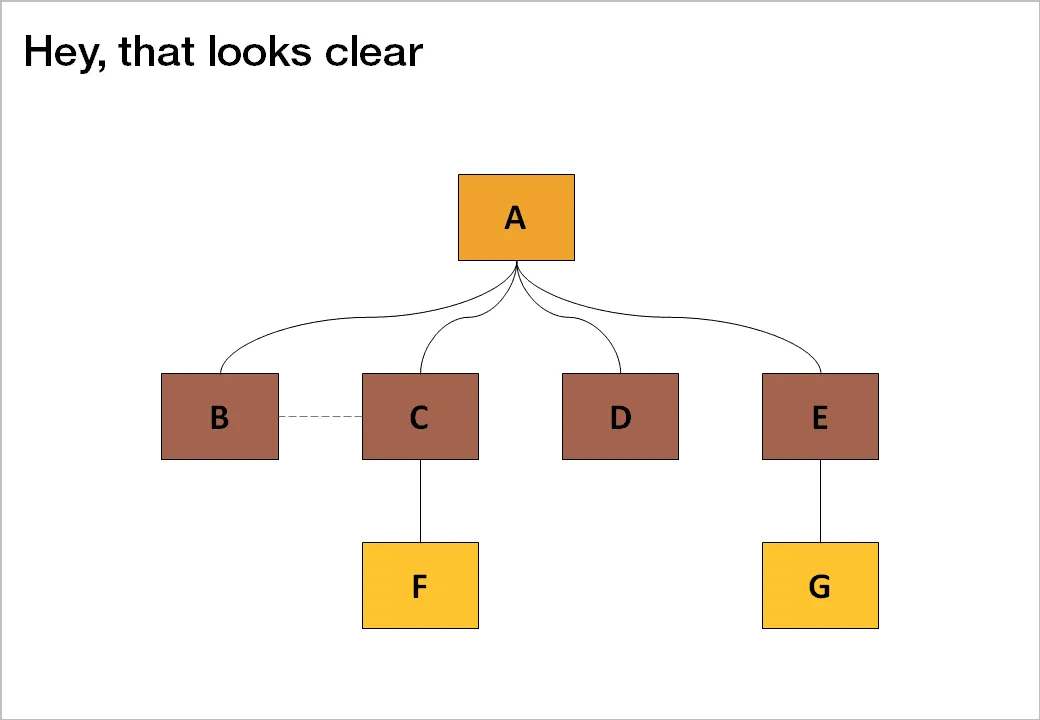
Thank you Jared Chung for emailing these charts to me in response to the post about the U.S. Army spaghetti chart (in a slightly different context though).