

SlideMagic Blog

Frequent updates about all things presentations since 2008. Subscribe to never miss a post.

RSS
all posts

Category Layout

·Design

Leading

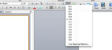
One of the typography elements I play with all the time is leading, the space between 2 lines of text. PowerPoint sets the leading standard to 1.0, or 100% of the typeface size. What leading looks good depends on:

  1. The typeface you use
  2. All caps, sentence caps or lower case
  3. And most importantly: the size of the font, bigger fonts need less leading

There is no general rule here, you need to fiddle and see what looks best. On a Mac, there is a button that controls the leading of your paragraph, see the screenshot below. It is one of the buttons I use most.
·Design

Designing a good logo page

Most sales presentations contain some logo page to show off your impressive client list. Make sure that the page looks impressive from a graphics point of view as well. An unstructured clutter of low-res logos makes an impression of an amateurish startup best to be avoided for serious business.

  1. Check whether you got the latest logo of a client (visit the home page)
  2. Use high resolution images
  3. Where possible, use the logo that has a white background
  4. Do not distort aspect ratios
  5. Make sure the logos are more or less the same size
  6. Distribute things evenly horizontally and vertically in a nice grid
  7. Keep the page simple: just logos
  8. If things look too busy, you can consider moving all the logos to black & white
·Design

Look serious

It is difficult for a startup to sell to a big company. Even if your solution is really innovative, large companies prefer to work with financially stable, large companies.

The look and feel of your sales presentation can add to that nervousness in the under belly of a big-corporate purchasing officer. Looks to avoid:

  1. Amateurish layouts with childish colours and water cooler fonts such as Comic Sans.
  2. Overly cute, touchy feely, retro look and feel, especially when selling in a male-dominated corporate culture (sorry).

Now we all know that the a slick visual deck full of stories and very little text will do great in these meetings (option 3), but, there is one surprising other option (4): the big corporate, lots of bullet points, serious, boring slide deck. Purely from a look and feel perspective, you will fit right in with all the other technology vendors, unlike option 1 or 2.

If you cannot pull off option 3, option 4 is still preferred over option 1 or 2.

·Keynote

16:9 layout

The 16:9 format was invited for movies not for presentation slides. Over the past 500 years, there is hardly any print work in a wide 16:9 format. Text that spans a wide column is hard to read, and most diagrams, paintings, visual concepts are more square than rectangular.

If you want to design slides in a 16:9 format you could consider breaking some of the slide design conventions. Examples: putting a multi-line slide header at the top left or even bottom left of your slide, saving up valuable vertical slide real estate. Or maybe even simpler: leave a lot of calming white space on the left and right of your slide.

·Colors

Too much colour (2)

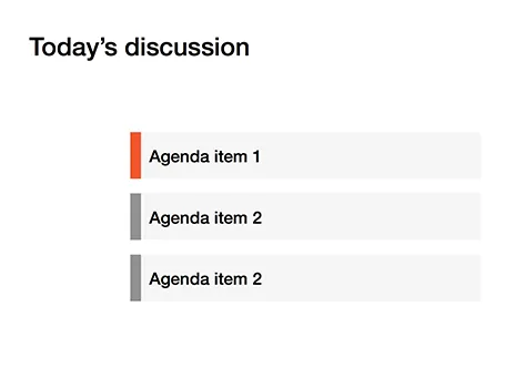
Following frequent requests after my previous post, I have included a picture here that shows the concept of the narrow coloured bar replacing a fully coloured slide object.

·Colors

Too much color

Colours brighten up your slides and are a great way to group related items together: USA is green, Europe is blue, Asia is purple for example.

But applying bold colours to big text boxes makes your slides too busy and nervous. Instead, keep those text boxes light grey and add a very narrow colour box attached to it at the left side, almost like a fat line.

·Keynote

Mess illustrates mess

“Hey, that chart looks very messy?” “Yes, but that is what we want to show, right?” “True.”

·Keynote

Design for reading

The other day, a client needed a presentation meant for reading, something that would be sent out to the employees by email. So, we designed it for reading and used the fact that for an internal audience we could be a bit more radical with the format.

Here is the concept: a dark 16:9 background. Each chart has a big visual on the left side while the message of the chart is spelled out in full sentences in a relatively small font in a column on the right. Full sentences, because nobody will be around to explain what the abstract graph means. A narrow column in a small font because it is easier to read than a very wide sentence spanning an entire 16:9 screen.

·Keynote

Use that style guide

If your company logo was designed by a professional designer chances are that somewhere in the bottom drawer of the marketing department you can find a complete graphical style guide that goes with it. Usually, it gets only used for commissioning other design work (brochures, web sites, etc.), and hardly any PowerPoint user knows of its existence.

Ask for a copy and use it to inspire your presentation design. See what colours the designer recommends, there might be more than present in the logo. See how pages are laid out. See what fonts and font colours are used. Lots of inspiration.

And yes, the section for the PowerPoint presentations in these style guides is usually pretty bad. Professional designers are not used to working in PowerPoint (an inferior product in their minds). Beautiful design work gets reduced to Arial, heavy top banners and watermarks. So, use the design inspiration of the first pages of the style guide to create your own PowerPoint template that fits it. Hopefully the marketing communications department lets you get away with it.

·Keynote

Every word counts

Often, presentation slides are filled with verbal padding: words that take up lots of space but do not add any additional meaning. Every sentence you write in a slide is like thinking of a newspaper/blog article headline: it should be as short as possible without diluting the content to an overly generic statement. Unlike a text document, in a presentation, every sentence needs careful consideration and scrutiny.