SlideMagic Blog

Frequent updates about all things presentations since 2008. Subscribe to never miss a post.

RSS
all posts

Category Layout

·Keynote

The audience expects it

Some presentation slides live for years, and that might be the reason that we are hesitant to change them, we think: well, the audience will expect this slide.

If nothing about your story has changed, then this is a valid point. If not, it is the wrong approach. The same slide signals no change at all, business as usual. Also, even if you did change its content, the audience will think it is the same slide as last year, and will not notice the different content.

Sometimes, change is good.

·Layout

Hide to emphasize

One way to draw attention to a specific object on your slide is to apply all of these at the same time: pink colour, bold, italics, underline, big drop shadow, fat circle around it (also pink), big arrow pointing at it. Maybe it will stand out of the clutter on the rest of your slide.

The other way: hide everything else around it. Semi-transparent white shapes are great to dim items on your slide.

·Images

Cover images

The ideal cover image of your presentation (the slide that sits on the projector while the audience walks in) would be one that tells your whole story so perfectly that the presentation itself can be skipped. Many people try to reach this level of perfection by putting up a messy collage of different images, a very tricky visual concept or a highly tacky and cliche stock image that represents the values of the brand: young, healthy, lively, dynamic, and social.

I am less ambitious and usually pick an image that fits the corporate colour scheme of the client and is a preview of an image that I use on a very important slide somewhere inside the presentation. It looks nice and calm when the audience enters, and it will generate that instant recall of that important slide when I show it for the 3rd time on the closing slide.

·Creativity

Learn to see

A child find it hard to draw realistic 3D perspectives, because her brain is still developing 3D perception. She draws a house with a front, and a side wall without that wall disappearing towards the horizon. She is not drawing what she sees, she is drawing what she thinks the house looks like. When the drawing is finished, she notices that someone is not right, but she finds it impossible to lay her hand on it what it exactly is.

The same is true for grown ups and graphics design. You see a beautifully designed page, you want to make something similar in PowerPoint and somehow, it does not come out. Why? Because you stuck to your own mental model of a PowerPoint slide (and what you think it should look like) and did not really see how the designer deployed white space, used of grey scales in text rather than blunt black, and set the space between title lines slightly tighter, and was careful not to overdo it with the colours.

Here is an exercise. Take a poster or design that you really like and literally recreate it in PowerPoint (or Keynote) until it looks exactly the same. Now apply that template to your presentation.


·Delivery

Audience perspective

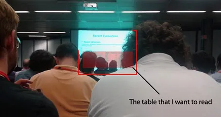
The PowerPoint or Keynote slide sorter view with the small thumb nails is a good proxy for how the audience will see your slides. But sometimes, they are even worse off as in this image by Ali Eslami.

While I would not go as far as recommending to fill the top of the slide with all the important content, it is true that this is the part of the slide that will get the most visibility. At least write the message clearly in the headline, rather than using the space for a descriptive title.

·Images

Unexpected perspective

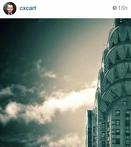
Everyone will agree that this image by Christian Xavier is beautiful and grabs the attention. Why? It is because the implied position of the photographer is impossible, it should be in the middle of the air. We are not used to seeing pictures of the Chrysler building from this perspective. Most pictures of the skyline of New York are taken from the same viewpoint (the roof of the Rockefeller Center for example).

How was this image created? He took a regular New York skyline picture with a good camera and zoomed in, cropping out areas of the picture he does not need.

Two lessons here. The theoretical one of using unexpected perspectives. And two, you can actually use this zoom/crop technique with high resolution stock images to make them more interesting.

·Images

Cheating with headshots

Pages with headshots of people are always a pain to design: the names and titles of people can vary greatly in length.

I spotted this neat trick in a promotion email for this book. People with long titles have been moved to the bottom where a 2 line job title does not break the grid. Also, the right column looks a bit wider than the first 2 to me, again creating a bit more breathing space for long names and/or titles.

Now, hopefully your CEO has a short name (she always wants to go first).

·Keynote

Visualising verbs

So, you need to depict an important concept in a slide. How do you do something more interesting than just writing a paragraph or 3 bullets on a page?

Here is how I start. That paragraph that you were about to write usually has one over-riding verb or action in it. Zoom in on that verb/action and use it to set up the overall structure of the slide:

  • We are better than an alternative: comparison, box on the left, box on the right
  • We stand out from the crowd: lots of elements in grey, one element in a bright colour, or clever 2x2 plot if you can find the axis definitions
  • We are squeezed, arrows pointing to a box in the centre
  • The inevitable conclusion: horizontal arrows at the left, pointing to a box on the right
  • There is a trade off: simplistic scales: box on left, box on right, tilted bar across the 2 of them, the preferred box is hanging down
  • The best of both worlds: overlapping boxes
  • We are the biggest: bar charts
  • It is complex: 25 factors written in font 10 all over the place
  • Etc.

This overarching visual movement sets the framework of your slide. Even if you cannot create an artistic master piece like a pro, your slide will be 10,000 times better than a list of bullet points. Good luck!

·Keynote

Dummy grid

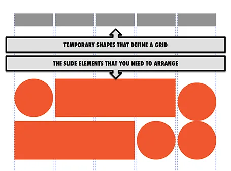
Drawing guides are a pain in PowerPoint (when you need to move an object close to the grid, you always end up moving the drawing guide line by accident). Also, grids can change from slide to slide.

My solution, quickly plop in some dummy shapes that define the grid for the slide you are working on. With snap to shape, you can create the slide layout you need, and get rid of the temporary shapes when you are done.

·Art

Cramped museums = bullet points

We have all been in them: museums full of densely packed displays of artefacts with tiny description signs that provide factual information rather than the story behind the objects. Crowds of people pass by without anyone paying attention.

Good museum design involves empty walls with just a few pieces to focus on. The explanation and background text are prominent, it could even be bigger than the object itself. People take a moment to absorb the piece, get interested in the story, read it, ponder the artwork a bit more, maybe take a picture.

Think about these 2 different approaches in the context of presentation design.