

SlideMagic Blog

Frequent updates about all things presentations since 2008. Subscribe to never miss a post.

RSS
all posts

Category Layout

·Data visualization

Word repetition

Some busy charts can still be highly effective. See the one below about the declining relative income of wealth classes in the US. The repetitive “United States” could have been replaced with something visually calmer, but the current works actually pretty well.

See that this charts presents other information as well (which countries did well), but the viewer is unlikely to take notice (and she does not need to).
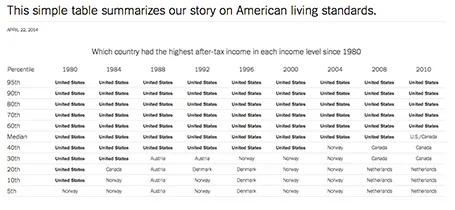
The original article in the New York Times can be found here.
·Keynote

You can be a pro

I did a quick reformat of slides that a client had edited overnight this morning. Here are some of the things I fixed:

  • Recolored red boxes to the correct red
  • Re-applied the correct slide master template to all slides, zapping left overs from other PowerPoint files
  • Re-applied the correct fonts, replacing the standard Arial/Calibri where appropriate
  • Make sure all objects fit within the slide margins
  • Re-sized images so that series have the same height/width
  • Replaced title case with sentence case

These are all simple things, no need for a pro here, you can do it as well!

·Images

White <> plain

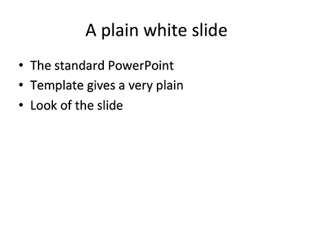
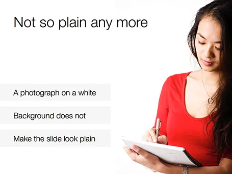
No one likes the plain, white, standard PowerPoint slide. And sometimes when I design a slide with an image on a white background and a lot of white space I get the comment that it looks very similar to a boring, plain PowerPoint slide. I beg to differ.

·Books

Slidedocs by Duarte

Nancy Duarte published her fourth book: Slidedocs, about how to design visual documents in PowerPoint (or Keynote) that are meant for reading rather than presenting.

She is on to something. Business communication is getting shorter and shorter, and the role of word processors that used to write long boring memos is taken over by presentation design software that is used to create more visual documents.

Slidedocs is a free download (it is actually a PowerPoint file) that talks you through an approach to make these documents better. Most useful might actually be the file itself, that can serve as a template for your next Slidedoc!

·Keynote

"I need only 10-15 slides"

Some clients ask me whether a project can be cheaper if we cut the number of the slides, the answer is: not really. If your presentation designer is charging you by the slide, it means that she is likely to focus only on beautifying graphics page by page, rather than turning your entire story upside down and designing it from scratch.

Every presentation design project has a big fixed cost component: getting to know the client, getting to understand the story, setting up the overall look and feel of the presentation. After this, you need to put in however many slides it takes to tell the story, and I tend to err on putting in more than less. 30, 40, or even 50 slides, it does not make a lot of difference in the cost of a project.

·Keynote

Feature laundry lists

Many tech presentations contain have the feature laundry list table in them: 15-20 great things your application can do. Here is how to make them better:

  • For reading: reduce the font and add more text to make the feature and its benefit explicit: from “historical overview” to “Compare usage levels over the last 30 days and spot unusual drops in demand”
  • For presenting: Option 1: if you only want to show that you have lots of features, keep the text short and put 20 boxes in a nice 4x5 grid on the slide, do not even bother to go into the specifics. Option 2: if you want to go into the specifics, create 20 slides addressing one feature/benefit each, make sure you can present each slide in 10 seconds while at the same time being specific enough so people can understand things beyond a vague description.
·Colors

Lighten up

It can be tempting to splash on the colours in a slide design, especially if you have a colour palette with 3 or more colours. The result: highly colourful slides that still look very “PowerPoint”.  Why does the work of a professional designer not look like PowerPoint?

The secret: only use colour or highly contrasting greys (dark on a white background, light on a dark background) when you want an object to pop out. Use one base colour frequently, and reserve all the others for accents. Use light shades of grey, rather than filling a big slide object with a very dark grey. Consider using dark grey for your font colour instead of pitch black.

·Data visualization

Software needs design as well

I see many enterprise software application dashboards that look worse than the worst PowerPoint slides. My clients begin to ask me to give my input on them as well.

  • People have not thought about what information is important, and what is not
  • People have not thought about how to present the information: numbers are not rounded, column, bar, and pie charts are thrown in at random, colours are picked randomly

Consumer applications have gone through a big design revolution over the last couple of years, now is the turn for enterprise software.

·Investor presentation

The investment banker

Investment bankers use presentations that are documents for reading, they are even denser than the slides a management consultant typically produces. And whereas a management consultant usually can be convinced easily to change a presentation approach, investment bankers stick to their traditional approach. I have been thinking why this is the case, because I believe that a more visual presentation approach also works in the world of finance. Possible reasons:

  • Finance is a conservative industry, and a different looking presentation might give the impression that you are not serious.
  • Bankers are actually good sales people and do most of their sales pitches verbally, they put up the confusing and dense slide with all the facts, but when you listen to the audio track, the story is quite clear. The slides are for reading after the meeting, the presentation is for listening only
  • Bankers work under very strict time pressure, so there is simply no other practical way than to produce a deck by writing bullet after bullet.
  • Bankers usually do not get very deep in to the strategy of a company (like a management consultant does), a company is a company with sales, growth, margins, PE multiples, and leverage. As a result, the presentation will look more generic.
  • Bankers are used to reading/interpreting financial ratios: a EV/adjusted EBITDA ratio of 6.8 instantly rings a bell. A less financially savvy audience might need more than a bullet point to be impressed by this.

In most of my projects with a conservative investment banker, I try to negotiate a highly visual summary deck that goes in front of the dense appendix. Over time, we iterate the summary deck more and more, and the appendix gets used less.

Continue reading →
·Keynote

The joy of tables

Tables in PowerPoint are a great basis to set up a slide in PowerPoint. Everything is instantly lined up in a grid, it is easy to add and remove boxes (lines). I often use tables with a very light grey fill and fat white lines.