SlideMagic Blog

Frequent updates about all things presentations since 2008. Subscribe to never miss a post.

RSS
all posts

Category Layout

·Layout

Against the light

In the early 1990s at McKinsey, presentation design was actually document production. Hand-written sheets of paper would be entered into a computer by full time graphics designers. Each word, each line, each graph. Then the whole thing would be printed and bound in books.

I remember the final quality check of the Amsterdam office manager: holding the pages against a strong light to see whether the titles, footers, page numbers, and margins of the slides lined up. You were in trouble if they didn’t.

Getting these basics right is very hard in today’s PowerPoint, If you copy and paste slides between masters, the alignment of objects will be off. If you change screen sizes (from narrow to wide screen and back), things go all over the place. Or, if you use/buy other people’s templates, they won’t fit well in your company’s slide layout. This is not PowerPoint’s fault, any software that needs to give total design freedom to its users will have this side effect.

I went through this the hard way myself, as I am making the slides of my “old” template store compatible with the new format of SlideMagic 2.0. Hundreds of slides that require small corrections to get things to line up properly.

With SlideMagic, professional designers might complain about the lack of flexibility in layouts, the rest of us will be extremely happy with how easy it is to tweak templates, screen sizes, and copy slides between presentations.

Photo by Bank Phrom on Unsplash

·Layout

I got the vanishing point wrong all the time...

They key concept in drawing in perspective is the vanishing point: every line in your slide should disappear in it (see an earlier blog post). It turns out I got the concept slightly wrong all the time. Because of the curve in the Earth’s surface, the real vanishing point for someone standing at sea level is actually below the horizon. A vanishing point that sits on the horizon, would require the radius of the Earth to be 64x as large. (For comparison, the Sun as a radius about 109x that of Earth.

 Vanishing point at a planet with a radius 64x that of Earth

Vanishing point at a planet with a radius 64x that of Earth

 The accurate vanishing point

The accurate vanishing point

With this new knowledge, will I change my approach to slide design? Not sure.

Based on an article in NRC Handelsblad. Simulation images by Siebren van der Werf.

·Concepts

Picking the 2x2 axes

Two by two matrices are a popular tool rank options. Watch out when to use them though:

  1. Do you actually have 4 distinct options that can be grouped according to 2 axes? Many situations have only 3 options, where the 4th option that is suggested by your framework is actually not meaningful in reality.
  2. If you pass the first test, make sure you set the axes right: the most favourable scenario in the top right, the least attractive options in the bottom left, the other two the “can’t have the best of both world” scenarios.

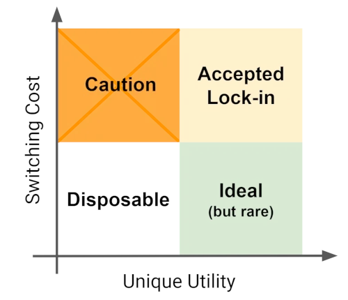
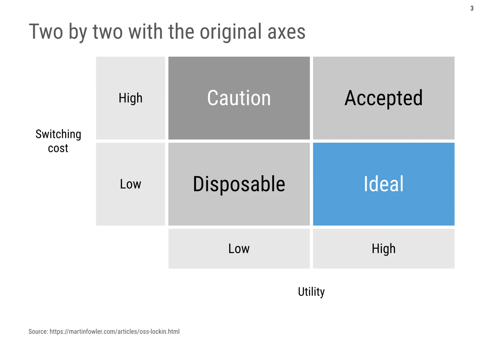
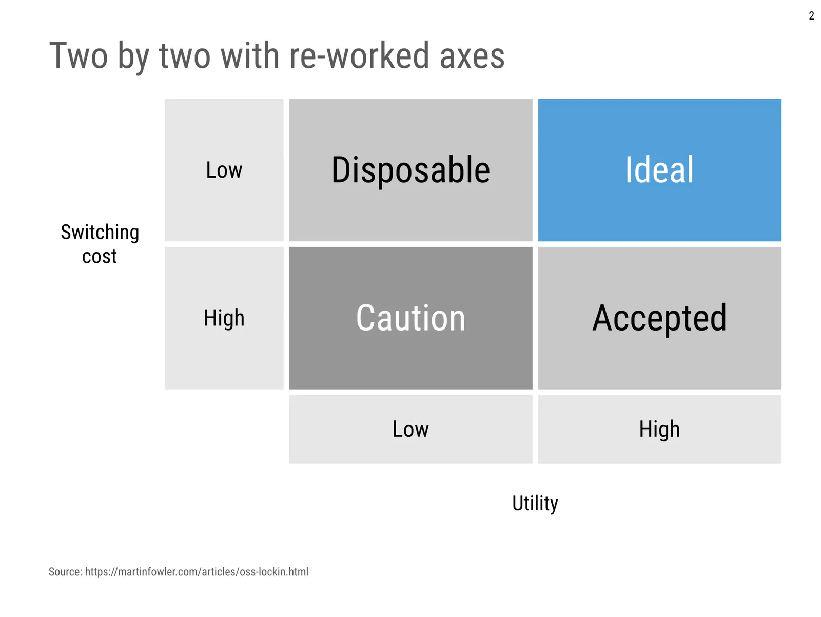
Below is an example of a 2x2 used in an article about software lock-in I stumbled across. Flipping the axes makes the diagram a lot clearer.

 The original diagram

The original diagram

I quickly created reworked the axes in a SlideMagic 2.0 diagram below:

·Data visualization

Quantification as a communication tool

The backbone of almost any management consulting project (and final presentation) is some sort of quantification of options. In essence, the quantification is the communication.

Strategic options can be hard to compare, evaluate. Uncertainty, risk, lack of information, dependencies, short term, versus long term. Throw these in an average politically charged management meeting and the outcome is almost certain: indecision.

A quantification is convenient: simple rank the “score” and the answer rolls out. Every option can be compared objectively. Well, objectively to a certain extend. With all the wild assumptions and predictions, you can pretty much force an Excel model to go anywhere.

But that might actually be useful. The process of debating assumptions, seeing how much they actually matter, which ones are certain, which ones are a bit uncertain, and which ones are wildly speculative, weighing all the factors, is the communication process a consulting team and client will go through. At the end, the point estimate of “Option 3 wins with $52.3b value creation in 2035” might not be correct, but the thought process that went into the estimate means that option 3 is probably the most sensible option to take.

Why do people need to hire expensive consultants to lead them through this process?

  • Some sort of objectivity, an outside party who has the run the numbers with a credibility at stake
  • Raw horse power: knowledge how to run complex calculations involving risk and options (and an infinite supply of available human capacity in a certain time span)
  • Privileged access to information: data from another country, disguised industry benchmarks, etc.
  • And the guts to make broad “20% of the effort, 80% of the result” assumptions where it is appropriate
Continue reading →
·Creativity

How to start a new presentation slide

When starting a new slide, most people think of what to write in it, then worry about composition which usually involves moving text boxes around so that everything still fits on one page.

Next time, start with the composition, then do the writing. Think how a few boxes and arrows can visualise common business concepts in a slide:

  • Something is bigger than another
  • Something is growing
  • Torn between opposing forces
  • Reinforcing loops
  • Ideal fit or a mismatch
  • Trade off
  • Dead end
  • A sequence

Put the shapes, align and distribute them, now add some text

Cover image by dylan nolte on Unsplash

·Data visualization

Years in columns, which way?

In financial statements, the most recent financial period is put first, and next to it is the previous period for comparison: 2017 - 2016. To the frustration of some accountants and CFOs, I insist on putting the years the other way around: 2016 - 2017.

  • The eye is used to moving left to right when looking at time series data
  • It makes tables match line or column graphs that are in the presentation
  • It makes it easer to compare data across 3 years or more

I am not trying to change the reporting practices for financial statements. In the annual accounts, the current year is the most important one. It needs to be accurate and is usually shown with far more digits (precision) than I would use in a presentation. A comparison to last year’s numbers is almost an extra, not the main purpose of the page.

Every financial document has its own purpose and own audience: spreadsheets, financial statements and presentation decks. And among presentation decks you can distinguish between quick and dirty documents to discuss (early results), detailed financial information for the investor community, and more generic financial slides for a general company presentation. Different purpose, different slides.

If you want you can check out financial slides in PowerPoint in my template store. Subscribers can download them free of charge.

·Layout

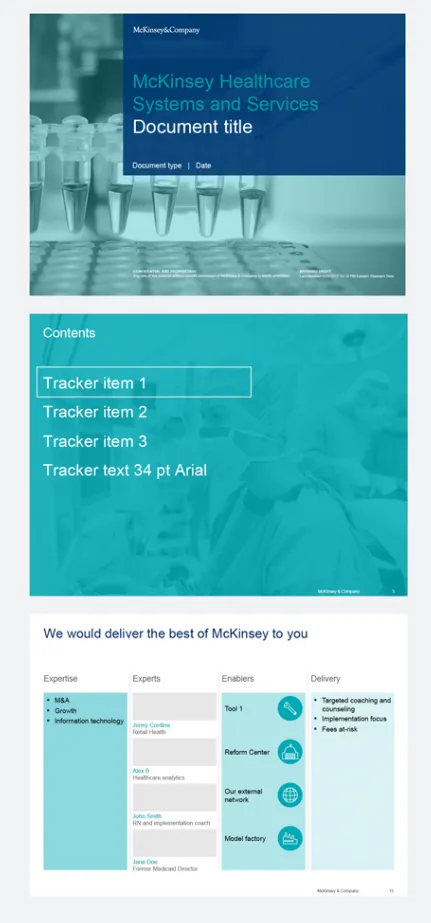
McKinsey's presentation template

I did not know this, but McKinsey has put its entire visual branding guidelines online. Beyond the usual instructions about fonts and colours, there are interesting documents about formatting exhibits and data charts. Most of it seems to be focused on print or web content, but overall it provides an interesting insight into template management of an organisation which basically produces presentations as its main product.

·PowerPoint

How to format tables in PowerPoint

Tables can carry more data than a data chart and as a result can be less effective in a presentation. For some situations though, there is no point trying to avoid using a table in PowerPoint. For example, when investors want to see the quarterly numbers, they expect to see a table.

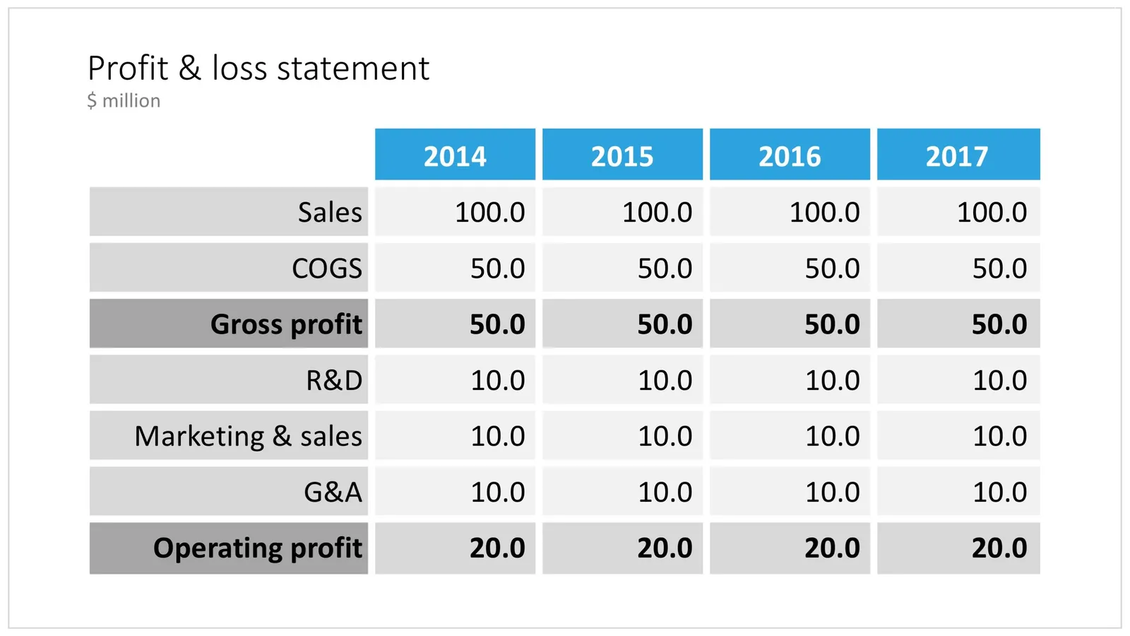
The way you format tables can make a huge difference in how your chart looks. When done well, a table can actually be an effective presentation slide. Have a look at the simple P&L table below.

 A PowerPoint table to present a P&L

A PowerPoint table to present a P&L

This might look like a super simple slide design (it is), but a lot of thought and little tweaks have gone into its design. Let’s take them one by one:

  • Colours have been adjusted to your own colour template, not the standard PowerPoint colours
  • Fonts have been matched to your current template (table can be stubborn sometimes and stick to Arial)
  • Instead of dark lines around boxes, I used lines that match the background colour, making cells a light colour of grey to stand out (or dark, black if you use that background)
  • Totals are bold, and a bit darker
  • The row labels are right aligned
  • The row labels are a bit darker than the cells
  • The data cells are right aligned
  • Numbers are rounded to the same amount of digits, so the dots line up
  • There are not too many digits in the table, enough to convey the data, but not too much to make it cluttered. If the numbers get too big, switch to thousands or millions.
  • There is a bit of inset in each cell, the text does not touch the edges
  • All the rows have the same height
  • All the data columns have the same width
  • The column headings are centered
  • The unit of measure is put at the top of the chart, not repeated inside the data values
  • The table covers the entire frame of the presentation template
  • Double check by hand/calculator: the numbers add up…
Continue reading →
·Concepts

Creating an infinity symbol in PowerPoint

It is tricky to create an infinity symbol (or lemniscate) in PowerPoint, it is a shape that needs to overlap with itself and requires Escher-style (impossible) layering of shapes. The only way to do it is cheat, and construct the final shape of many individual shapes that are grouped together cleverly.

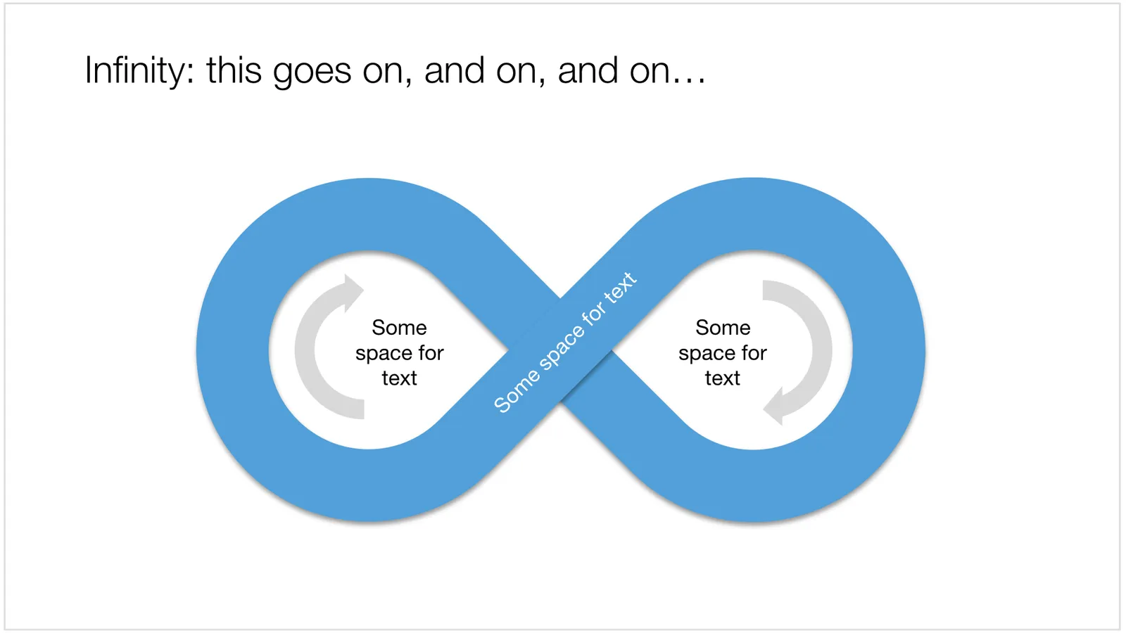
I managed to get it done, and you can see the final result here (hmm, those arrows point the wrong way around though):

 An infinity symbol in PowerPoint

An infinity symbol in PowerPoint

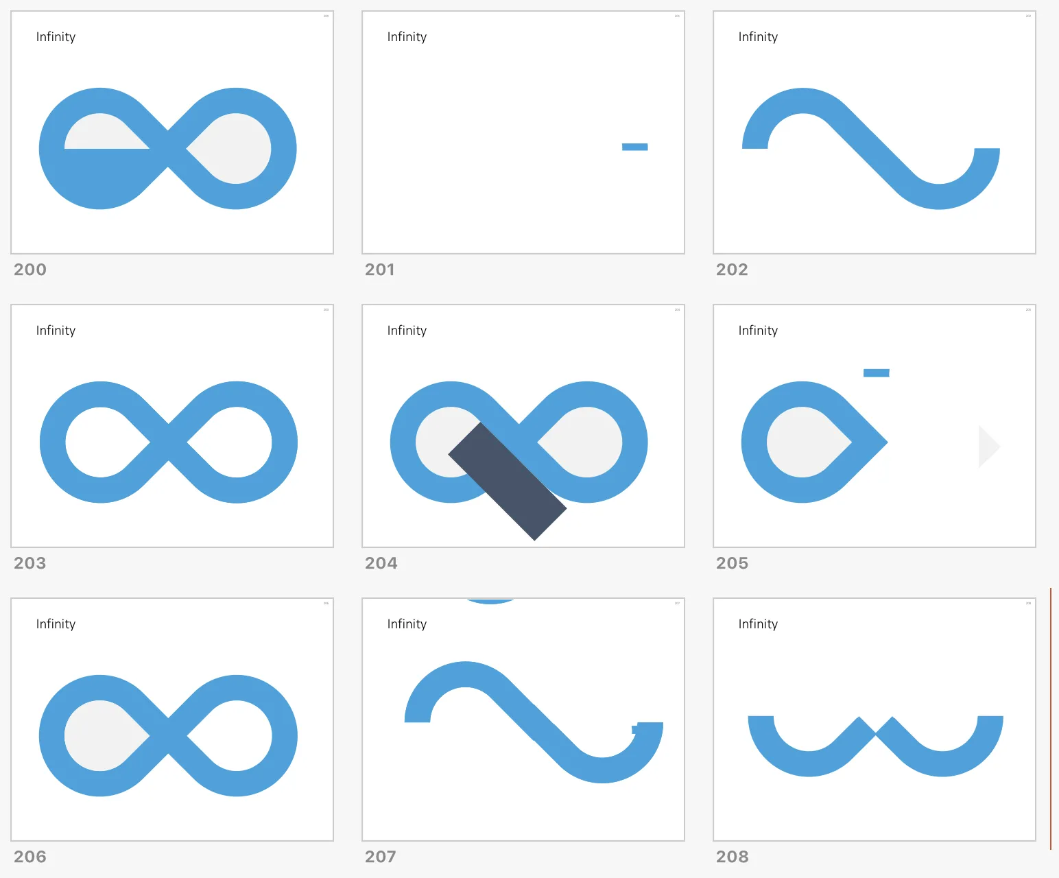
I don’t have the exact workflow anymore that I used (I made some destructive edits), but below is a screenshot of the PowerPoint file in slide sorter mode that I used to create the shape, starting with 2 circles and a square.

 How to create an infinity shape in PowerPoint

How to create an infinity shape in PowerPoint

This shape is useful to show concepts that keep on going, or loops that you can’t get out of. You can download the infinity symbol here, or find other slides with loops. There are Apple Keynote versions available as well.

Cover image by Mark Asthoff on Unsplash

·Concepts

Puzzle pieces in PowerPoint

Although you could consider them a presentation cliché, puzzles can work really well in a presentation:

  • Show how things fit beautifully
  • Show how your are missing (hopefully just one) critical piece
  • Show that you finally managed to plug that last gap

Puzzle shapes can also work great when you use them in combination with images. You can go back to this blog post about making Photoshop-like image cut outs in PowerPoint.

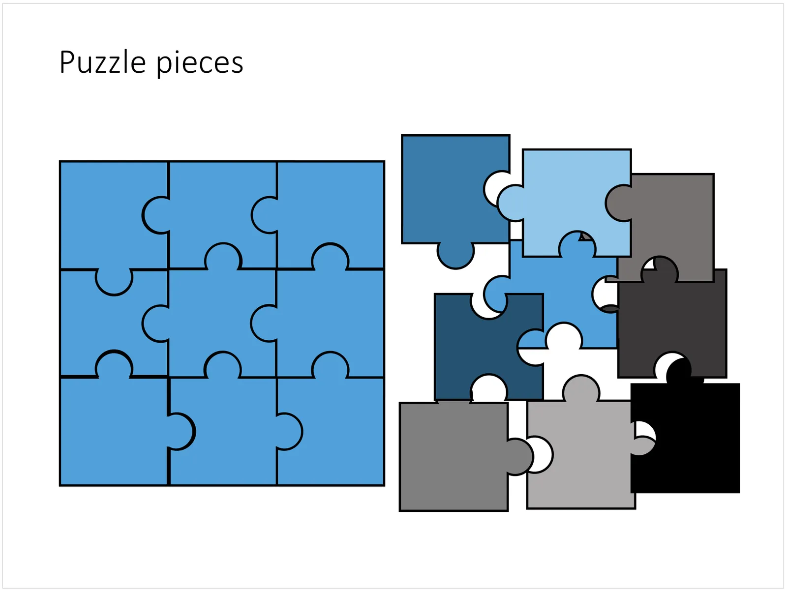
Stock image sites are flooded with millions of puzzle piece designs, but they are not very practical for the average PowerPoint designer (especially late at night working for tomorrow’s deadline). Almost all these puzzles pieces are vector objects or images that are impossible to edit in PowerPoint. Moreover, all these puzzle pieces have wildly irregular shapes that make them hard to fit in your slide composition that requires exactly nine of them.

ThisPowerPoint puzzle slide solves the problem for you. The pieces inside are fully editable PowerPoint shapes, you can change their colour, you can put text in them, you can reconfigure and piece them together as you see fit. Yo’u can download the finished slide by clicking the image (An Apple Keynote version is available as well).

You can try to create the pieces yourself if you want, I used simple square shapes and circles, either joining or subtracting the shapes. Circles and squares might not be the most realistic shapes, but they are very practical when have to piece things together. There is a little bit of math homework to do to determine which type of puzzle shapes you actually need, and which ones you can create by rotating existing pieces.