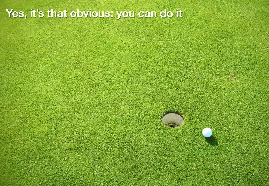
Chart concept - sky writing
You take a picture of a cloudy sky, and hand write a text with a healthy dose of “glow” and you can create your own skywriting images.

Here is how people used to do this before the age of PowerPoint:


Frequent updates about all things presentations since 2008. Subscribe to never miss a post.
You take a picture of a cloudy sky, and hand write a text with a healthy dose of “glow” and you can create your own skywriting images.
Here is how people used to do this before the age of PowerPoint:
PowerPoint does not have the rich image clipping and cropping tools that PhotoShop has. To take the background out of an image, you can set its background color to transparent and hope that the image edge come out reasonably clean.
Jose Arriaga recently started blogging about presentations on PowerPoint Symphony. He discusses an original alternative method: drawing a shape similar to an image and then fill it with the source picture as a background. Full details in his post here.
Most images have the perspective of someone who, well, stands up and look around. These 2 different ads (one here, and another one here) reminded me to look out for unusual compositions to keep your slides interesting.


Via Ads of the World.
A reader asked me in the comments of my post on the Pulse News iPad app what feeds I put in there. Here are some sites for daily creative inspiration:
Please let me know what sources I am missing here.
Every day I like to browse through an enormous amount of images from photography, art, design, and advertising sites to get inspiration for my presentations. The iPad is making this a whole lot easier.
Applications for the iPad are still in their infancy. Many RSS reader applications are popping up, partly driven by the fact that Google Reader does not work very well in the iPad browser (scrolling down is hard).
One iPad RSS reader app, Pulse News, is making an effort to mimic the iPad user interface by rendering content “iPad-style”: creating a stream clean headlines with images ripped from the RSS feed. For your regular feeds, this is a nice gimmick, but the draw back of the app is that you can only put in 20 feeds, by far not enough.
But for my image feeds this is brilliant. I follow less than 20 feeds and with the touch of a finger I can fly through days of content in a few seconds, just images! Try it if you own an iPad.
I have been avoiding clip art for many years in my presentations. The graphics look clumsy and cliche compared to a high quality stock image. (Sometimes I am longing for that screen bean though).
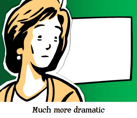
After reading a few posts on Tom Kuhlmann’s Rapid e-learning blog I might change my mind though, maybe. All these big image, big text slides start looking sort of the same. Some ideas by Tom:
Add Tom’s blog to your RSS reader if you are interested in this.
Look at this beautiful visualization of images taken in London. Blue: images taken by locals, red: ones by tourists (more cities here).
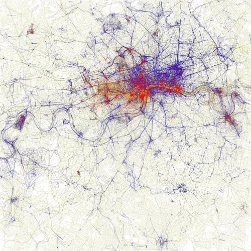
I am using maps more and more in my presentations. A map with color-coded segments is a much more powerful way to visualize data than a bar chart with a ranking of variables. I am still struggling to find good tools. There are very few good editable PowerPoint maps available, and Google maps screen shots are a bit cumbersome for large volumes of data points. Suggestions?
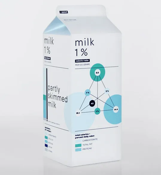
I never saw this before: infographics on food packaging. Nice work by Audree Lapierre.
It is very hard to capture the sensation of a wide panoramic view in a photograph. Making a picture of that stunning view will look boring when you view it later. Not when you capture an object nearby as well.
Impressionist painters use this technique in the composition of their works. See this painting by Alfred Sisley (Village On The Banks Of The Seine at Villeneuve La Garenne). Unusually, the background of the scene is actually lighter than the foreground.

I used this lone tree in one of my own photographs of a recent visit to the ruins of the Masada fortress near the Dead Sea here in Israel.
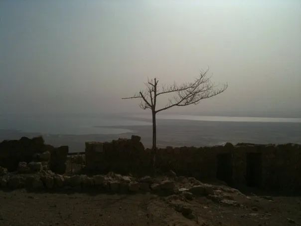
Think about this when your pick your next stock image in your presentation.