SlideMagic Blog

Frequent updates about all things presentations since 2008. Subscribe to never miss a post.

RSS
all posts

Category Images

·Concepts

Chart concept - low hanging fruit (that's gone)

“Low-hanging fruit” is a term that is over-used in corporate meeting rooms. Recently I used a nice giraffe image to create a tongue in cheek slide explaining that all the easy opportunities have been picked away. (Yes I now giraffes eat leaves and not fruit…). Image found on iStockPhoto.

·Design

CNN-style lettering tape

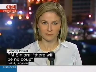
A semi transparent overly is one way to keep text readable over busy images (previous post). CNN uses a different one: black and colorful bars behind white text. The length of the bar varies with the length of the text that it covers.

It is easy to recreate this effect in PowerPoint. Here an example with an image from one of my favorite boulevards in Paris (image credit to jfgornet). You can go further and imitate the retro lettering tape using stock images like this one.

·Design

Un-stretch those images

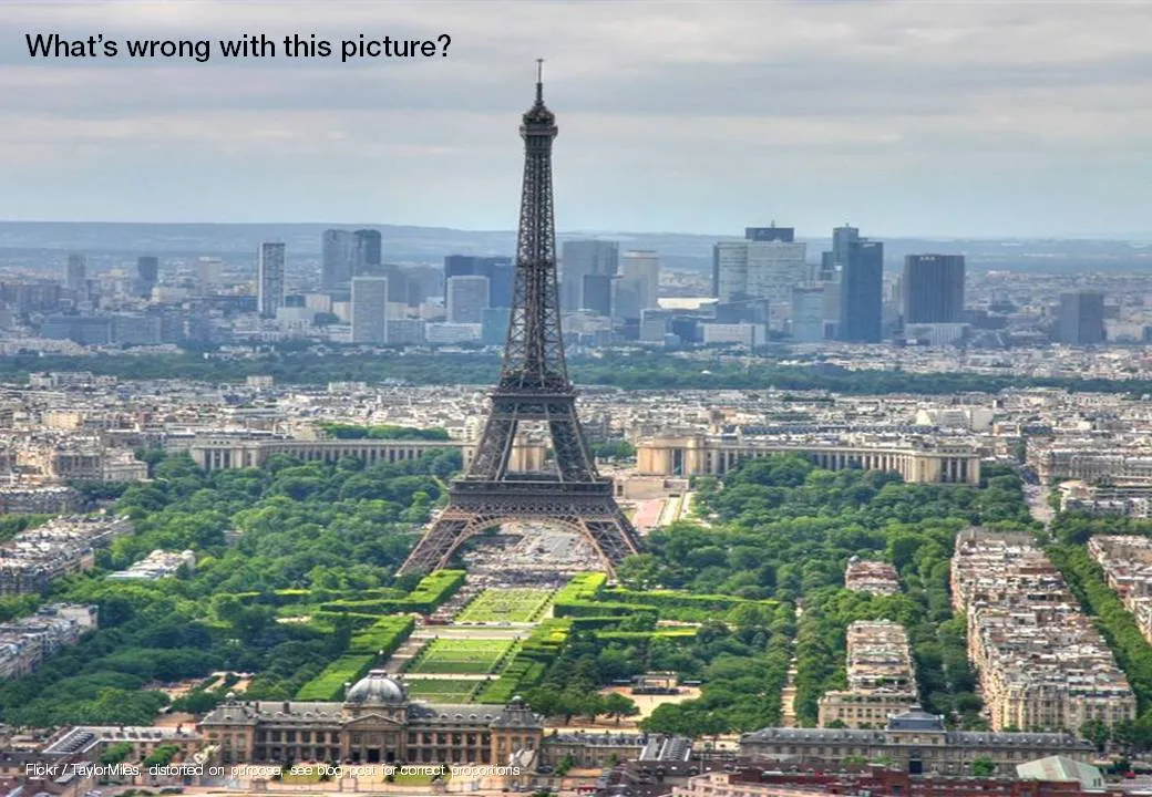
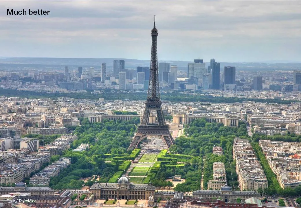
Many presentation images are distorted: the proportion between height and width got confused somewhere along the way. It is easy to correct this. In PowerPoint 2007: right click the image, format picture, reset picture, and you got your original image back. Now hold the shift key while resizing your image and the proportions will be preserved.

Here is an earlier post with a more advantaged tutorial how to scale images to a full page without distortion.

·Design

Image sequences to set your audience's mood

Presentation designers can learn from film directors. Inserting a sequence of good (and real) images can take your audience from the conference hall to a different place. Beautiful and sad at the same time, click through some of these urban decay images to get the feeling: here, here, here, and here.

(Image by Yves Marchand & Romain Meffre)

·Design

Beyond images that just show things

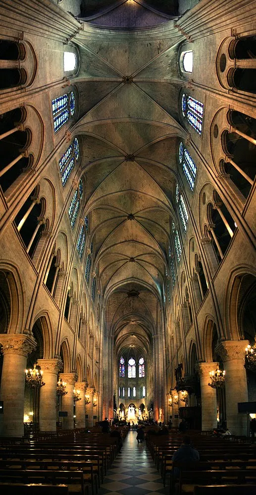
Most stock images are descriptive: search for “ice cream truck” and you get what you asked for. The position the image puts the audience in, is at least as important (maybe even more important) than the object it represents. Look at this image of the inside of the Notre Dame cathedral in Paris (Wikipedia link). Six images stitched together to create the sensation of small child looking up to the ceiling of this vast place. It puts the audience inside the image.

Image credit: eso-teric, visit his site for a larger picture. I linked to these images as a source of inspiration (earlier post), check copy right restrictions before using them in an actual presentation. Found via TwistedSifter.

·Advertising

Iconic images

What a wonderful advertising campaign: if 4 pixels can tell a story, imagine what millions can. Here is one example, but there are lots more on Ads of the World (click the previous and/or next buttons).

I like using iconic images in presentations, an endless repertoire of visual shortcuts stored in the brain of almost any person on the planet.

·Design

Immerse yourself in photography

As a child I already loved flicking through magazines, just to look at pictures. The Internet makes it so much easier to absorb vast quantities of visuals. Simple add a huge amount of photography-focussed RSS feeds to your Google Reader and hold down your finger on arrow-down, only to lift it when an image instantly touches you.

Not that I am hunting for images to use in presentations, often they are not right, often they have copy right restrictions. But still, immersing yourself in images improves your slide design skills. It is a bit like the best way to learn a language: surrounding yourself with it (maybe Hebrew is the exception to the rule though).

The most interesting images are often not the most professional ones. Stunning sun sets, volcano eruptions, can be beautiful but do not touch you on an emotional level.

I recently added the RSS feed for ffffound to my Google Reader: a community image book marking site with a large readership. Images are picked by random users (most of them with a good eye for photography), as a result you get a frequently updated image stream full of surprises. As an example, here is an image I found today on the site:

Yay!Everyday is another example of image highlighting site, worth following.

·Design

Picking the correct logo

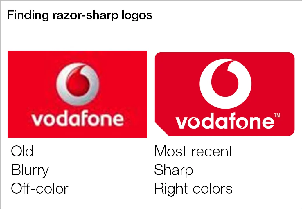
Many investor and sales presentations include logo pages. Improve the quality of these slides significantly by not picking the first image that pops up in Google image search:

  1. Visit the company’s web site to see what the latest logo of the company in question is, logos get updated frequently
  2. Set the Google image search options to large format
  3. Pick a correct, huge logo
  4. Paste it in your presentation, reduce to the correct size, hit compress images

Companies with a good PR department have high-resolution images of their logos on the web site. Use them.

·Design

Turning any image into concrete

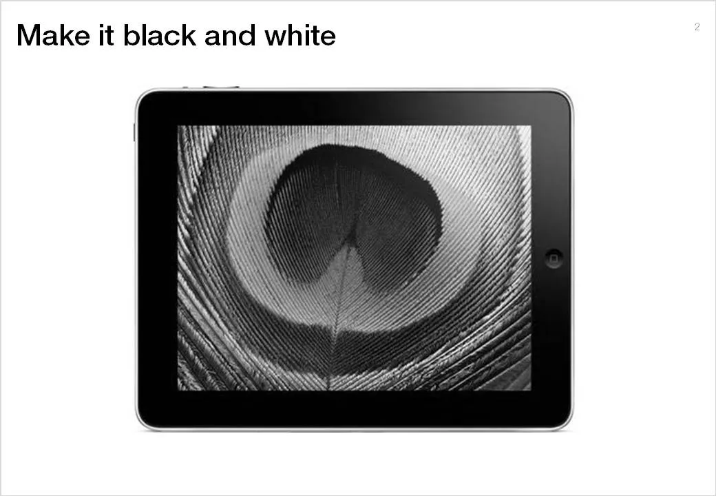
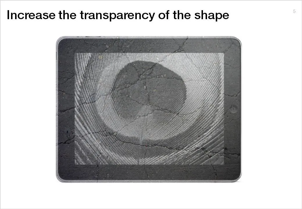
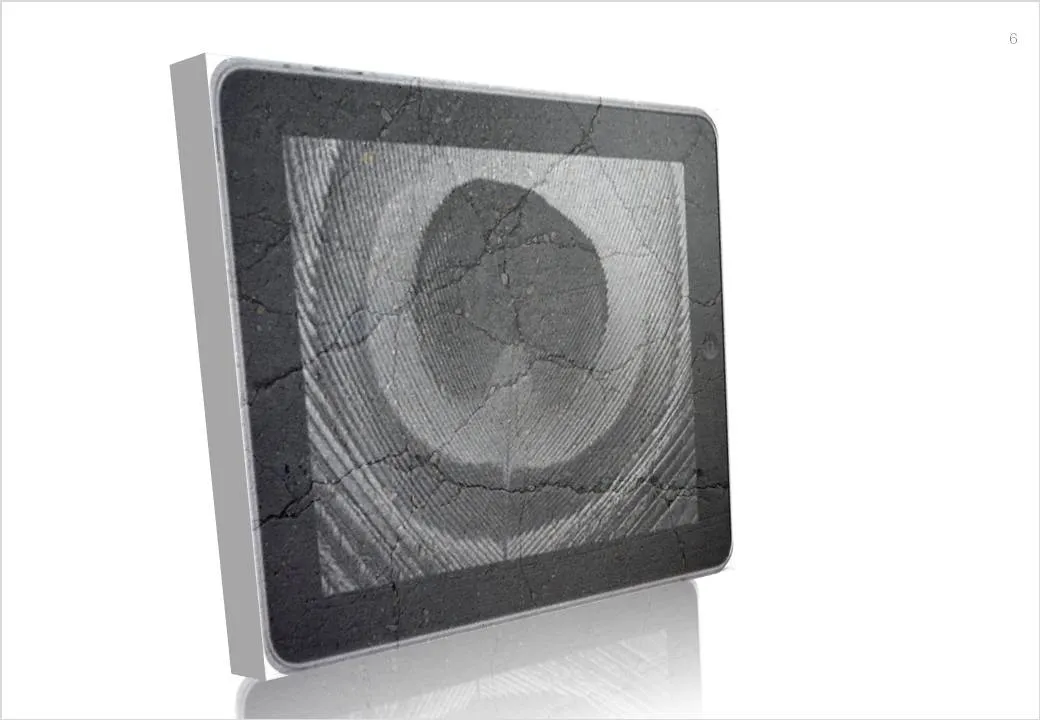
Here is a simple trick to turn any image into concrete. As an example I took an iPad and turned it into an iSlate, but it might actually work better with other images (you can turn portraits into statues for example).

To do this in PowerPoint without the help of advanced image manipulation software you need to add a shape on top of the target image, fill the shape with an image of a concrete texture (available on any stock image site) and make that shape with the concrete texture semi-transparent.

·Design

SpiderPic - price comparison shopping is coming to stock images

By now everyone knows that using professional images in your presentation is far better than ripping images from Google image search or clipart: higher quality photographs, isolated subjects on a white background, detailed search capabilities including required colors or available white space for type, and last but not least: no copy right infringement issues.

With the increase in popularity of stock images also came a backlash: many photographs were so cliche and/or over-used that designers increasingly start to look at other image sources with creative common licenses (I like Flickr a lot).

Price is another issue. Online stock image sites used to charge around $1 for each image. At that price you could afford to buy volumes and volumes of images, try them and discard them if they were not appropriate. Prices have gone up significantly recently, requiring a change in the creative process: design your presentation with low-resolution comps and only buy your images at the very last stage of the project.

Technology is about to put new power in the hands of stock image buyers. Many stock image sites contain the exact same image, but offer them at different prices. Differences in price are the result of general pricing policies (driven by the strength of the brand of the stock image site) or sophisticated dynamic pricing algorithms, setting image prices based on the number of downloads/views (more popular images become more expensive).

SpiderPic is a price comparison search engine for stock images and let’s you decide from which source you want to buy the image. You key in the search term, the site presents the available options, and once you select a candidate it lists other sites that offer the image (and at what price for what resolution). Once you made your selection you are linked through to the relevant stock image site to complete the purchase transaction.


Continue reading →