SlideMagic Blog

Frequent updates about all things presentations since 2008. Subscribe to never miss a post.

RSS
all posts

Category Data visualization

·Data visualization

Order of data series

Here is a (sad) chart from today’s Economist:
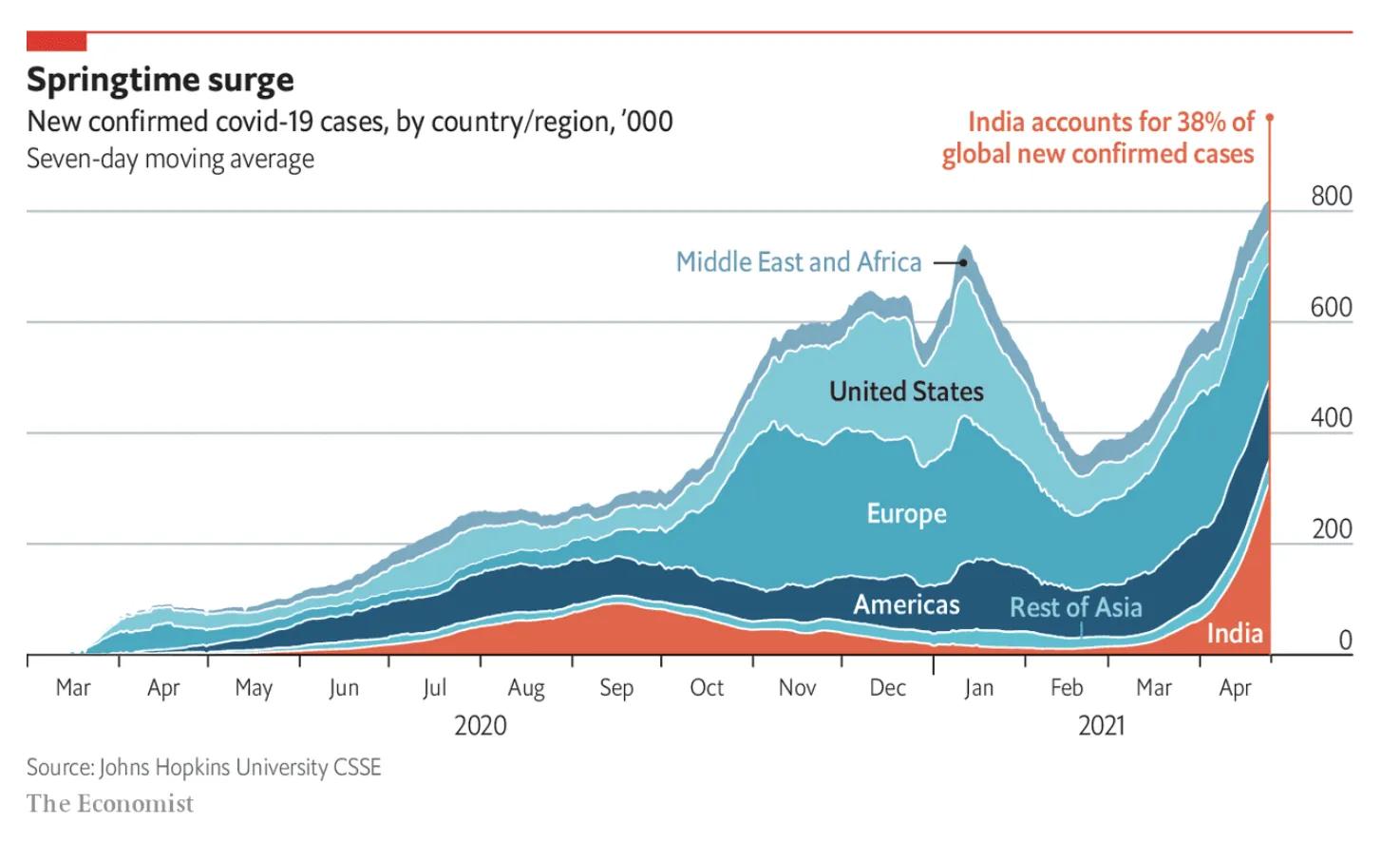
The Economist put the data series that carries the main message of the chart at the bottom, pushing up all the other data series. My preferred option is the other way around, put it on top. In that way you can see all other regions staying pretty much stable, while India grows strongly.

(Unrelated). India has a very large population, and you need to look at COVID in that perspective. In terms of caseload, it is still behind other regions (such as Europe). The problem is the quality of the healthcare system, and the availability of basics such as oxygen in emergency rooms. Europe could handle the load (more or less), India is in a far worse position. Also, the India stats are averages for the entire country. On a region-by-region basis, there are likely to be places with much bigger caseloads than Europe. Let’s hope that it gets better.
·Data visualization

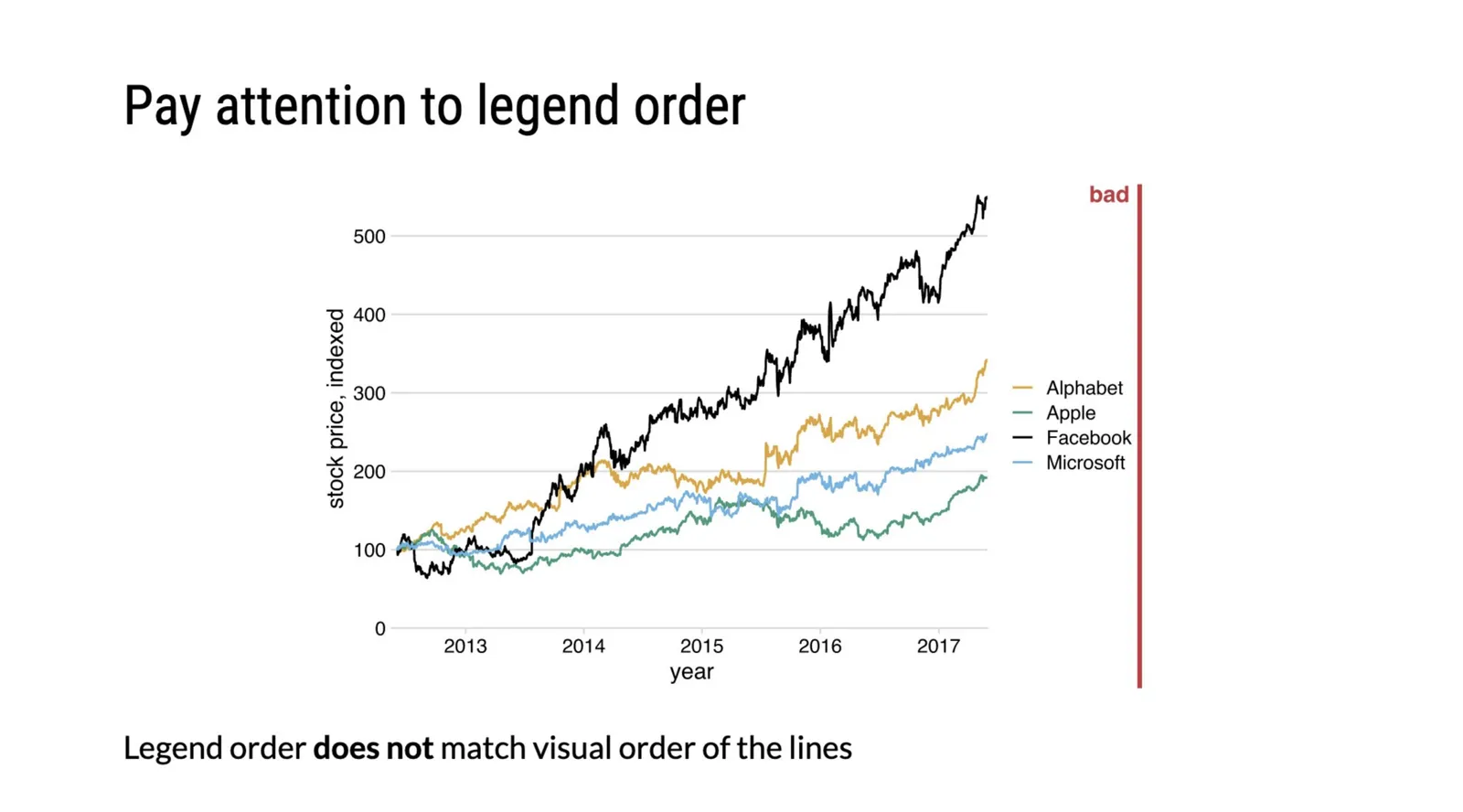
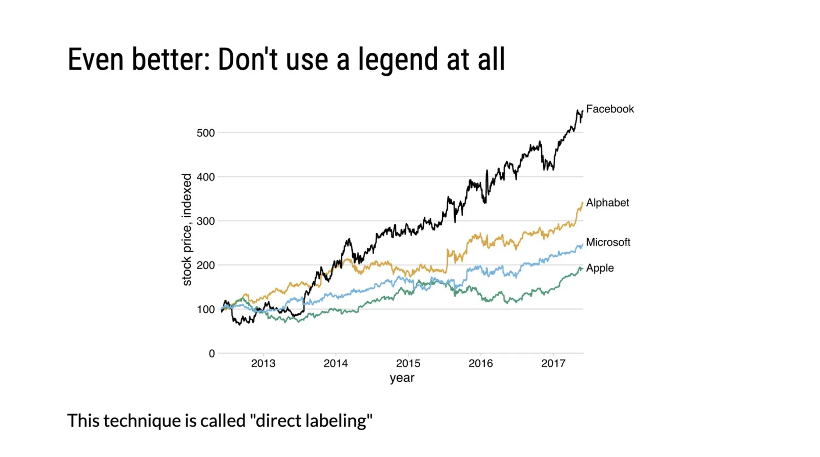
Legends can be confusing

Some perspectives by @clauswilke:

He is right. Legends can be confusing and are prone to errors, when possible, put the data label immediately next to the line.

·Data visualization

Making sense of Israeli vaccination data

Here in Tel Aviv, I was lucky enough to receive my second vaccination with the Pfizer COVID-19 vaccine. The whole world is watching us:

  • High vaccine availability
  • Advanced healthcare infrastructure, with a centralized IT system (any medical professional can punch in my ID number in her computer and get all my medical records on the spot, this would raise some privacy issues in other countries)
  • (Unfortunately) we are set up to deal with national crises and get organised quickly

There is lots of data available, cases, hospitalizations, difficult cases, casualties, by age, religious background, location, total cases, new cases, etc., etc. And everyone is looking at the top line number, will the big case graph go down and can we declare victory over the virus. Unfortunately so far, it stays more or less stable (at high levels).

This is a typical case of data overload. If you want to see whether the vaccine works you need to compare 2 things like for like: people who got vaccinated, and people who did not. And when you do that (pretty much like a clean medical trial), it shows that the vaccine is overwhelmingly effective, the same size is just not the entire Israeli population.

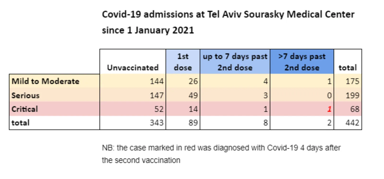
One such example is hospital admission data from a Tel Aviv hospital. Not millions of people, but a small, isolated group that you can compare. The original chart is here:

I did a quick makeover of this slide in SlideMagic.

  • Colours are consistent
  • Everything is properly spaced
  • A better way to communicate the ‘1’ exception case
Continue reading →
·Data visualization

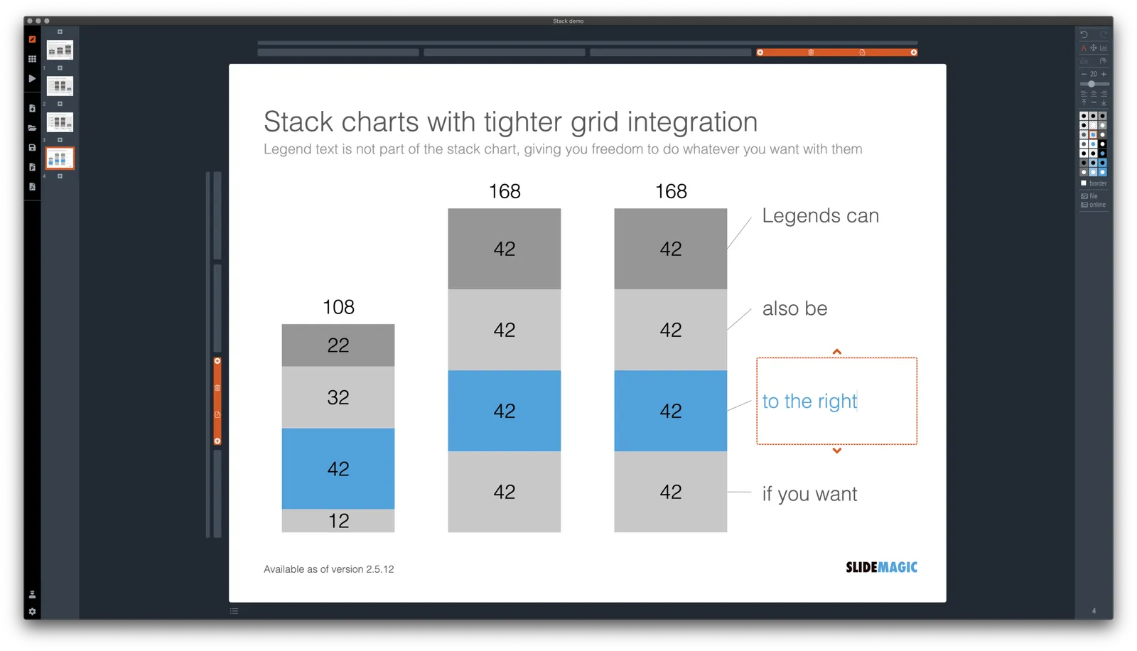
Stack charts with tighter grid integration

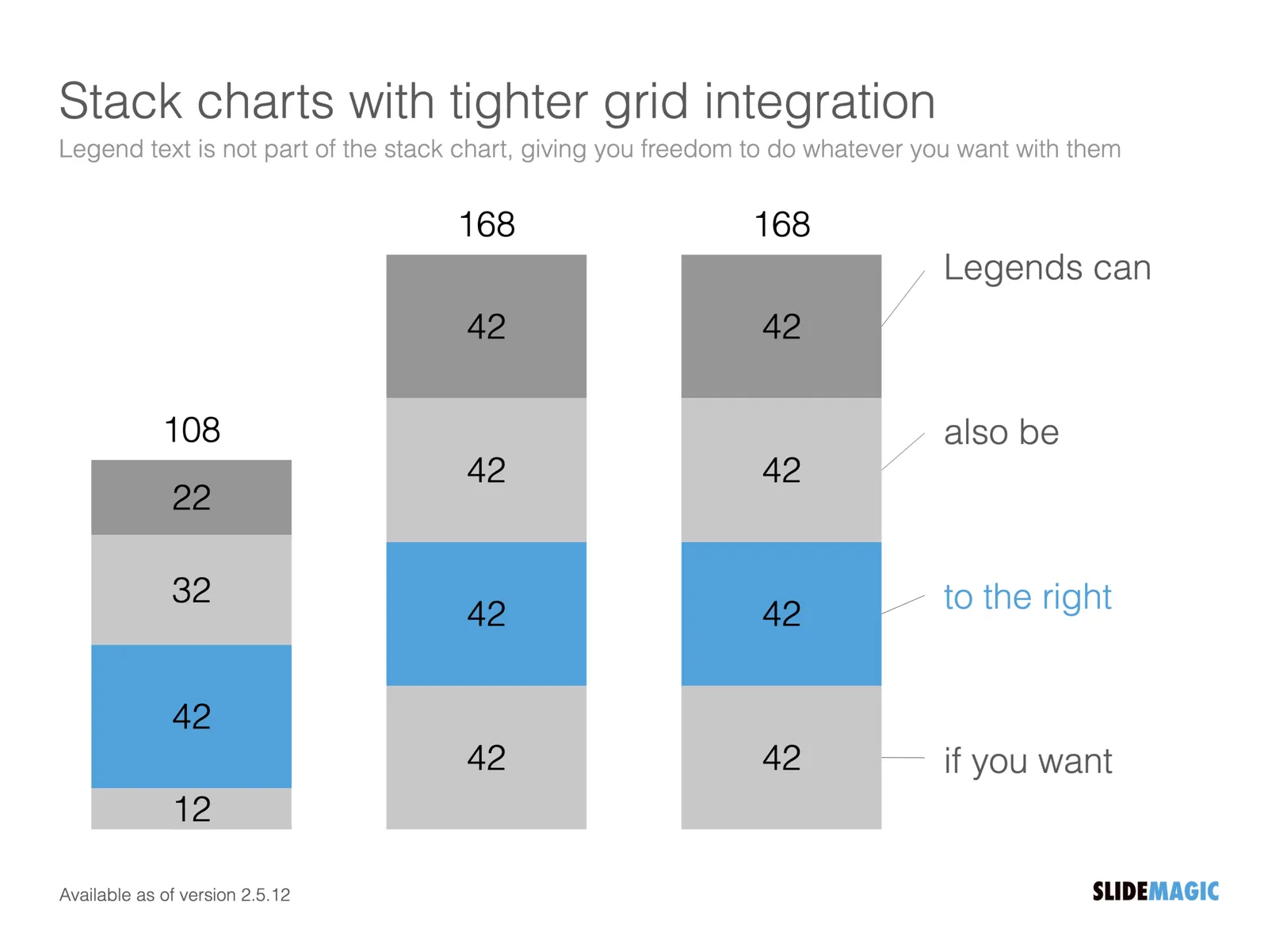
Stack charts are very useful. So useful in fact, that SlideMagic does not support pie charts (by design).

They are very easy to make in Excel, but using them straight in a presentation is tricky. First there is the overall formatting of the chart, then there is the legend which is never connected to the chart itself, and does not leave enough space for text other than ‘new’, ‘old’.

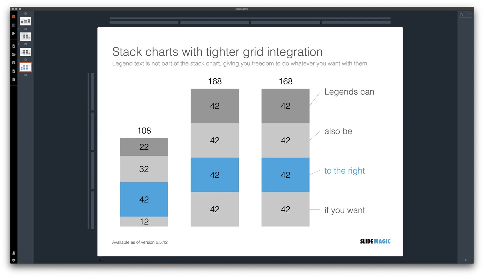
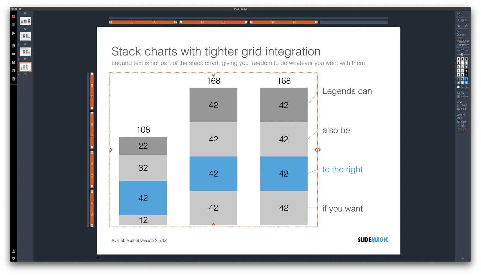
I just overhauled the stack chart in SlideMagic and forced to be tightly integrated with the slide grid. Adding/deleting rows to your slide will add/delete data series to your stack chart. Furthermore I have actually removed the legend from the stack chart shape itself, what is left is only the option to add lines that point to boxes outside the chart. This gives you total freedom to do whatever you want with the chart legend, small, big, or even huge text boxes. Everything lines up, you can even fit stack charts in tables if you want.

The charts below give you a sense of what the new engine does:

The old stack charts will continue to work in SlideMagic for the moment. If your charts have them, you can edit them. If you want to make new ones, click + and you can still make them. An old stack chart can instantly be converted into a new one by selecting it and clicking the icon.

Stack charts in the template database are still in the old format, I will convert them over the coming weeks to the new format.

Continue reading →
·Data visualization

Creative with bar labels

Below a screenshot from an Economist instagram post:

The labels of the first 2 bars have been placed over the bars themselves to save space: there is now more room for the bars themselves. Other labels to the right of the bars.

I am not a fan:

  • The white over red of the top labels is hard to read
  • There is no nice and simple list of the top players, aligned in a consistent way
  • The names inside the chart area makes it harder to relate the bar to the axis
  • (I also prefer to put data labels in the chart rather than having a very imprecise value axis)

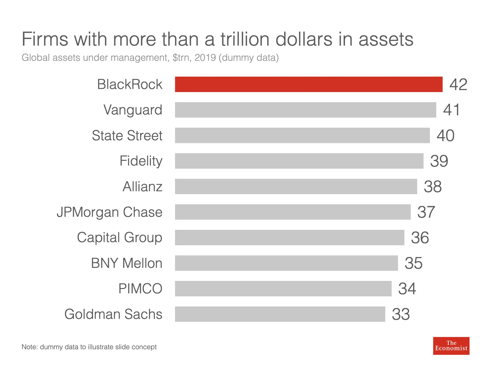
Here is a quick illustration of a bar chart in SlideMagic (The Eonomist did not provide the exact values, hence the dummy data).

·Data visualization

How to make a source of change waterfall chart (Apple quarterly results)

In between the election news: waterfall charts….

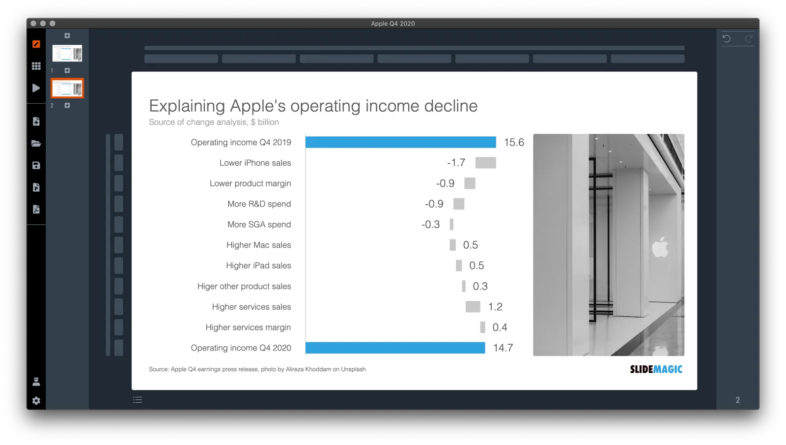
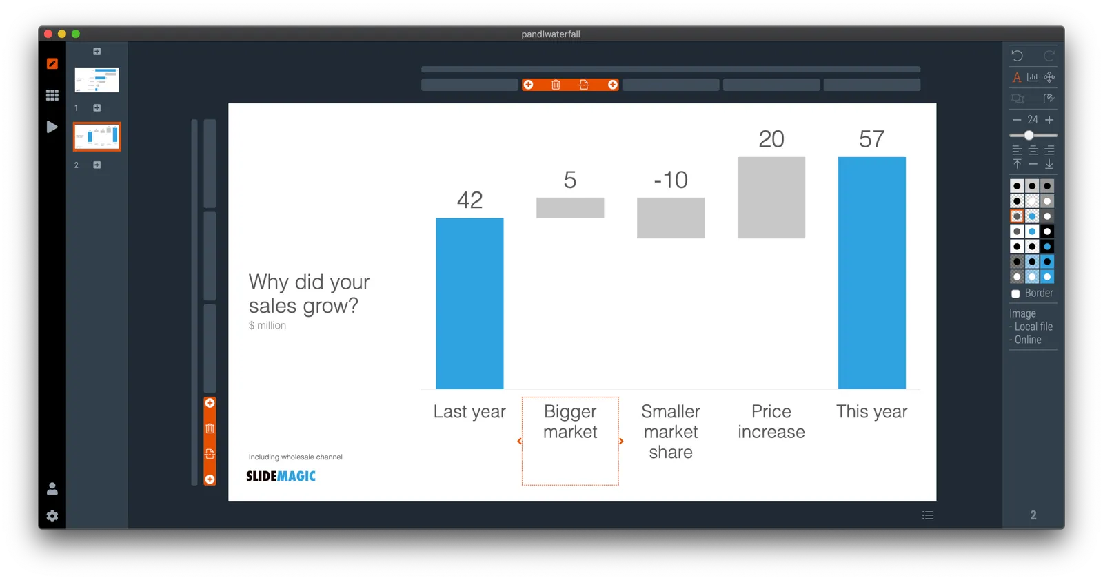
Waterfall charts are a great tool to explain the difference between 2 scenarios. In SlideMagic, they are really easy to create. Below is one I put together quickly with data from Apple’s 2020 Q4 earnings result, and a photo I found using SlideMagic’s built-in Unsplash image search. Notice how I opted for an unusual vertical waterfall, to create more space for the axis labels.

Some people would argue that you could make the chart even clearer by breaking the axes: showing them as ‘5.6’ and ‘4.7’ for example. Yes, it would highlight the deltas better, but in general, I think manipulating axes, well, manipulates the message. The fact that the changes are relatively small to the total is part of the message.

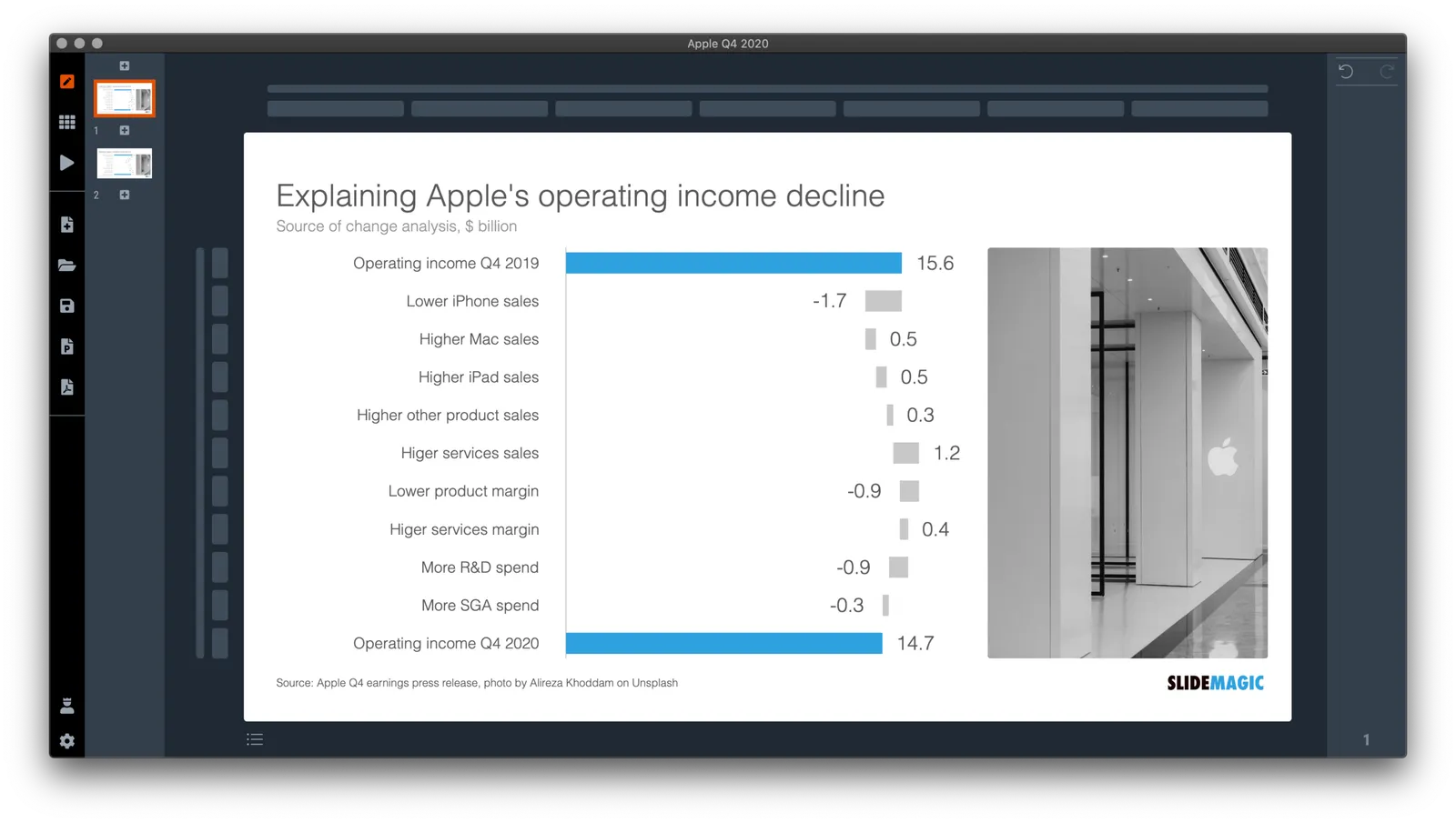
I reshuffled the rows a bit to group the decreases and increases. That makes it more clear in one sense, but less clear in another. Your choice.

\How do you go about making such an analysis? I put my numbers in a Google Sheet that you can view yourself.

  1. Enter the data for the 2 comparable quarters in 2 columns. Add the totals as calculations rather than hard-coded numbers to check that you did not make any typos. (The blue cells are the one that I type in, the white ones are calculations).
  2. Create space between the 2 columns
  3. Pull numbers from the input that you consider drivers. You see that I deviated a bit from the way the input was presented:
Continue reading →
·Data visualization

Log scales?

With all the talk about exponential growth of the virus, logarithmic scales are popping up in graphs everywhere.

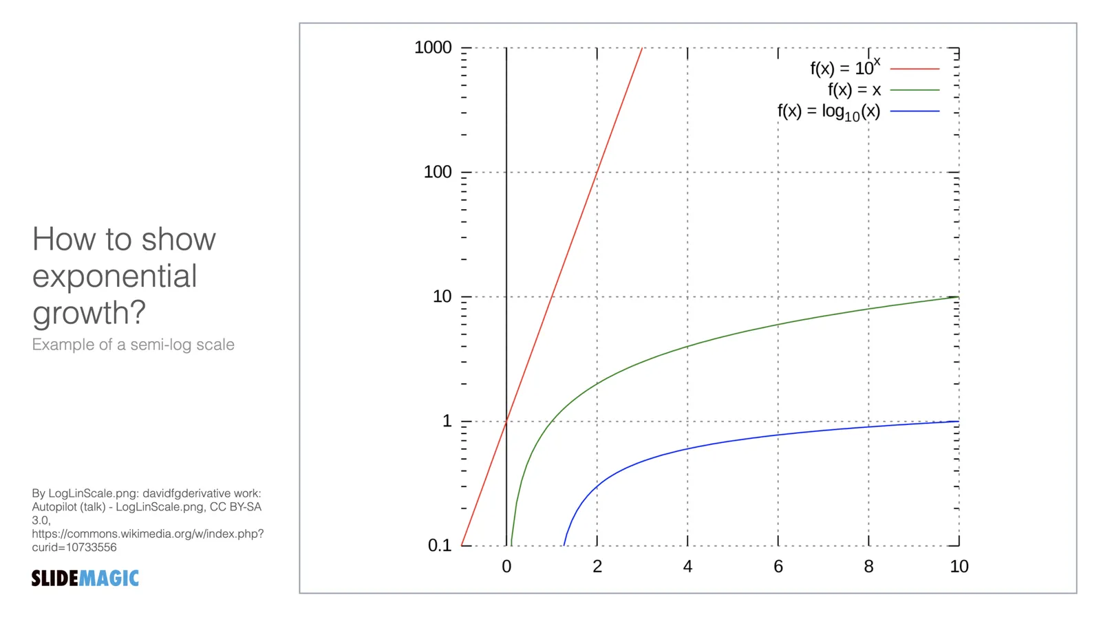
What is a logarithmic scale? Unlike those on a linear scale, the units on a logarithmic scale change. See the chart below.

The result is that the normally speaking rapidly growing line 10^x now appears as a simple straight line.

Exponential functions can be hard to graph, analyse and compare. Toning down the scale makes things more manageable. I remember in high school, I used log mm paper to plot graphs from physics or chemistry experiments. By measuring the incline of the line, I could estimate exponential coefficients, and compare them.

While logarithmic scales are a great practical tool for scientists, I think they are less useful in presentations to a more general audience. “Look at this straight line, but in order to understand how fast tings are really growing, look at the small numbers that reveal the axis measurements”. People simply don’t grasp the concept of a logarithmic scale. If the virus grows exponentially, well, show an exponential line.

If you need to compare exponential growth, make a bar chart of the growth rates, rather than drawing straight lines on logarithmic scales.

·Data visualization

Architecture diagrams

I am starting to experiment with different chart types in SlideMagic. One experiment: IT architectures that consist of users, servers, databases, clouds and lots of lines.

The built-in icon search, combined with the new line drawing feature does a pretty good job actually. And while SlideMagic is not a dedicated tool to design network architectures, it might actually force you to make better architecture diagrams in presentations. Let me explain.

Detailed network diagrams have the same problem as detailed spreadsheets when it comes to presentations. They are project work tools to run analysis and plan work, they are not tools for communication. When I need to make a data chart, I always disconnect from the spreadsheet and resist the temptation to copy-paste. Instead, I pick the 10 numbers that matter, round them up to the relevant precision, and plop them in a very simple bar/column chart that tells the story.

The same is true for IT architectures. If you want to present an architecture overview on a slide, that slide needs to be understood almost immediately when putting it up (like all slides in your deck). If tangled connections, boxes, servers make that hard, then the only thing your slide communicates is that your architecture is complex, not much more.

Again, disconnect from the working papers. Think about your message: ‘my architecture has 3 layers’, ‘my system connects the systems of 15 suppliers’, ‘my system is entirely on premise’, whatever that message is, make a simple chart that supports it.

Continue reading →
·SlideMagic

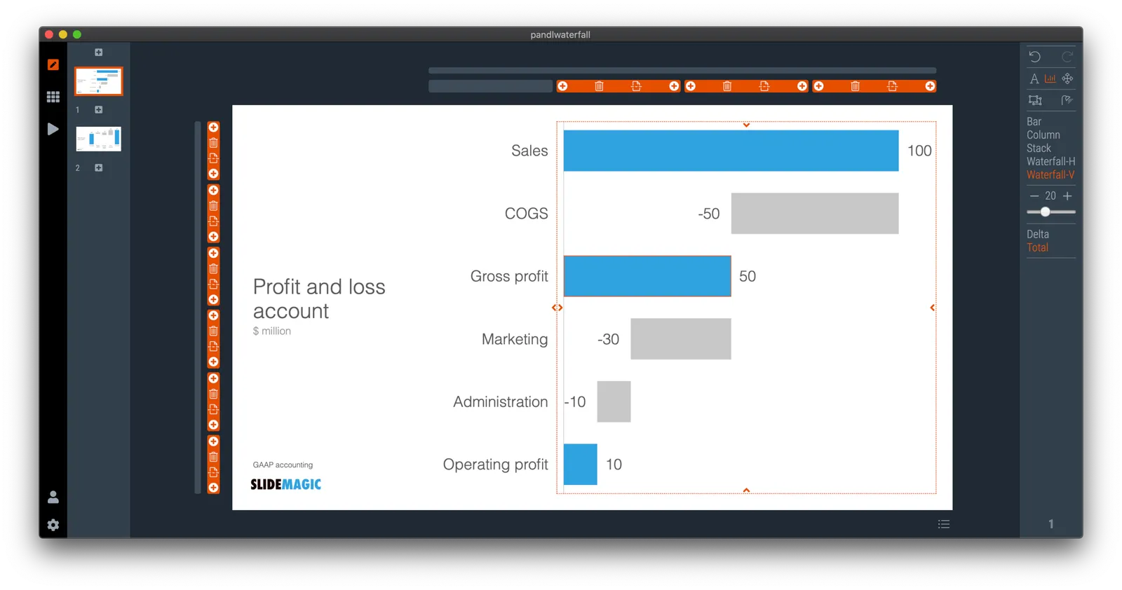
Waterfall charts in SlideMagic!

Finally, they have arrived. Waterfall charts in SlideMagic. Everything lines up with other elements in your slide. Super easy to make and edit, super easy to convert to editable PowerPoint / Excel charts if needed. Download version 2.4.7 of SlideMagic to try it out (both for Windows and Mac). This is a brand new module in the app, please let me know if you experience any issues or have other suggestions.

·Data visualization

Chart makeover: where do people get infected with COVID-19

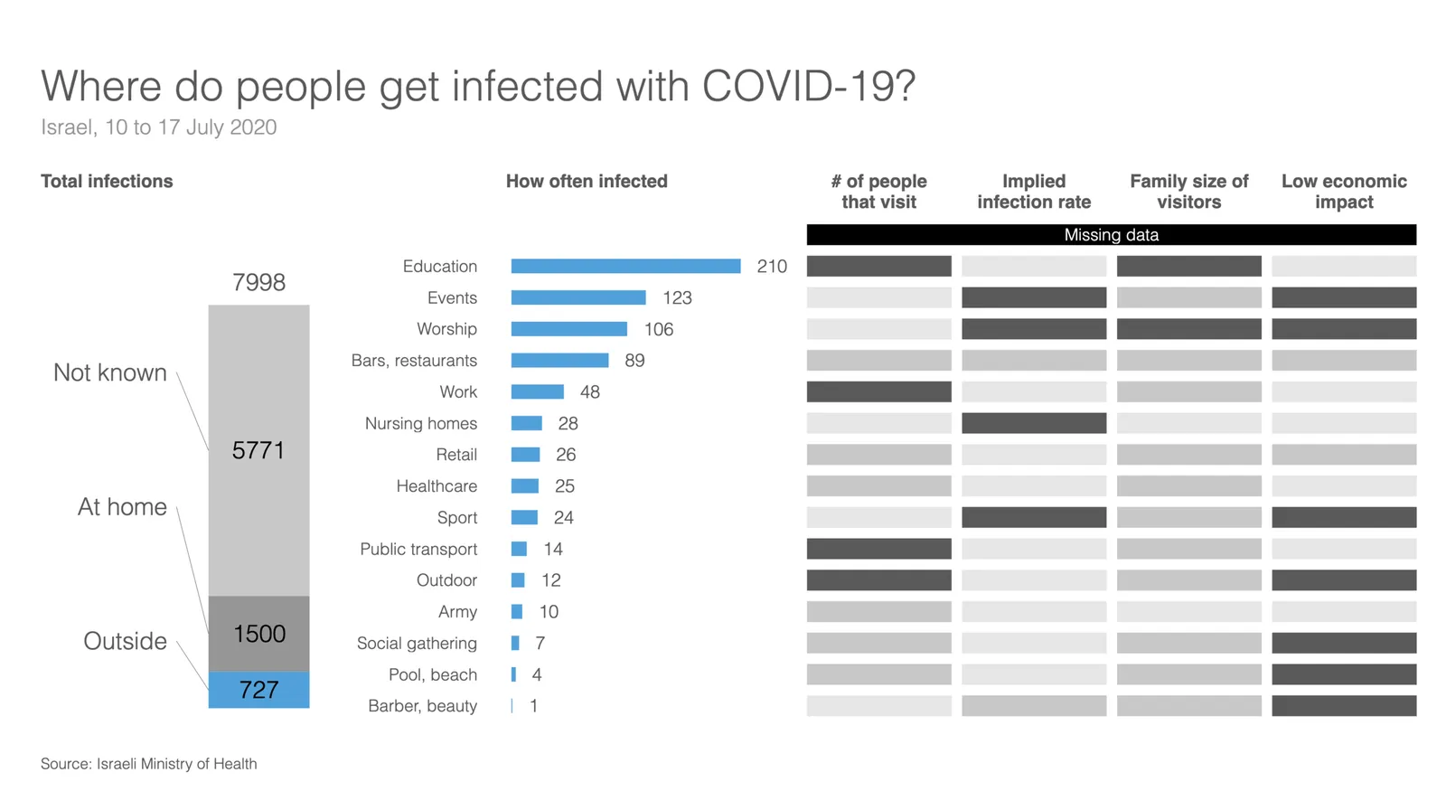
Israel is experiencing a very strong second wave of the virus. Its health ministry recently published data about where people get infected.

This graph does not tell the entire picture, I tried making a quick slide in SlideMagic:

What did I add?

  • Providing the overall context: for many patients it is not known where they are infected, and many get infected at home (which are probably secondary infections)
  • There is still important data missing. The most important one is how many people in total actually visit a place. Millions of people visit schools, thousands probably visit gyms and places
  • We need to understand the impact on secondary infections (how big are the typical households that these people are coming from).
  • Then there is the question about impact to society…

This SlideMagic slide is free, you can download it here. It is clearly an example of an analysis slide, rather than a visual to be presented to a large audience. While I am not a big fan of stretched 16:9 layouts, in this case I had to go for it to create space.

PS. My opinion re. the strong second wave in Israel? Yes, Israel got the virus under control and then reopened too quickly (school were the main source of infection initially). But, in the end I believe any country re-opening will go through the same process, may just a bit slower. I think Israel is 1-2 months ahead of other countries re-opening.