SlideMagic Blog

Frequent updates about all things presentations since 2008. Subscribe to never miss a post.

RSS
all posts

Category Data visualization

·Data visualization

Don't make them study the graph

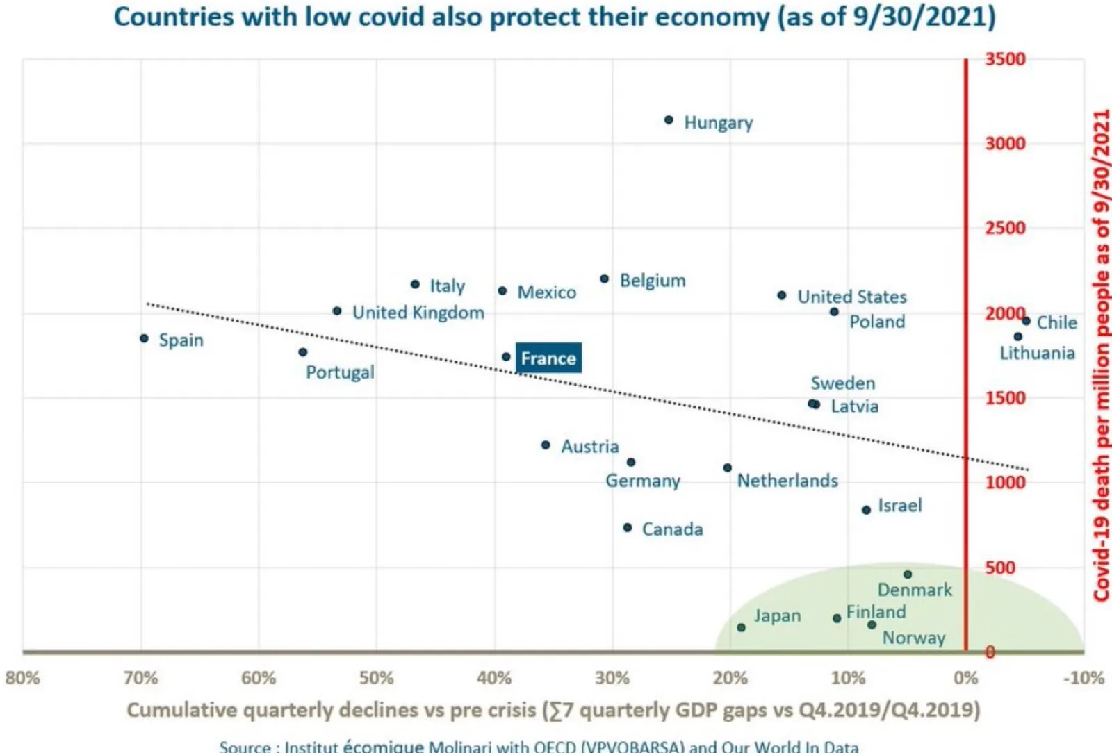
A random chart on Twitter made me pause to see what is actually graphed. The chart title suggested a positive correlation, but the line is actually sloping down.

On closer inspection you see that the vertical axis is “low is good, high is bad”, and the horizontal axis is “left is bad, right is good”, also the horizontal axis talks about “decline” instead of “growth”, so a positive number is actually a decline.

To analyze data, it is OK to ponder and study a chart. In a presentation of final results, not.

·Data visualization

McKinsey slide makeover

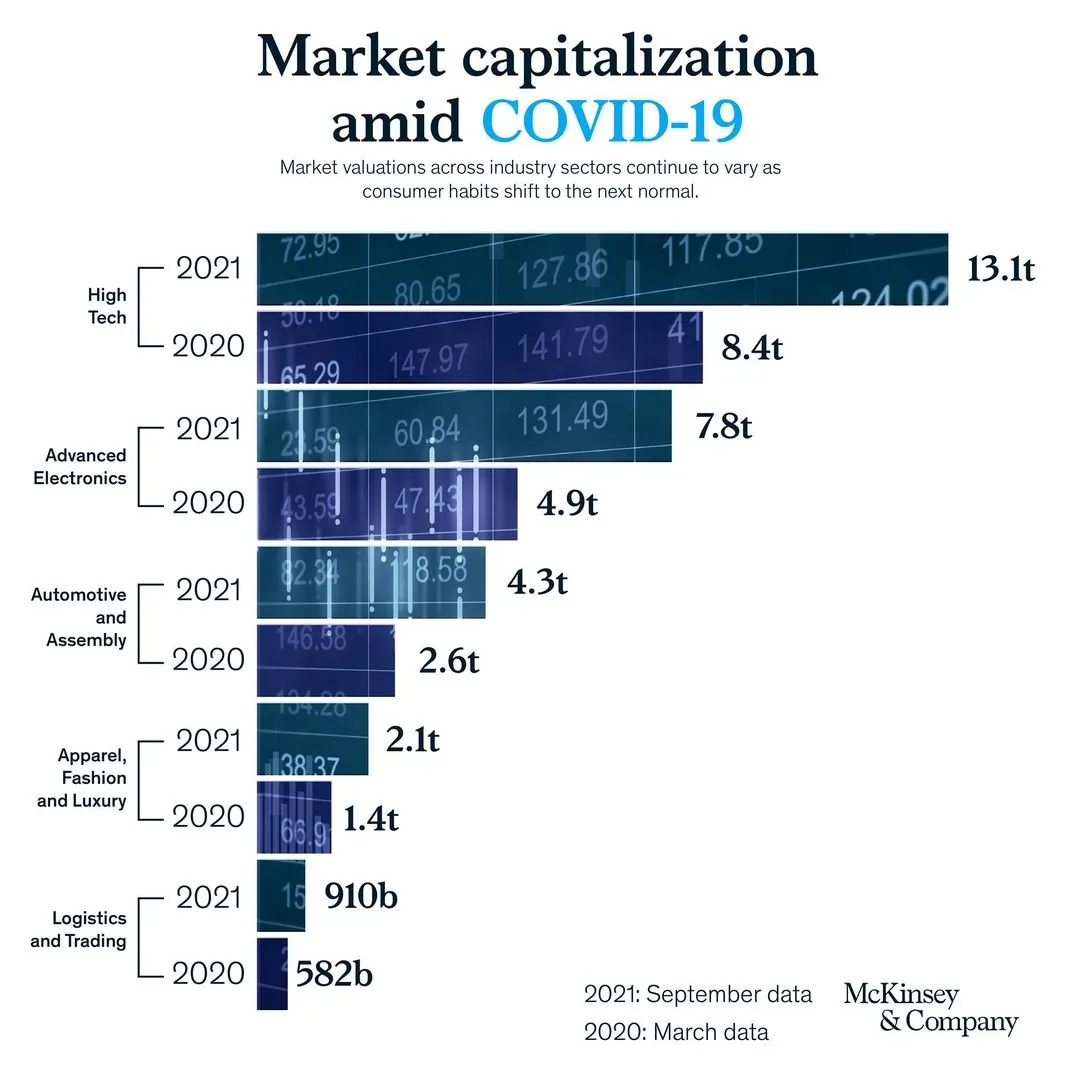
A saw a slide by my former employer coming by:

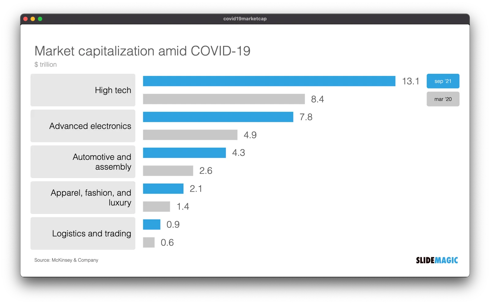
It has a very sophisticated image effect: look how the background of the bars in the chart are part of one image. Still, there is room for improvement. I quickly replicated the chart in SlideMagic with a few changes.

  • I brought back the more traditional, very in-your-face alternate coloring of the bars, blue for 2021, grey for 2020 and a legend, instead of the repetitive text labels with the years.
  • I increased the size of the industry sector labels
  • By replacing 910b and 582b by 0.9 and 0.6, I could get rid of the “t” and “b” in the bar label.

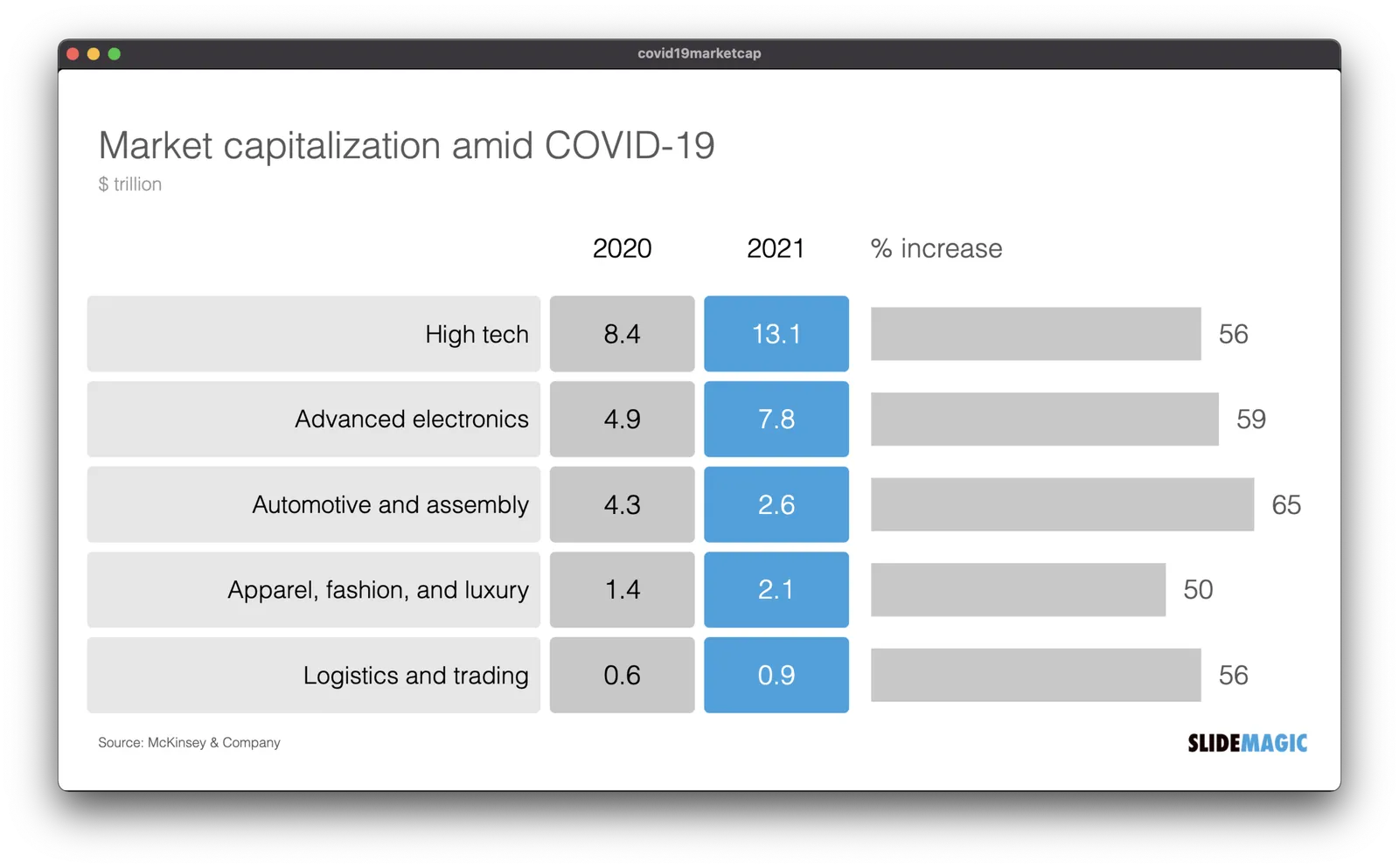
But the analysis of the slide can be pushed further. The main point of the slide is how markets have bounced back over the past year, which is independent of the ranking of the market capitalizations of the sectors. As an alternative, I constructed the combined table/bar chart below, de-emphasizing the absolute value of the market capitalizations, and using the bar chart to highlight the % increase in market valuation. The inside here is that all sectors grew more or less the same over the last year (except fashion, probably reflecting less dressing up for work.

I have added the slide to the SlideMagic slide library, look for “COVID” and they will show up. Emails subscribers: if the slide images don’t show up in the email, please open the link to the full blog post.

·Data visualization

Information hierarchy

I just returned from a short trip to Paris to show my son around some of the famous sites and restaurants. In 2021, that means a lot of health checks and tests. I was probably the only one in the airline terminal that looked at all the forms with the eye of a typographer.

I am not talking about elegance here, pure functionality. The people at check in desks are looking for “positive” or “negative”, the date the test was given, and whether the passport numbers match. On the test result form, the thing that is printed biggest is the name of the testing laboratory…

All this can be fixed easily with an adjustment of font sizes.

·Data visualization

Rounding numbers in data charts

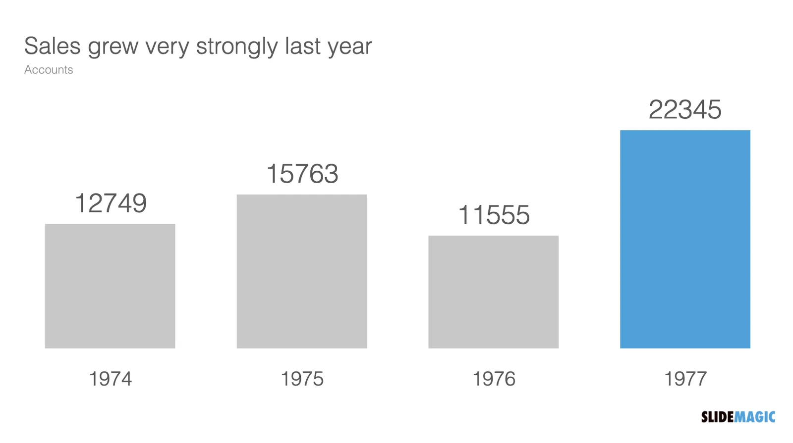
How to round numbers in a data chart? It depends. The chart below does not look very appealing

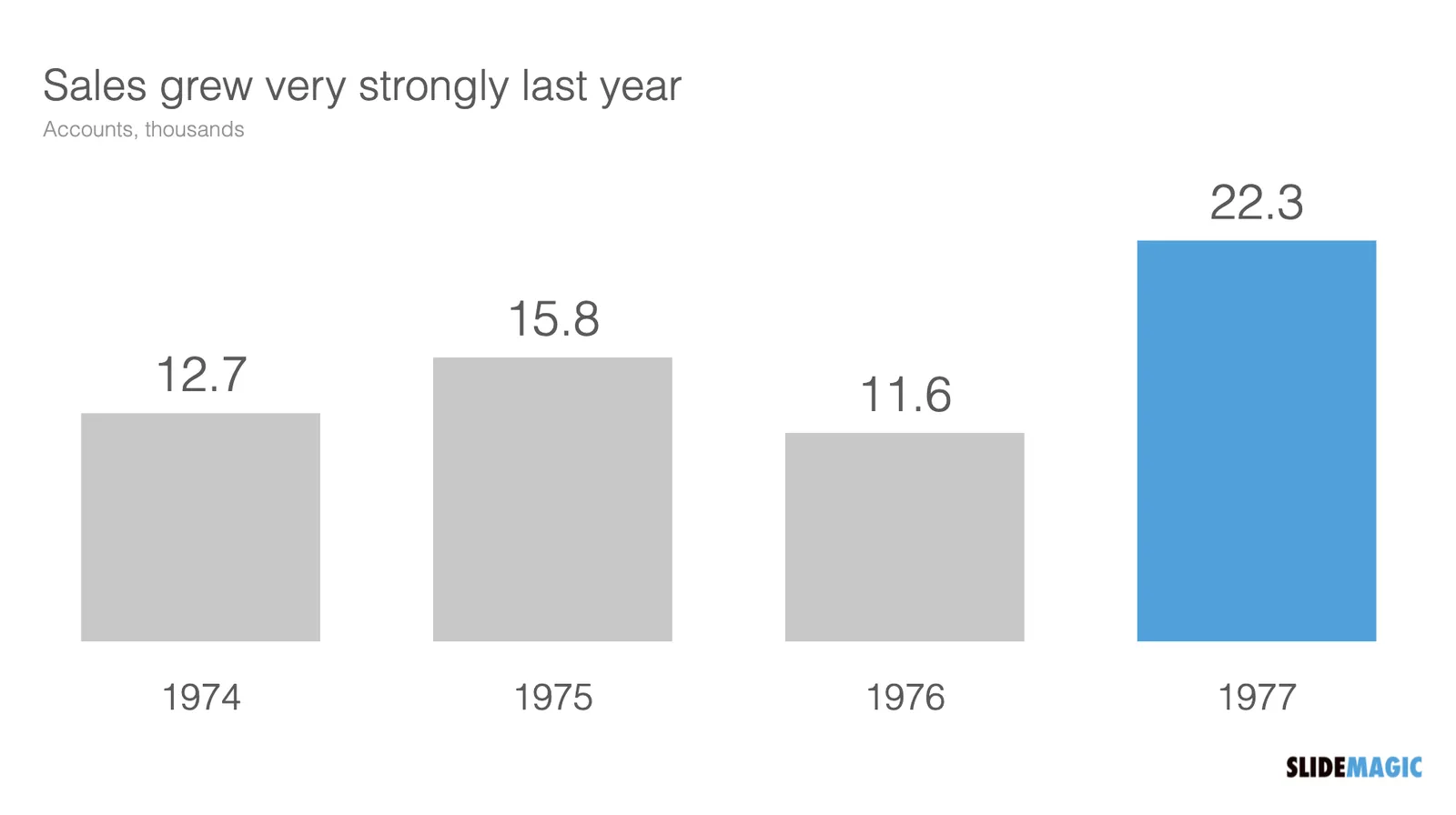
The numbers are hard to read. This chart can serve 2 purposes. Either show the trend in sales, or show the exact sales figures. To show a trend in sales, simply show the accounts in thousands, and round up to one decimal point:

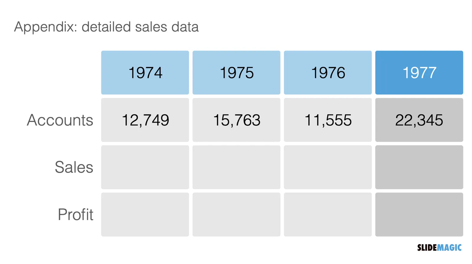
If you need to provide the actual precise sales data (for accounting or tax purposes), put it in an appendix slide that does not even pretend to show a trend:

·Concepts

Scaling of data charts in SlideMagic

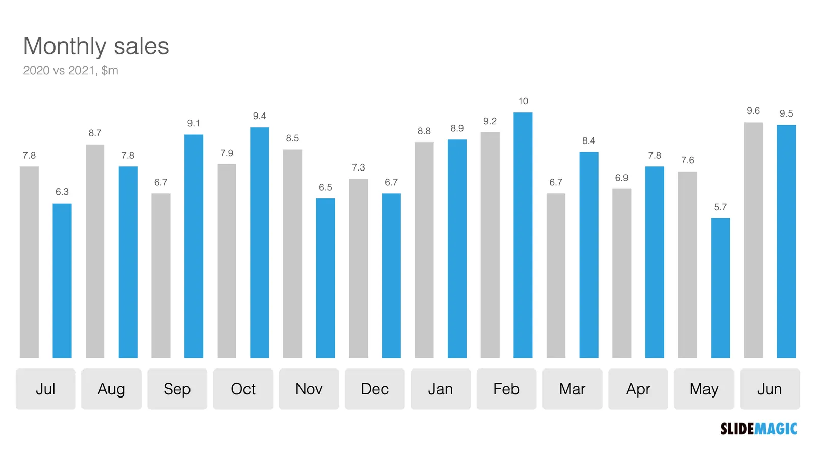
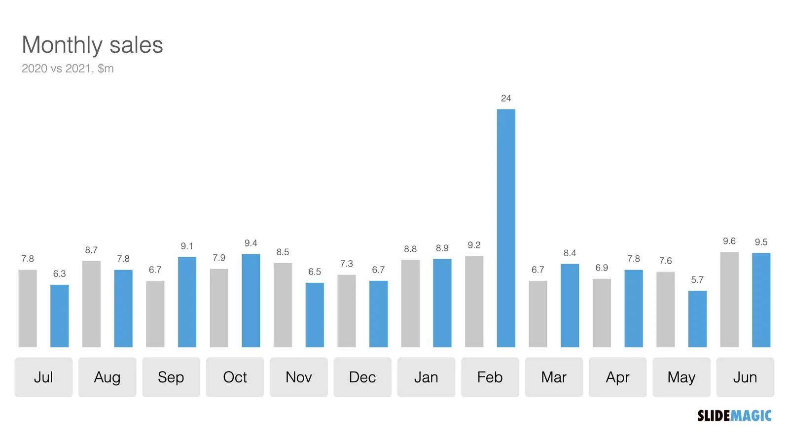
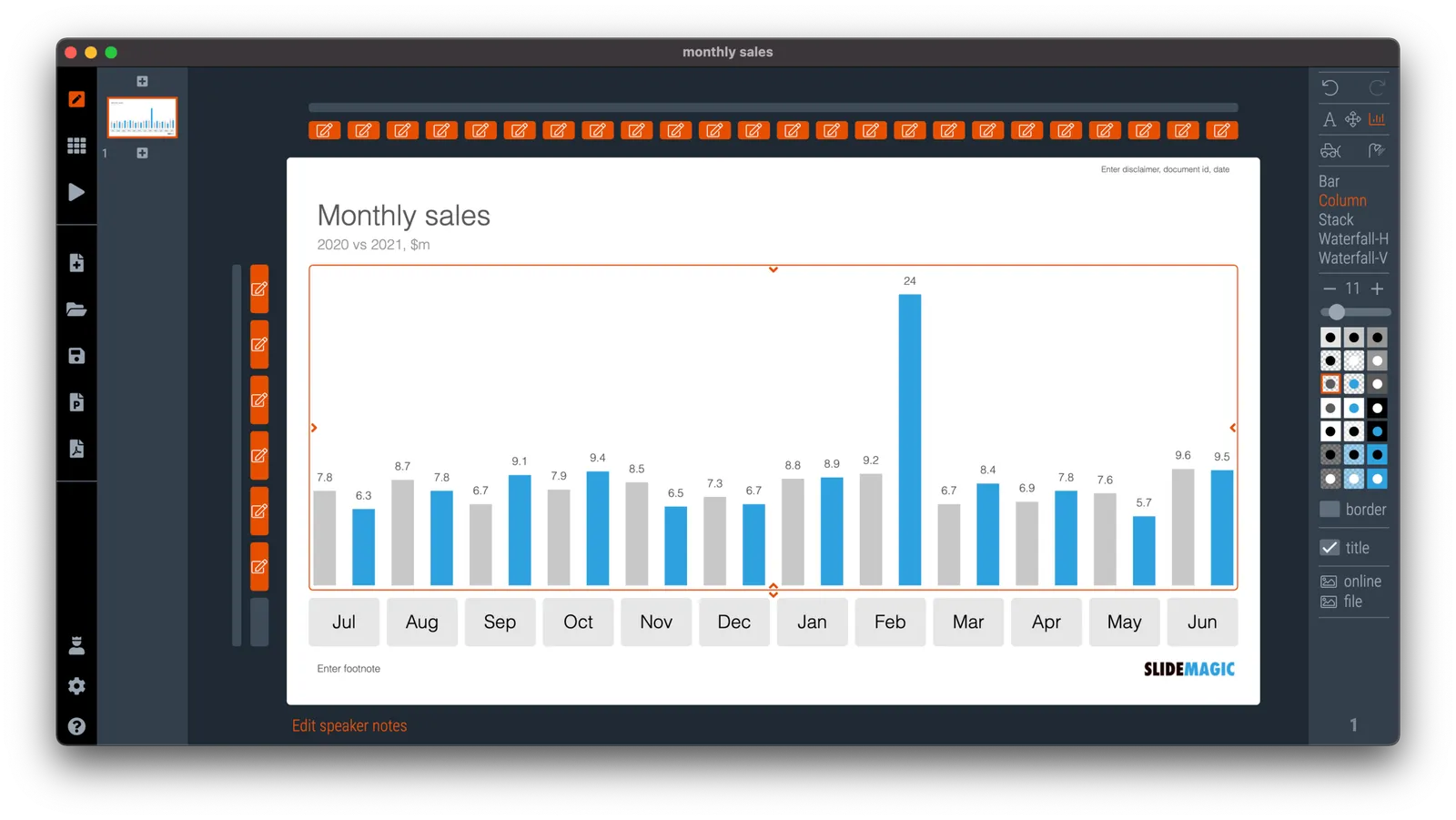
In SlideMagic, you do not have to worry about picking the right scale for your data chart. The entire chart adjusts itself to the numbers you type in. See the example below:

To make sure that a consistent scale is used for your entire chart, you need to place all your data points in one shape, instead of using multiple shapes for example for each month.

P.S. I have added this monthly sales comparison chart to the SlideMagic slide library so you can easily use it in your own presentations as well. Search in the app for ‘sales’ and it will pop up.

·Data visualization

Leaving the math to your audience

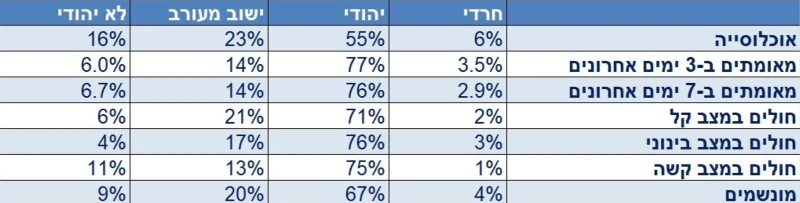
It is raining COVID statistics in Israel as we are the first country in the world to deal with a post-vaccination outbreak. Below is one table that was released by the Ministry of Health (I found it here).

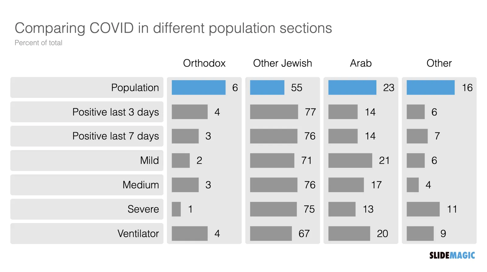
I have translated it in a quick SlideMagic chart (it always puts a big smile on my face to see how quickly this can be done).

But this data is horrendous to understand. Percent of what? What is 100%? The audience is left to do the math themselves. Compare the categories to the breakdown of the population, look at differences between 3 and 7 days ago, look at the ratio between mild to severe, etc. etc.

Using bars instead of numbers (another smile) makes things a bit clearer.

But in this case, it would have been clearer to release the data in absolute numbers and let people construct their own charts.

I have added the charts above to the SlideMagic library, search for COVID in the app and the slides will show up (see the search here).

·Data visualization

Cheating with statistics

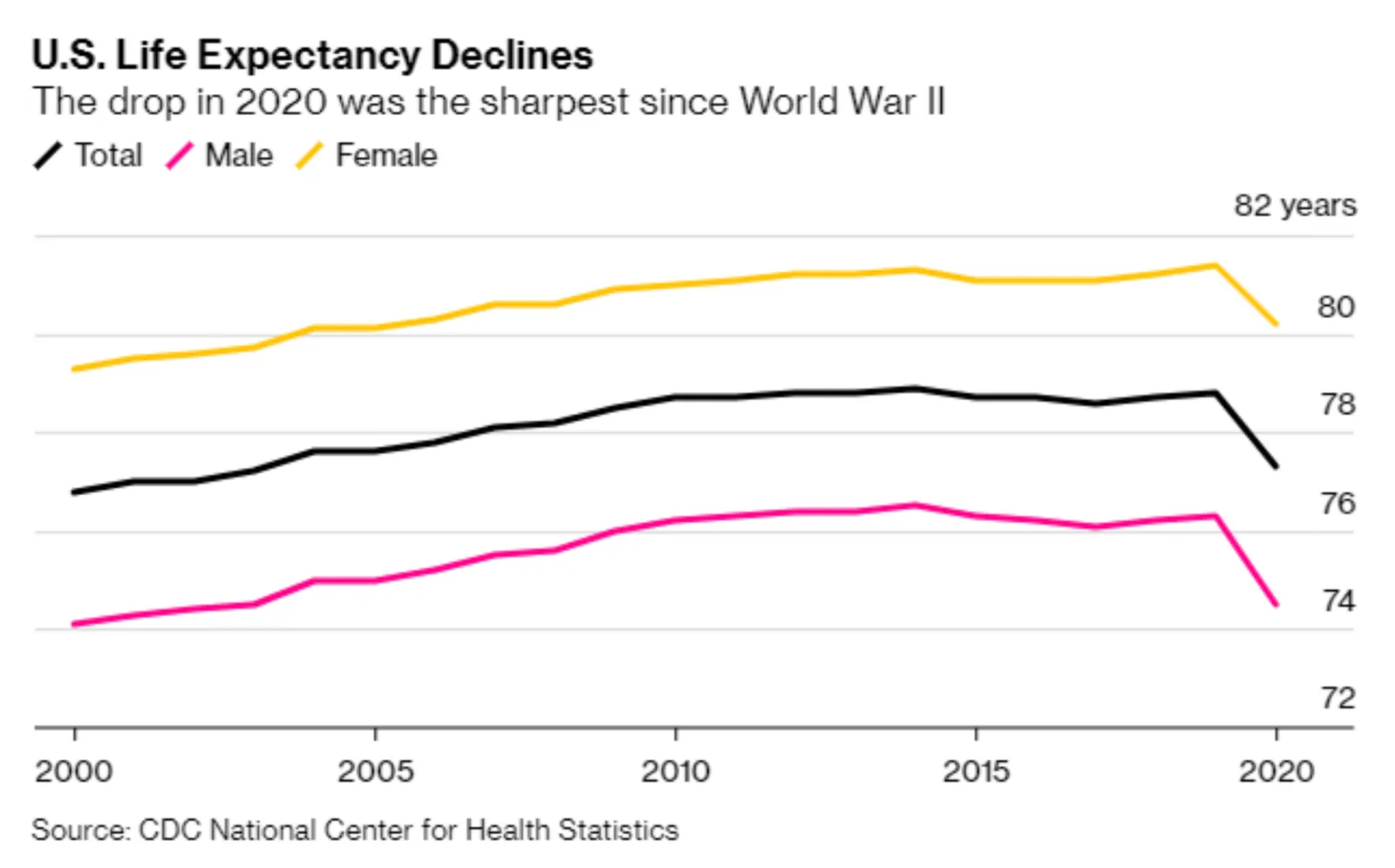
The chart below (source) is a good example of “axis”. The drop in life expectancy looks huge, but upon closer inspection, we see the the vertical axis starts only at 72.

There is another problem with the chart: “the sharpest since World War II” is not supported by the data.

One way to bring out the significance of the message, and support the WWII point is to show the annual change (not the absolute number) in life expectancy since 1940.

·Data visualization

Trying to understand vaccine effectiveness

Here in Israel we are ahead of most other countries in terms of vaccination and the prevalence of the delta variant. After almost zero cases, the count is starting to creep up again. There is a lot of confusing data going around and it is surprising to me that the scientific community does not have a generic approach to evaluate the effectiveness of vaccines.

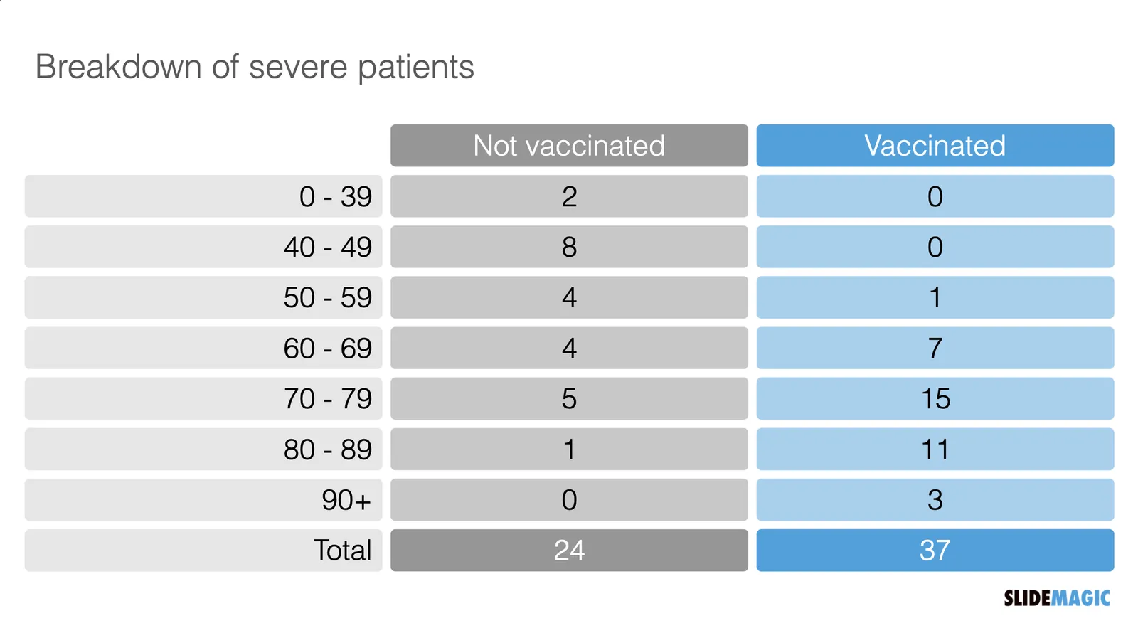
Last night the following table appeared on the TV news. Severe cases by age category and vaccination status. But these absolute numbers cannot be taken at face value.

  Source: https://twitter.com/arad_nir/status/1416832997597265933/photo/1

Source: https://twitter.com/arad_nir/status/1416832997597265933/photo/1

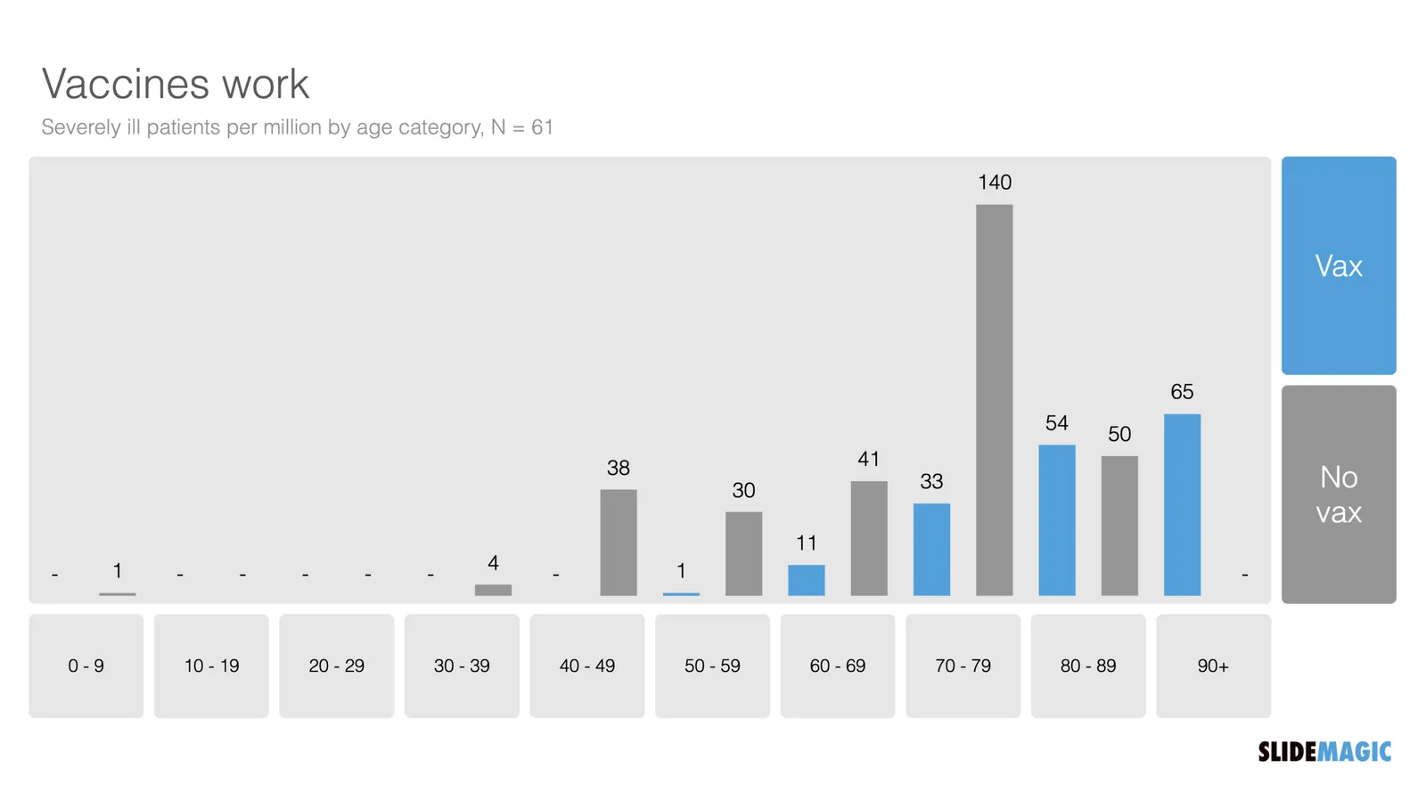
“Open source” statisticians went to work and made some adjustments. The population categories are not equally big (there are more young people than old people), and the vaccination rate is not the same (older people vaccinate more). So the correct approach is to look at severe cases / million, split by vaccinated and unvaccinated. I put the results in the graph below and added the chart to the SlideMagic library.

I put the results in the graph below and added the chart to the SlideMagic library. Search for “vaccine’ in the SlideMagic app and the designs will pop up, either for use in a COVID-related presentation, or maybe something completely different that requires a similar layout.

·Data visualization

Dashboard design

In my current (stealth) side project I need to build many dashboards to show information in different cuts and slices. For me, it is a very interesting experience as I can apply the full arsenal of my slide design experience, but now with dynamic data. I control the full stack of technology: what information to store, how to slice it, what information to show, and how to show it.

Each of the above usually reside in a different person. Management consultants spend time recutting and re-combining data manually in spreadsheets because systems can’t do it. So called “BI” applications take data from systems and spit out an endless amount of bar and pie charts in the hope that it will give some insight in where things are going. Traditional front-end web designers can make data look pretty, but don’t really understand what data is required.

The principles of a good dashboard and a good slide are completely the same. Every detail is important. What information to show, what rounding, what order, what sort of graph, what headings, bold, not bold, margins, right aligned, left aligned., how to group things, where to put subdivisions, etc. etc.

But once you get it right, it will work for a long time.

Photo by Cody Fitzgerald on Unsplash

·Data visualization

Tiny data labels

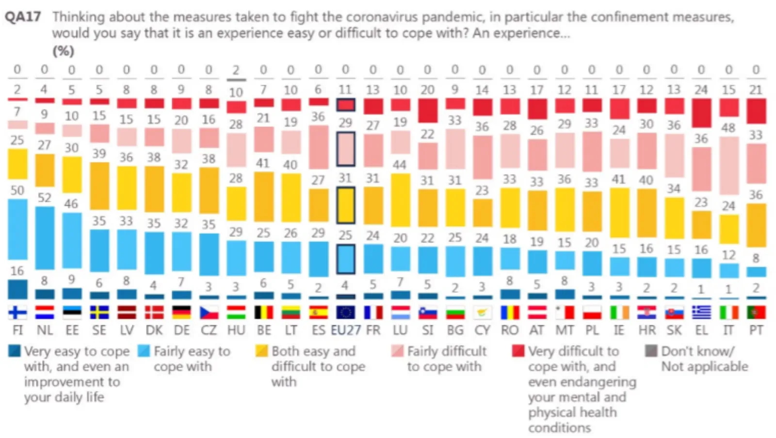
This chart shows 2 interesting things. One, Finland was pretty happy under lock down. Two, an interesting way to put data labels on a stacked column chart. The small boxes are always a problem in a regular format. Here you get the combination of the visual effect of the size of the boxes, versus the table of the actual information. This could be inspiration for a future SlideMagic expansion.

I would do some things different though. That row of zeros at the top does not add much. The flags make the whole chart even more busy. And given that this is a comparison, I would have shown the data as a stacked bar chart.

If you were to use me as a bespoke designer, I would actually show this data on a map of Europe, color-coding different countries with maybe only the some of the 2 blue data series. The geographical clustering of the countries is interesting. In addition, I would combine it with one stat about the health impact of COVID in these countries.

If you do not have the software and/or the time to make a chart like this, the solution is easy, take off the data labels completely and make a straightforward stacked column chart.

I found this chart on Twitter, without quoting a source, the format looks like a page in some document by the European Union though.