

Israel is experiencing a very strong second wave of the virus. Its health ministry recently published data about where people get infected.

This graph does not tell the entire picture, I tried making a quick slide in SlideMagic:
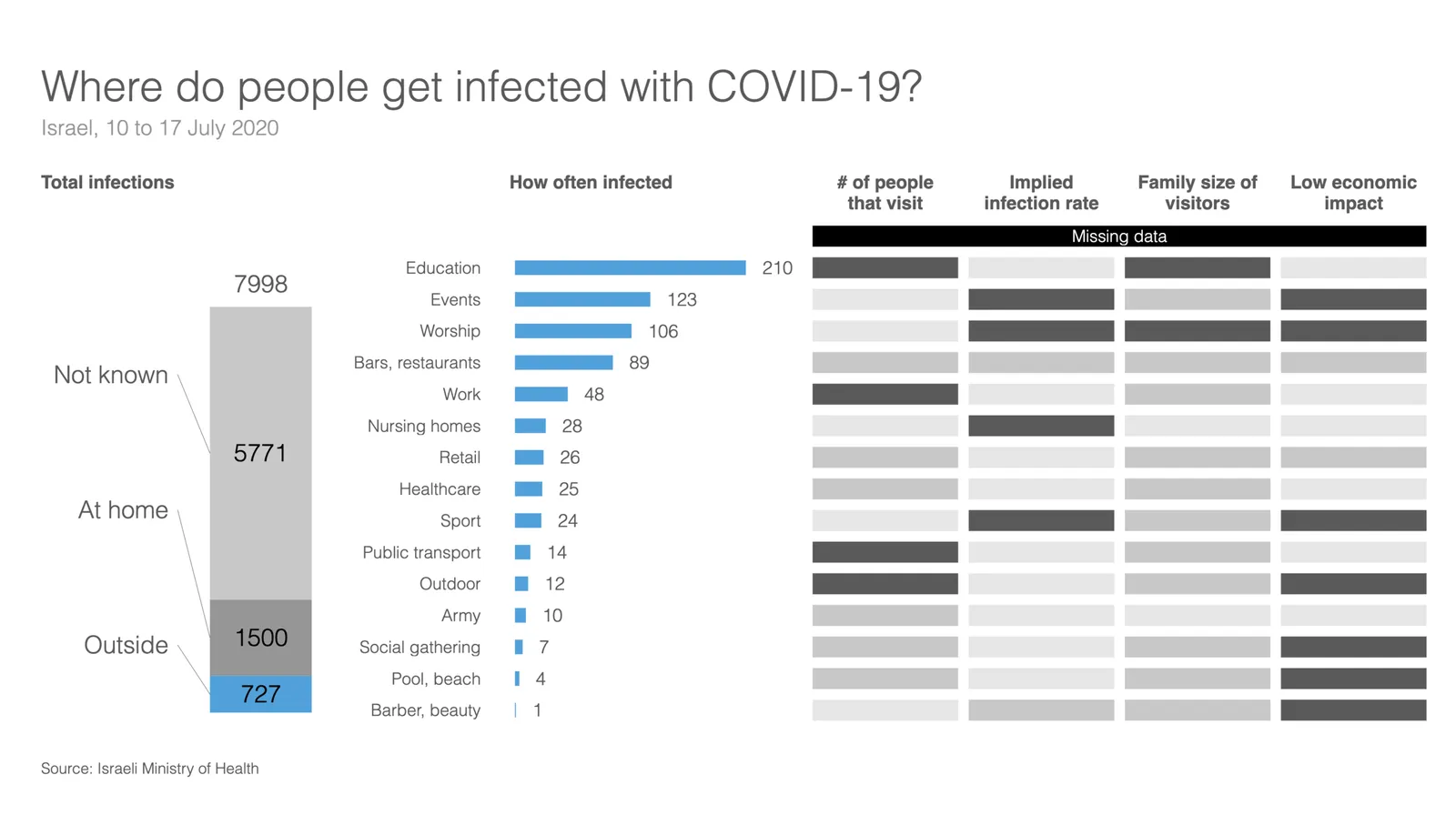
What did I add?
- Providing the overall context: for many patients it is not known where they are infected, and many get infected at home (which are probably secondary infections)
- There is still important data missing. The most important one is how many people in total actually visit a place. Millions of people visit schools, thousands probably visit gyms and places
- We need to understand the impact on secondary infections (how big are the typical households that these people are coming from).
- Then there is the question about impact to society…
This SlideMagic slide is free, you can download it here. It is clearly an example of an analysis slide, rather than a visual to be presented to a large audience. While I am not a big fan of stretched 16:9 layouts, in this case I had to go for it to create space.
PS. My opinion re. the strong second wave in Israel? Yes, Israel got the virus under control and then reopened too quickly (school were the main source of infection initially). But, in the end I believe any country re-opening will go through the same process, may just a bit slower. I think Israel is 1-2 months ahead of other countries re-opening.