

Here is a (sad) chart from today’s Economist:
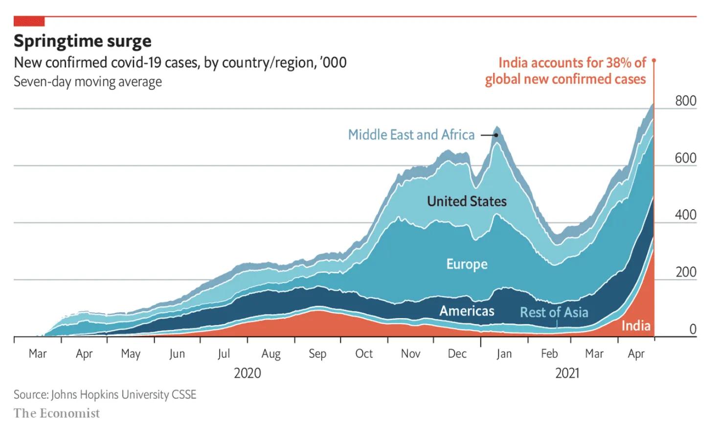
The Economist put the data series that carries the main message of the chart at the bottom, pushing up all the other data series. My preferred option is the other way around, put it on top. In that way you can see all other regions staying pretty much stable, while India grows strongly.
(Unrelated). India has a very large population, and you need to look at COVID in that perspective. In terms of caseload, it is still behind other regions (such as Europe). The problem is the quality of the healthcare system, and the availability of basics such as oxygen in emergency rooms. Europe could handle the load (more or less), India is in a far worse position. Also, the India stats are averages for the entire country. On a region-by-region basis, there are likely to be places with much bigger caseloads than Europe. Let’s hope that it gets better.