

Here in Tel Aviv, I was lucky enough to receive my second vaccination with the Pfizer COVID-19 vaccine. The whole world is watching us:
- High vaccine availability
- Advanced healthcare infrastructure, with a centralized IT system (any medical professional can punch in my ID number in her computer and get all my medical records on the spot, this would raise some privacy issues in other countries)
- (Unfortunately) we are set up to deal with national crises and get organised quickly
There is lots of data available, cases, hospitalizations, difficult cases, casualties, by age, religious background, location, total cases, new cases, etc., etc. And everyone is looking at the top line number, will the big case graph go down and can we declare victory over the virus. Unfortunately so far, it stays more or less stable (at high levels).
This is a typical case of data overload. If you want to see whether the vaccine works you need to compare 2 things like for like: people who got vaccinated, and people who did not. And when you do that (pretty much like a clean medical trial), it shows that the vaccine is overwhelmingly effective, the same size is just not the entire Israeli population.
One such example is hospital admission data from a Tel Aviv hospital. Not millions of people, but a small, isolated group that you can compare. The original chart is here:
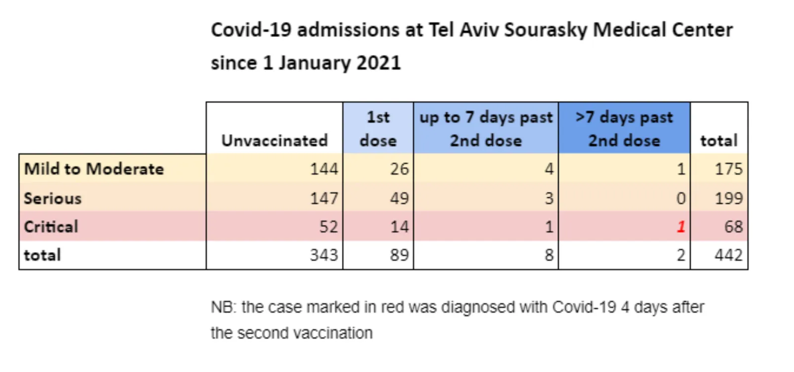
I did a quick makeover of this slide in SlideMagic.
- Colours are consistent
- Everything is properly spaced
- A better way to communicate the ‘1’ exception case
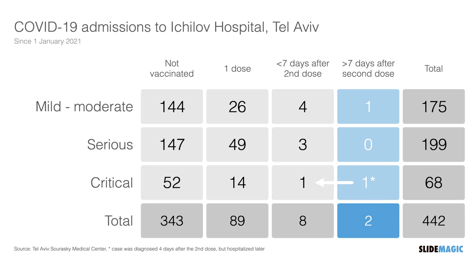
But this is the raw data, mainly of interest to scientists / statisticians. The average person just looks at the big blue “2” next to “442”. You can simplify things a bit more, see the following chart:
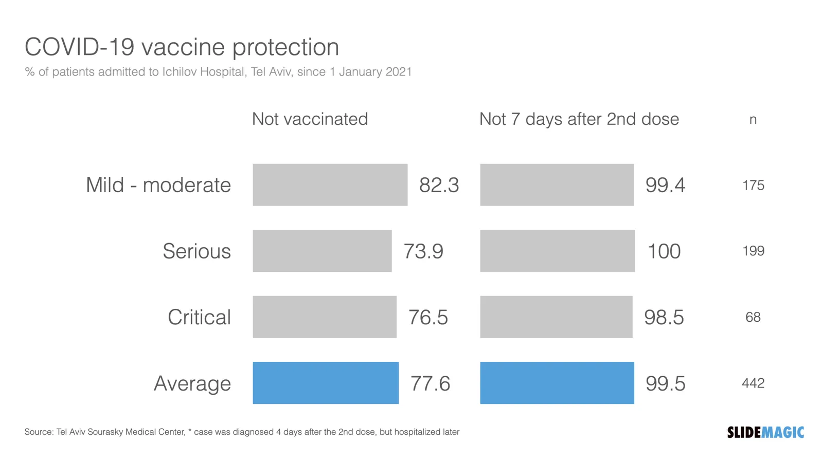
What did I do?
- Use a data chart instead of a table (bar charts are best for comparing)
- Lump the 7 days before and 7 days after data together, they are almost the same
- Change the metric to something that people are used to, everyone talks in terms of “vaccine efficacy is x%”. I reworked the numbers to reflect that.
I included these vaccination charts in the online SlideMagic slide template bank (click on the images), or simply search for ‘vaccination’ in the desktop app to use charts like this in your own presentation.