SlideMagic Blog

Frequent updates about all things presentations since 2008. Subscribe to never miss a post.

RSS
all posts

Category Data visualization

·Data visualization

Breaking conventions

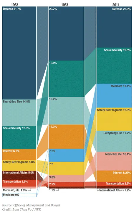
This column chart about government spending on NPR breaks a lot of conventions. Years at the top, no totals, data labels inside, not on the second column, repeated in the third, and it tries to visualize both the size of the values and the order in which they appear with the semi-transparent connections. For an on-screen presentation it is too much to digest, for careful on-screen reading it might be OK. What do you think?

·Data visualization

Facebook IPO comparison

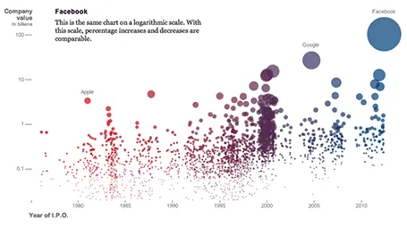
The NYT published an infographic that compares technology IPOs over time, including the facebook IPO of last week. At first, it looks really nice, it resembles bubbles going up in the air (a sentiment shared by many left out in the golden rain). It shows just how many of these IPOs we have had, and the billions in value they have created. And that is probably all the casual reader is left with when clicking to the next page.

On closer inspection, things are less clear. The value on the y-axis is the same as the size of the bubble. A good description of the axis labels is missing. And the things that the graph wants to display, could be visualized much better in a dedicated data chart for each conclusion:

  • How many IPOs in what year: column chart
  • Top ranking of IPOs by value at the opening day: bar chart
  • Top ranking of IPOs by value in 2012 $: bar chart
  • % share price movement on day 1: bar chart (probably only show big, well-known offerings)
  • % return on investment 3 years later: bar chart (again for household name IPOs)

Still, if you are a newspaper, maybe getting across that bubbly feeling is more important than the visualizing the insight.

·Books

Visual memory

A year after discovering it, I finally got around to reading Moonwalking with Einstein(affiliate link), by Joshua Foer. A journalist gets fascinated by memory championships, and takes on the challenge to participate himself. On the way he explains how to train your memory, and puts memory in a historical context.

Why am I interested in these types of books? Presentations are all about helping people remember your story. We all know that forcing people to remember bullet points be repeating and repeating and repeating them does not work. The brain needs a visual story around which to store your message.
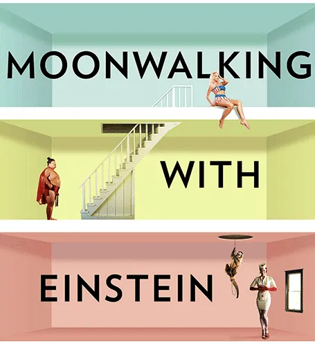
And it turns out that is exactly what memory champions do. They commit random numbers, names, facts, to rooms in virtual memory palaces in their brain. These palaces are often based on places the contestants know very well: a home, a school, a library. In these rooms, the objects are placed in the most outrageous (memorable) ways possible, including smells and sounds. After you put everything there, you can simply take a walk in your virtual memory palace and see all objects in front of you.

Scientists now think that the brain actually never forgets anything (capacity: 10-100TB). The problem is accessing the information. The brain needs an emotional stimulus (smell, visual) to unlock its memory. Slightly different than a indexed memory access of a computer. People think that we are so good at remembering places, locations, stories is survival: how to find a place with food, and then more importantly, how to find the way back home was a more useful skill in the stone age than remembering phone numbers.


Continue reading →
·Data visualization

Fixing standard data charts

Standard data charts in PowerPoint and Excel look ugly. Here is how I usually fix them. A raw screencast with som uhs and ohs, I am still experimenting with the software to see whether I can make these videos more often.

·Data visualization

Sugary drinks

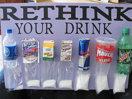
This photo posted by Carolyn McDowell is much more powerful than a bar charts with the sugar content of soft drinks

·Data visualization

Evidence versus detail

They may sound or look the same, but there is an important difference:

  • Detail is a pile of facts that bores the audience
  • Evidence is that critical (and sometimes detailed) fact that convinces an audience
·Data visualization

1st, 2nd, and 3rd order elements

Most financial or scientific data slides gave all visual elements equal weight.

  1. The big trend in the data (a declining line for example)
  2. The amounts are in EUR million
  3. The explanation that 2010 includes France
  4. The fact that 2011 results are still unaudited
  5. The source of the market data
  6. All data is to be treated confidential

This is not how the novice discovers your data. Make the first order element pop out, so people get the message without the clutter of all the other information.

For the 2nd, 3rd order elements you can use smaller fonts, or - what I find most effective - use light grey font colors. Another options is to put a long wordy foot note at the bottom of the chart that has all the other bits in it, thereby avoiding the need to populate the slide with scattered text labels.

After people get the message and have questions they will look for more information and find everything they need.

·Data visualization

You put in that P&L manually?

When people receive my analyst or investor presentations and they see a few years of P&L data entered manually one-by-one, they always ask me whether after all these years I have not found a more efficient way to do it. I have not.

While I punch in the numbers manually (which takes about 15 minutes by the way), I can do a lot of things in parallel:

  • Round up numbers
  • Shorten labels
  • Collapse labels and combine rows
  • Check whether everything adds up

A data table is worth that extra attention, instead of an Excel data dump, you get a visual that makes sense.

·Data visualization

Ranges versus point estimates

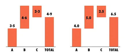
Things are never sure in business analysis. One option to deal with uncertainty is to use data ranges: $3-5m instead of ~$4m.

While it might be the correct approach to qualify your analysis, I do not find it visually pleasing. My approach would be to settle on a point estimate, and put a note on your slide that these numbers are estimates. It also easier to discuss with your audience, it is difficult to refer to ranges all the time: “Next year’s sales of $3-5m”.

One additional complication, ranges amplify when you add or subtract them. In the chart above, you see that 6.5 equals to a range of 4-9 instead of 6-7 for example. If this is the point you want to make, our sales forecast can fluctuate wildly because of things we do not know, then use the chart. If you just want to give a small range to show uncertainty about the exact value go for the point estimate.

And one more issue, a range of $1m more or less can be a big difference if you apply it to a small number, or a big one: 1-2 versus 10-11 for example. The first is a 100% variation, the second 10%. So, to do it correctly you have to write down in your chart: 1.0-1.1 and 10.0-11.0. All this just makes it too complicated to have a meaningful strategy discussion.

And another one: ranges are a pain to use in calculations, as seen in the slightly counter-intuitive column chart above. (See an earlier post on how to make water fall charts here).

Continue reading →
·Data visualization

How to export a chart from Excel to PowerPoint?

Yesterday’s post triggered this question: how to export a chart from Excel to PowerPoint? The short answer: copy the data not the chart.

Standard Excel charts are ugly, they have the wrong formatting, they have the wrong colors, axis labels are in the wrong place, data is not rounded up and too precise. Copying and pasting an Excel chart into PowerPoint is also copying all that ugliness. Even worse, copying and pasting it as a picture might make it look blurry.

I believe that data charts in a PowerPoint presentation deserve careful attention and need to be designed by hand. You start by inserting a blank, ugly, PowerPoint chart into your slide, next copy the data across from Excel and then start tweaking until it looks perfect.

Once you have done one, you can use that PowerPoint chart as a template for other charts in your presentation.