SlideMagic Blog

Frequent updates about all things presentations since 2008. Subscribe to never miss a post.

RSS
all posts

Category Concepts

·SlideMagic

All the way back to 2008

Now and then I dive back into the 12 year archive of my blog and see some or the early slide layouts I made. This Google image search pops up many of them.
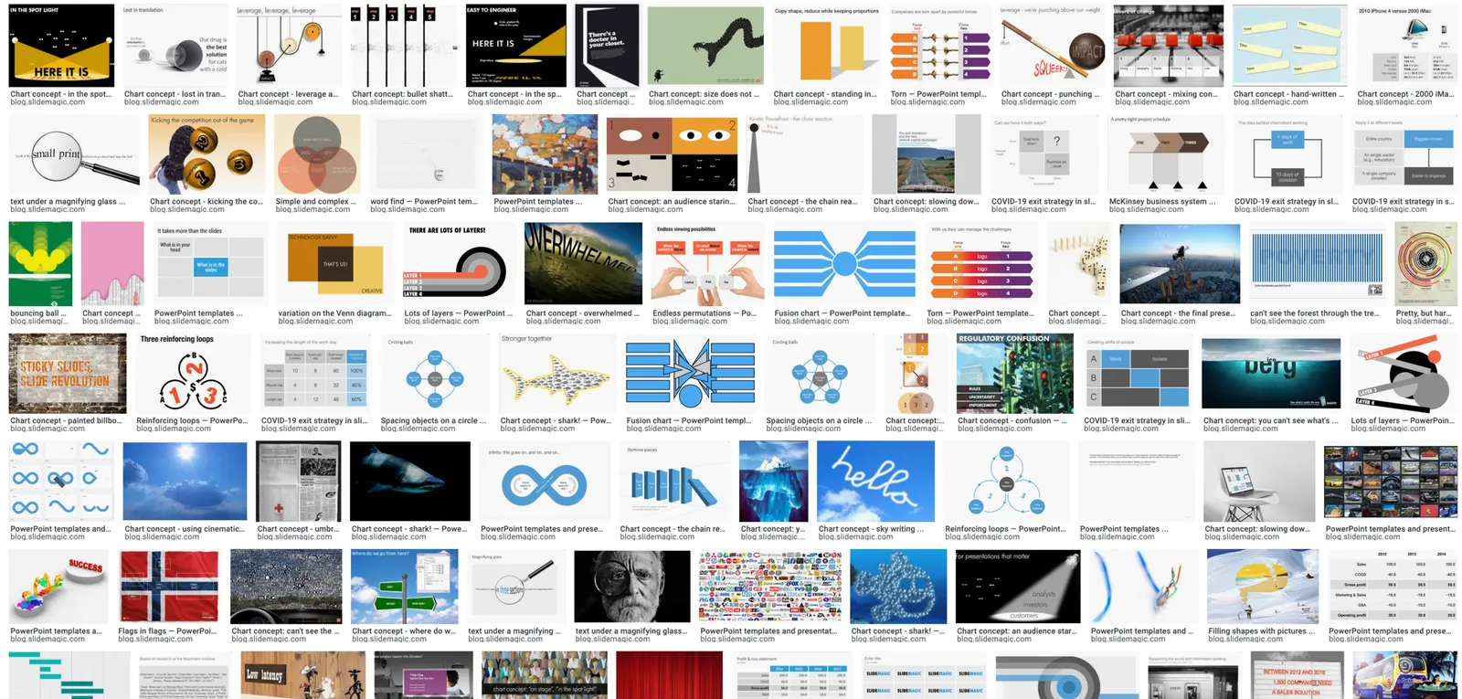
While many of these layouts are now still available as templates in SlideMagic, some of them, especially the early ones are a bit different:

  • “Slides that stick” orange and brown
  • Lots of hand written fonts
  • Unusual visual analogies
  • Most of them are definitely not for the layman designer…

Yes, I made have been a bit more “daring” back then (and remember, most of these designs actually were taken from actual client work), but I still think that I am on the right track with my current sober, simple, easy-to-make layouts. Less artistic, but far less time wasted by smart people that can use their energy to do more useful things that creating presentation slides.

·Concepts

COVID-19 exit strategy in slides

Uri Alon and other researchers at the Weizman Institute just south of Tel Aviv here in Israel have been working on an innovative idea for a COVID-19 exit strategy: intermittent working: let people work 4 days, and go into isolation for 10 days. Even if someone gets infected on day 1 of the work shift, the person will only become infectious during the isolation time, after which symptoms will appear. In that way, the economy can get going, while the infection rate of the virus will come down.

I think the idea is great, but I cannot see it adopted at a country level by politicians. For a specific sector (education?), or a specific company (a retailer with lots of client-facing staff), it could get adopted. Another (maybe even likely) application is to combat a likely second wave of the virus towards the winter. Rather than slamming the full brakes on the economy, go for the intermittent approach.

Communication of this idea is hard though. The researchers started with their scientific paper. Lots of graphs and analysis that shows the statistical impact of their research, including all kind of variables such as the percentage of people that actually stick to the rules. Next up is a video that explains the concept in a much more intuitive way.

I am constantly looking for new charts to the SlideMagic template database, and made a few simple charts that communicate this idea. All of this is done in the spirit of SlideMagic: very simple charts that are really quick to put together. Nothing fancy, but looking decent and doing the job of getting your message across.

Continue reading →
·Concepts

Presenting sensitivities

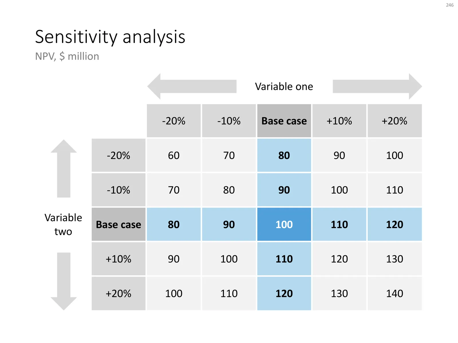
I added a few more slides to the database today, one of them was this one: a template to present a sensitivity analysis.

Why this particular layout?

  • It is nicely spaced out, a calm composition for so much data
  • Numbers are disconnected from the spreadsheet: rounded up, entered by hand
  • Colours, bold, are used to direct the eye to what is important, and what is secondary

Some thoughts about how and when to present this type of analysis:

  • Presenting sensitivities and not the same as analysing them. The latter is the homework that you should have been doing before the presentation. Figure to what factors your model is sensitive, decided whether that is how it should be, then gather more information where needed to increase your confidence in variables that can make a big difference. What is left to discuss are sensitivities after you did everything to minimise and/or understand them.
  • The ranges of the variables you show should be realistic. This is not an exercise in mathematics, but an attempt to really understand what drives the future.
  • Pick dimensions that are not correlated, if the risks on the x and y axes are the same, you are not adding much insight.
  • Try flipping the analysis upside down, instead of showing deviations from the base case, show “what you would have to believe” in order to get to a certain number.
  • Be careful when sharing this type of data if you are in some negotiation about valuation. If the other side understand your model, they can basically salami slice the valuation using your own excel. You need to understand the sensitivities, but sharing them directly might not be smart.
Continue reading →
·Layout

I got the vanishing point wrong all the time...

They key concept in drawing in perspective is the vanishing point: every line in your slide should disappear in it (see an earlier blog post). It turns out I got the concept slightly wrong all the time. Because of the curve in the Earth’s surface, the real vanishing point for someone standing at sea level is actually below the horizon. A vanishing point that sits on the horizon, would require the radius of the Earth to be 64x as large. (For comparison, the Sun as a radius about 109x that of Earth.

 Vanishing point at a planet with a radius 64x that of Earth

Vanishing point at a planet with a radius 64x that of Earth

 The accurate vanishing point

The accurate vanishing point

With this new knowledge, will I change my approach to slide design? Not sure.

Based on an article in NRC Handelsblad. Simulation images by Siebren van der Werf.

·Concepts

Picking the 2x2 axes

Two by two matrices are a popular tool rank options. Watch out when to use them though:

  1. Do you actually have 4 distinct options that can be grouped according to 2 axes? Many situations have only 3 options, where the 4th option that is suggested by your framework is actually not meaningful in reality.
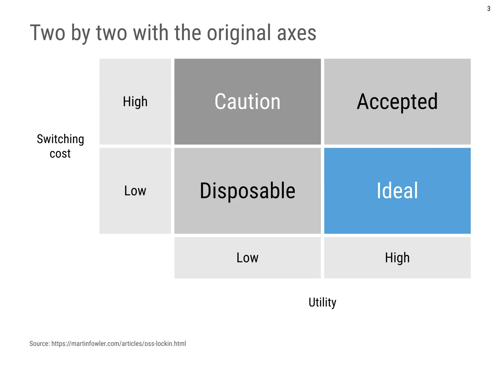
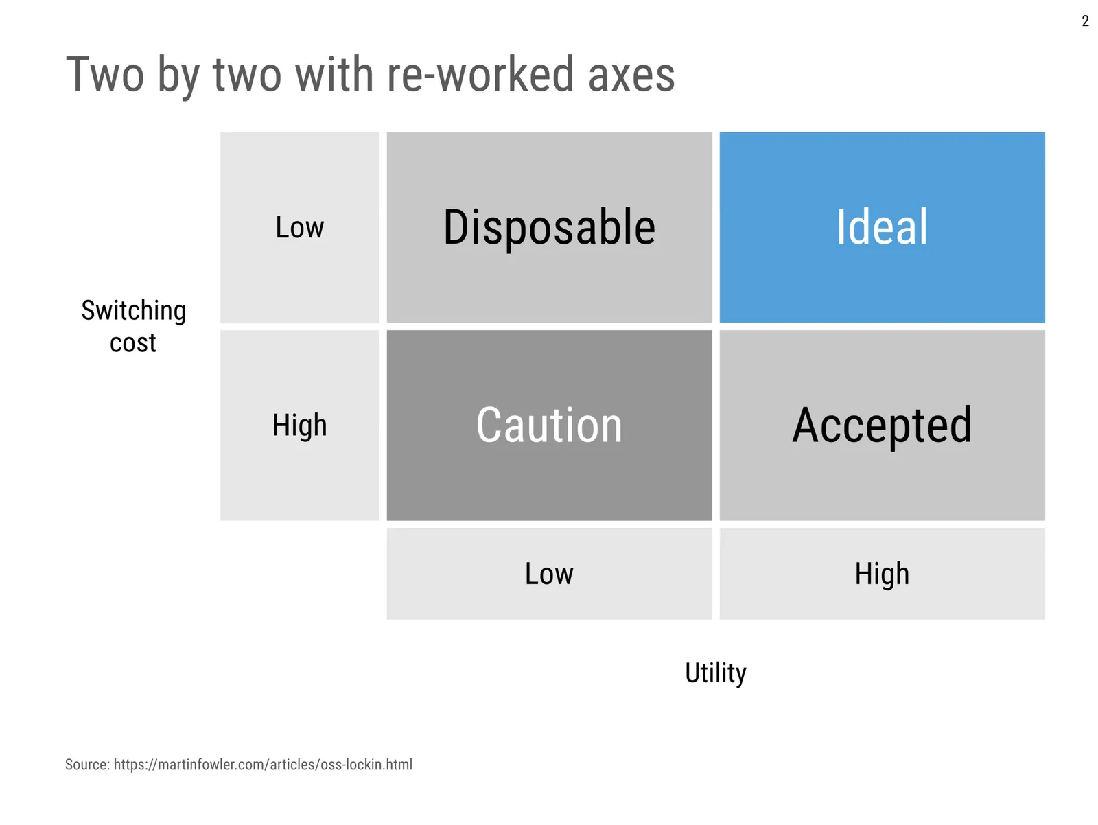
  2. If you pass the first test, make sure you set the axes right: the most favourable scenario in the top right, the least attractive options in the bottom left, the other two the “can’t have the best of both world” scenarios.

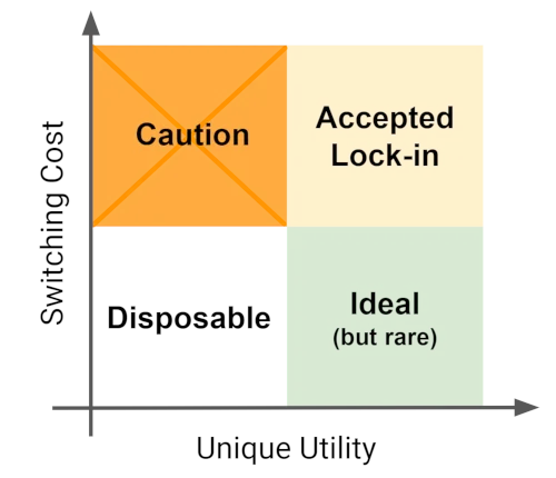
Below is an example of a 2x2 used in an article about software lock-in I stumbled across. Flipping the axes makes the diagram a lot clearer.

 The original diagram

The original diagram

I quickly created reworked the axes in a SlideMagic 2.0 diagram below:

·Concepts

Adjusting frameworks

The world of management theory is full of frameworks designed by MBA professors and/or management consulting firms. Many view in the same of was the laws of physics: this is how you go about solving a particular problem.

That is giving them too much credit. Dogmatically forcing a certain problem/solution into a framework will not work: if it does not fit, it does not fit. Every situation, every problem is different. Here is an example of someone adjusting the famous SWOT framework. Here is my own attempt at modifying a SWOT 2x2.

While frameworks can be helpful start thinking about a problem and planning the work that lays ahead of you, they are often not that good as layouts in presentations that communicate your final recommendations. Frameworks are complicated diagrams, and try to be exhaustive and list everything that is relevant for a problem on the page. For your final slide, that might not be what is needed to explain your findings. Frameworks can be useful to solve a problem, but might not be ideal for communicating the findings.

·Books

Visualising quantum mechanics

That is an ambitious title to start my first blog post after my return from a summer holiday in Asia!

Through a series of coincidences I ended up reading through a number of popular science books about quantum mechanics. I remember getting all carried away in the briefing session of a presentation design project for a startup in the field of quantum computing. My academic knowledge of this field was basically high school chemistry, so I added this topic to the list of things that needed a refresh. A holiday was the perfect occasion. I am sure I was the only one at the side of the pool dusting of theoretical physics knowledge.

From a presentation perspective, the fascinating problem that quantum mechanics struggles with a the lack of either a visual or verbal language to describe concepts. The mathematics is water tight and has proven to be really useful (lasers, semiconductors, LEDs, etc. etc.). But when you try to take a step back and want to understand what it actually all means in the context of your daily routines, things get confusing.

It is all the result of some form of Anamorphosis, projections of phenomena that get scrambled when angles or dimensions no longer line up. Every scientist is looking for that ultimate simple underlying concept that can explain/visualise/link quantum on a small scale to the more traditional physics that we see everywhere around us at a human scale.

In case you are interested, here are 2 books on the subject: Beyond Weird, and What is Real?.

Continue reading →
·Concepts

Heat maps in presentations

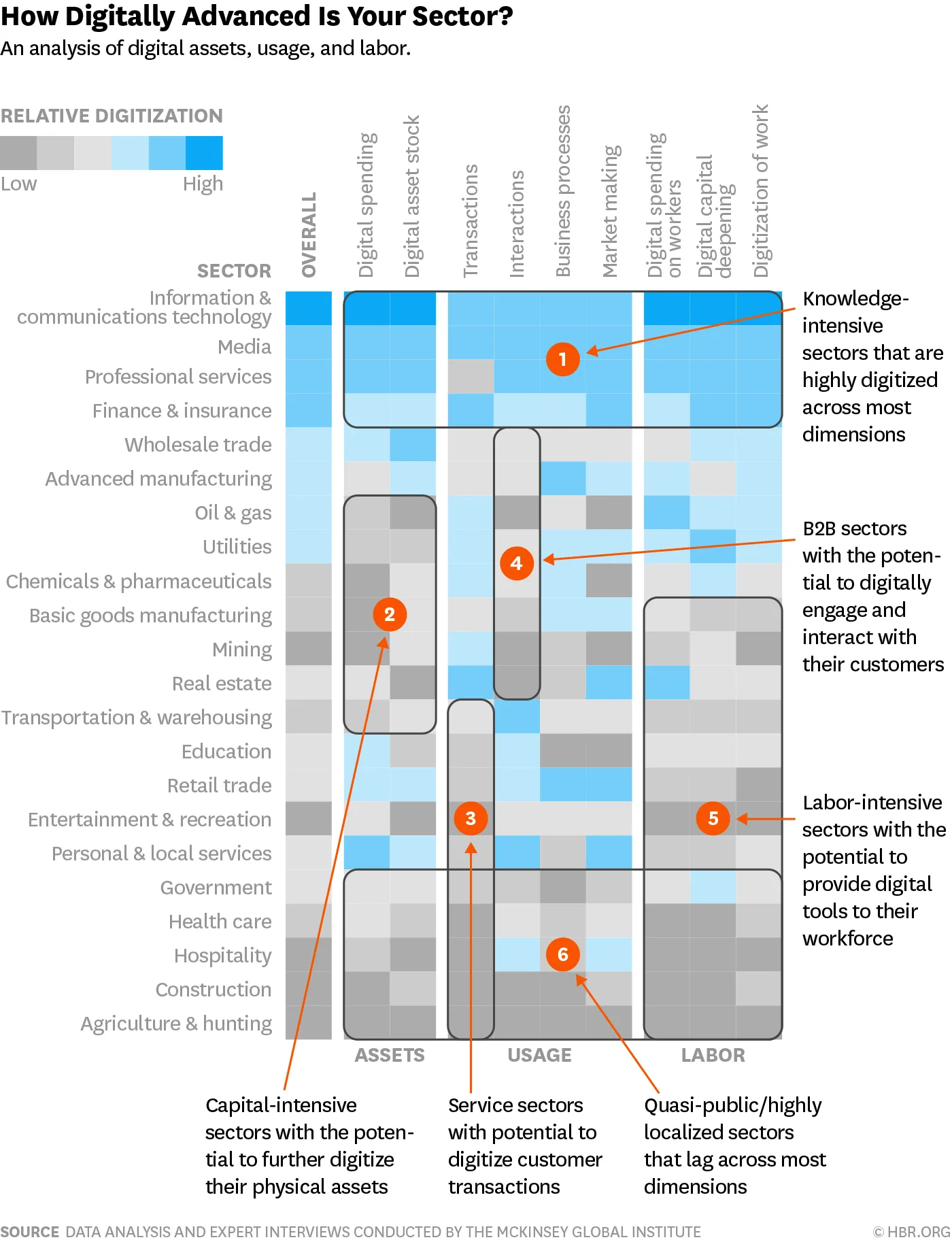
Harvard Business Review is bombarding (spamming?) my Instagram feed with this ad almost every day (Google shows that the chart was first created somewhere in 2016):

It is a very busy chart, so not to be used in your next TED Talk, but for close-up reading these heat maps are actually pretty good. This is a pretty decent summary of what much have been a huge scoring spreadsheet.

  • Only a few colours (suspiciously similar to the SlideMagic look…)
  • Careful attention is paid to sorting and grouping rows and columns

Some more improvements are possible:

  • There is too much text in the descriptions of the boxes: we know that we are talking about sectors, no need to remind us, and there is too much lingo in there (“digitally engaging”).
  • Column headings can be shortened, especially that long word “digital” can be lost here and there
  • I would move the “assets, usage, and labor” headings (nice short ones) to the top to make the link with the column headings clearer.

This boxy chart will be a good challenge for my code of SlideMagic 2.0, I am going to try it.

Photo by Guillaume Bolduc on Unsplash

·Images

Flying through

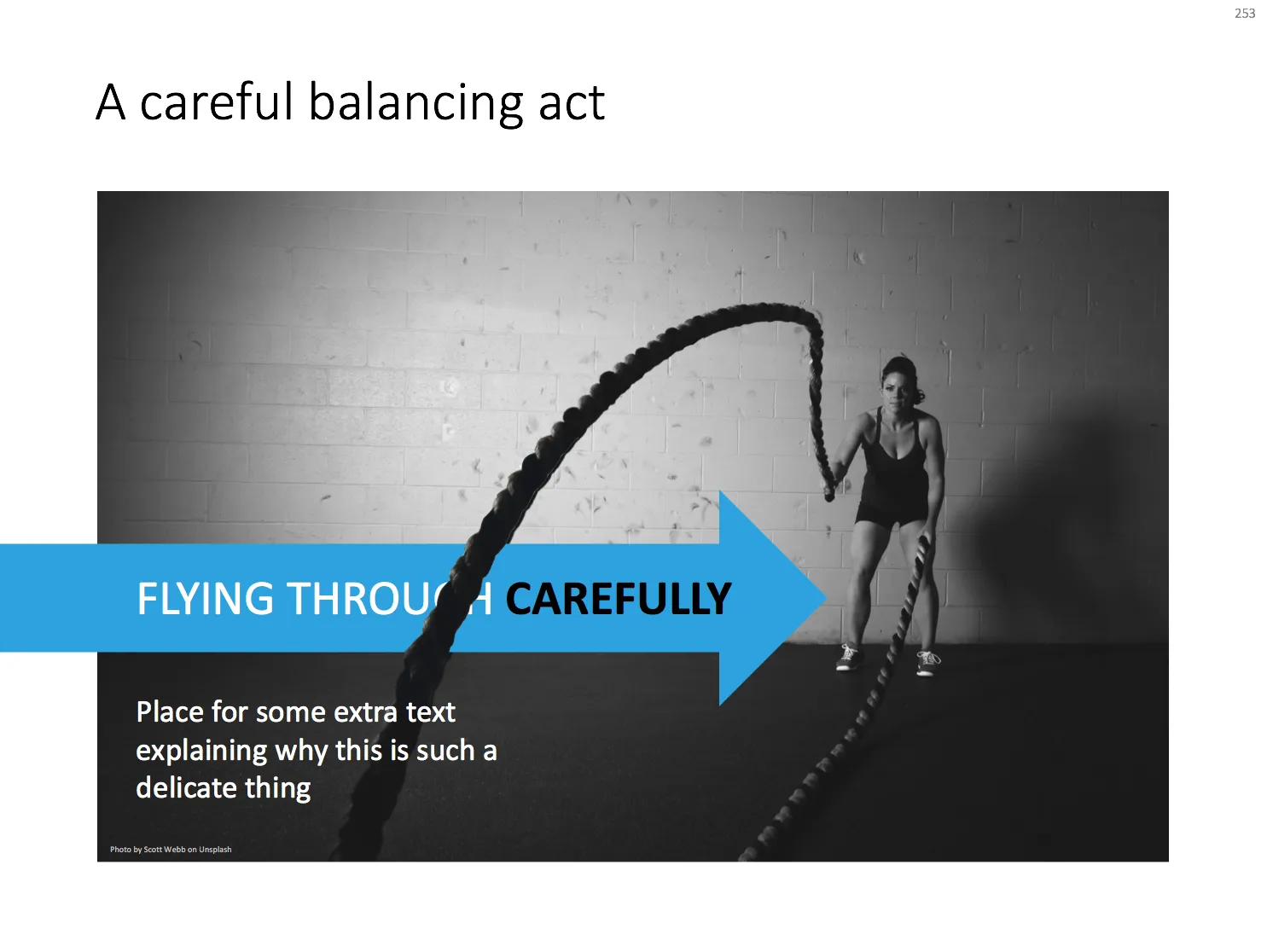
With a bit of Photoshop editing you can create an effect of a PowerPoint shape flying through some loop. I uploaded a new slide to the template store that uses this effect. Over the arrow, I positioned a second layer of the image, but just with a piece of rope with its background isolated. The arrow expanding outside the frame of the image (yes, I look those), adds to the motion feel in the slide.

Click the image to find the slide on the template store, subscribers can download it free of charge.

Cover image by Blake Wheeler on Unsplash

·Concepts

Sensitivity analysis in PowerPoint

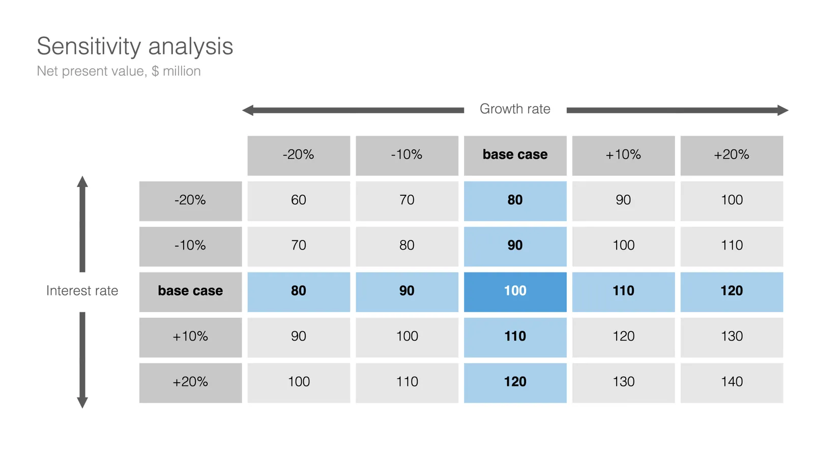
Today, I am adding a simple table to the store to show the sensitivity of an analysis. Each cell in the table shows an outcome of an analysis with a slight variation on 2 critical input variables. I used this type of a slide a lot in discounted cash flow valuation models, where assumptions about discount rates and assumed perpetual growth could make a significant impact on the outcome of your analysis.

The base case scenario is put very prominently in the centre of the table, it is the anchor for the viewer from which to start studying the other scenarios. I prefer making these type of charts manually, and not via a blanket copy-paste out of an Excel sheet. In that way, you have to think about whether each cell in the table is meaningful, and you can make sure that the data is formatted and rounded in the best way.

You can download this sensitivity analysis from the store, subscribers can do so free of charge.

Cover image by Markus Spiske on Unsplash