SlideMagic Blog

Frequent updates about all things presentations since 2008. Subscribe to never miss a post.

RSS
all posts

Category Concepts

·Concepts

Psychology of young people pondering the COVID vaccine

I am intrigued by the dynamics surrounding how people make the decision whether to take the COVID vaccine or not. Unlike most other countries, people have the luxury to ponder this decision here in Israel. The government has a real communication challenge here.

We spoke about segments before. If you are a fundamental anti-vaxxer, or have severe doubts about the vaccine safety, you are unlikely to be convinced.

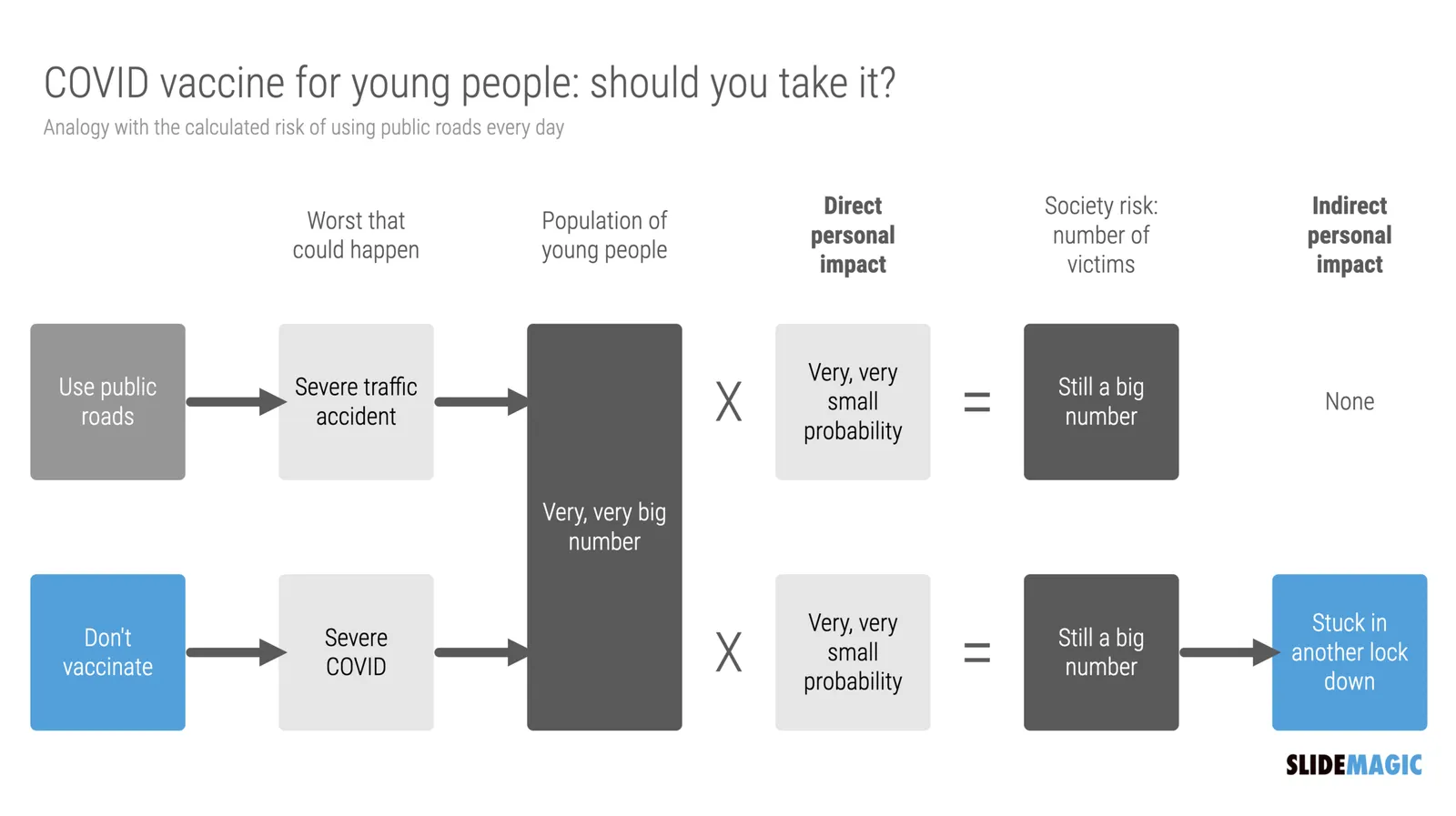
There is a segment of young people though that “can not be bothered”. The personal risk of getting severe COVID is very low. They consider it the same as joining public roads every day. You consciously take this calculated risk, knowing that the probability of getting stuck in a severe accident is very small, especially when you drive safely.

What people forget, is the indirect impact. Big number of people x tiny percentage is still a big number of people at country level. And filled up intensive care units, trigger more lockdowns, more closed restaurants, bars, parties, zoom schools, etc.

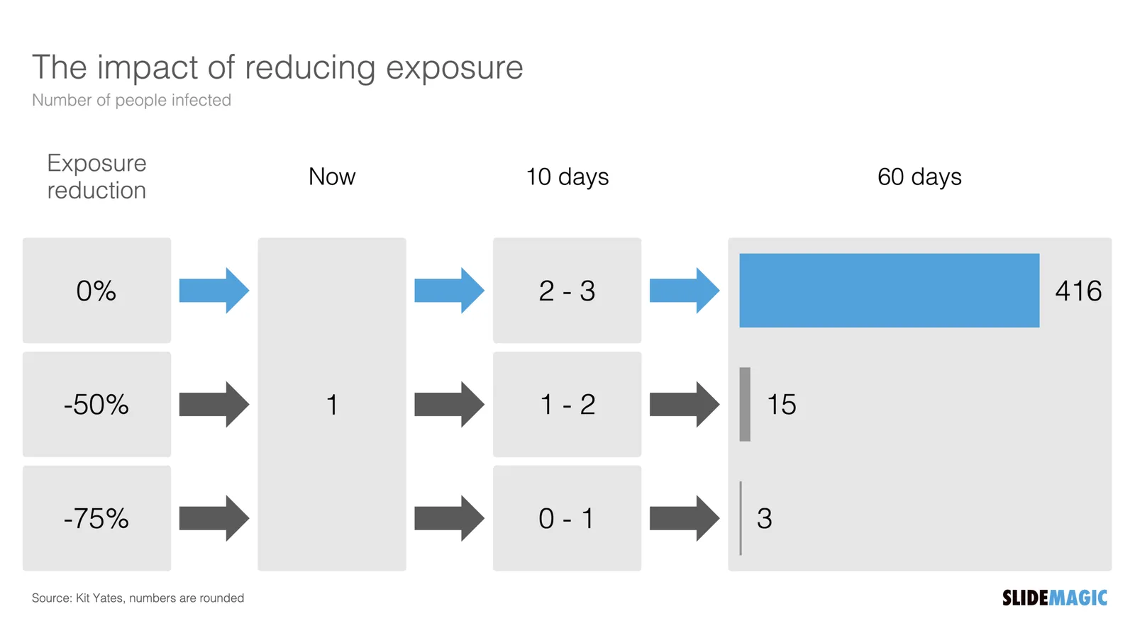
I compared the two scenarios in the chart below (search “COVID” in the SlideMagic app to use something like this logic flow in your own presentations for other topics, also put it in the web template bank, download it here).
·Concepts

"Why are 2x2 so popular in consulting firms?"

I answered a question on Quora:

I can think of a number of reasons:

  1. A 2x2 is a nicer way to present options than a slide with 4 bullet points, a 5 dimensional space can get very complicated
  2. It forces you to think things through thoroughly for holes and overlaps, maybe you start with 2 options, add a third, take a step back and think what actually defines these 3 options, come up with the 2 axis, and then realise you overlooked option number 4 to be complete
  3. A 2 dimensional framework allows you to think about what happens if you move things around, and makes it easy to visualise.
  4. In most cases there are more than 2 dimensions to a problem, but it is hard to visualise (see point 1), and think about. The 2x2 forces you to choose the 2 most important dimensions.
  5. Cultural habit, if you are in a place that uses a lot of 2x2s, you will use it more often, it is a language that people understand easily.

SlideMagic has lots and lots of 2x2, 3x3 and other matrices as slide templates for your to get started. Download the app and get started.

·Concepts

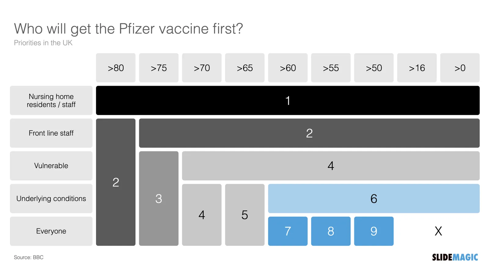
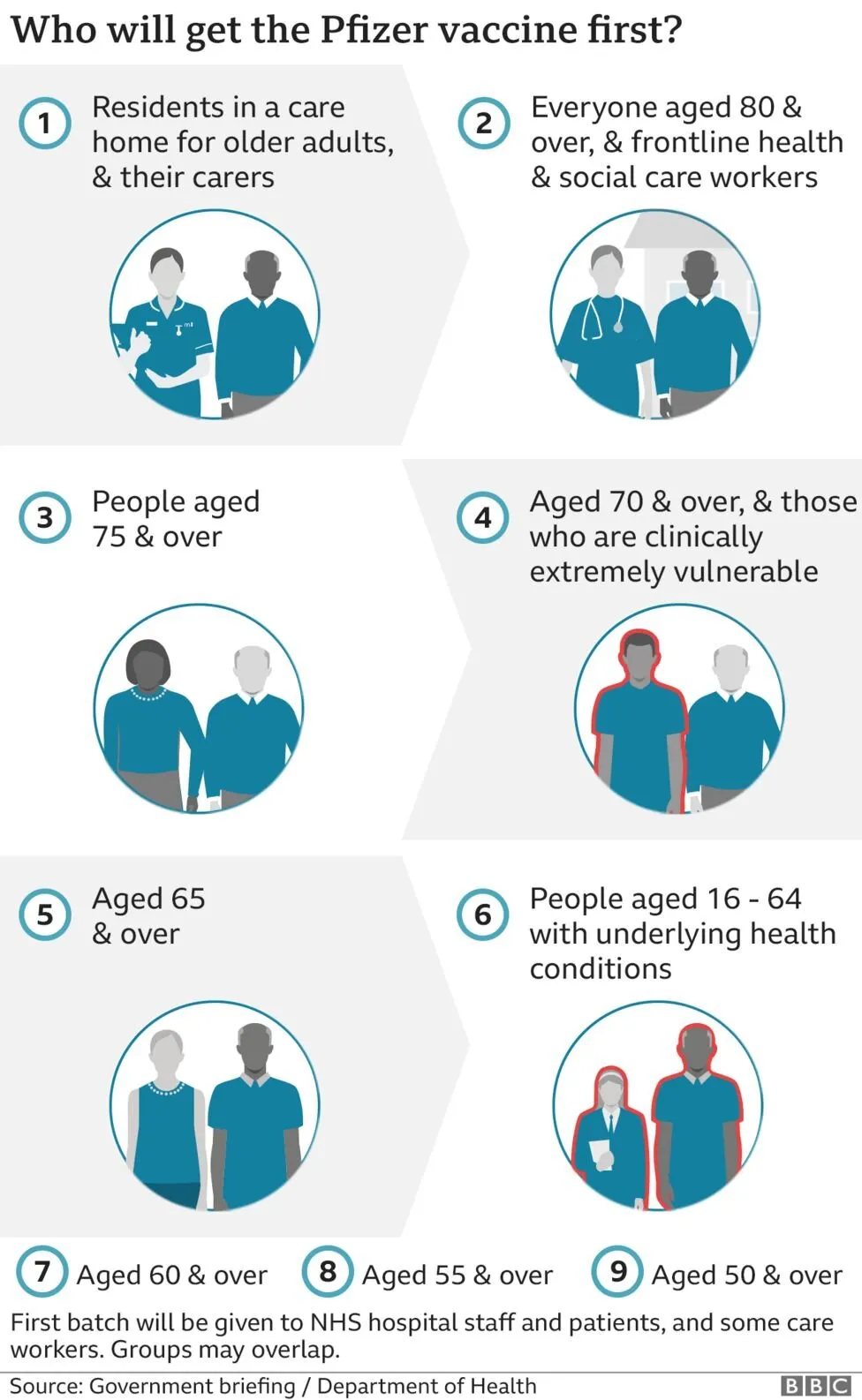
Chart make-over: UK vaccine priorities

I took on the challenge from this tweet:

The embedded tweet is obscuring the image, here is the original taken from the BBC:

I think these icons are very cute, but are very hard to understand. I quickly put the following together in SlideMagic.

In the philosophy of SlideMagic, not the design of a pro, but very clear and very quick to put together. Notice how I kept things simple, by including the theoretical 0-16 years in nursing home residents, there won’t by any but the big horizontal bar shows the message “everyone” and maintains the visual harmony.

I have added this vaccin priority slide to the SlideMagic template database. You can access this slide for free by simply searching for “vaccine” from within the SlideMagic desktop app.

·Concepts

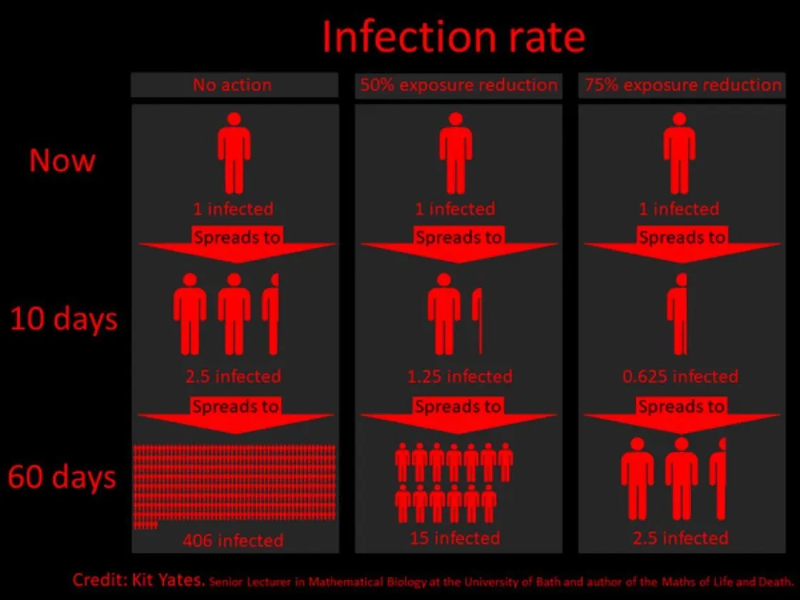
Example: COVID chain of infection

A slide came flying by on Twitter:

I might a quick remake of this slide in SlideMagic, in line with the SlideMagic philosophy: quick, clear, nothing too fancy (= time consuming) and added it to the SlideMagic template database since it could be a useful basis for any slide that needs to show some sort of chain of events.

What did I change?

  • Removed the low-contrast red on black colours
  • Took out the simplistic icons and replaced it with no-nonsense clear numbers
  • Rounded up numbers so to avoid cut up people (audience is not hard core scientists)
  • Put in a proper bar chart to show the magnitude of 416 vs 3, instead of an icon count
  • Flipped the design left to right to make the flow in time more clear

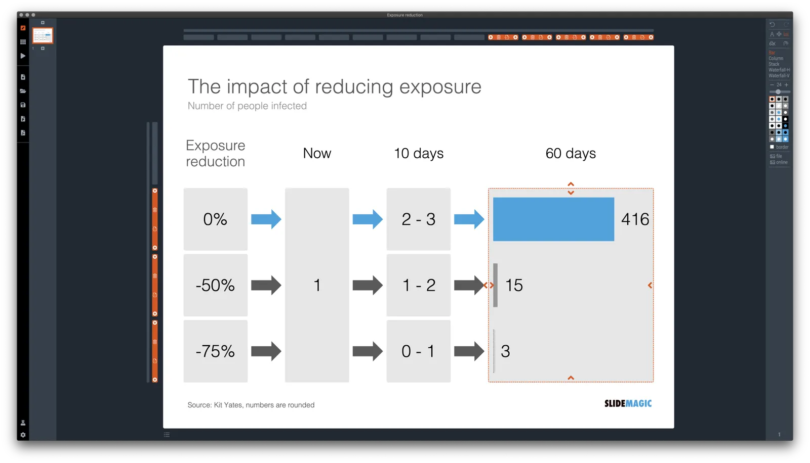
This slide demonstrates how easy it is to line up bars of a data chart, arrows, and text cells of a table in the overall slide layout (an absolute pain on other presentation design software).

·Concepts

Hexagons

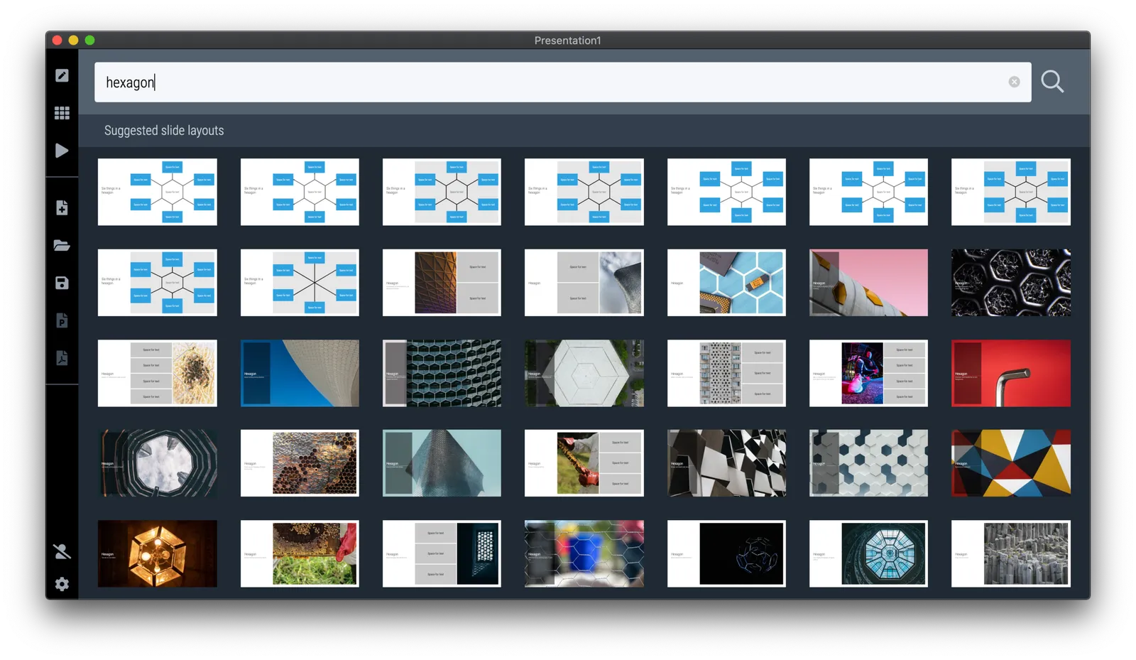
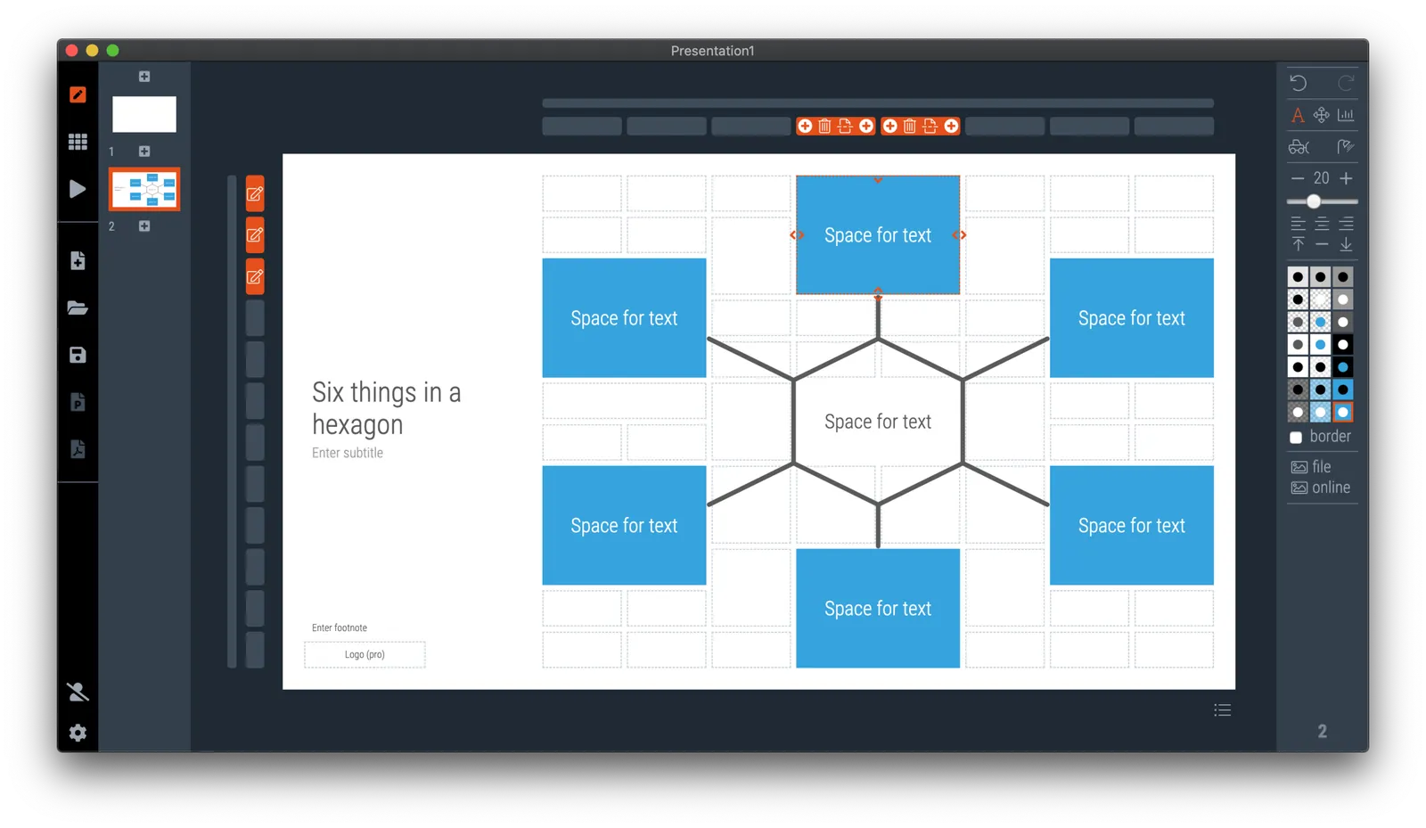
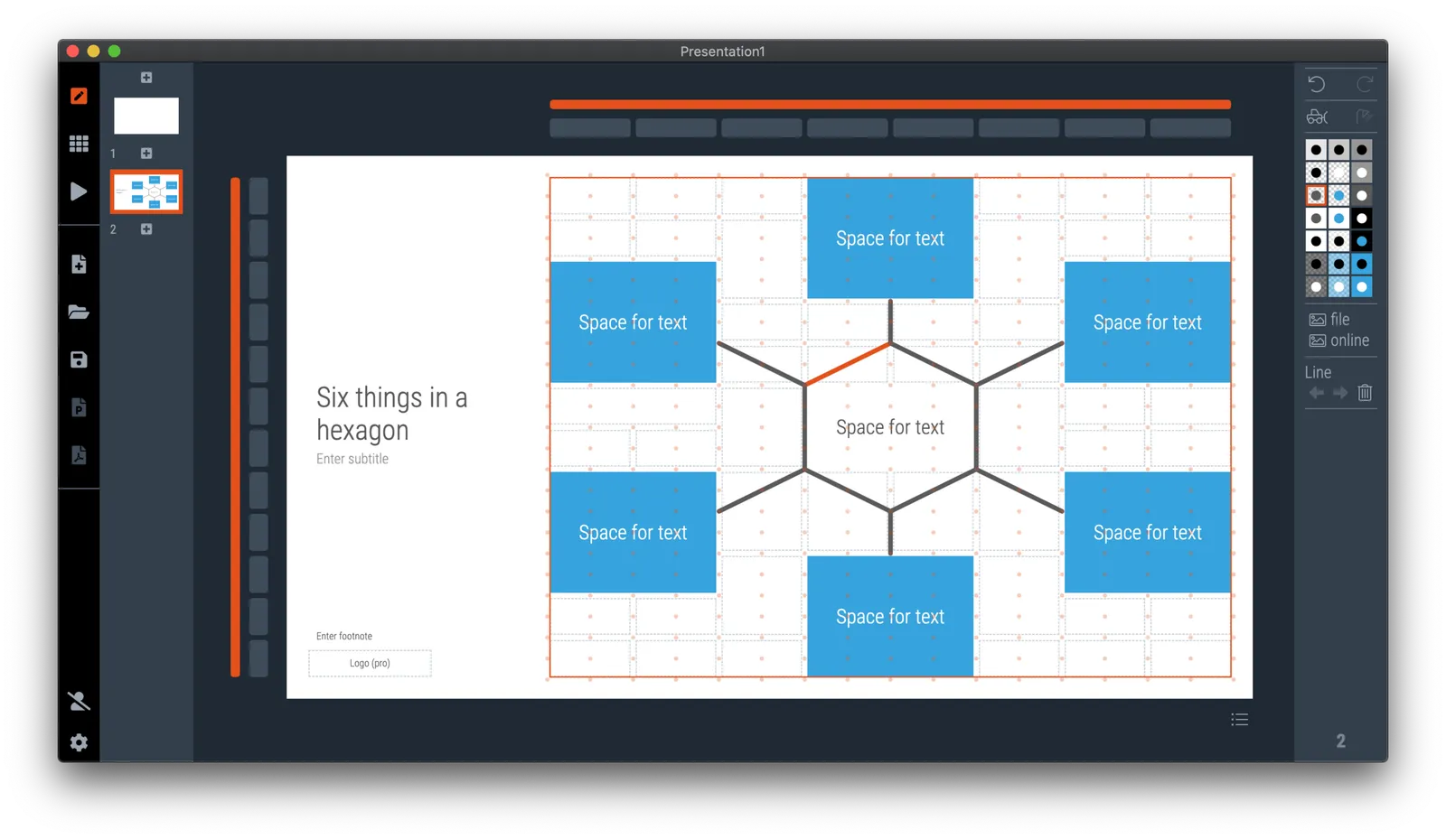
The new line drawing feature in SlideMagic was put in to support the connection of boxes in organisation charts and flow diagrams, but you can use it more creatively as well. The attached examples of the use of hexagon shapes shows how you can bypass SlideMagic’s strict limitations on shape types (basically boxes). But do you need to?

Photo by Jonas Svidras on Unsplash

·SlideMagic

An OKR slide template (Objectives and Key Results)

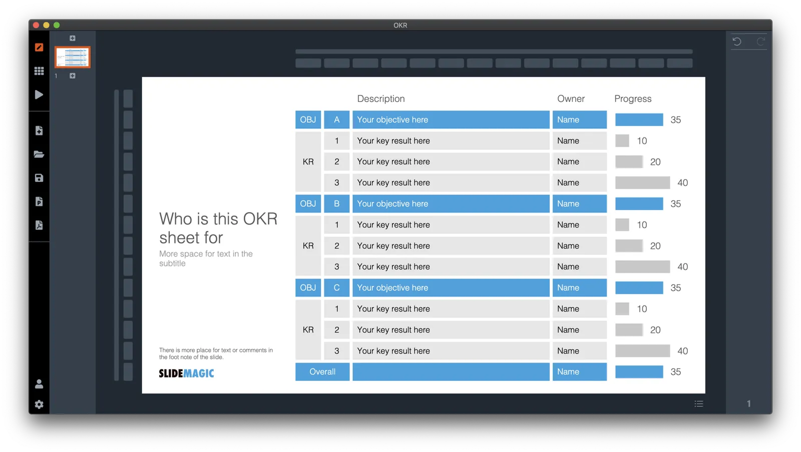
Not enough SlideMagic users have discovered that I try to respond to requests for new or missing templates. Today I added a template for an OKR sheet, Google’s approach to managing Objectives and Key Results.

SlideMagic is particularly useful for slides like this, it is easy to add rows, adjust the layout, and now those boring percentages can be visualised easy with a bar chart that always lines up with your table.

Search for “OKR” in the SlideMagic desktop app and it will pop up and ready to work on for free, alternatively, pro subscribers can download the template (in .magic or .pptx format) from the online template bank.

Let me know if you need more/different types of OKR templates.

·Concepts

Using heat maps in your presentation

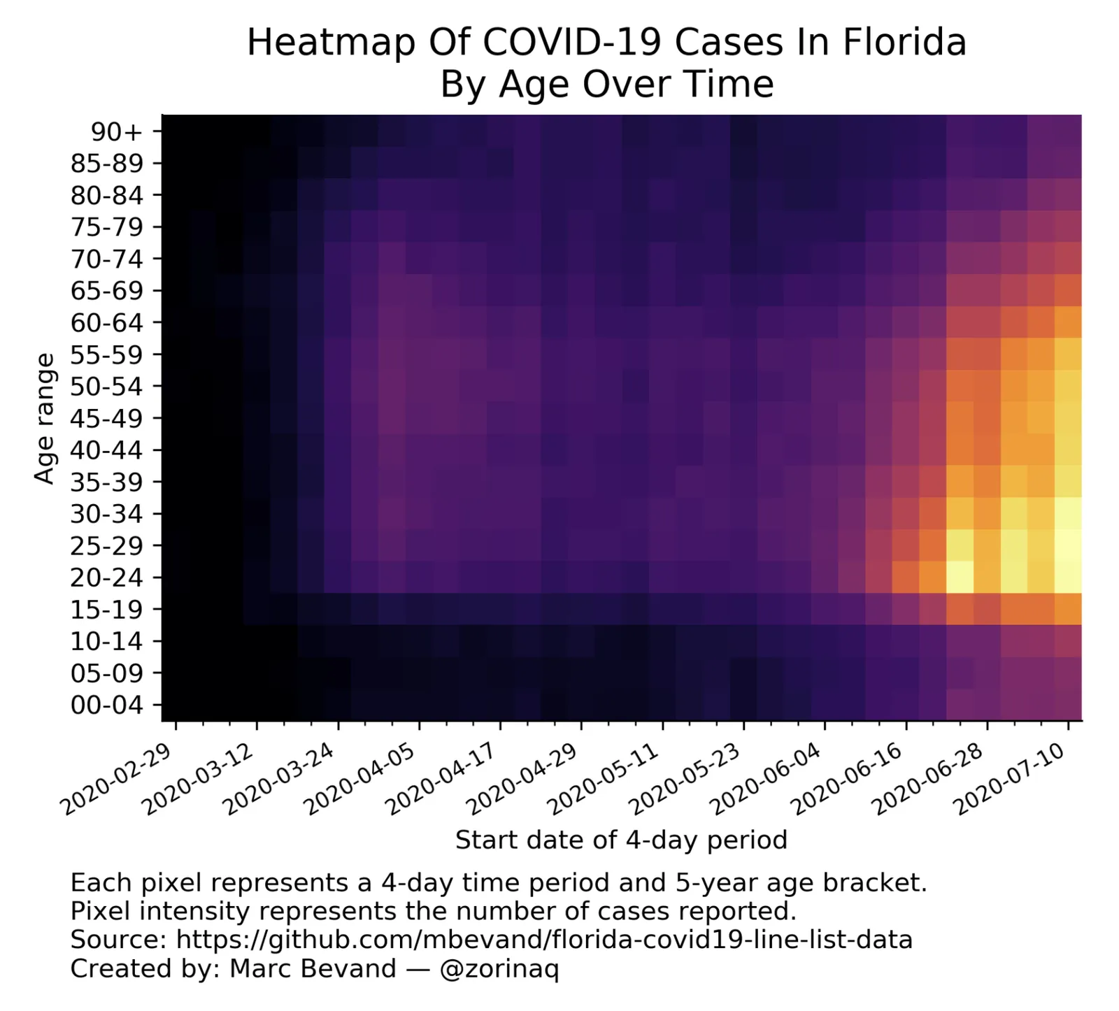
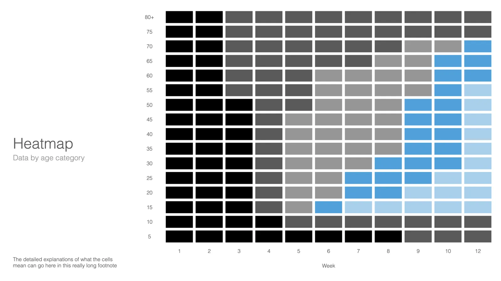
This is a neat visualisation of the COVID outbreak in Florida:

Why does it work?

  1. It uses colour intensity to introduce another dimension of data in a column diagram: time, number of cases, and age range.
  2. The colours are nicely chosen so the chart gives the impression of some sort of fire being lit (which is unfortunately the case).

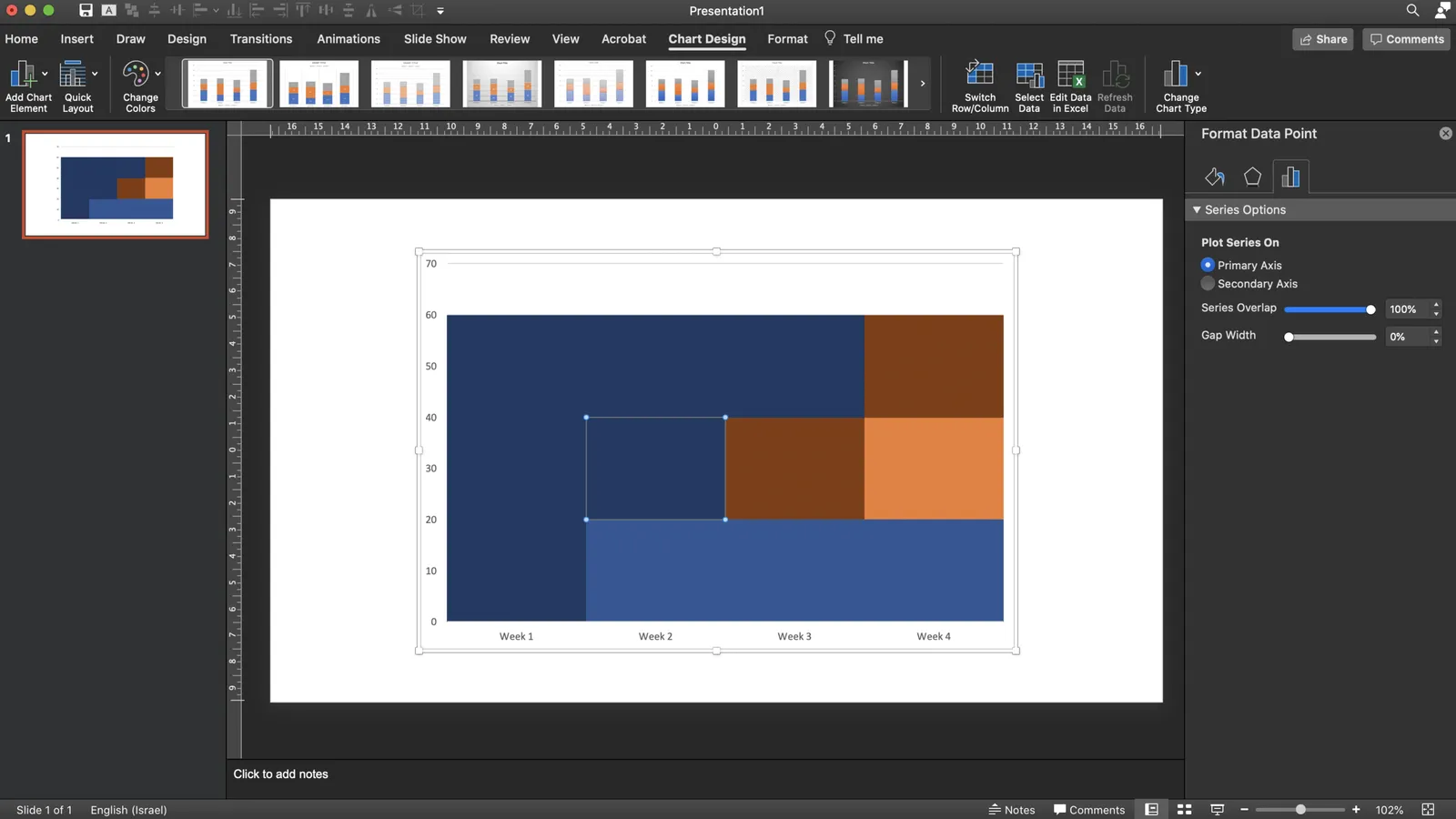
These charts cannot easily be created in PowerPoint, this one is generated by some code. But you could give it a go in PowerPoint.

  • Take a standard column chart in PowerPoint
  • Make all the data series have the same value, the age brackets you want to use
  • Set the gap between the columns to zero
  • And now comes the hard part: manually add different colours to each data point. To select a data point click it twice in quick succession (one click will give you the entire data series wiping out your detailed painting effort in one go)

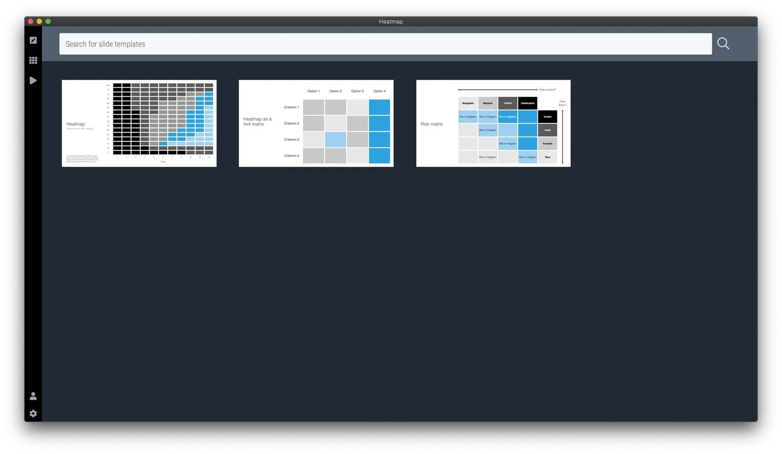
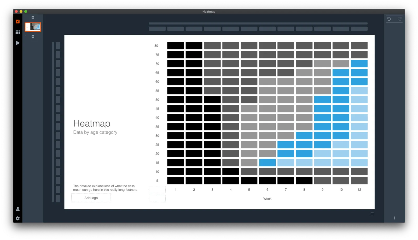
Here is a quick search for heat maps in SlideMagic, I added one design that sort of resembles the COVID chart. You can see how the new slide layout with the side title I introduced a few days ago comes in handy to create more vertical space for data.

·SlideMagic

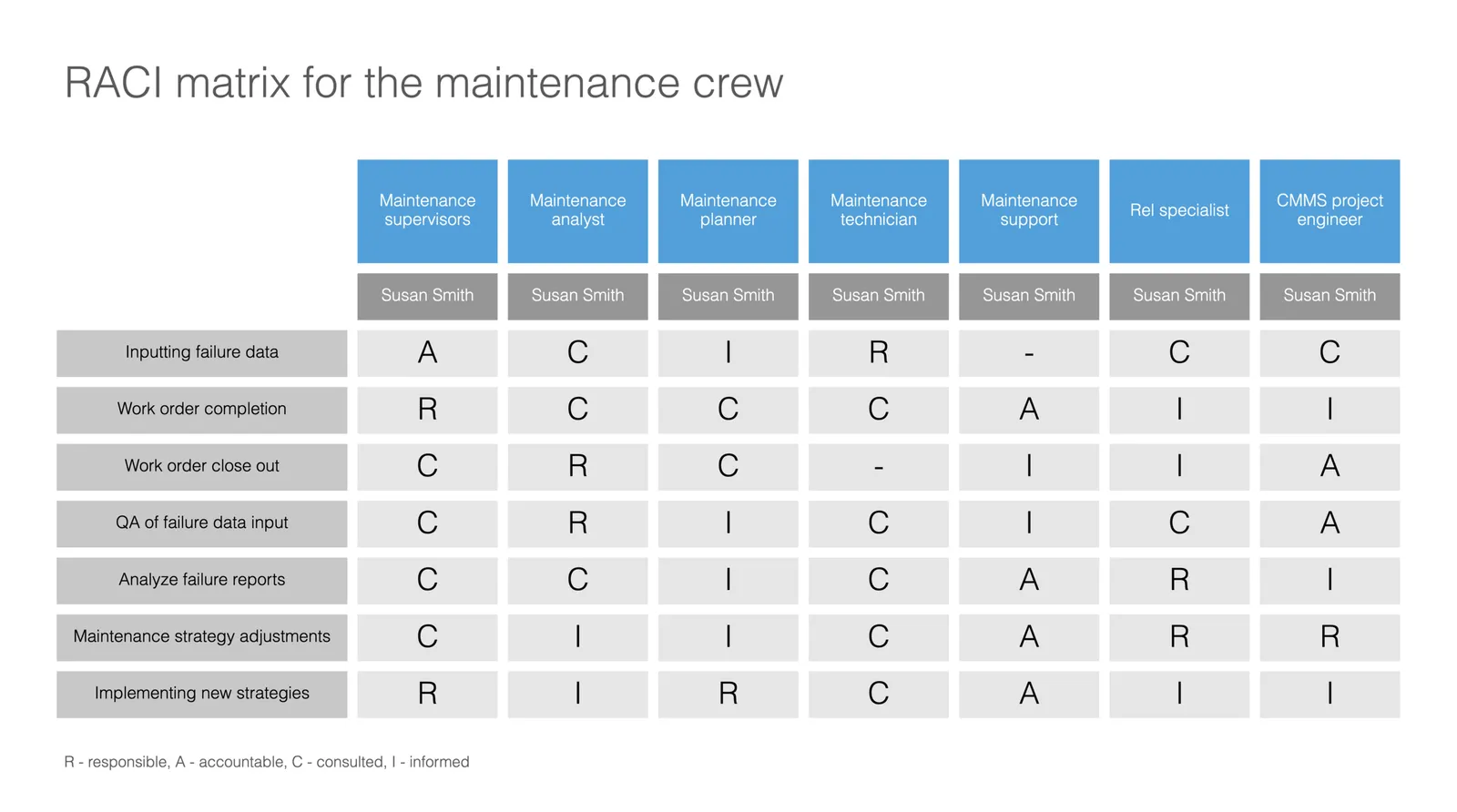
Slide template for a RACI matrix

On request of a user, I have added templates with a RACI matrix to the SlideMagic database. (It does not happen often, but this is the first time I actually heard about this consulting framework, the responsibility assignment matrix). In SlideMagic it is super easy to manage all the columns and rows of the table. If your colleagues are not ready for SlideMagic yet, use the app to create the chart, then export to PowerPoint.

·Concepts

Organisation charts

Organisation cultures are changing. Traditional hierarchies becomes less important, and project teams often become the engine of doing things. Also outsiders such as freelancers do not fit in nicely in big structures. At my time in McKinsey in the 1990s, we could have full meetings about whether a line should be dotted or not, and who would have to be drawn slightly higher than someone else on a page. Mistakes here were especially painful in a presentation to the management team.

Organisation chars in presentation are tricky for two reasons: it is hard to get all the boxes right on the page from a technical point of view, and it is hard to make everyone happy that the hierarchy and lines of the boxes reflect reality.

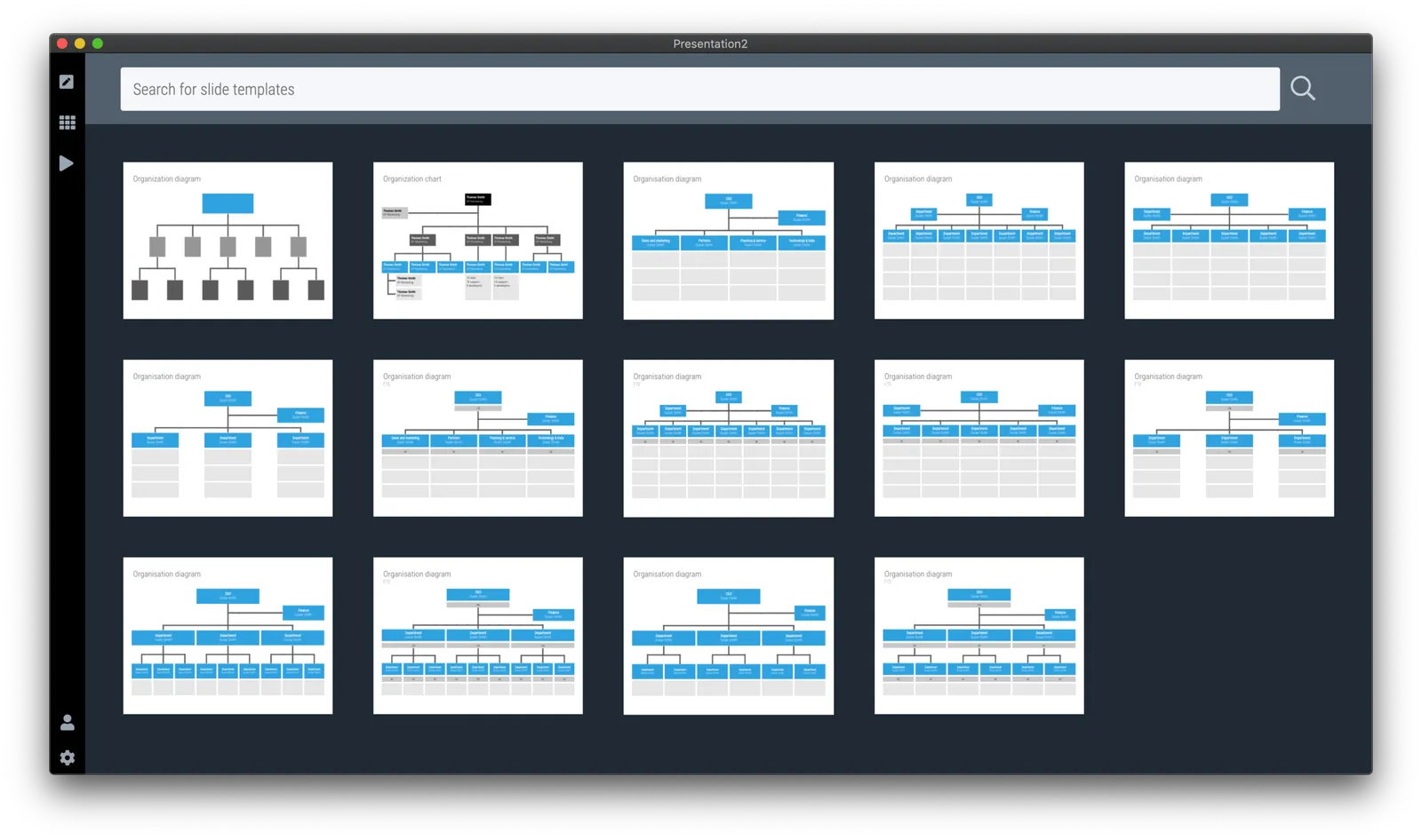
At the request of a user I have added a few more organisation charts to the SlideMagic slide template database. Complex organisation diagrams are not SlideMagic territory (if they are. hard to draw, the audience must also find them hard to understand). Instead, I created a few simple templates that can lay out the structure of an organisation in simple way, cutting the amount of lines, and increasing the size of text boxes.

If you present your chart as a a rough summary of the organisation rather than an exact reflection of hierarchy, you might just get away with it. If you pretend to be precise, people will nitpick…

The “connector” element in SlideMagic is still the weakest drawing tool and I am thinking about a new diagramming user interface now that my front end HTML design skills have improved significantly over the past year. As usual, the problem is not technical. Also in PowerPoint with its more sophisticated diagramming interface, it is hard to get connecting. lines to do what you want. They always angle and bend in a different way than you want them to.

Continue reading →
·Concepts

Pretty template, ugly slide

Most corporate presentation templates are designed starting from an empty slide. The designer feels the urge to spice things up a bit with logos and other graphical elements. Now when you actually use that template (designed for a blank page) with everyday presentation content, things start to clash.

The same things must have happened to the designers at BMW, who forgot the license plate that would be plastered over the front of their new car design….

The next time you brief a designer for a new PowerPoint template, give her a full slide deck including content, let her create a design you like, then strip out all the elements and see what you are left with.

<!— Sponsored content: with SlideMagic, there is no need to worry about a presentation template that fits your corporate branding —!>