SlideMagic Blog

Frequent updates about all things presentations since 2008. Subscribe to never miss a post.

RSS
all posts

Category Concepts

·Concepts

Risk matrix in PowerPoint

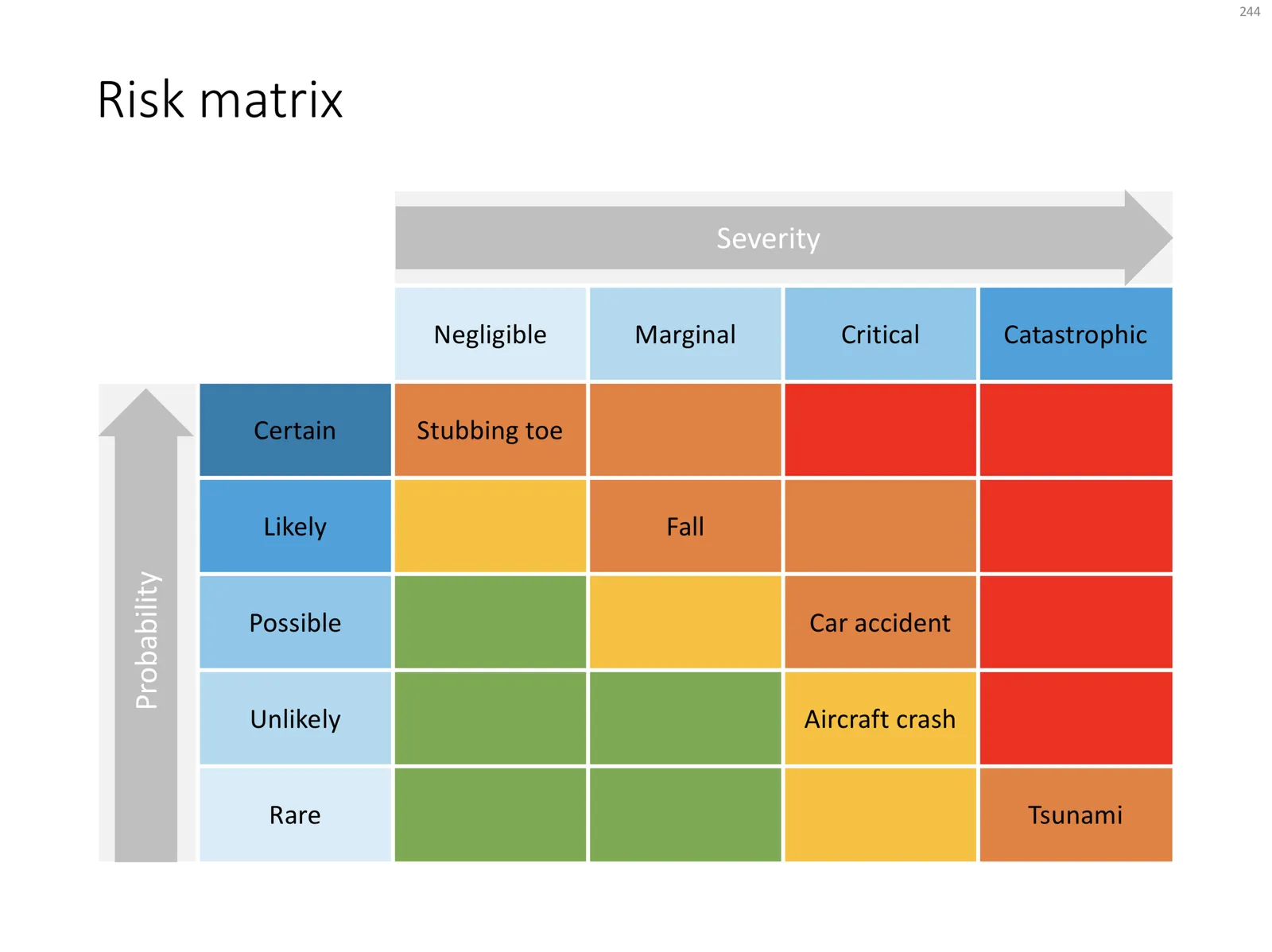
I am continuing to tick off the standard presentation frameworks in the store, yesterday I added a PowerPoint template for a risk matrix. The matrix has 2 axes: one for the probability that a disaster happens, the other one how severe it would be if it were to happen.

The matrix is designed in true SlideMagic style: not very fancy, but highly symmetrical, usable, and adaptable to your everyday presentations. You can download the slide here, subscribers can do so free of charge. Feel free to adjust the axis titles, labels, or dim the bright traffic light style colours to your taste and needs.

Cover image by JC Dela Cuesta on Unsplash

·Concepts

A prism that shows what's inside

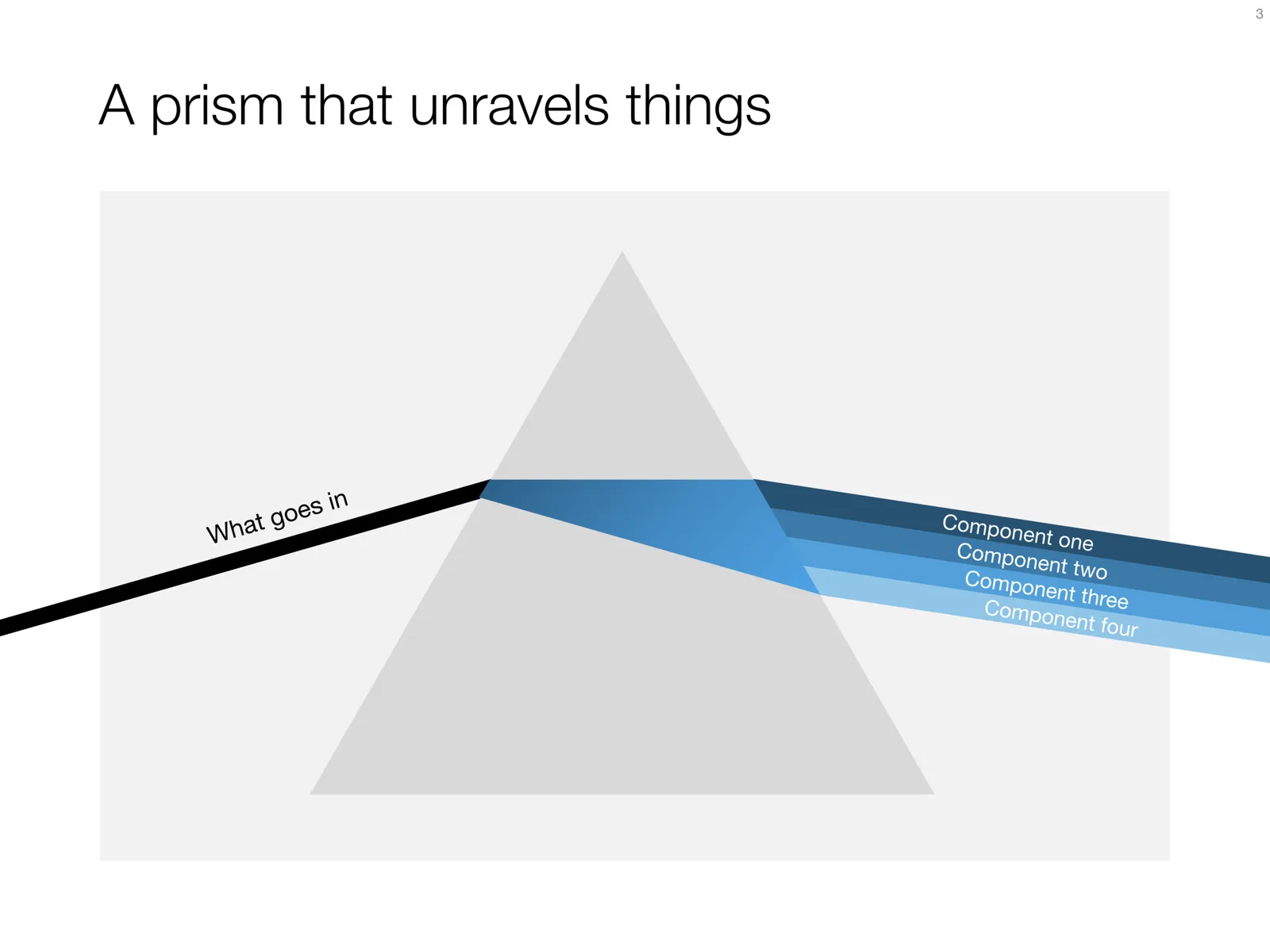
I have used the prism visual metaphor a few times in my client’s presentations to show how rich, intricate, subtle components are present in a service or product that might not be apparent from the outside. Below is an attempt at a minimalist pyramid in PowerPoint (roughly modelled based on the cover of that Pink Floyd album).

I simplified the laws of physics here and there, the tricky bit was to get the blue shape inside the triangle right. I added the slide to the template store yesterday, you can find it ready for download here, and subscribers can do so free of charge.

Cover image via WikiPedia

·Concepts

Hmm, what do you think?

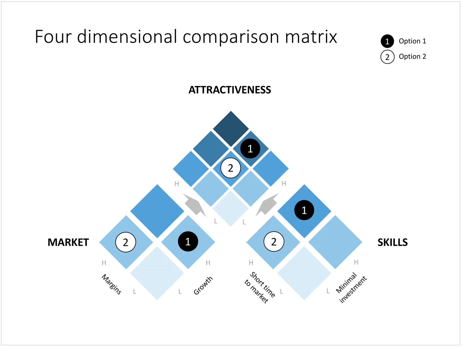
The chart below is an attempt to create a comparison matrix that can deal with 4 dimensions. Two dimensions get consolidated into another one, which are put on another matrix. The results is mathematically correct, but does it work as a slide? Maybe it is pushing things too far.

You can download the four dimensional comparison matrix by clicking the image, subscribers can do so free of charge.

Cover image by Amy Reed on Unsplash

·Concepts

Creating an infinity symbol in PowerPoint

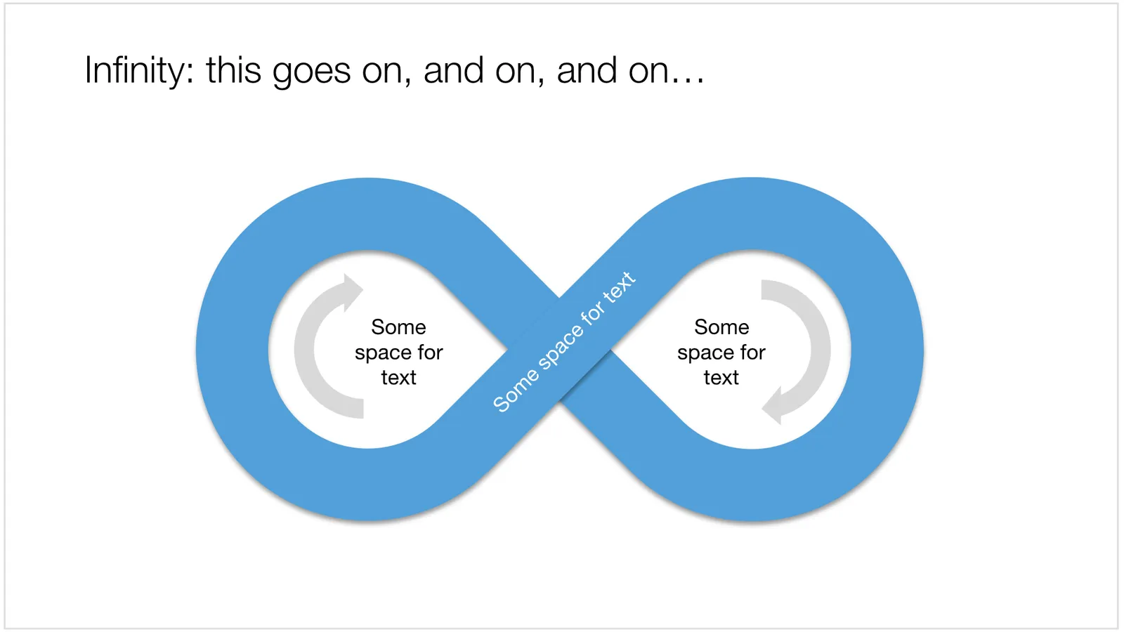
It is tricky to create an infinity symbol (or lemniscate) in PowerPoint, it is a shape that needs to overlap with itself and requires Escher-style (impossible) layering of shapes. The only way to do it is cheat, and construct the final shape of many individual shapes that are grouped together cleverly.

I managed to get it done, and you can see the final result here (hmm, those arrows point the wrong way around though):

 An infinity symbol in PowerPoint

An infinity symbol in PowerPoint

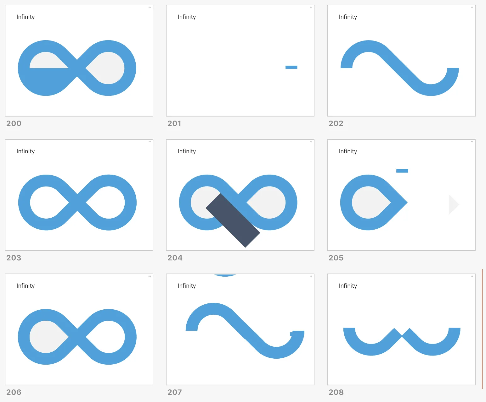
I don’t have the exact workflow anymore that I used (I made some destructive edits), but below is a screenshot of the PowerPoint file in slide sorter mode that I used to create the shape, starting with 2 circles and a square.

 How to create an infinity shape in PowerPoint

How to create an infinity shape in PowerPoint

This shape is useful to show concepts that keep on going, or loops that you can’t get out of. You can download the infinity symbol here, or find other slides with loops. There are Apple Keynote versions available as well.

Cover image by Mark Asthoff on Unsplash

·Concepts

PowerPoint vs Keynote in 2018

Over the past few days I converted all the slides in the SlideMagic store from PowerPoint 4:3 into PowerPoint 16:9, Keynote 4:3, and Keynote 16:9. That was quite a bit of conversion and uploading work… As a result I got an even better understanding of the differences between PowerPoint and Keynote. Here is the 2018 version of the comparison.

Overall both programs are excellent, as you would expect from software that has been around this long. Bugs have been ironed out, and both programs have “learned” from each other to get to a good workflow. So the differences are not that major.

Where PowerPoint is stronger

  • Workflow for advanced users. I can customise the top tool bar with the functions I use most (aligning, distributing, moving things to the back, etc. see my full list of toolbar short cuts here). Also in Keynote it can get confusing at high speed to change colours of text and shape fills, too many clicks, and too many opportunities to get it wrong. The interface looks elegant, but it slows you down.
  • Data chart editing is better in PowerPoint with the full power of Excel behind it
  • Stretching of (groups of) shapes is predictable in PowerPoint: you can distort aspect ratios. Keynote is more restricting and protects the novice designer with stretching images. But, it does the same for large groupings of objects, as soon as you have a few connectors inside, it is no longer possible to stretch complex diagrams across the page, without also increasing its height. This cost me a lot of time to clean up my flow chart template for example. I could not understand when Keynote decides it is OK to stretch, and when not.
  • Complex connector diagrams run more smoothly in PowerPoint. Keynote is “smarter” and helps you pick/decide/suggest possible connector lines between shapes, but because of that, it is harder to convince it to something you want against its own suggestion. In more complex diagrams this becomes a problem.
Continue reading →
·Concepts

Puzzle pieces in PowerPoint

Although you could consider them a presentation cliché, puzzles can work really well in a presentation:

  • Show how things fit beautifully
  • Show how your are missing (hopefully just one) critical piece
  • Show that you finally managed to plug that last gap

Puzzle shapes can also work great when you use them in combination with images. You can go back to this blog post about making Photoshop-like image cut outs in PowerPoint.

Stock image sites are flooded with millions of puzzle piece designs, but they are not very practical for the average PowerPoint designer (especially late at night working for tomorrow’s deadline). Almost all these puzzles pieces are vector objects or images that are impossible to edit in PowerPoint. Moreover, all these puzzle pieces have wildly irregular shapes that make them hard to fit in your slide composition that requires exactly nine of them.

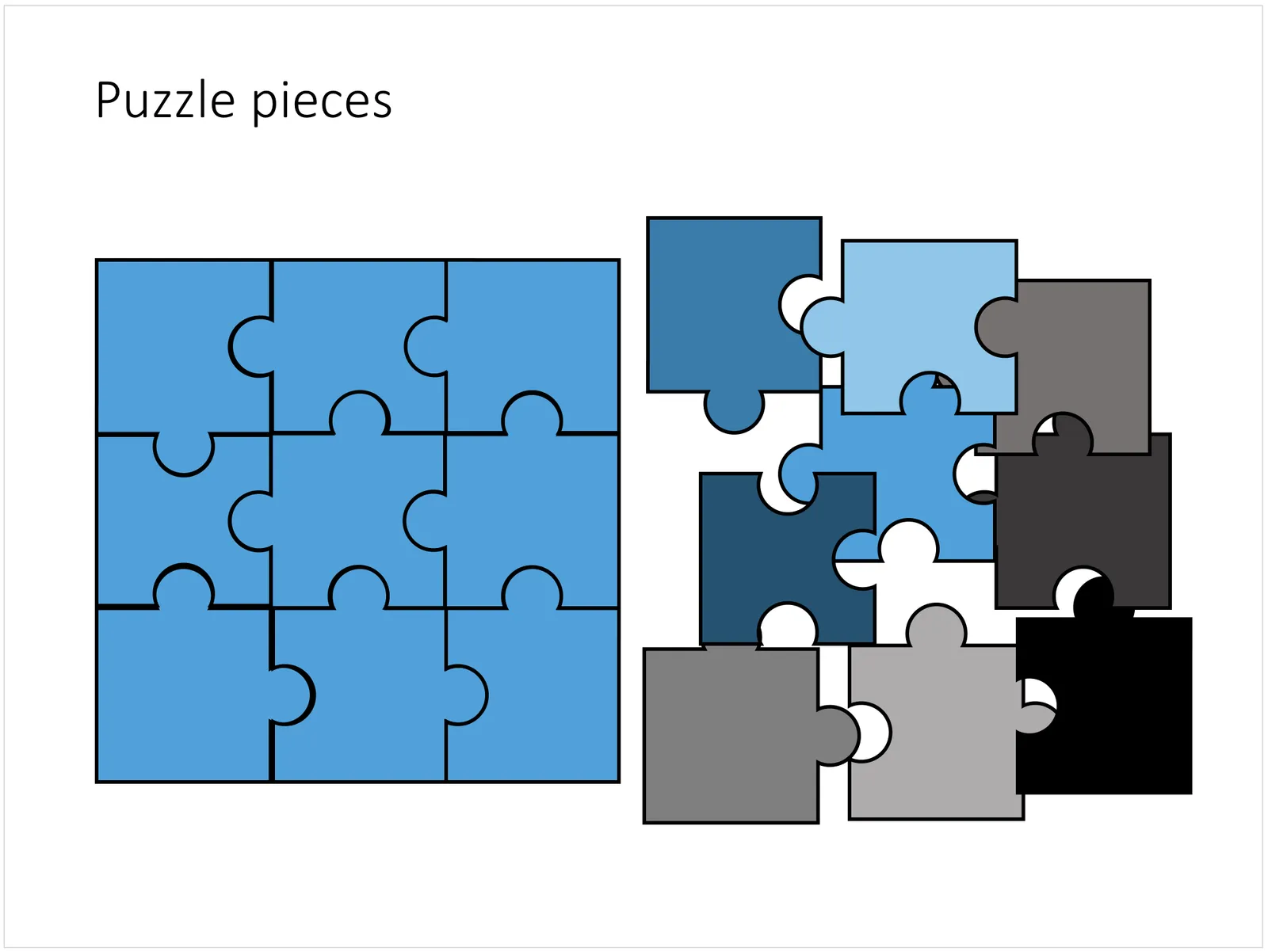
ThisPowerPoint puzzle slide solves the problem for you. The pieces inside are fully editable PowerPoint shapes, you can change their colour, you can put text in them, you can reconfigure and piece them together as you see fit. Yo’u can download the finished slide by clicking the image (An Apple Keynote version is available as well).

You can try to create the pieces yourself if you want, I used simple square shapes and circles, either joining or subtracting the shapes. Circles and squares might not be the most realistic shapes, but they are very practical when have to piece things together. There is a little bit of math homework to do to determine which type of puzzle shapes you actually need, and which ones you can create by rotating existing pieces.

·Concepts

Concentric circles in PowerPoint

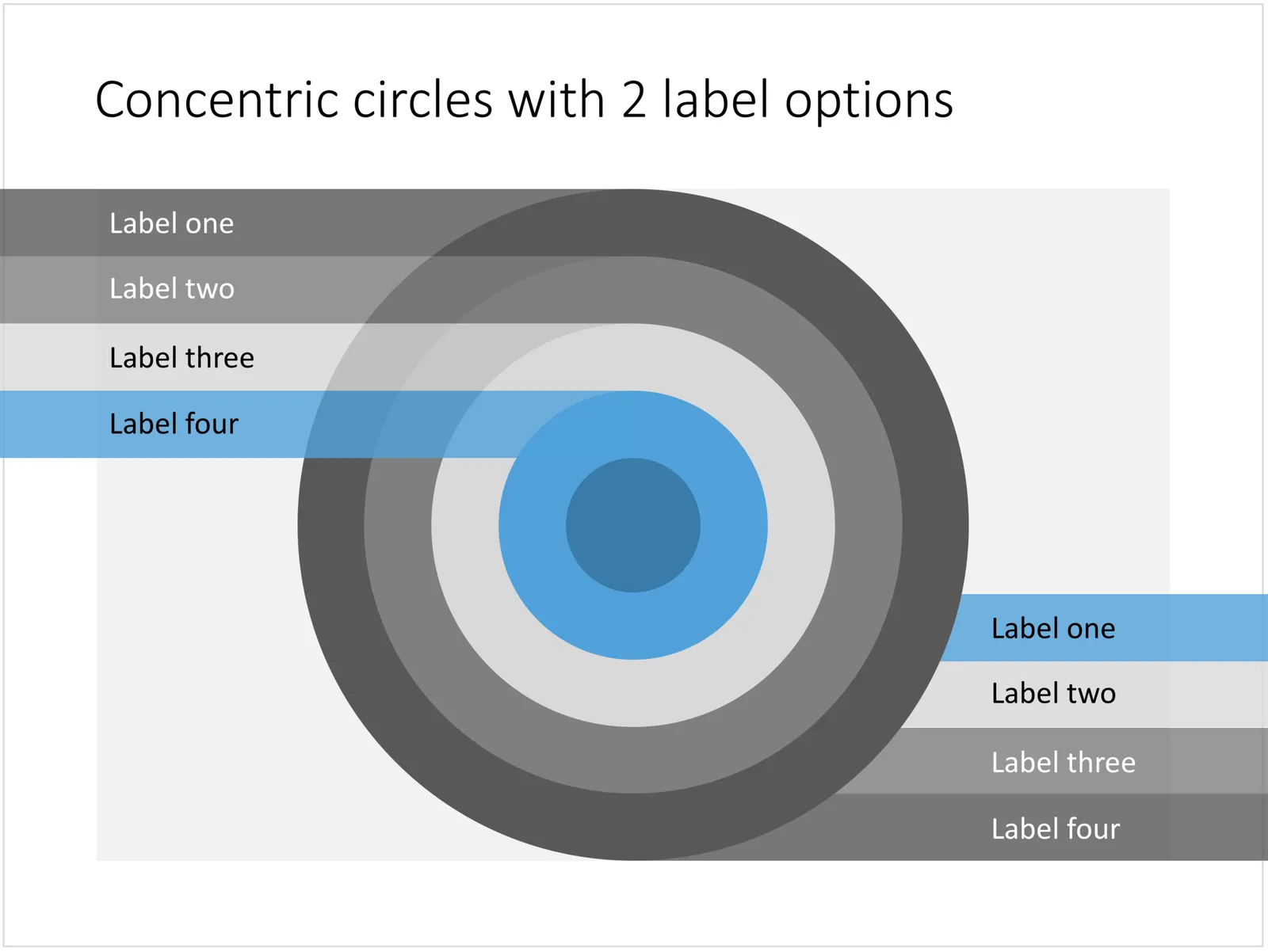
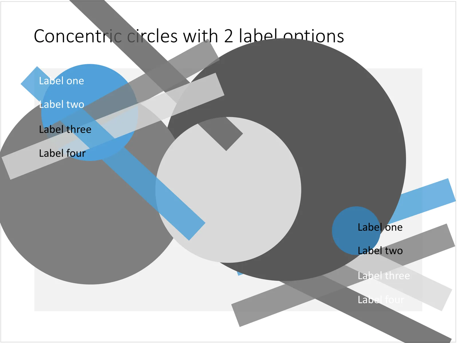
You can create very beautiful compositions by just using basic shapes and a few colours. Below is a presentation slide with concentric circles, and an image that shows how it is constructed. Feel free to borrow the design approach, or you can download the finished slide here.

This technique was often used by the Swiss graphics designers in the 1960s. You can use the slide concept below in a number of ways: show some sort of layering, show multiple layers of security or protection, show a whirl or rolling dynamic. You can take the labels of and just use the circles.

 Concentric circles in PowerPoint

Concentric circles in PowerPoint

 How to make concentric circles in PowerPoint

How to make concentric circles in PowerPoint

·Concepts

Blue ocean strategy in a presentation

Most investor or sales presentation have some sort of slide about the competitive environment. (Here are earlier blog posts about how to present the competition). Usually, people use tables, or 2x2 / 3x3 matrices to show how they are different.

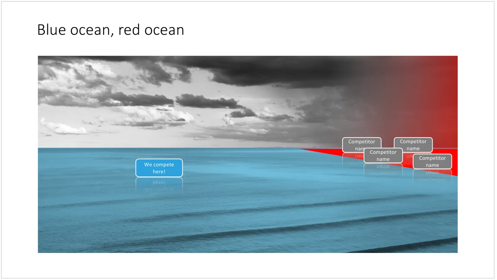
The chart below might a completely different take on the subject. The Blue Ocean strategy concept developed by INSEAD argues that is often better to define an entirely new market rather than battling with all the existing companies that go after well-established market segments. You can download the slide here.

 Visualise the competition using

Visualise the competition using “Blue Ocean Strategy” in a presentation

Cover image by Ishan @seefromthesky on Unsplash

·Concepts

Presentation layout for when you are stuck...

Sometimes the simplest slides can be the most effective ones. This slide layout shows a big arrow crashing into a wall to visualise your obstacle or roadblock. The wall image is framed, while the arrow is bleeding of the page, adding an extra movement effect.Edit to text in the arrow and/or on the wall to show your audience what it stuck. The text in the arrow will automatically tilt in the right 3D angle, and both the wall and arrow will colour in your primary accent colour. Please copy this slide into a presentation that uses your own corporate presentation colour theme.

I am gaining a lot of experience now in translating PowerPoint designs into Keynote. This chart is only available in PowerPoint and not in Keynote, because the latter cannot tilt objects in a 3D space. The same problem arises with charts that rely heavily on bevels or other 3D lighting effects, which is not obvious to do in Keynote.

Here you can find this wall layout in the SlideMagic store. Cover image by Chris Benson on Unsplash

·Concepts

Bubble charts in PowerPoint and Keynote

Bubble charts are useful to present and analyse very large datasets. The standard template in PowerPoint and Keynote still needs some adjustment to make the chart useful. In thisbubble chart on the SlideMagic template store, I have tried to do the hard work for you.

This a reformatted version of the standard bubble chart that you will find in PowerPoint and Keynote, on top it has the layout of a 2x2 matrix. The bubble chart is useful when you want to compare a data series with 3 elements, across a large number of data points. Examples are countries, business units, regions, products, etc.

The first two elements will be plotted on a regular XY chart, the 3rd element is the size of the bubble. PowerPoint or Keynote do not support labelling of the bubble very well, which are put in manually.

A 2x2 matrix structure is put on top of the regular bubble chart, giving you 4 distinct quadrants to segment your bubbles in. In the current example, the quadrants have the same size, by putting the 2 axes right in the middle. To do so, you need to manage the ranges of the axes carefully. If this is not important to you, you can put the X and Y axes where they are relevant without worrying about this. Quadrants of unequal size will still look good.

I am working hard to make the store more useable. This layout is an example. There are 4 variants of the chart: PowerPoint, Keynote, both in 4:3 or 16:9. I tried to add all the right instructions about how to use the layout, and show many links to other relevant slides in the store. While working on your presentation, you can go back and forth between designs and get ideas on how to visualise the key messages of your presentation. Some layout suggestions, you might be able to create yourself, others you might already have bought and can re-use, or you can download a layout right away to add it to your library. SlideMagic will be a place that saves you time making your business presentations.


Continue reading →