

Harvard Business Review is bombarding (spamming?) my Instagram feed with this ad almost every day (Google shows that the chart was first created somewhere in 2016):
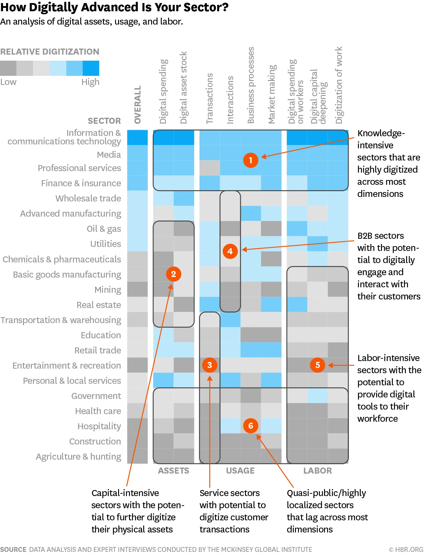
It is a very busy chart, so not to be used in your next TED Talk, but for close-up reading these heat maps are actually pretty good. This is a pretty decent summary of what much have been a huge scoring spreadsheet.
- Only a few colours (suspiciously similar to the SlideMagic look…)
- Careful attention is paid to sorting and grouping rows and columns
Some more improvements are possible:
- There is too much text in the descriptions of the boxes: we know that we are talking about sectors, no need to remind us, and there is too much lingo in there (“digitally engaging”).
- Column headings can be shortened, especially that long word “digital” can be lost here and there
- I would move the “assets, usage, and labor” headings (nice short ones) to the top to make the link with the column headings clearer.
This boxy chart will be a good challenge for my code of SlideMagic 2.0, I am going to try it.
Photo by Guillaume Bolduc on Unsplash