SlideMagic Blog

Frequent updates about all things presentations since 2008. Subscribe to never miss a post.

RSS

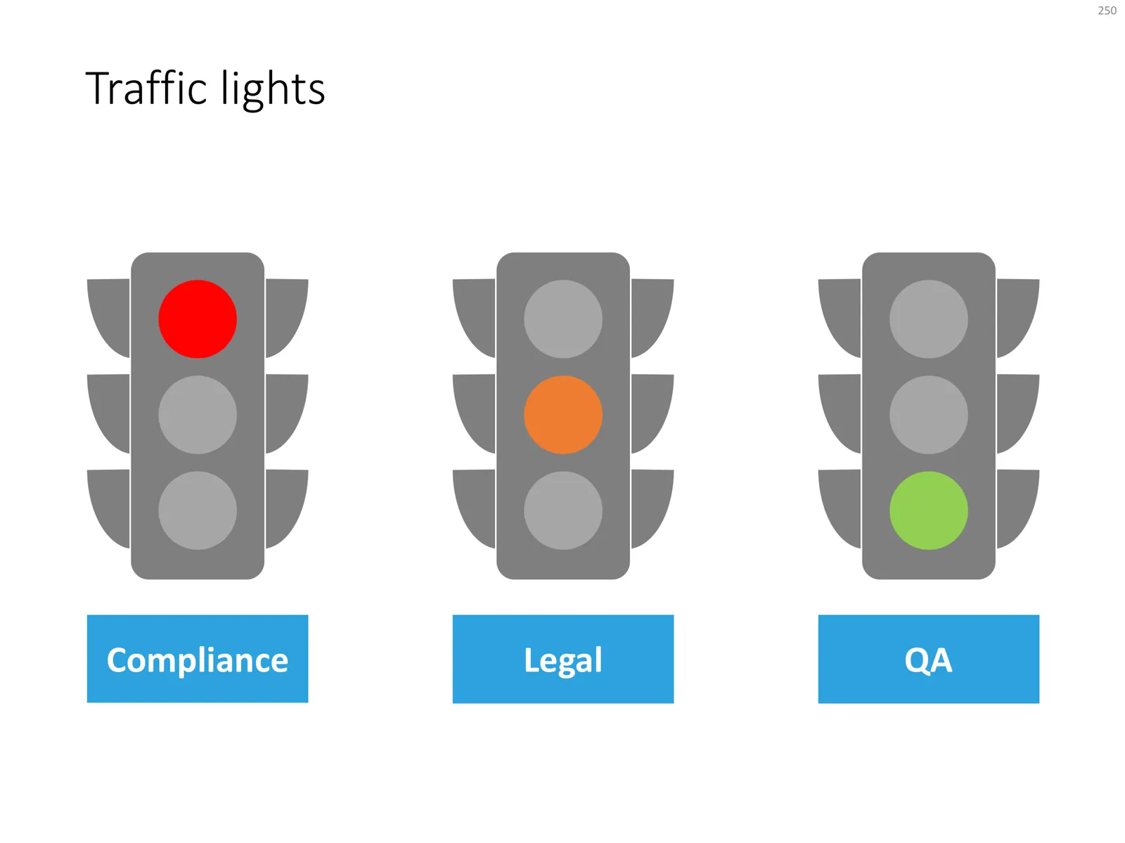
Traffic lights in PowerPoint

Now and then, I use the good old traffic light chart to present the progress in a project: who has given “the green light” and where things are still stuck. These icon-style shapes are easy to create in PowerPoint. I usually start with Googling a few example images/icons, then see what basic shapes are needed, to finish with the composition I like.

Click the image above to be taken to the traffic light slide in the store, subscribers can download it free of charge.

Digging yourself in a hole

I have to be cryptical not to give away the confidential details of a project I am working on, sorry.

Some opinions are universally agreed upon, no facts, backup, or convincing is needed. (Unless you want to disprove the common understanding). Still, many consultants cannot resist and launch an effort to quantify something that is blatantly obvious, but is extremely hard to quantify exactly.

In a legal case, this non-issue, all of a sudden turns into a major obstacle:

  • Shaky assumptions can easily be attacked from left, right, and center, putting the credibility of your entire presentation at stake (what if all the other analysis was this “sloppy”?)
  • Lots and lots of data takes time to present, and all of a sudden this issue which is either already agreed upon, or not important at all, is taken up 75% of the presentation time and discussion. The “after taste” of the meeting is the impression of expensive consultants that could not defend their numbers.

Always ask yourself: do I need to convince the convinced, how important is this issue, and when is the best time to bring it up (if at all)?

Cover image by Vladimir Kramer on Unsplash

Two types of PowerPoint templates

The Internet is littered with PowerPoint templates that fall roughly in 2 categories, I would classify them as follows:

  1. “Potpourri”-style
  2. “Adobe InDesign”-style

Potpourri. These are the slide templates that have been around since the mid 1990s.

  • Not very pretty: a very “PowerPoint” design with gradients, bevels, shadows that is often trying too hard
  • Hard, if not impossible, to integrate with prescribed corporate template files
  • Filled with cliche icons and stock photos
  • Sites offer “tens of thousands” of slides, but they are highly inconsistent across designers

Adobe Indesign. Recently, print/web designers have been branching out into the world of PowerPoint: creating very pretty designs that look a lot like the finished product that is created in Adobe InDesign. But there is a reason that InDesign-style presentations do not work very well for everyday business presentations:

  • They tend to ignore the way PowerPoint works with template slides: instead “hard coding” text boxes, shapes, and images on a blank page. This is very hard to customise as a non-designer, and it is impossible to fit into a corporate PowerPoint layout
  • They mostly are designed around paragraphs of text. Headlines are big and bold, but text is incredibly small. From a distance the grid of images and paragraph text looks pretty, but it is impossible to read.
  • The compositions are dependent on exactly the amount of words, pictures, paragraphs that are presented in the template slide. Have more text, one more option, less text, and you have to redesign an entirely new grid layout.
  • Custom fonts make porting the source files between devices hard (most people don’t even bother and in no time the presentation will end up in Arial).
  • The layouts are all about presenting lists, or blocks, there is no visual movement that is important in business presentations: cause-effect, pros and cons, trends, sequences.
Continue reading →

Is TED becoming stale?

This tweet passed by recently:

Yes, I agree that the excitement about attending the actual conference is not anymore what it used to be, and people are starting to make fun of giving a presentation TED style…

But, the main TED conference, the local TED sessions, and the online library have made a huge change about how people prepare and deliver presentations. And, maybe even more importantly, by showing what a good live presentation actually is, they might have changed the agenda of many corporate meetings. Rather than everyone politely sitting through hours and hours of slides that will never be TEDTalk (next year’s budget for example), it might be better to just do a Q&A / discussion.

Cover image by Gisela Giardino

Graduating as an analyst

I have a few very long standing clients, often going all the way back when I started my presentation design business. They are mostly very large corporations where I work for many departments. Inside these I have followed along very junior analysts which are now rising in the ranks of the company.

I have seen this scenario in multiple versions:

In the very early days, they would be the ones in the background, providing me the data analysis for a presentation design project that would cover a much wider area than they would be responsible for.

Then they would contact me on their own (outside these big projects) with little slide requests and we would find a way to work together on a very small budget. And step-by-step, this analyst would pick up slide design skills, basically establishing their own minimal slide library of designs they could always fall back to (see an earlier post about this). As a next step, they would become bolder in the way they structure their presentations, having the courage to cut words, add an image and even some humor here and there in their slides.

These people can now produce pretty decent slide decks, not master pieces of design, but effective documents that speak the language of top management, enabling them to leave the analyst/engineering pool and making the next step in their career. This ability to teach yourself these basic presentation skills has been a big factor I think why they are moving ahead.


Continue reading →
·Investor presentation

Pitch deck alternatives

Venture capitalist Fred Wilson describes 3 alternatives to the traditional pitch deck:

  1. Short video
  2. Short podcast interview
  3. A well-written letter

They are all great suggestions, some observations:

  • All these are substitutes for the “first shot” pitch deck, where the VC is absorbing your idea for the first time, as Fred says to find out: “if they are a fit with our thesis and of interest to me and my colleagues at USV” He will spend a few minutes max on these pitches. You still will need other, more elaborate materials in the next stages of due diligence.
  • See how important information about you, the founder is: videos and podcasts give away a lot about you as a CEO, entrepreneur, people manager, Board Member
  • All of the above are as hard to get right as a good traditional pitch deck (especially the letter is really tricky). Just recording a video in itself will not give you a better chance to succeed. Seeing the first 10 seconds of a poor video, or reading through the first bullet of a poor slide deck are equal turn offs.

Cover image by Daniel McCullough on Unsplash

·Story

The point is that there are many points

Everyone knows (from experience) that bullet point charts full of text don’t work. Still, now and then, I need to make a chart that is full of points, literally.

Why?

To make the point that there are tons and tons and tons of arguments in favour of something. The business, the abundance of points, IS the message of the chart.

How do I keep it readable?

Separate the chart that makes the point that there are lots of points from the slides that actually explain the points:

  • Show the overview chart that lists all the points, but not as written out sentences. For example, you can use circles with short descriptors in them: “low cost”, “quick”, “beautiful”. Resist the temptation to go into detail about each of the circles,
  • Bring all (or a subset) of the arguments to the forefront with individual slides, here you can show your cost comparisons, speed comparisons, etc.
  • After the supporting slides, bring back your original chart with a slightly different headline

Note that this is an exception. Most arguments can be nailed with 3-5 decisive points. Rarely, I encounter the logic that “Each of these points are ‘mah’, but if you add them all up, a compelling case arises”. In that case, use the above approach.

Cover image by averie woodard on Unsplash

Improve your English

I have been a follower of Clare Lynch on Twitter for a while, and recently started watching her quick videos with tips how to improve you English as well. They are worth watching! She takes a very pragmatic approach when it comes to business writing, giving us permission to break some of the rules we were taught back in high school in the interest of clear and concise writing.

Lower post frequency

I will be taking some time of over the next week with my family and some good friends, and blog posts will be less frequent than usual. Most of my blog posts are almost live, and as a result I don’t have a long post buffer that I can use to pretend that I am writing 365 days in the year.

Cover image by Vesela Vaclavikova on Unsplash

·Delivery

My presentation training in 1996

In the middle of the house and office declutter exercise, I found my credit card-sized reminder of things I should work on which I wrote after a communication training at McKinsey, back in 1996 when I just returned from INSEAD:

  1. Avoid the “Napoleon hand”, I seemed to have difficulty finding a natural position for my right hand
  2. Finish a point completely before jumping into the next slide / topic
  3. Introduce a slide before putting it up (McKinsey data slides can be overwhelming)
  4. Maintain eye contact with the audience
  5. Use a loud (maybe confident?) voice

I think I had a few strengths as well, but did not bother to write them down (I hope :-) ).

That little card might survive the declutter tornado.

Cover image by Margarida CSilva on Unsplash