SlideMagic Blog

Frequent updates about all things presentations since 2008. Subscribe to never miss a post.

RSS
·SlideMagic

App update

I am posting a bit less frequent these days since all my posts originate directly from the work I do day to day, and presentation design work has pretty much dropped to zero at the moment…

So what is happening with SlideMagic 2.0? I pretty much completed the desktop app but still think it is not ready for public release as small bugs continue to pop up, and I keep on discovering tiny, but annoying usability issues for which I do not need the help of others to discover them. The feature set is frozen, but experience is super important for a presentation design app (the big issue with version 1.0).

Hunting tiny bugs is not the most inspiring things to do, so I split my day now between this, and the next challenge: creating a template “store” with a smart search engine that integrates tightly with the app (unlike the current Shopify site). Technically, this is a lot simpler than the complex desktop app that I created, but for me it is a bigger challenge as I need to dive into the world of server design, which did not really exist when I graduated in Computer Science in 1992.

The potential upside should be interesting though, as this is the final barrier for me to go all out in thinking about what technology can do to help make the creation of presentations easy. Again, I will start with the tinkering approach, slowly iterating towards a product that is useful (which involves backing out of a lot of dead end alleys.

Continue reading →

SlideMagic is a design language

I have started using SlideMagic 2.0 extensively now to shake out every single possible bug (I can’t believe all the things that can go wrong in software). The more I use the tool, the more I come to realise that SlideMagic is a design language that happens to be supported by a tool, and not the other way around.

 Trying to break SlideMagic 2.0

Trying to break SlideMagic 2.0

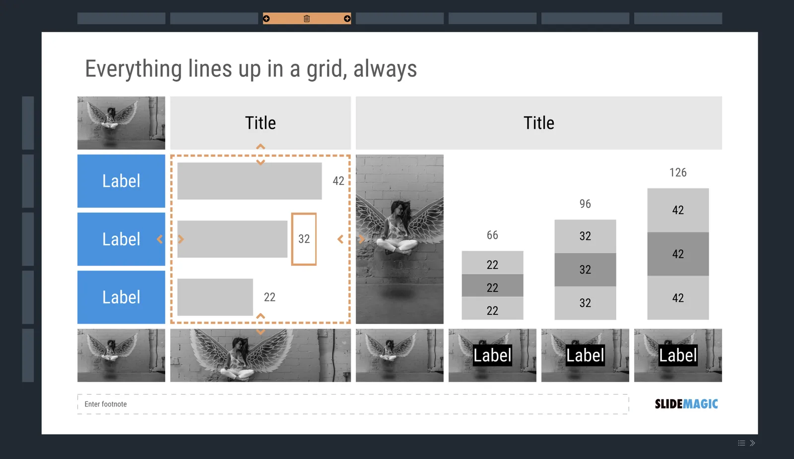
  • Titles, footnotes, (small) corporate logo, page numbers, the slide content, all of them have a fixed place in the layout
  • Mainly greyscale slides with one strong accent colour to make things pop out
  • Rigorous adherence to the grid, everything lines up with everything, text, images, arrows, data charts, labels, everything
  • You can use any shape you want, as long as it is a rectangle with sharp corners
  • It is technically not possible to create a bullet point dot on a slide
  • It is technically not possible to stretch images out of their aspect ratio

The constraints of email and instant messages have made corporate communication a lot simpler and more efficient: text can be brief, informal. Something similar needs to happen to presentations.

·PowerPoint

Screen sizes in PowerPoint

The coding of my app requires me to descend into the detail of font and screen sizes: SlideMagic 2.0 renders slides on the screen (HTML), in PDF, and in PowerPoint. It requires some fiddling to get things to look exactly the same in all three of these channels.

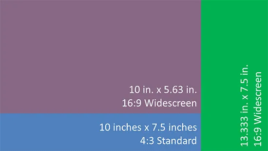
This post by Geetesh Bajaj explained nicely why things can go “wrong” in PowerPoint. Switching from “4:3” to "16:9 onscreen” mixes up all the font sizes. Why? Font sizes are expressed in terms of character height. The “16:9 onscreen” mode keeps the width of the screen, just makes the height smaller. The result, all text looks way too big.

Recently, Microsoft added the “wide screen” setting. This is the one to use. The height of the screen is kept the same, the width is made longer.

 PowerPoint screen sizes explained by  Indezine

PowerPoint screen sizes explained by Indezine

If you are never switching layouts and masters, and/or are not coding presentation software, all of this should not worry you. The only thing that matters is 4:3 versus 16:9. Still, when you have a choice, pick that “widescreen” option to make life easier. for you.

Photo by Jon Ander on Unsplash

M&Ms

Over the weekend I read a profile of Christine Lagarde and how she rescued a EU crisis meeting once by passing around a bag of M&Ms (sugar kick) and suggesting to move all documents aside and start writing points of agreement on a blank sheet of paper.

It is incredibly hard to get a large group of people to agree on a complex document (or presentation) on the spot. Sometimes, the list of bullet points is the best solution:

  • Short informal language
  • Everyone has full visibility fo what is written
  • Any distracting side comments can easily be parked

Image via WikiPedia

·Software

Animations in user interfaces

I usually don’t put animations in my presentations, they don’t add much, and in web interfaces I find them mostly annoying. I just discovered an exception: the tile or story view of presentation software. If you add or remove slides from the grid in one “bang” (instantly rendering the sequence of slides), your brain gets confused and does not seem to understand what just happened.

I have something else to learn…

Photo by DESIGNECOLOGIST on Unsplash

Presentations on Apple Watch

As soon as the first Apple Watch came out, I said I would consider getting one when it could operate independently of your phone. Last week, Israeli cellphone operators finally starting supporting eSims. So far the device works great, especially for tracking bike rides (and spotting when my family calls worried after my helmet triggers a false alarm crash alert). But the best is that for an introvert with a profession that requires few lengthy discussions by phone, I start leaving my phone at home altogether more and more.

The app landscape for the watch is still a bit primitive. Many big-tech companies actually pulled their Watch apps as most users just read notifications, rather than use a native interface on the watch to do things. I quickly had a look at the PowerPoint and Keynote Apple Watch apps.

Keynote works as expected. You can use your watch as a remote control for presenting a deck on your iPhone. The use case for this is limited though in my opinion. If it could control the flow of slides on a mac or iPad, it might be useful.

PowerPoint probably is supposed to do the same thing. It asks you to open a presentation on your phone, but when you do, nothing really happens. I guess it is a temporary bug in the app.

I could see other small features being incorporated, a little buzz when you reach the last 5 minutes of your allocated speaking time for example, but these are all well, features.

Continue reading →
·Delivery

Yes, I know...

The first few seconds of any presentation, the audience is not really paying attention to what you say, but rather checks out who the speaker in front of them is. Wow, that is a bright pink shirt, is she senior, he seems nervous…

A major distractor is vocal accents: where is she from? Often, accents can be so heavy that they start reminding us of characters in movies and/or other stereotypes. Yes, this is not politically correct, but you cannot help the brain making that connection.

I often “apologise” for that Dutch accent in a short opening intro explaining where I am from. If you are a French engineer, with a heave French accent, maybe you should acknowledge it with a smile and move on.

Photo by Titouan on Unsplash

·Delivery

Live audience questions

In a huge keynote, audience questions are almost impossible. The practicalities of picking who can ask a question, getting a microphone to the person. The lottery of whether the question will actually be interesting or relevant, and/or whether the person is actually good at asking to the point questions. And what if no one actually responds to the famous speaker inviting questions?

Dedicated smartphone apps (or even Twitter) seem to solve part of these problems. Users have to be brief, don’t interrupt the live presentation, people can upvote things, and you can pre-populate question to get people started.

I have seen them in action. Often the questions are projected on a huge screen behind the speaker. But, that constantly changing huge screen is actually distracting, there is even a possibility of “background vandalism” for controversial speakers, and most of the times, the questions are actually ignored.

A solution? Use the system, but don’t put the questions on the main screen. Answer at least one question. But most importantly, use the questions that pop up to make other conference presentations more relevant. Questions are live feedback about what the audience actually wants to hear. If it cannot be used now, maybe it can help the next session.

Photo by Camylla Battani on Unsplash

Good panels: prepare first-hand stories

The ‘panel’ is often a preferred presentation format for big conferences. It seems like a win-win for everyone. The conference can advertise a handful of high-profile speakers that are all together on the stage sharing their wisdom. The panel members can just show up without preparing any slides, presentation, just winging it.

Unfortunately, the audience can tell. Panelist that get caught off-guard by a question and making up an answer like a politician, throwing in a few buzzwords along the way. Moderators that try to sow their own smarts by answering the questions themselves.

A good panel requires preparation. Moderators need to think what questions to ask to whom. And panel members should be asked to share what interesting stories they can share that then can be weaved into a question.

From my own experience, the panels that share ‘raw’ stories are the most interesting. How a company grew, what decisions they took, stats on where they are now. Everything first hand and directly related to the panel member. Very specific, actual experiences. As soon as people try to generalise and abstract away from the direct experience, things become boring very quickly.

A good panel discussion is well-prepared

Photo by Alex Read on Unsplash

What drives you?

Upon hearing my efforts to build a new presentation app, I get lots of friendly advice about how to turn the program into an office productivity giant and produce a phenomenal (financial) exit. How to launch, what to build, where to expand, how to price.

While this huge IPO might be nice, it is not my main objective at the moment. I feel that through a number of coincidences I have been put in a position that can really end the suffering of creating and watching presentations in companies. By coincidence: the combined skill set of understanding business, having a feel for design, and the ability to program all ended up in the same head somehow.

Building a new presentation tool is not something you do with a huge VC investment, a high profile Board, a large team of developers, armies of social media copy writers. Getting product market fit requires tinkering, trying, starting over, fixing things.

The whole thing is a calculated risk. Today, the investment to create software is relatively low. And with decades of professional experience under my belt, I can always fall back to designing decks again. On the upside software can scale infinitely if it works.

And in addition, I have that urge to push the current V1.0 that is out on slidemagic.com to what it really should have been.

Crazy? Maybe, but not completely.

Photo by Allie Smith on Unsplash