SlideMagic Blog

Frequent updates about all things presentations since 2008. Subscribe to never miss a post.

RSS
·Concepts

Adjusting frameworks

The world of management theory is full of frameworks designed by MBA professors and/or management consulting firms. Many view in the same of was the laws of physics: this is how you go about solving a particular problem.

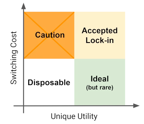
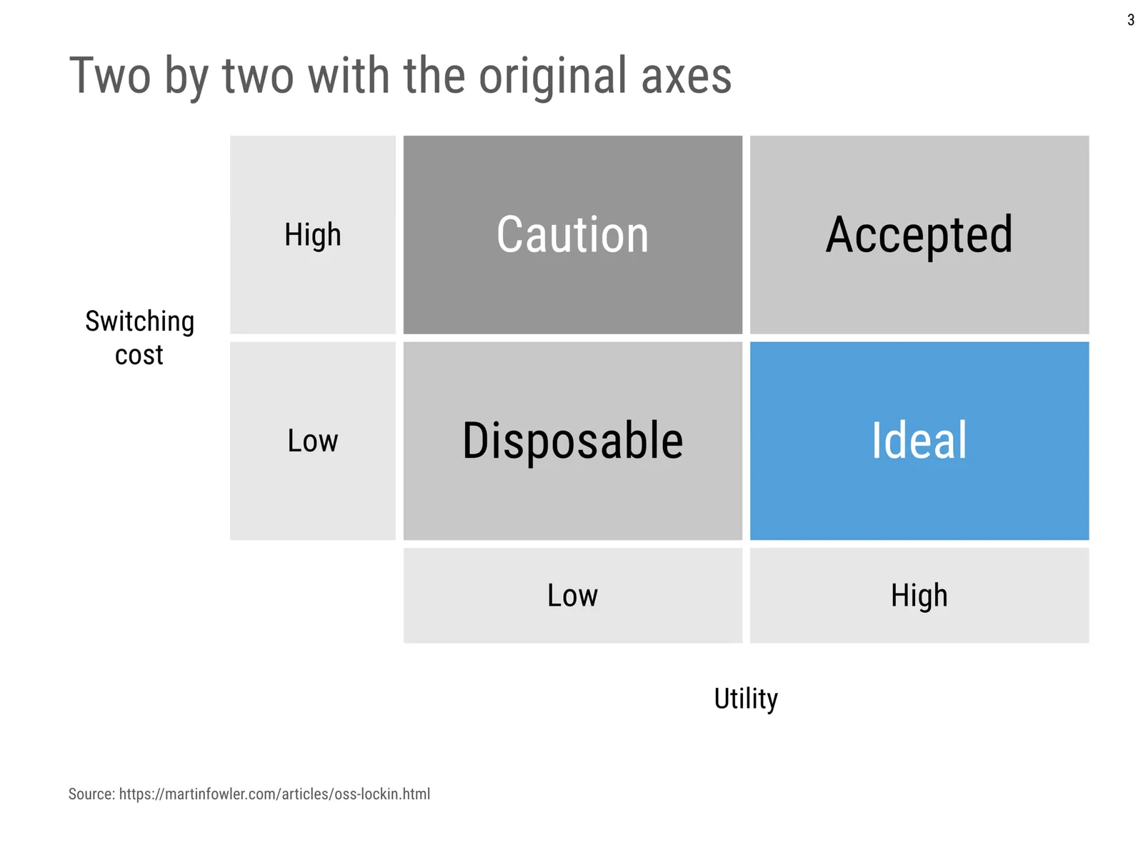
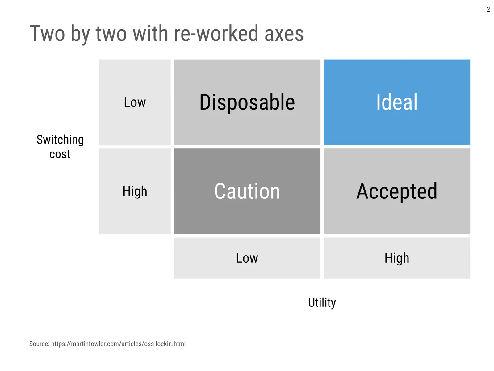
That is giving them too much credit. Dogmatically forcing a certain problem/solution into a framework will not work: if it does not fit, it does not fit. Every situation, every problem is different. Here is an example of someone adjusting the famous SWOT framework. Here is my own attempt at modifying a SWOT 2x2.

While frameworks can be helpful start thinking about a problem and planning the work that lays ahead of you, they are often not that good as layouts in presentations that communicate your final recommendations. Frameworks are complicated diagrams, and try to be exhaustive and list everything that is relevant for a problem on the page. For your final slide, that might not be what is needed to explain your findings. Frameworks can be useful to solve a problem, but might not be ideal for communicating the findings.

·Creativity

But it won't take that much time?

Many clients do not understand that, no, I really do not have time at the moment to do that small presentation design project, as I am focussing 100% on my coding efforts.

People understand that it is unreasonable to ask for a big project, but that small presentation fix, that should work right? It will only take a few hours.

Here is the problem with those few hours:

  • The opportunity cost of those few hours can be huge, since coding a big feature in the app can take an entire day or more. Knowing that you have to spend a few hours on something else means you won’t even get started on it.
  • Building on that: this small project might actually be an excuse to put off that major feature update
  • Now that I am a bit out of the presentation design flow, what used to take me a few hours, could actually take a lot more time.
  • A small design fix is not a big rewarding project, it is likely to be a fix: a small payment, not my best work, in short a distraction.

Photo by insung yoon on Unsplash

·SlideMagic

App update

It took me a few days after the holiday to get back into my own code again (scary how fast you forget things). But I am on a roll again. A major achievement for a 1990s computer scientist is that I got the SlideMagic server running: you can log in as a user to activate the pro features (probably spotless and instant PDF and PowerPoint conversion) and equally important, access to a much broader searchable layout database. The latter works now as well, the server responds with dynamically generated slide suggestions based on search keywords.

The next challenge will be to 1) expand the slide layout database, and make the search suggestions smarter, and 2) to make the user signup/login robust. For most developers, 2) is easy (this is coding 101) and 1) is hard (this requires 25 years of slide design experience). For me it is the other way around.

Photo by Markus Spiske on Unsplash

·PowerPoint

Accurately cropping images

Cropping an image accurately can be tricky, especially when PowerPoint is trying really hard to suggest possible cuts alongside snap lines it thinks are useful. My solution, drag the image to a huge size (without distorting its aspect ratio), crop, and shrink it down again.

Photo by Morgan Harris on Unsplash

WeWork IPO: elephant in the room?

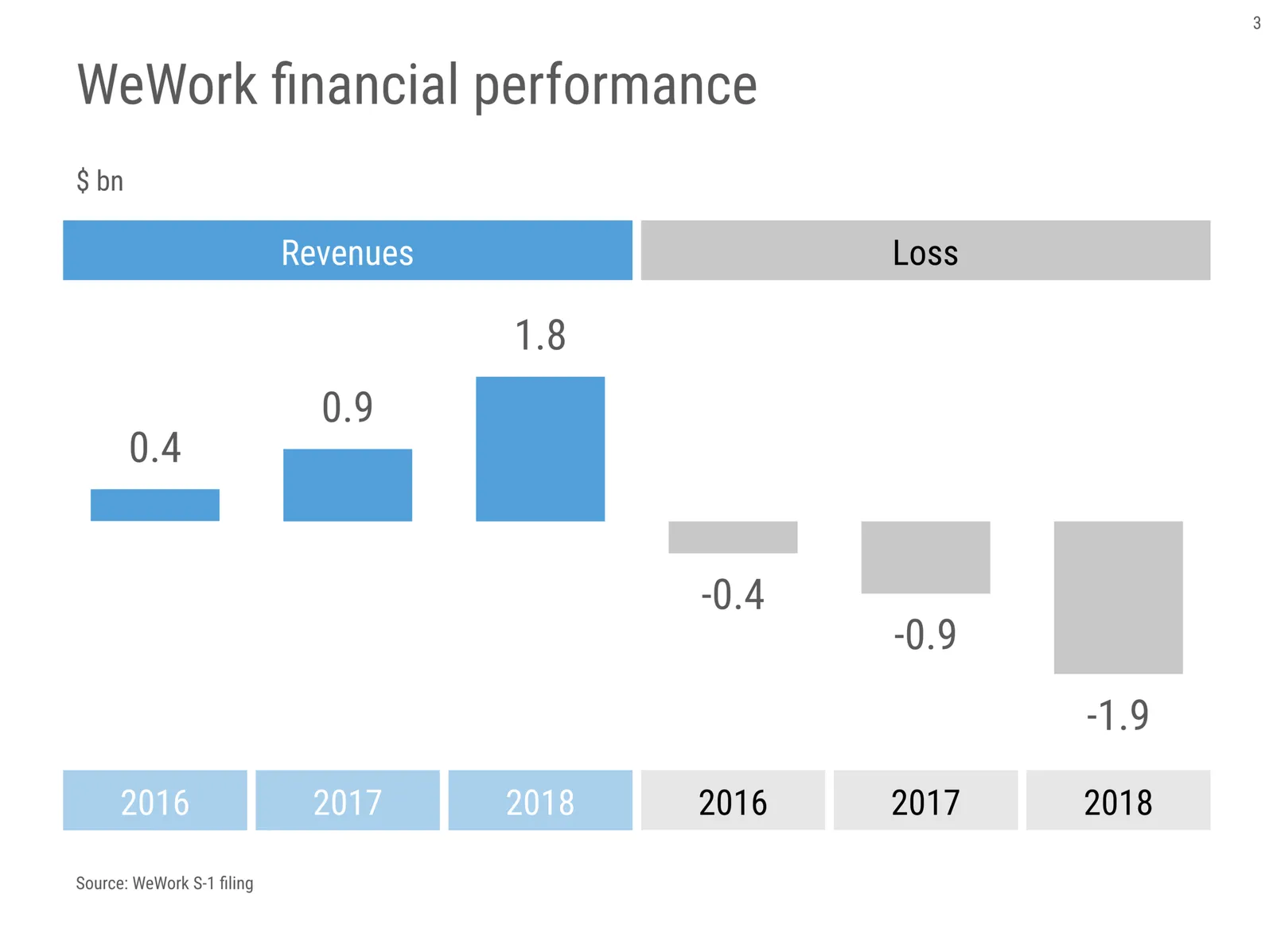
WeWork has filed its S-1 documents to prepare for the upcoming IPO. This set of numbers is the big question for investors (quickly put together in SlideMagic 2.0):

Investment analysts are all over this document: unlike Facebook, or Uber, real estate is a relatively well-understood business, so people can apply traditional valuation methods to try to make sense of a valuation. Is this a gigantic money burning operation, or the start of one of the world’s most profitable tech giants that will change how people work together?

I think WeWork needs an investor presentation that takes the questions head on.

  1. What are the economics of a single location (finding. refurbishing, filling, etc.) per square meter, and back it up with data of actual locations. The S-1 contains a graph explaining the concept, but it lacks a y-axis.
  2. Show a scenario of the current real estate business, how many locations/members would you need to get to a stable, profitable operation
  3. Then, what other options are out there to start building other businesses on top of this.

I have not run the numbers, but I suspect that stage 1. and 2. will not be enough to justify the share price, and your decision to buy into the IPO will depend on what you believe the potential of 3. is.

Photo by Eloise Ambursley on Unsplash

·Books

Visualising quantum mechanics

That is an ambitious title to start my first blog post after my return from a summer holiday in Asia!

Through a series of coincidences I ended up reading through a number of popular science books about quantum mechanics. I remember getting all carried away in the briefing session of a presentation design project for a startup in the field of quantum computing. My academic knowledge of this field was basically high school chemistry, so I added this topic to the list of things that needed a refresh. A holiday was the perfect occasion. I am sure I was the only one at the side of the pool dusting of theoretical physics knowledge.

From a presentation perspective, the fascinating problem that quantum mechanics struggles with a the lack of either a visual or verbal language to describe concepts. The mathematics is water tight and has proven to be really useful (lasers, semiconductors, LEDs, etc. etc.). But when you try to take a step back and want to understand what it actually all means in the context of your daily routines, things get confusing.

It is all the result of some form of Anamorphosis, projections of phenomena that get scrambled when angles or dimensions no longer line up. Every scientist is looking for that ultimate simple underlying concept that can explain/visualise/link quantum on a small scale to the more traditional physics that we see everywhere around us at a human scale.

In case you are interested, here are 2 books on the subject: Beyond Weird, and What is Real?.

Continue reading →
·Typography

Font or typeface?

Seth Godin in hist latest blog post:

And yes, there’s a mustard analogy in everything you do. In how you shake hands, in the typeface you use in your presentation (and whether you call it a ‘font’), in the volume you choose for your voice when in conversation.

Yes, there is a difference between “typeface” and “font”. Typeface refers to the style of a character, (Helvetica), font is the specific instance of that typeface (Helvetica 12 bold italic), which corresponds to a specific drawer with letters printers once used.

As someone who presents himself as a professional designer, I should be a purist, but don’t tell anyone, but I use the word “font” all the time. It sounds better is shorter, and an issue that is relevant for me recently: “font” is easier to fit in a dropdown menu of an application than “typeface”.

Photo by Mr Cup / Fabien Barral on Unsplash

App update

Things are a bit quieter on the blog as I am continuing to work on SlideMagic 2.0. There was a small personal triumph as I finally acquired the skill to code a web server and remote database and read/write slides and users to it.

This enables me to start finally working on a proper search mechanism for template slides. I have a pretty good idea in my head of a mechanism where a user can click around between related slide layouts, visual concepts, business concepts, but it is (still) tricky to code this in software. When I succeed, I could probably file another patent, but for sure can claim SlideMagic 2.0 uses “AI”, which always sounds good.

To be continued.

Photo by NeONBRAND on Unsplash

Fancy paper

Back in university, whenever we had a few more advertisers for the student association magazine, we immediately went for more expensive paper, full colour, or sophisticated binding.

This is a bit like throwing fancy effects at a presentation. In both cases, it does not always work.

Very heavy rough paper works for wedding invitations, but on a magazine, it looks like a brochure for expensive wine fridges.

Heavy satin finish paper looks beautiful on a thick 100+ page, coffee table book, full of A4±sized pages with lots of white space in it. Not so much for the A5-sized, loaded page with the calendar of the weekly drinks gatherings, plus 10 more pages.

In many cases, black and white photos with just one highlight colour makes things look much prettier than noisy images with random colour palettes.

Fancy is not always better.

Photo by NordWood Themes on Unsplash

PowerPoint templates in one file

If you want to download many slides from my template store, the process is a bit cumbersome: you have to add slides 1 by 1 to the check out card, and then download load them individually. My vision (hate that word) was to create a super useful slide search engine which you then accessed on an as-needed basis. The problem is the Shopify platform (which is designed to sell T-shirts, not digital downloads).

Slowly but surely I am building up the skills to start running my own template server, as a web site, as a backend to my new SlideMagic 2.0 desktop app, and possibly as a plugin to PowerPoint itself. Until that is all launched (and built), I am going to make life easier for current store subscribers: making all slides available in one downloadable file.

On request, I put a quick 200+ slide file in PowerPoint 4x3 format up (you can find it here, free to download for subscribers), the other formats will follow.

Photo by Bernard Hermant on Unsplash