

I have started using SlideMagic 2.0 extensively now to shake out every single possible bug (I can’t believe all the things that can go wrong in software). The more I use the tool, the more I come to realise that SlideMagic is a design language that happens to be supported by a tool, and not the other way around.
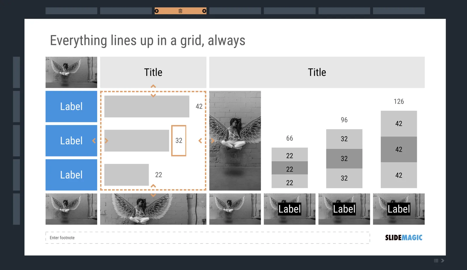
Trying to break SlideMagic 2.0
- Titles, footnotes, (small) corporate logo, page numbers, the slide content, all of them have a fixed place in the layout
- Mainly greyscale slides with one strong accent colour to make things pop out
- Rigorous adherence to the grid, everything lines up with everything, text, images, arrows, data charts, labels, everything
- You can use any shape you want, as long as it is a rectangle with sharp corners
- It is technically not possible to create a bullet point dot on a slide
- It is technically not possible to stretch images out of their aspect ratio
The constraints of email and instant messages have made corporate communication a lot simpler and more efficient: text can be brief, informal. Something similar needs to happen to presentations.